Cotality
A new story leading information services into the future
Transforming from core equities to new possibilities
Challenge
Having grown by acquisition and with its deep industry roots, CoreLogic was a company with a collection of sub-brands that had become primarily known as a mortgage solutions company. Despite being a trusted, go-to resource for real estate, insurance, and mortgage professionals, many did not know that CoreLogic’s impact was far wider than just the traditional real estate lifecycle. It’s a property intelligence powerhouse with data that spans the entire property ecosystem—reaching industries like government, telecommunications, retail, and more. With ambitions to grow even further and a desire to be seen as a leading information services company, the brand perception would need to change.
Insight
Our approach started from within. We conducted in-depth internal research, engaging everyone from executives and sales teams to key internal influencers. We explored every dimension of the brand—product value propositions, messaging, sales materials, employee engagement, user experience, brand architecture, even the name itself.
What we discovered was striking: Cotality had a powerful impact story—but it wasn’t being fully told. The brand needed a platform that could do justice to its real impact. So, we began from the inside out, refining what mattered most and creating space for a unified, expansive story to emerge.
Answer
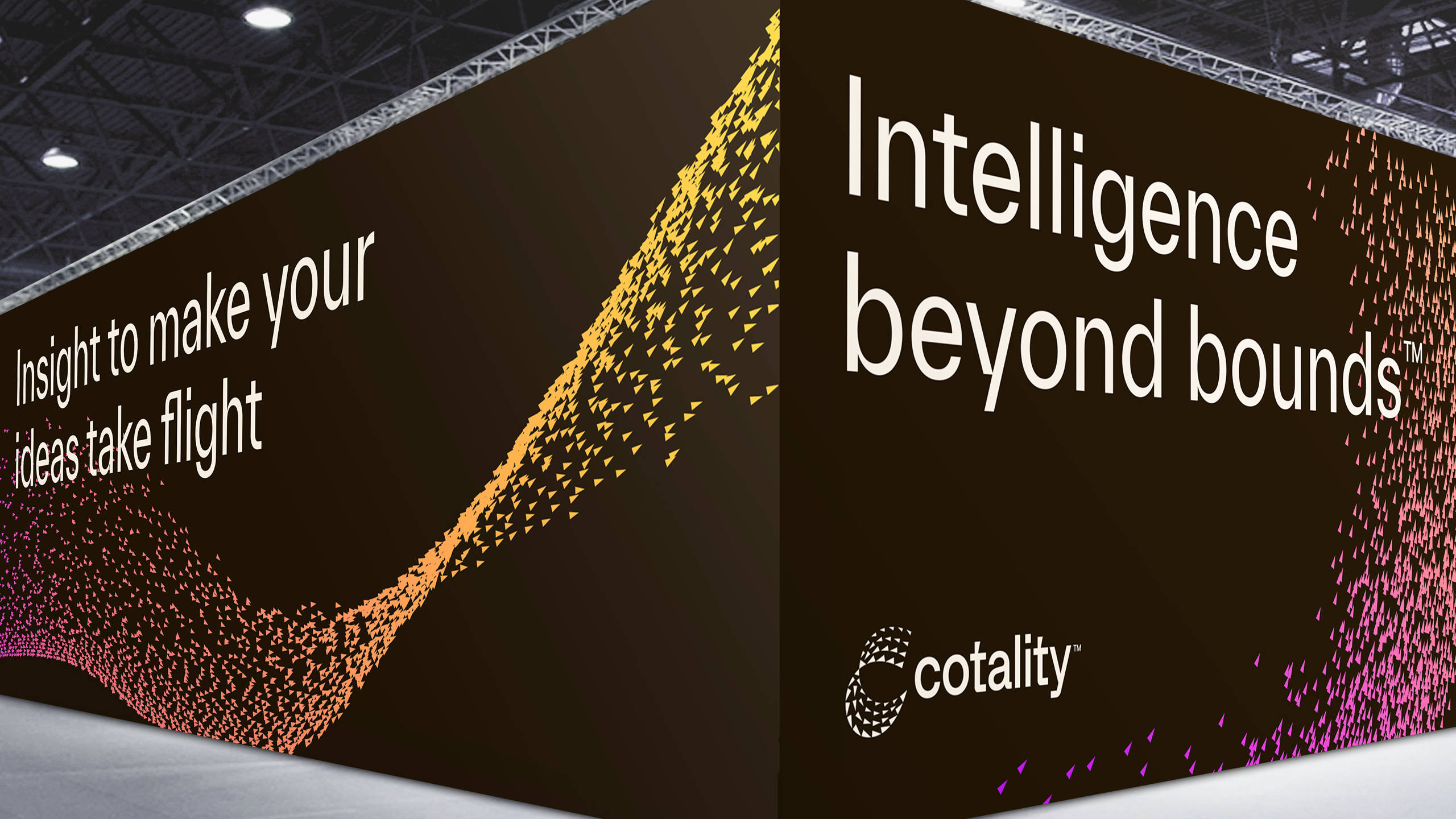
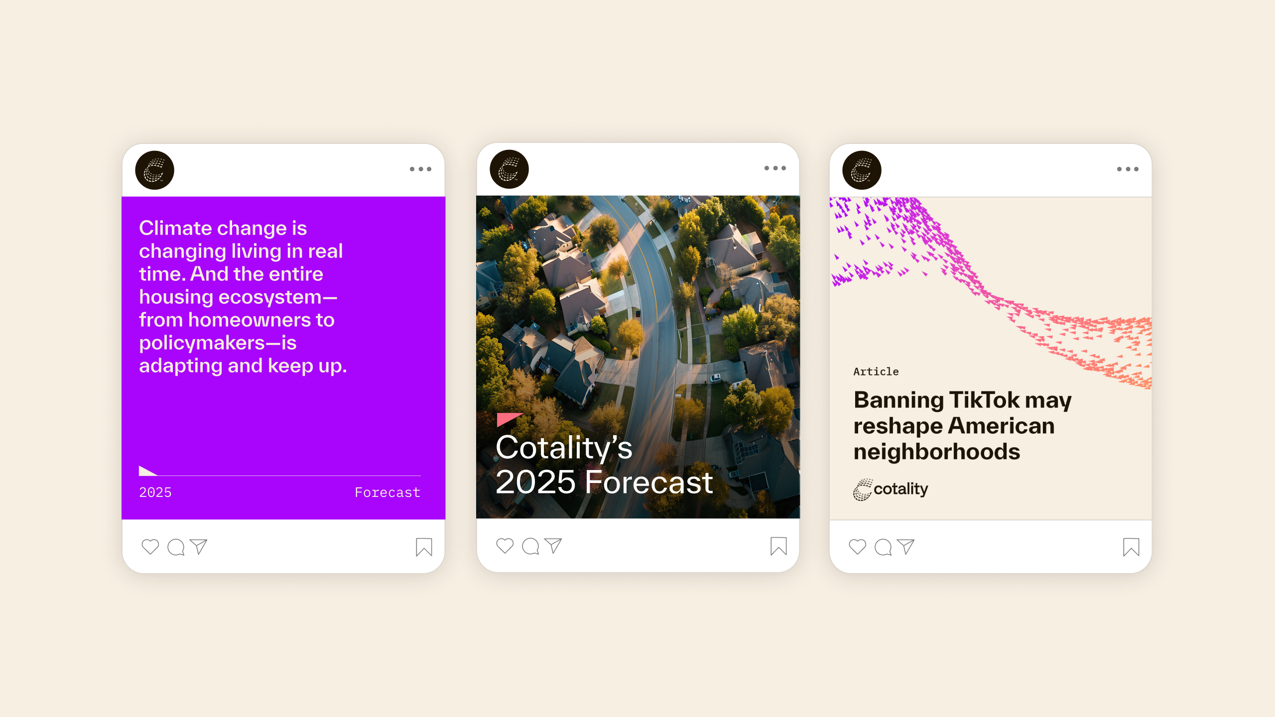
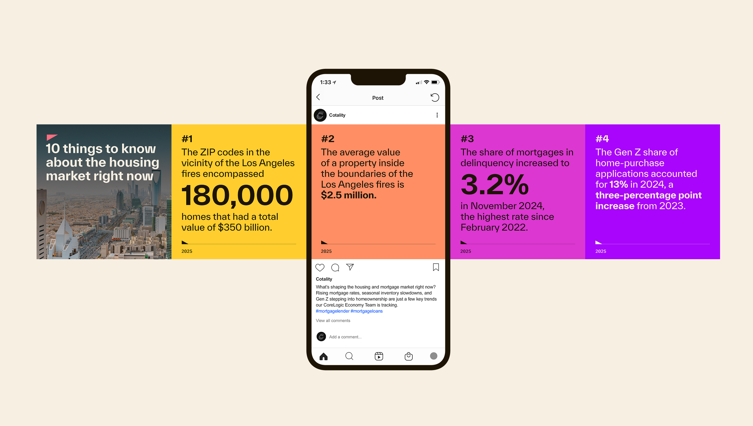
We started with a new name: Cotality, that captures the span of the company’s impact, capabilities and the breadth of its ambitions, while highlighting it’s core differentiator as a collaborative partner. We reoriented the brand with a narrative, visual identity, and brand architecture that tells a 360° story around Cotality’s layers of data and the opportunities it illuminates—signing off with the tagline “Intelligence beyond bounds.”
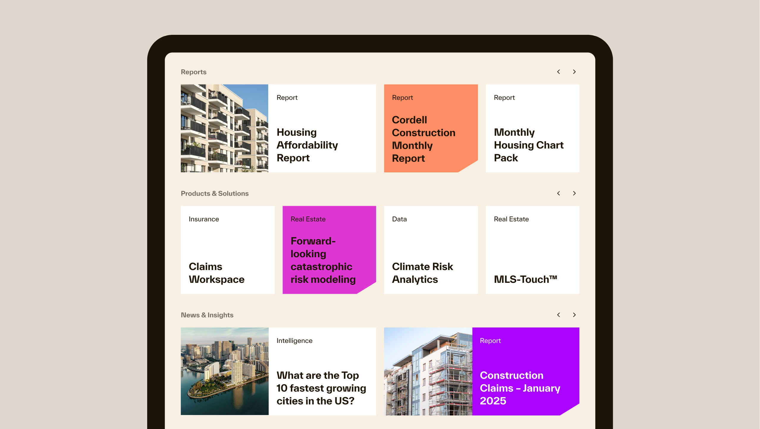
Engaging brand ambassadors from the beginning, we built an internal and external rollout plan to ensure stakeholder pride and readiness to convert it into business growth. This vision came to life in a refreshed website we architected, designed, and built—one optimized for generative AI to ensure continued brand ownership and accuracy across the web. Like good data, the design is clean, clutter-free and rich with potential for storytelling and engagement.
The Cotality logo
The logo draws inspiration from starling formations. Like these flocks, Cotality’s power lies in the ability to unify individual data points to illuminate big picture results.

Timeless and timely
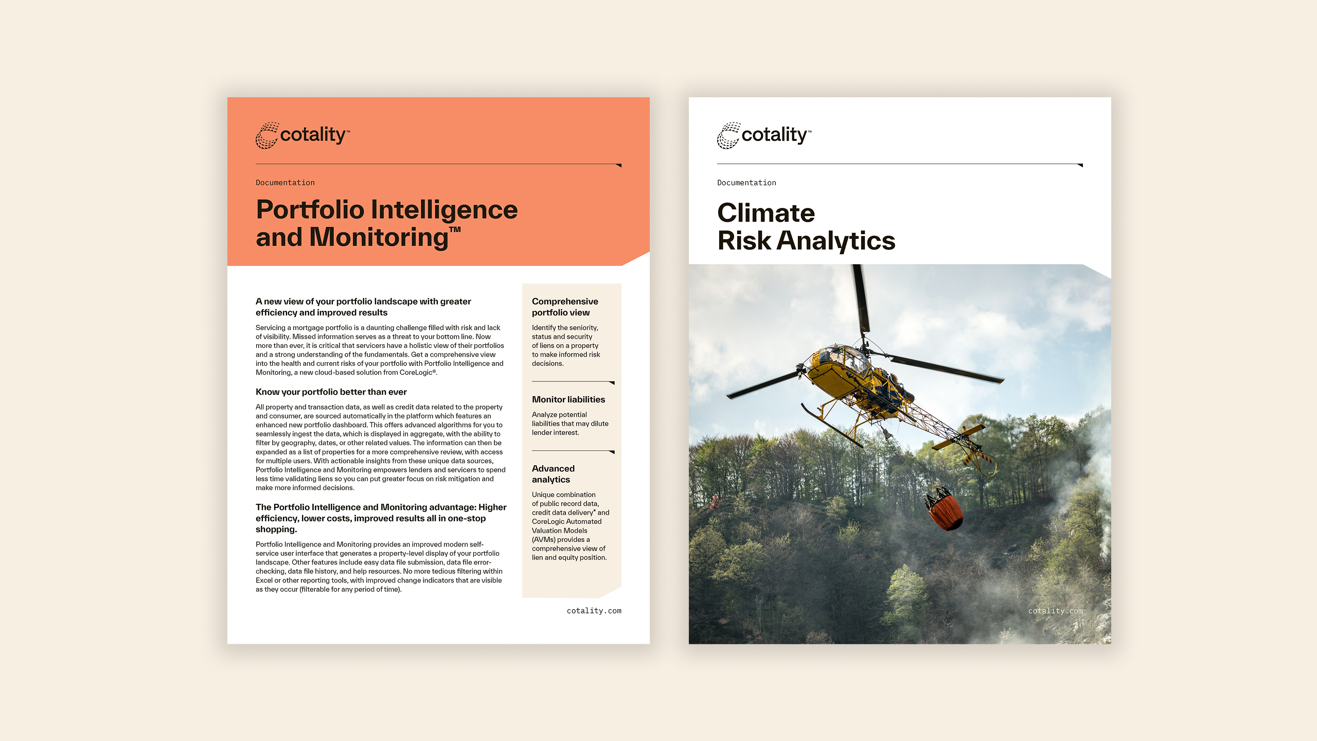
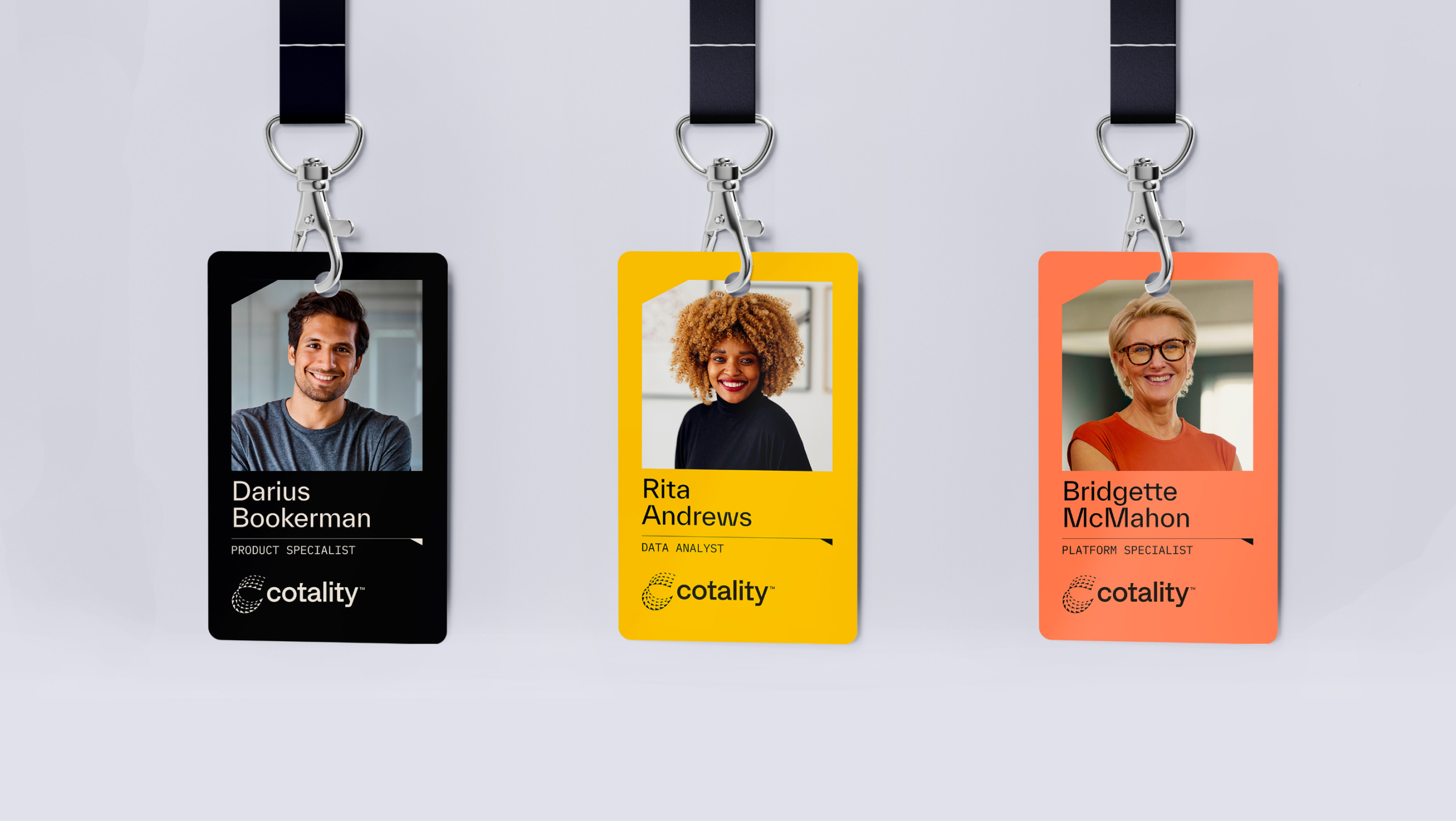
A modern and powerful visual system designed for effortless deployment across every platform while also intuitive to understand. It balances timeless design with authentic imagery, bold colors, and precise typography.
Distinctive and vital
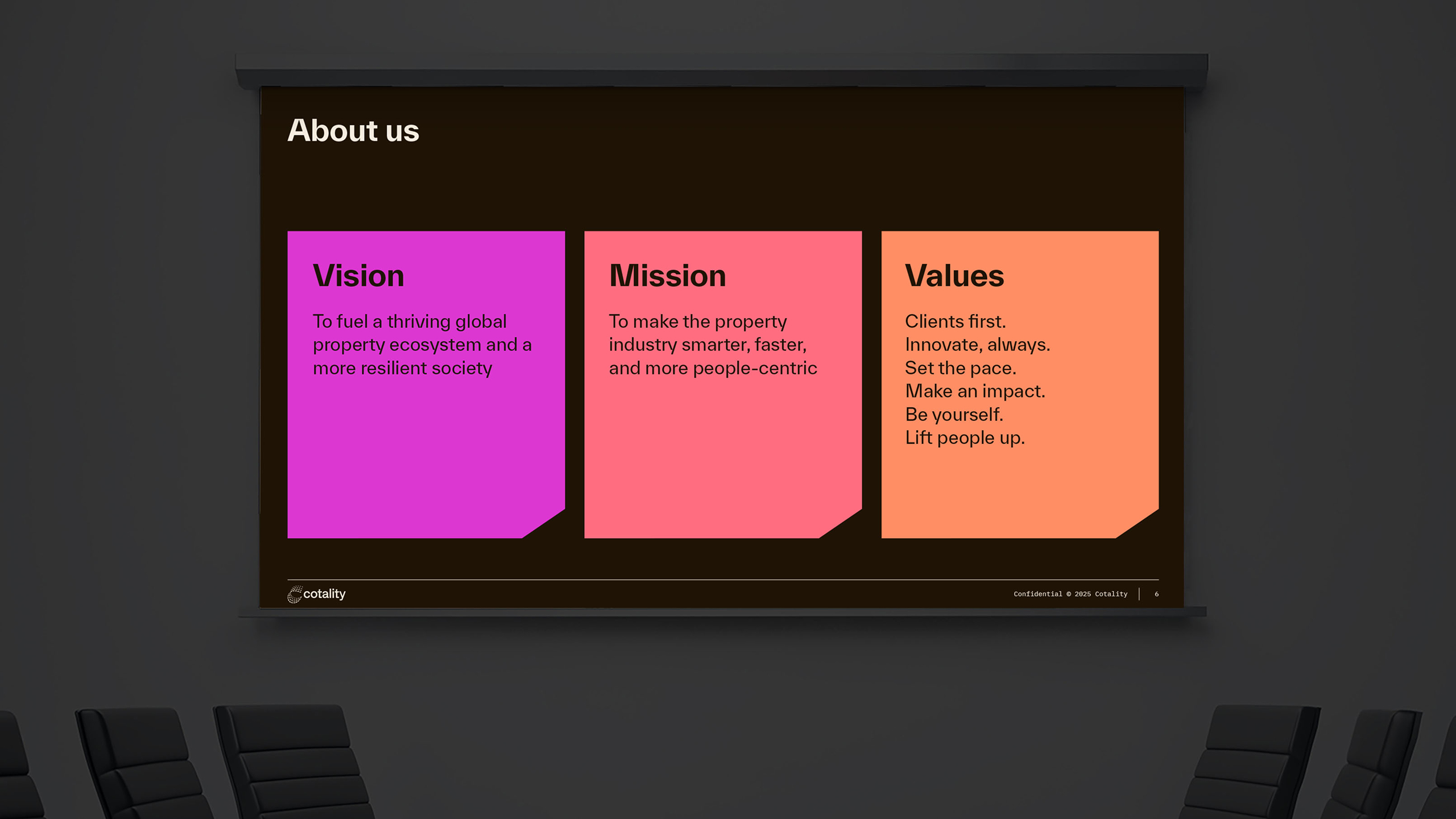
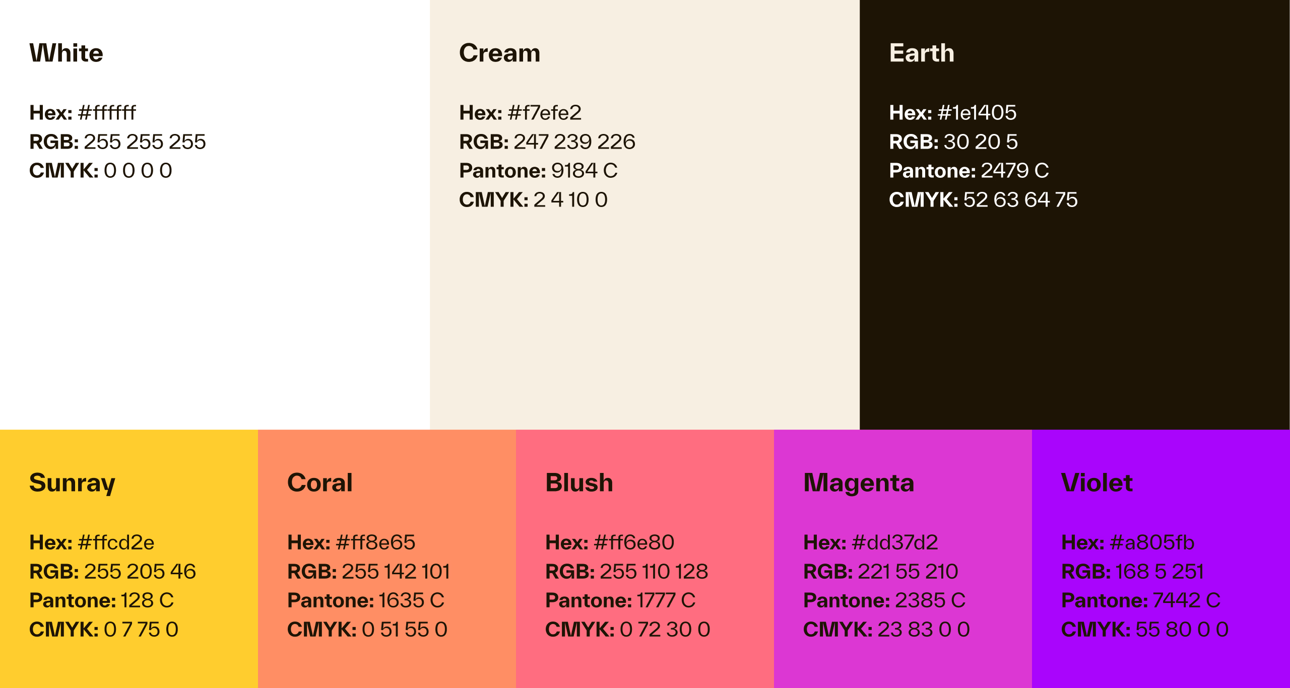
The warm and bold tones of the color palette convey vitality and optimism. The bright colors feel confident and innovative, while the sunset and sunrise hues evoke light that reflect how Cotality illuminates insights and possibilities.


Infusing the right balance of humanity
The photography captures authentic living—from warm interiors with natural light to exteriors showcasing architectural character. The dynamic interplay between people, places, and communities through thoughtful compositions reveals moments of genuine connection.


Building a memorable system
The visual system features dynamic, organic patterns that continuously shift and rearrange into endless possibilities. Even in static layouts, there’s a living sense of movement and transformation.