Agility
From five companies to one bold brand
Challenge
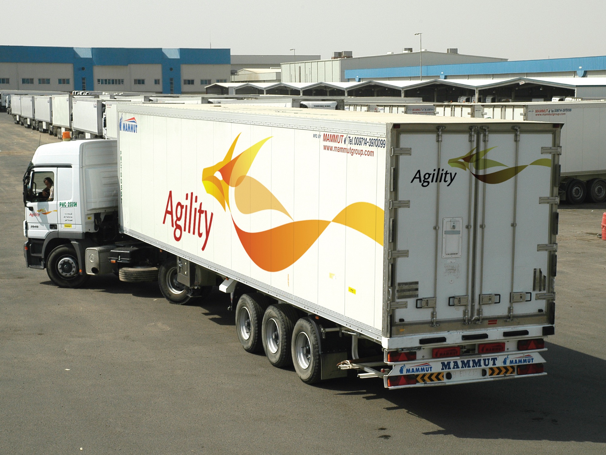
Five major logistics companies merged into one (PWC Logistics, GeoLogistics, Transoceanic, Trans-Link—and others).
Suddenly, they had global reach. Over 450 offices in 100+ countries. More than 20,000 employees. But no shared identity. They needed a name and a brand that could unify them. More importantly, they needed to stand out in an industry where every competitor looked the same. Acronyms. Globes. Trucks. The usual suspects.
The real challenge? They had to find a single word, a single symbol, that captured both their scale and their secret advantage: personal, customized service delivered by people who understood local cultures.
They had one chance to do this right.
Insight
A logistics company’s strength isn’t in moving boxes faster. It’s in moving them smarter—with partners on the ground who understand your business, your market, your needs.
The merger created something rare: a company with global reach backed by local expertise. That fusion needed a name that worked in every language, in every culture. A name that didn’t describe logistics—it described how they approached logistics.
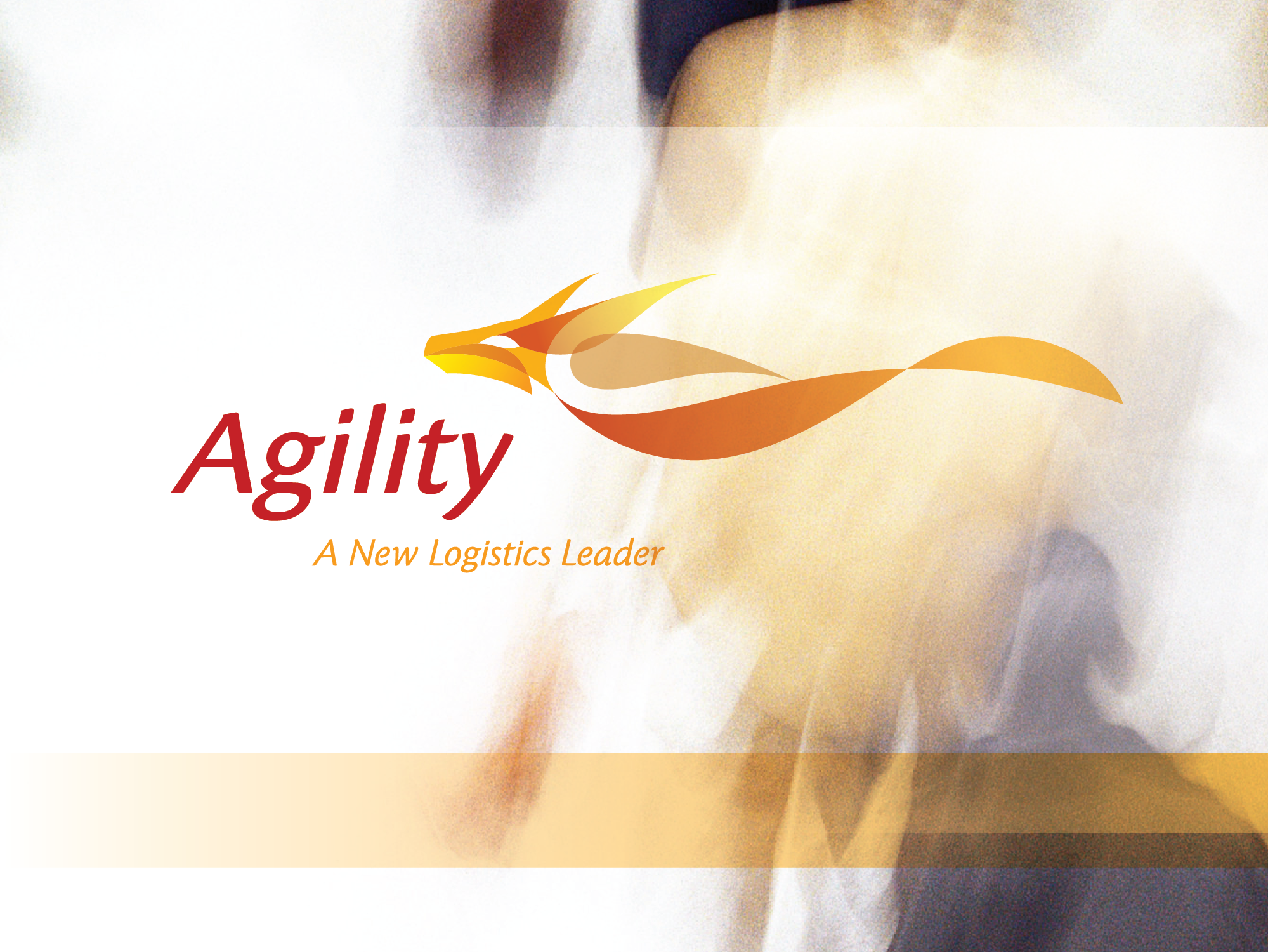
The answer: Agility.
Result
Agility’s identity was unique in its category. More importantly, it was unique beyond the category. It created new associations. New possibilities. A brand that didn’t describe logistics—it described a way of working. A way of thinking. A way of serving clients that competitors couldn’t easily replicate.
In an industry where every competitor looked the same, Agility stood out. The name is simple, bold, uncommon, and unmistakable.
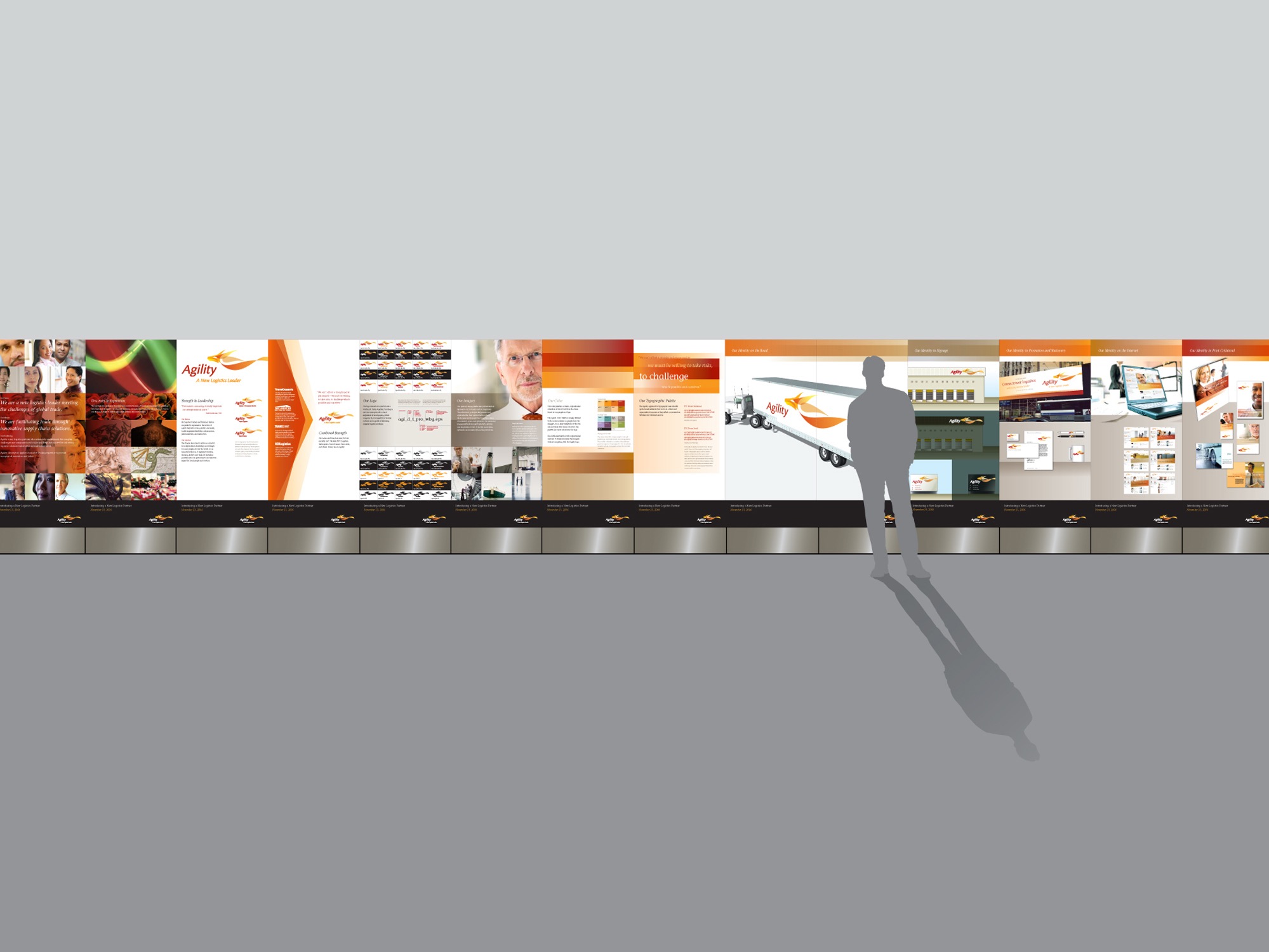
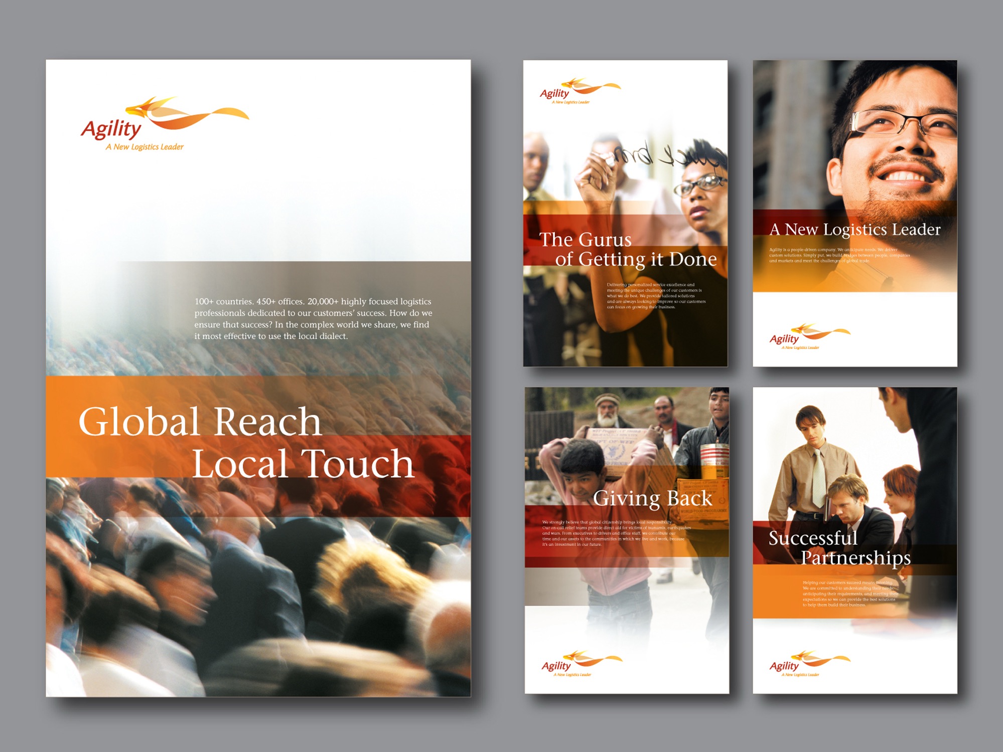
The name and identity
The system
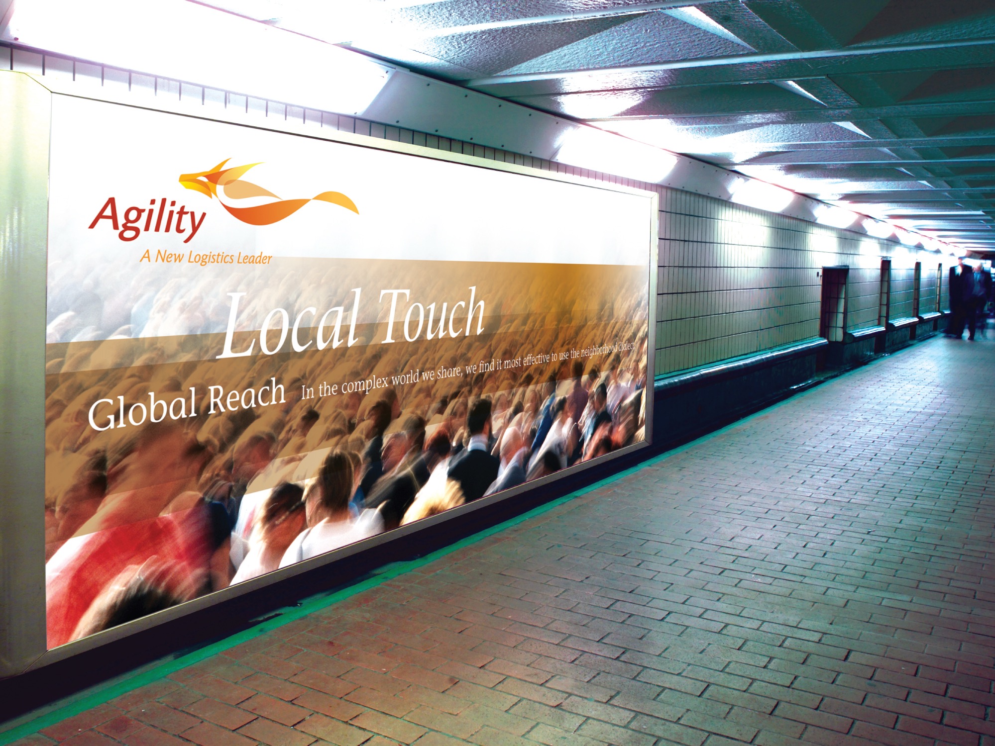
launch materials that announced the new brand, marketing communications and sales presentations, and a new website that fundamentally changed how clients experience the brand. Global signage, trucks, posters, billboards too. Each surface told the same story.
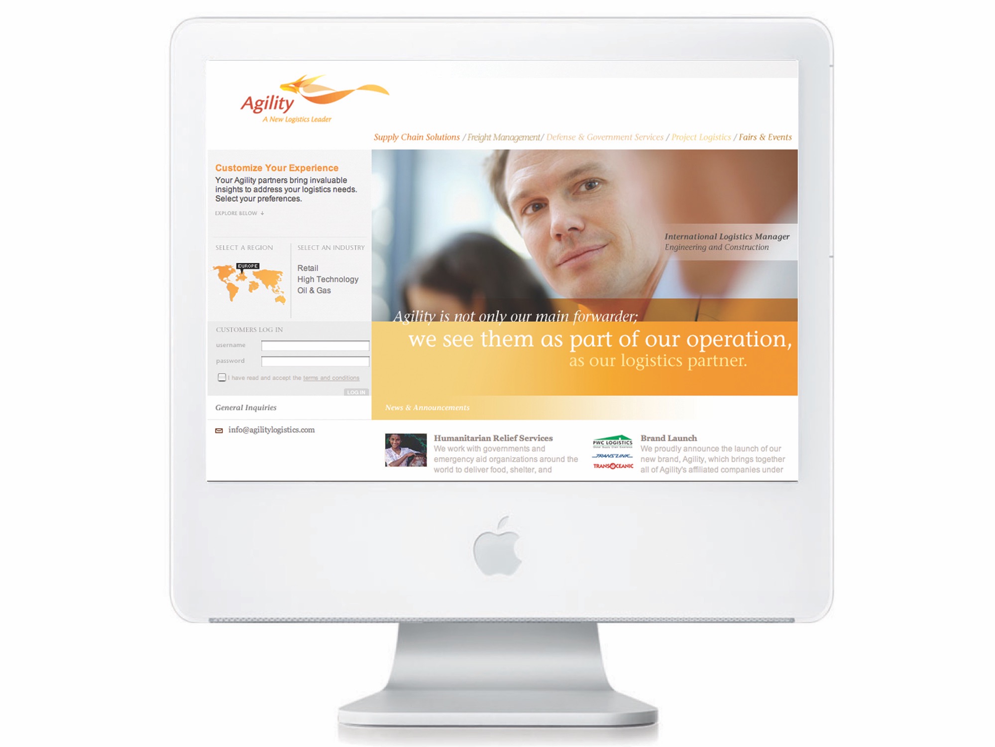
The web experience