Where we lead
Industry
Healthcare
Manufacturing + Industrial
Financial services
Consumer + Retail
Technology
Professional services
Energy
Travel + Hospitality
Business challenge
M&A / Spin-off
Rebrand
Brand strategy
Naming
Activation
Solventum
Creating a spin-off health care brand built for day one leadership
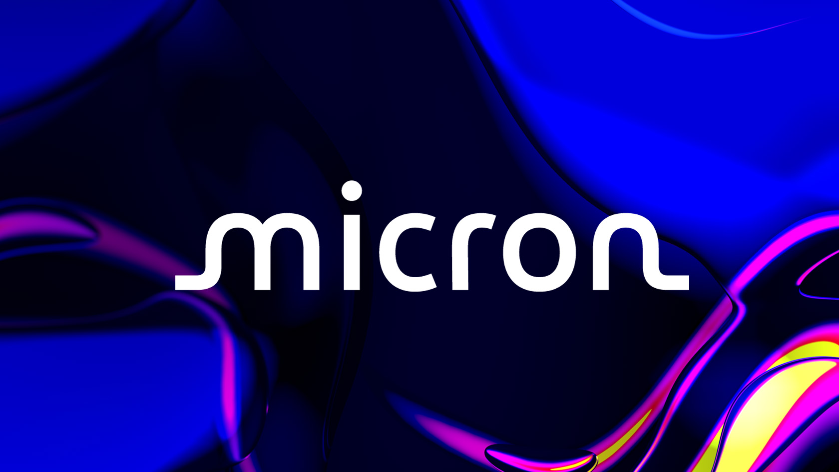
Micron
Inventing a forward-looking identity for a vibrant tech company
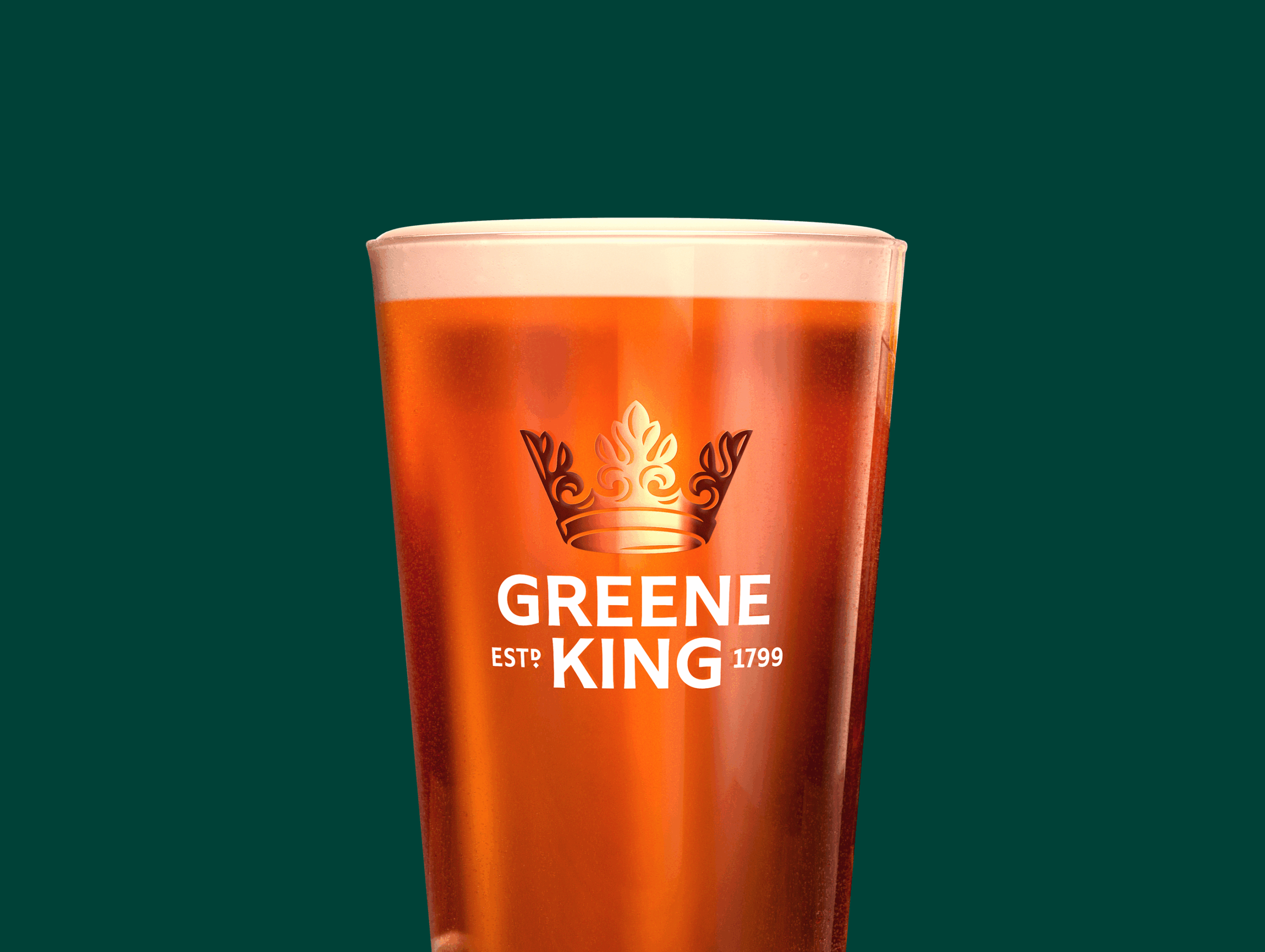
Greene King
Revitalizing an iconic pub chain brand with over 200 years of history
U.S. Army
Rallying the next generation of soldiers with a modern identity
CVS Health
Shaping the future of healthcare with cohesive, purpose-led branding
HPE
Powering the future of enterprise technology
Tirlán
Reinventing an Irish heritage brand for the global stage
Shearwater
Modernizing a geoscience leader for a sustainable new era
QuidelOrtho
Designing a brand that makes complex testing easier to understand, trust, and act on
Tether
Turning the largest stablecoin into a digital disruptor
Blue Cross NC
Redefining a member-first identity for the largest health insurer in North Carolina
H&R Block
Ushering in a new era for an industry legend
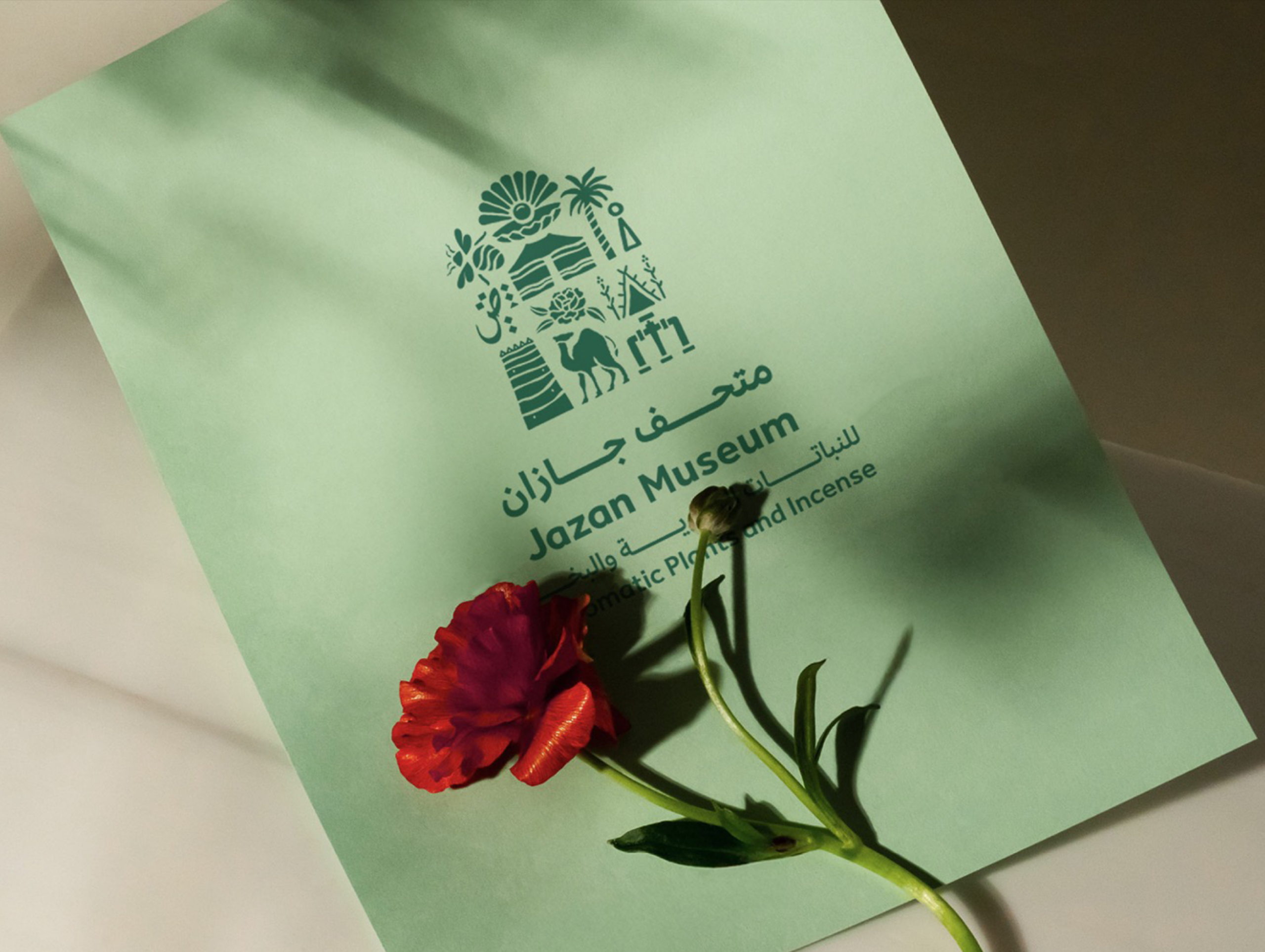
Our Saudi Story
Transforming a portfolio of regional museums into a platform for Saudi Arabia’s past, present and future
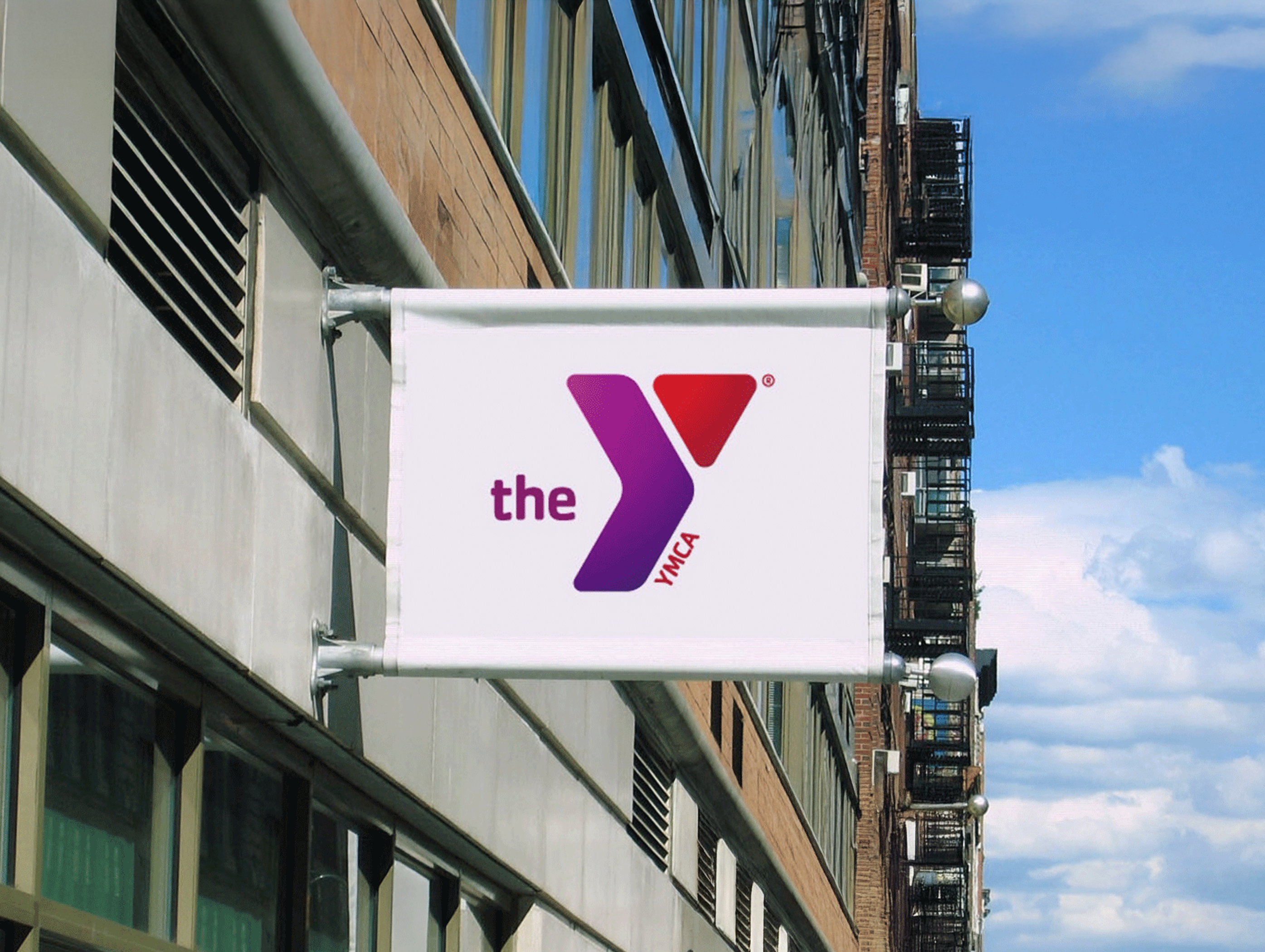
The Y
Breathing new life into one of America’s most recognizable nonprofits
Bristol Myers Squibb
Building a brand where scientific ambition meets the people it serves