QuidelOrtho
Uniting Quidel and Ortho to simplify diagnostics
Designing a brand that makes complex testing easier to understand, trust, and act on
Challenge
First, Quidel Corporation and Ortho Clinical Diagnostics joined forces to transform the future of healthcare. Next, they asked Siegel+Gale to unite and advance the new company with a comprehensive new identity that connects employees, products and partners worldwide.
Insight
Our research confirmed what matters most to laboratorians, hospital administrators and healthcare professionals: accuracy, clarity, reliability. The new QuidelOrtho brand had to communicate the company’s passion for transforming healthcare with precision and empathy.
Answer
We crafted a brand identity system for QuidelOrtho that is far more than the sum of its two prominent legacies. From mobile apps to stadium signage and beyond, the visual language is both data-driven and tactile, embodying the brand’s commitment to transforming diagnostics into a healthier future for all.
Organic identity
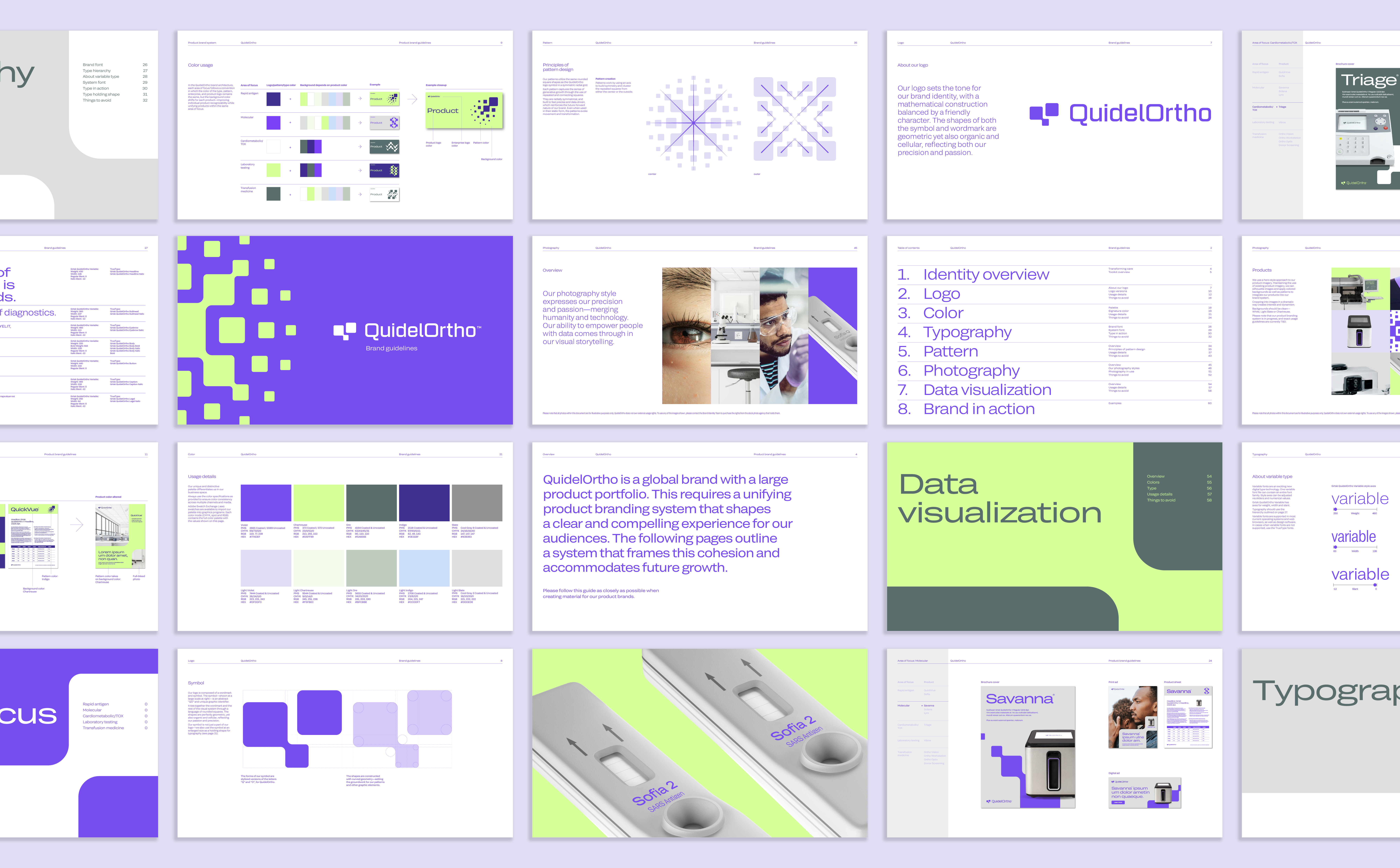
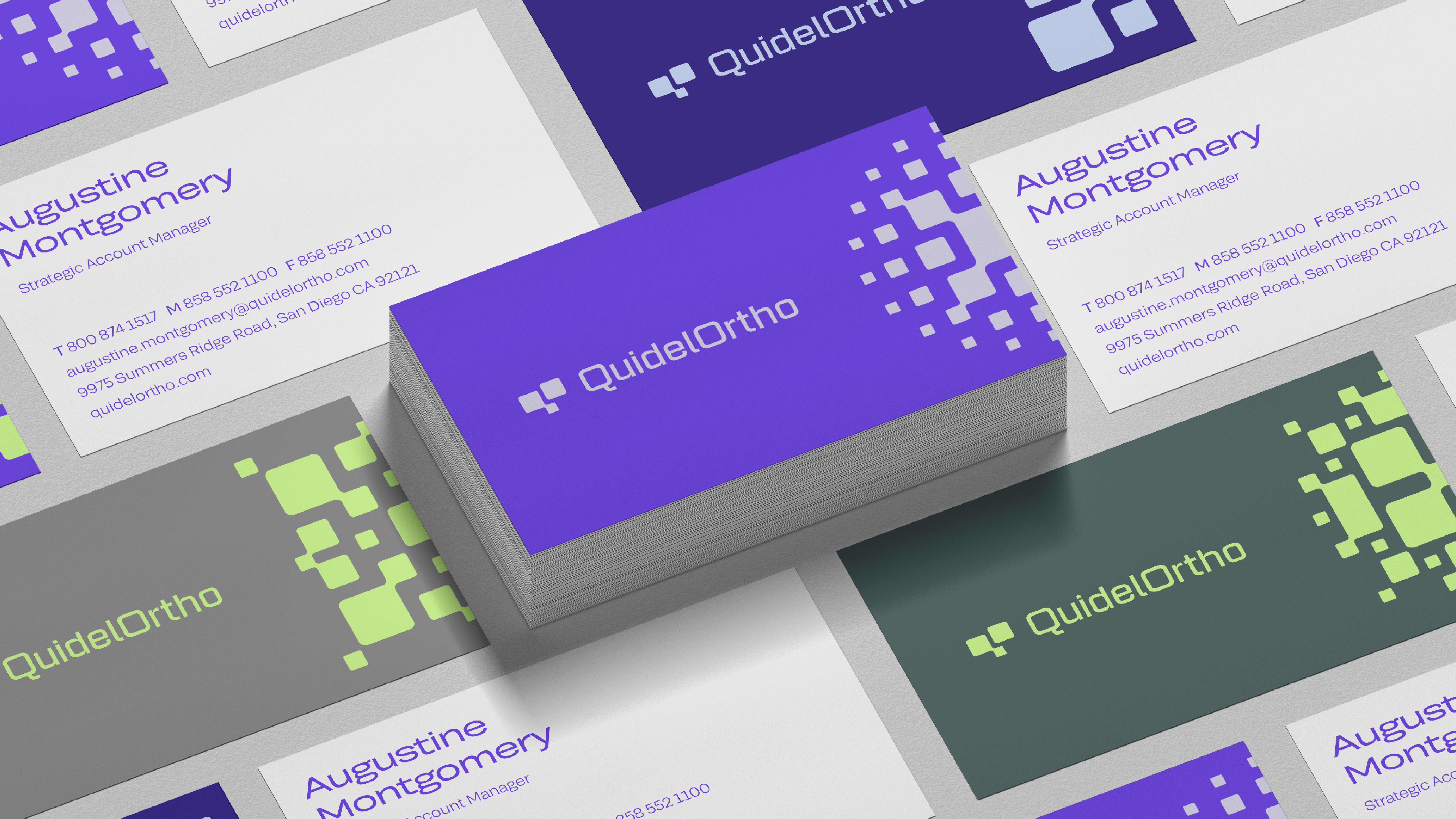
The forms of our logo mark are stylized versions of the letters Q and O, a geometric
construction using rounded squares that feel both mathematical and organic. This
design DNA is also expressed in our system of radial patterns, or “digital blooms.”
A customized variable font delivers an entire typographic system of 16 styles in one
typeface for versatility in any environment.

Flexible applications
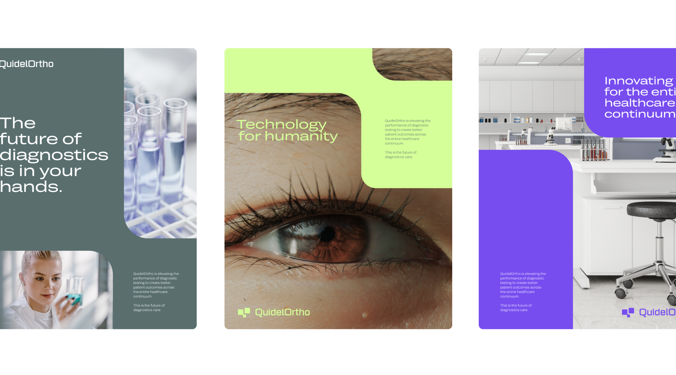
Alongside the logo and typeface are a robust portfolio of assets, including a unique
color palette, a family of patterns, unmistakable imagery styles and animations that
evoke growth and optimism. The visual identity system allows for both variety and
consistency across every audience touchpoint.

Product system
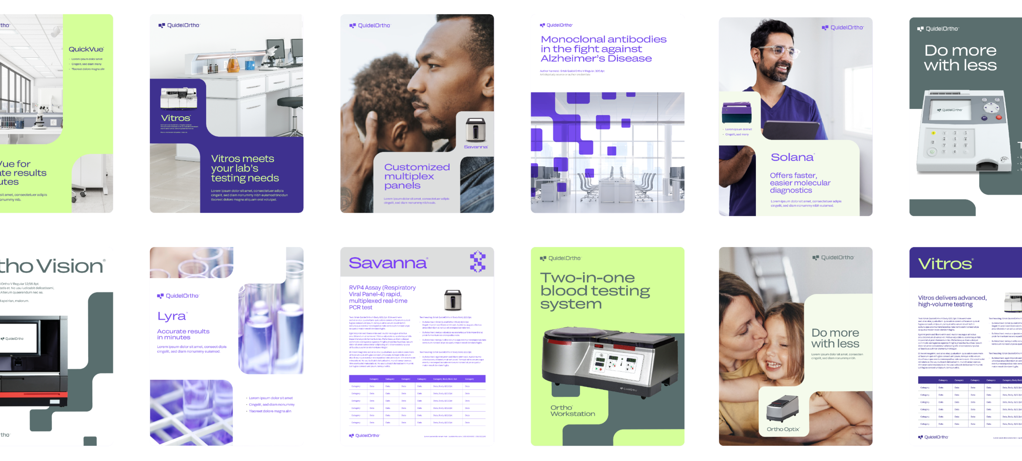
Our product-level branding offers a cohesive structure that unifies an expansive
portfolio while granting each product its own scheme of colors and patterns. This
precisely defined hierarchy supports an ecosystem of interrelated product brands
with shared design DNA.
Growing possibilities
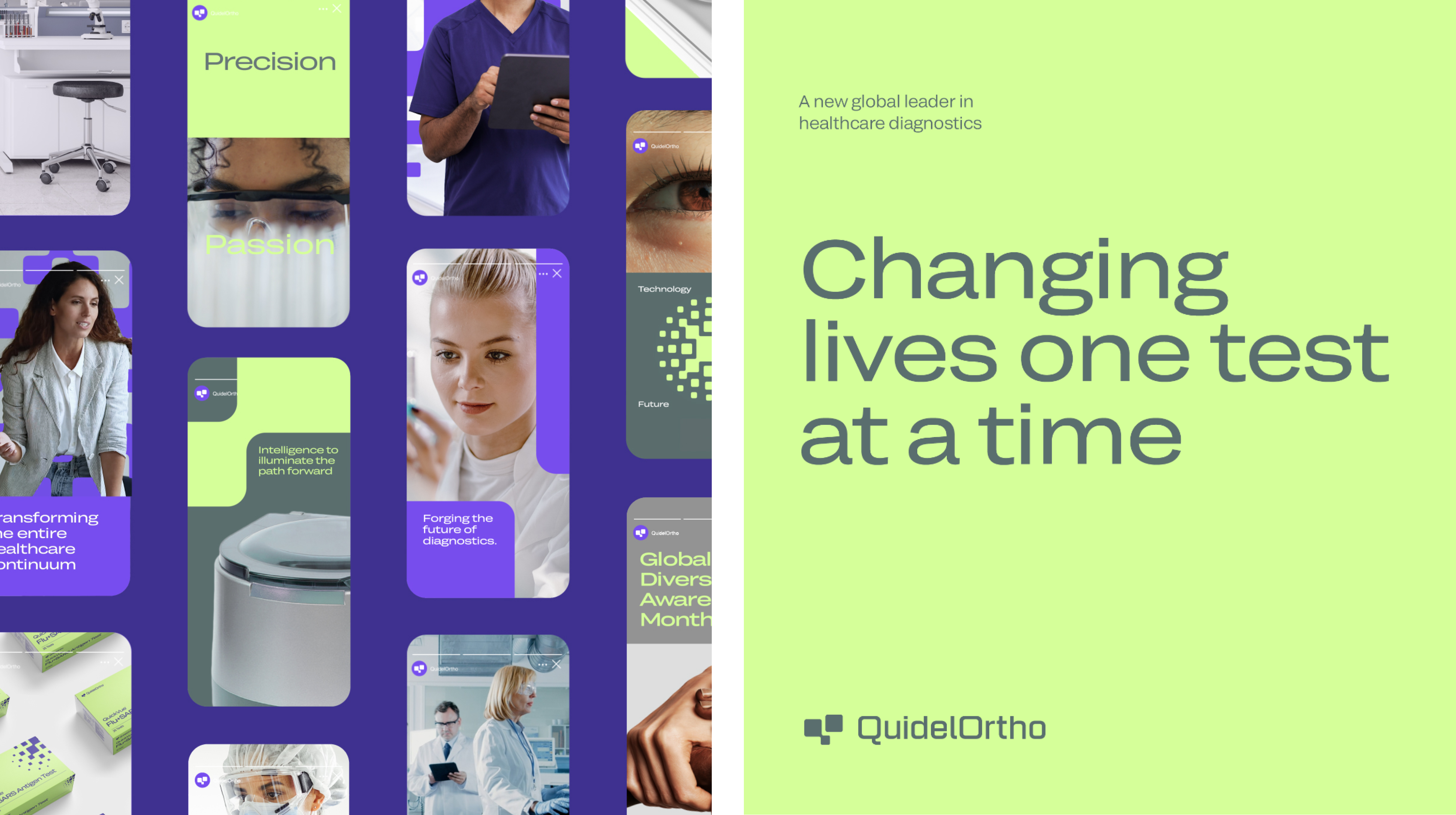
Like QuidelOrtho, the brand system was built from square one to drive value
long into a multi-screen future. The visual identity was designed to span every
environment from lab to hospital to home with boldness and flexibility, keeping
up with rapidly-evolving technology, industry and customers.
