
AerCap
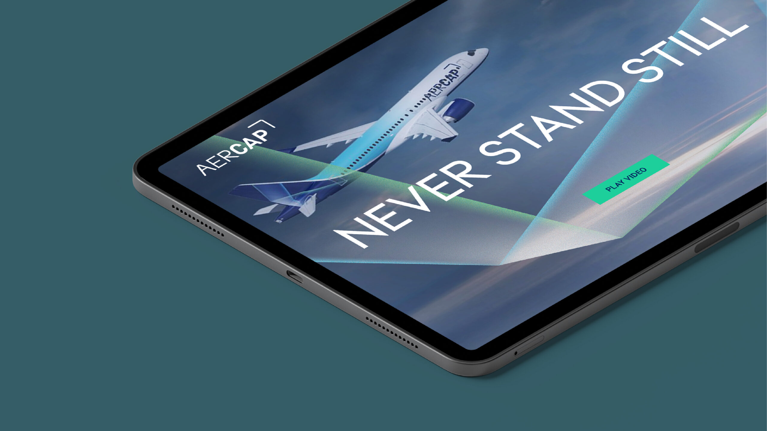
Never stand still
Taking an industry leader to new heights
Challenge
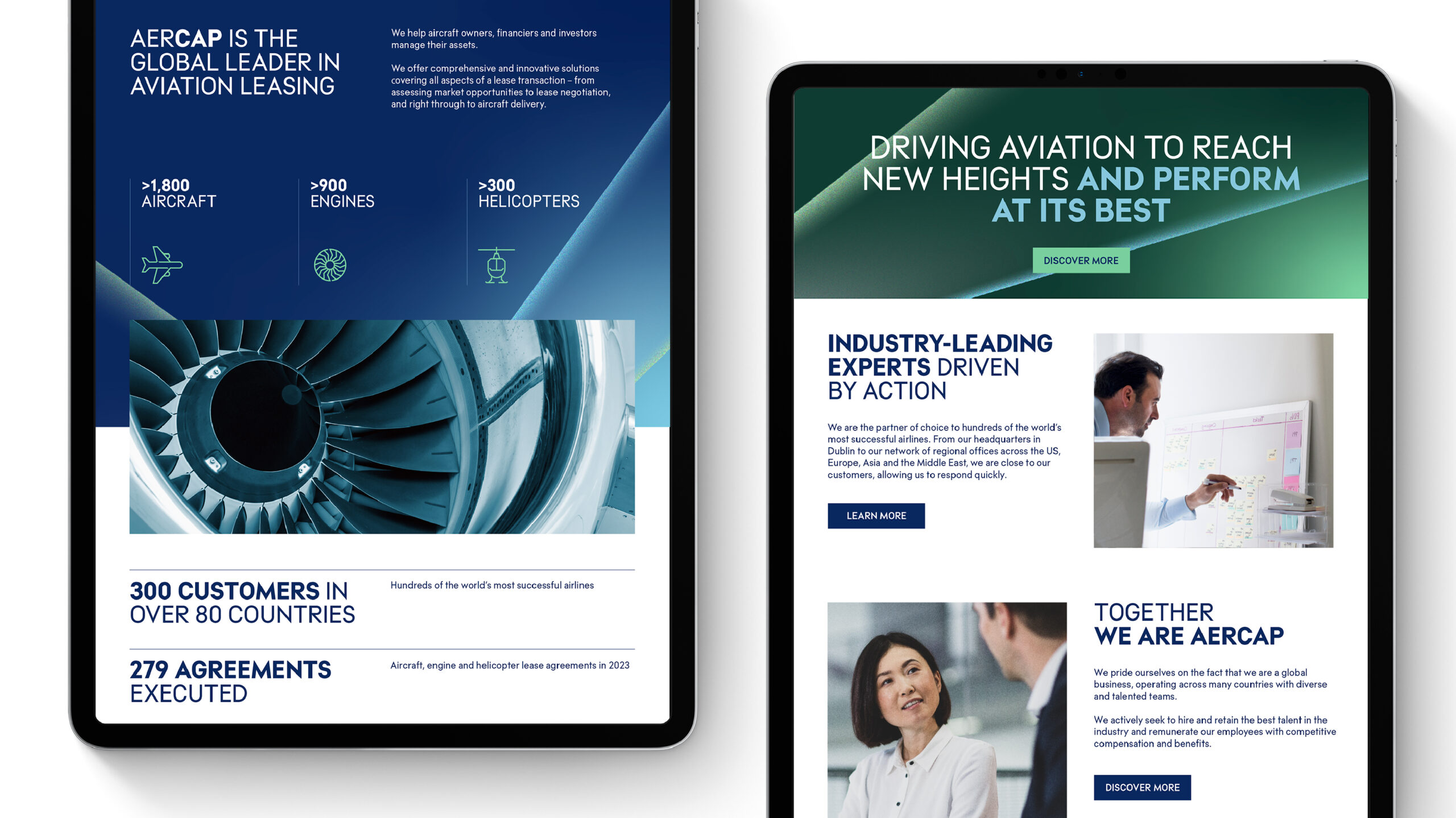
AerCap, a global aviation leasing company with its headquarters in Dublin and 13 office locations around the world, became the world’s largest player in its industry after the successful acquisition of the GE Capital Aviation Services business (GECAS) from General Electric in 2021. This move, which was truly transformational for the company, consolidated AerCap as a leader in the industry across all areas of aviation leasing, greatly enhancing its offerings to customers.
With momentum as its tailwind, AerCap realized it was time to reassess the existing brand to ensure it was fit for purpose. Fundamentally, the company needed a brand that reflected its acquired size and stature in the industry while representing the newly unified company. The new AerCap brand should then stand for a market-leading company with world-class expertise that is shaping the future of aviation.
Insight
The Siegel+Gale team got to work immediately by immersing themselves in everything AerCap did, visiting company locations, holding online focus groups and speaking with employees to codify the ambitions and motivations of the people behind the well-oiled machine. They also spoke with key external stakeholders, including partners, manufacturers and airline customers, to understand their perception of the company.
AerCap had an inherent duality of ingenuity and collaboration coupled with the financial muscle and performance of a world-class business. For these two parts to be in balance, it required constant movement; thus, the concept of “Never Stand Still” was created. Only by never standing still was AerCap able to mobilize its people, lead the industry and be acknowledged as one of the world’s most prestigious brands.
Answer
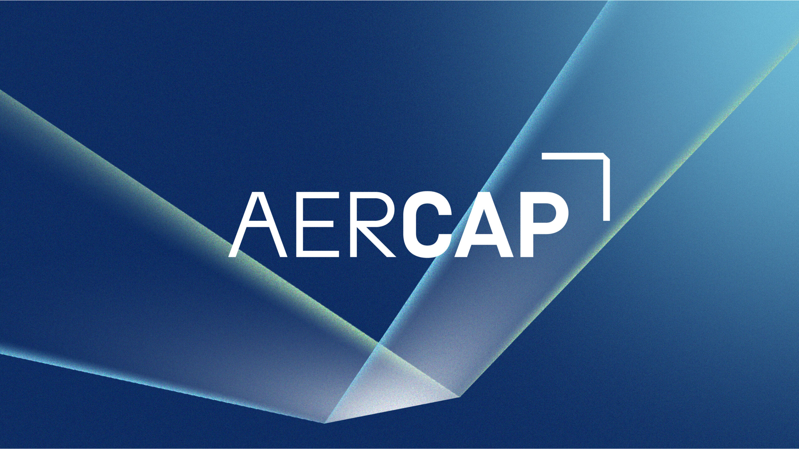
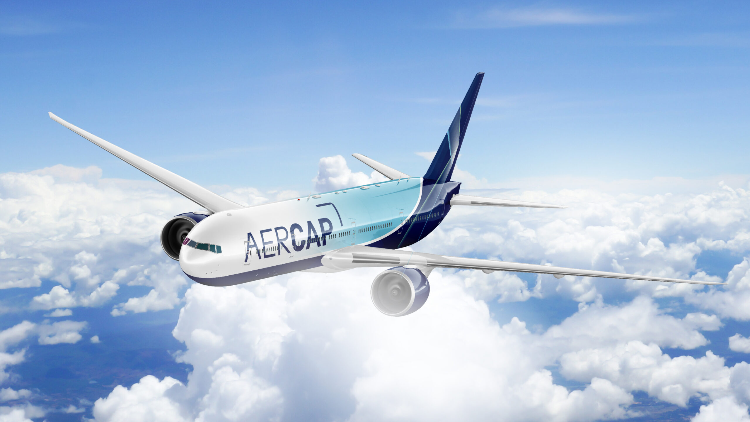
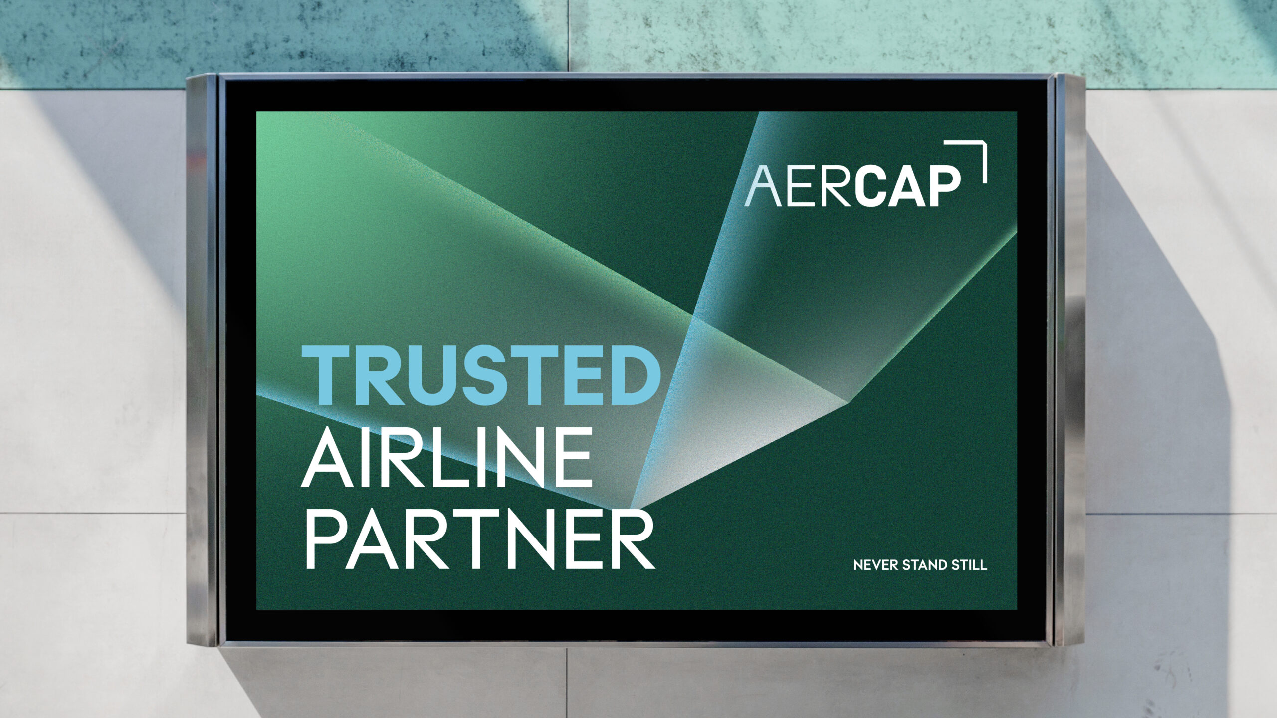
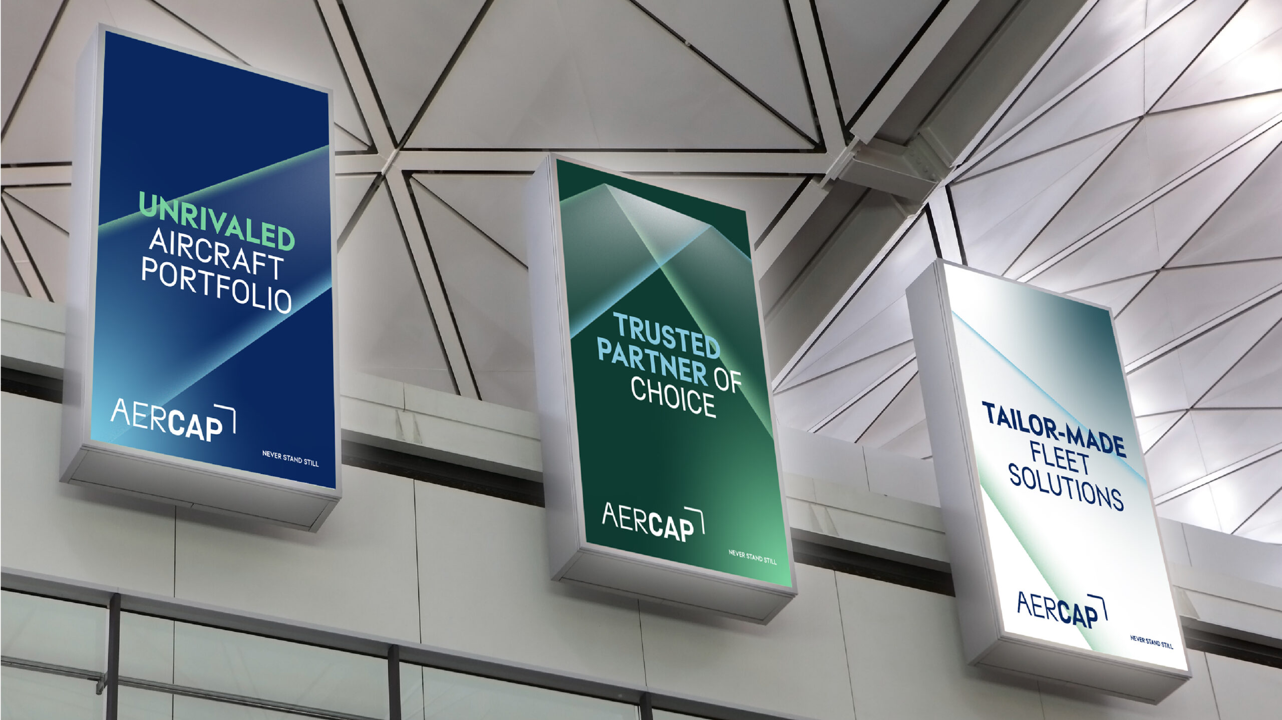
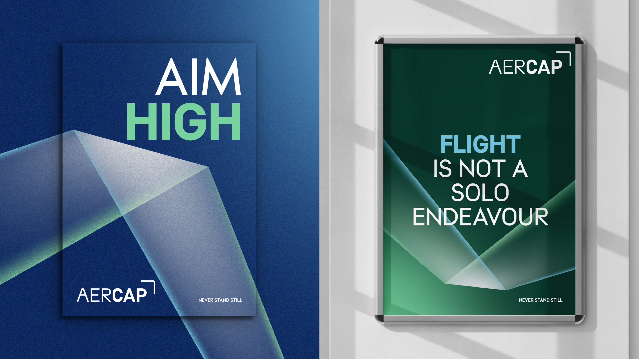
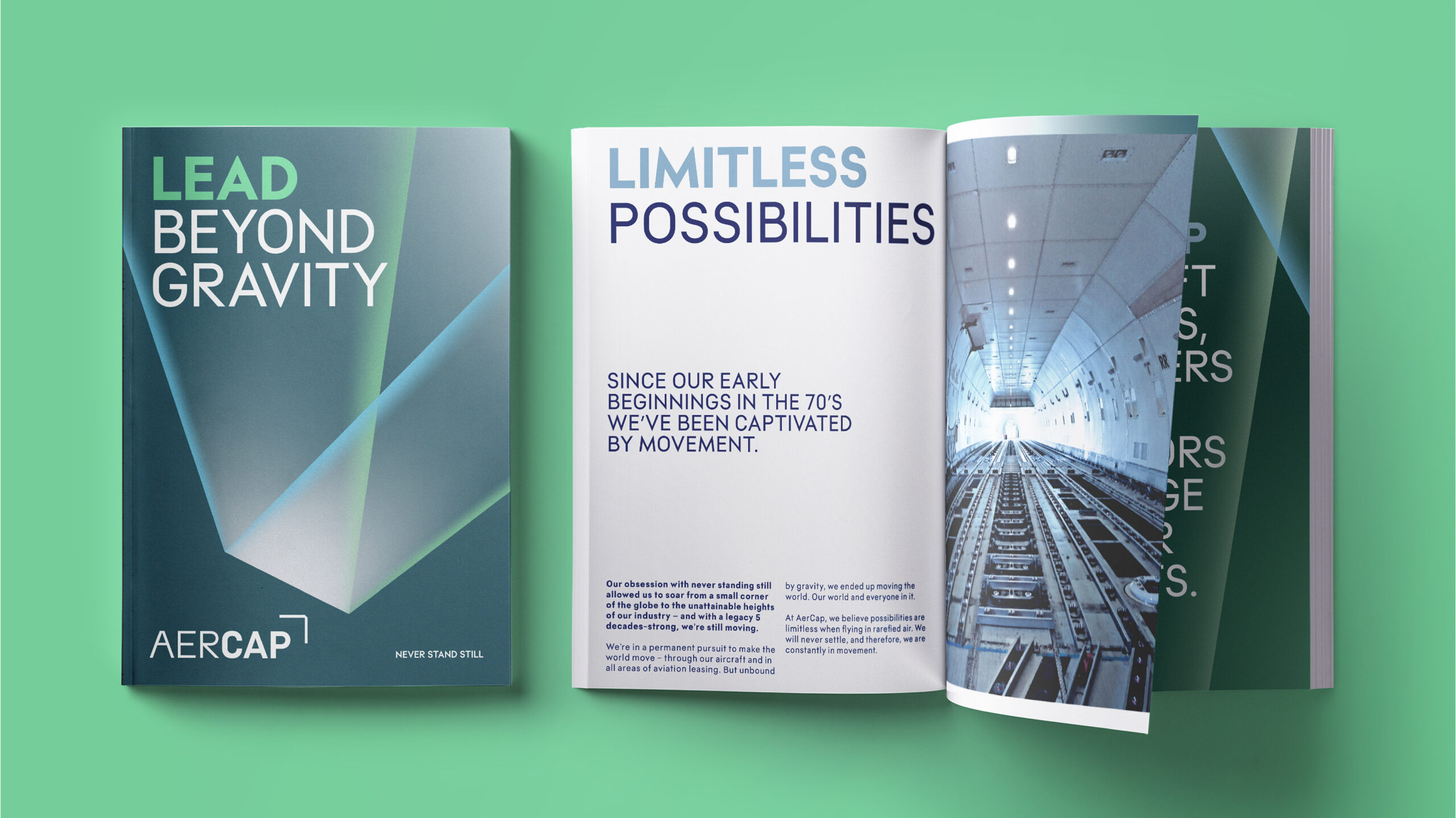
To creatively translate the “Never Stand Still” concept, we took inspiration from movement and flight; the brand expression derived from the attributes: Confidence, Agility and Precision.
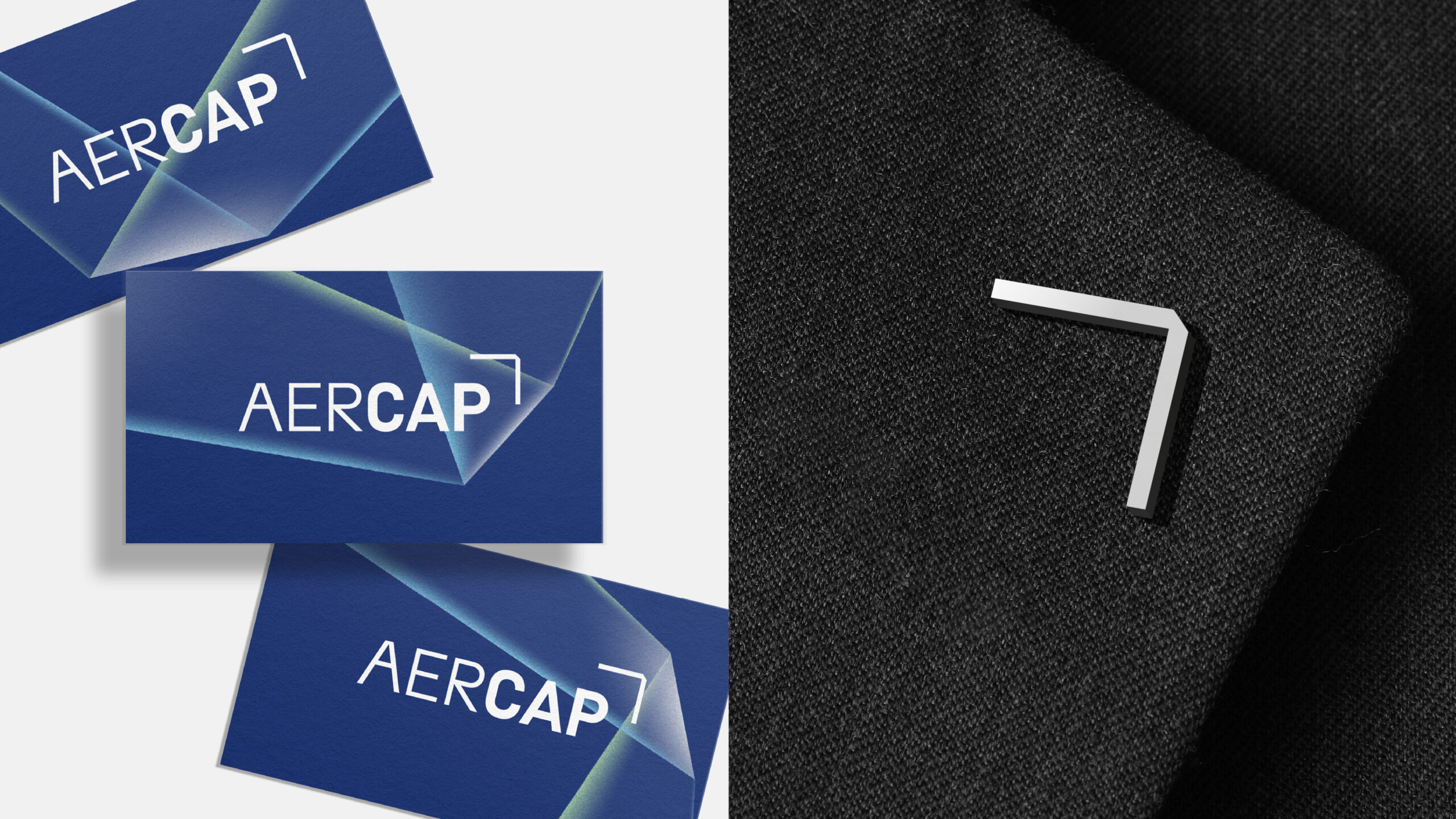
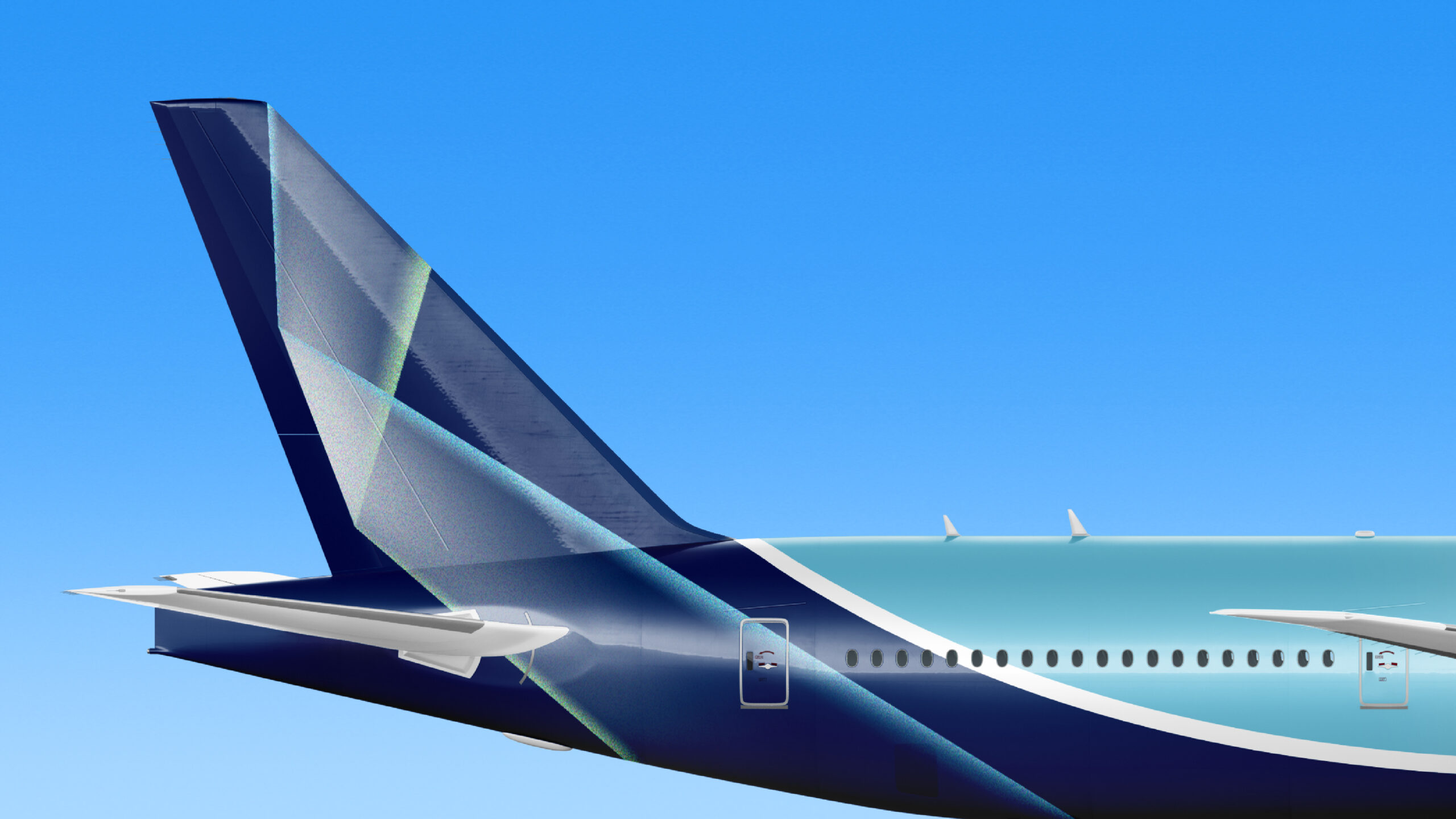
Together, this direction gave birth to a striking new wordmark made of two type weights, which captured the duality of Aer and Cap. The solidity and stature of the business are represented through a symbol that hangs above the wordmark, a cornerstone in aviation.
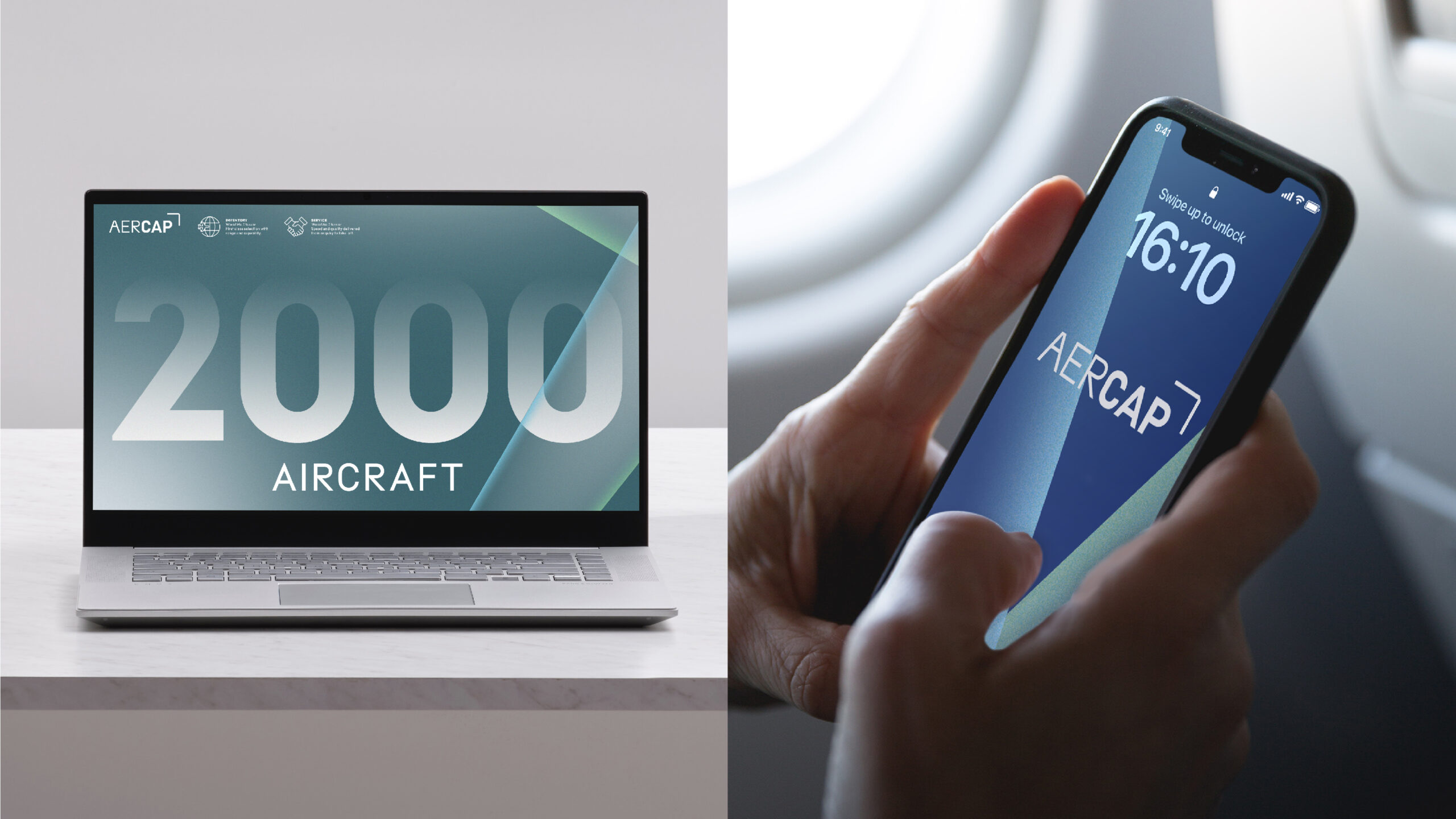
A new color palette was also introduced to reflect key elements of AerCap’s business, as well as a nod to its rich heritage and legacy, which can be traced back to the two founders of the aircraft leasing industry, ILFC and GPA.
The new brand is supported by disruptive graphic properties inspired by flight paths, sure to take AerCap to new heights.
Results

Transform Awards Europe—Bronze, Best Creative Strategy (Corporate)