Valleywise Health
Bringing new life to an established health care system
Challenge
For over 140 years, Maricopa Integrated Health System (MIHS) has been delivering quality, cost-effective health care to the Phoenix-area community. As Maricopa County’s only public hospital, MIHS served a distinctive role, committed to serving a patient community that no other hospital in the area would.
But it was a critical time for MIHS. The hospital system delivered 21st-century health care in facilities constructed in the late 1960s. The buildings were outdated, designs were obsolete and technology was outmoded. And though Maricopa County no longer owned them, negative perceptions of being the “county hospital” persisted. Few in the community knew about much of the groundbreaking and meaningful work MIHS was doing—from operating the premier regional burn center in the southwest to educating most of the physicians and nurses serving the Phoenix metropolitan area.
They needed a brand that would help them re-establish their presence and enhance their reputation. After Proposition 480 passed in 2016—a multi-year bond to upgrade MIHS—Siegel+Gale was tasked to create a brand that reflects the heart and soul of the organization.
Insight
During the three-year engagement, pride was one of the key attributes we honed in on. MIHS’ doctors, nurses, and staff care fiercely about their work and delivering on the organization’s mission: to provide exceptional care, without exception, to every patient, every time. First responders knew that MIHS was the first and best place to go in an emergency, and patients valued the range of health and educational services that MIHS made available to the community.
The real opportunity was a paradigm shift in how the organization looked at and presented itself. We found that their county heritage didn’t have to be a hindrance; instead, it represented an organization deeply embedded and committed to the community.
Answer
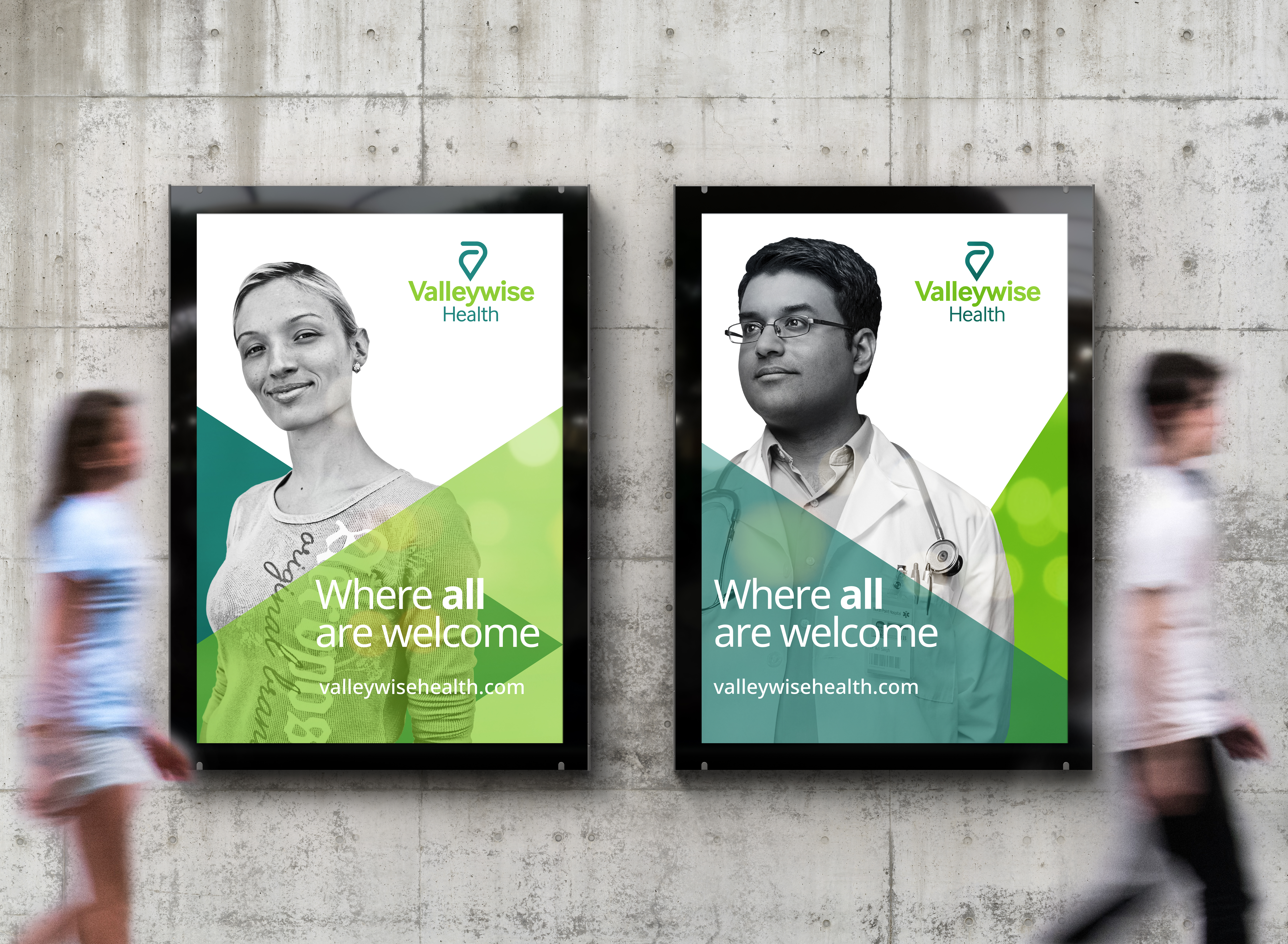
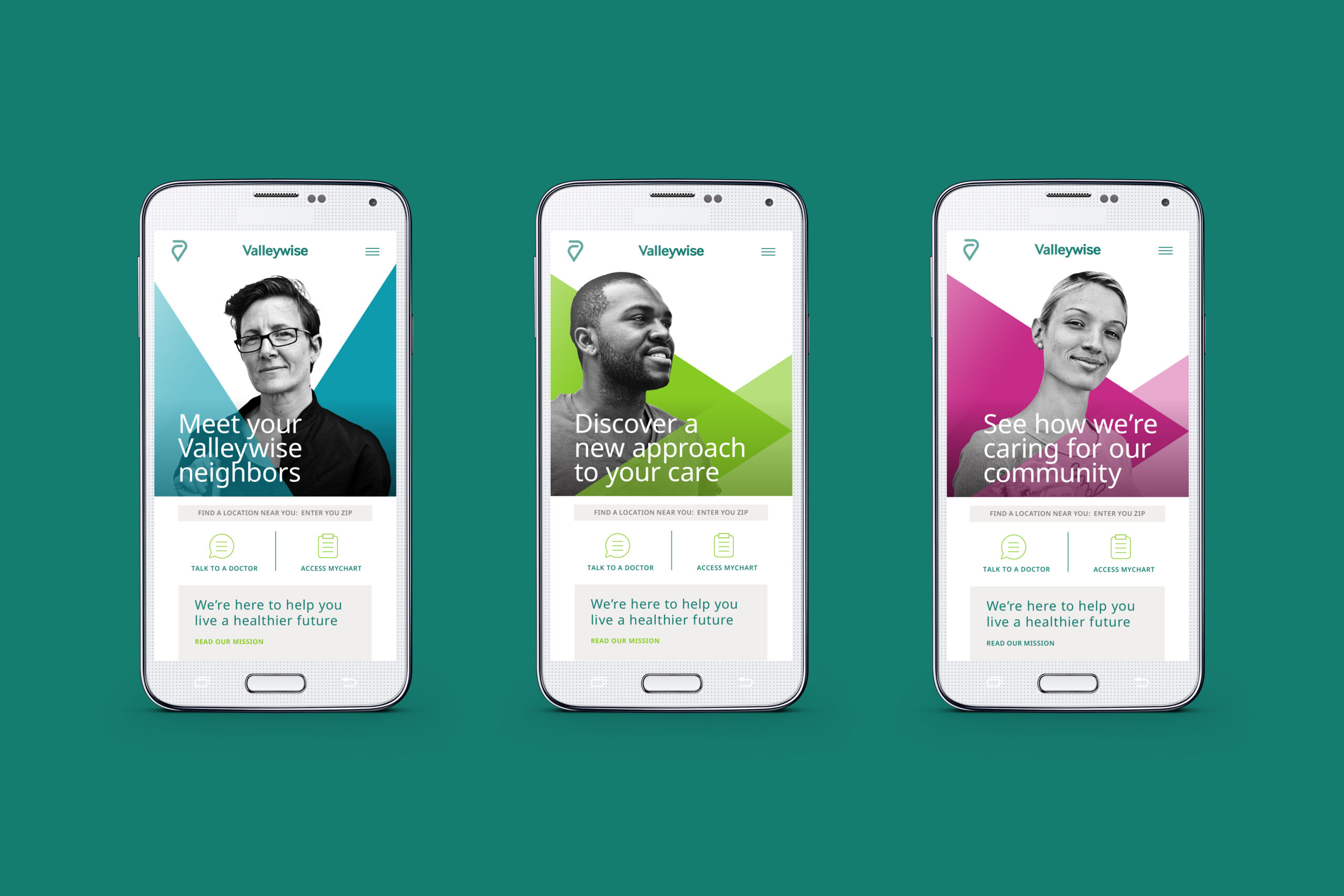
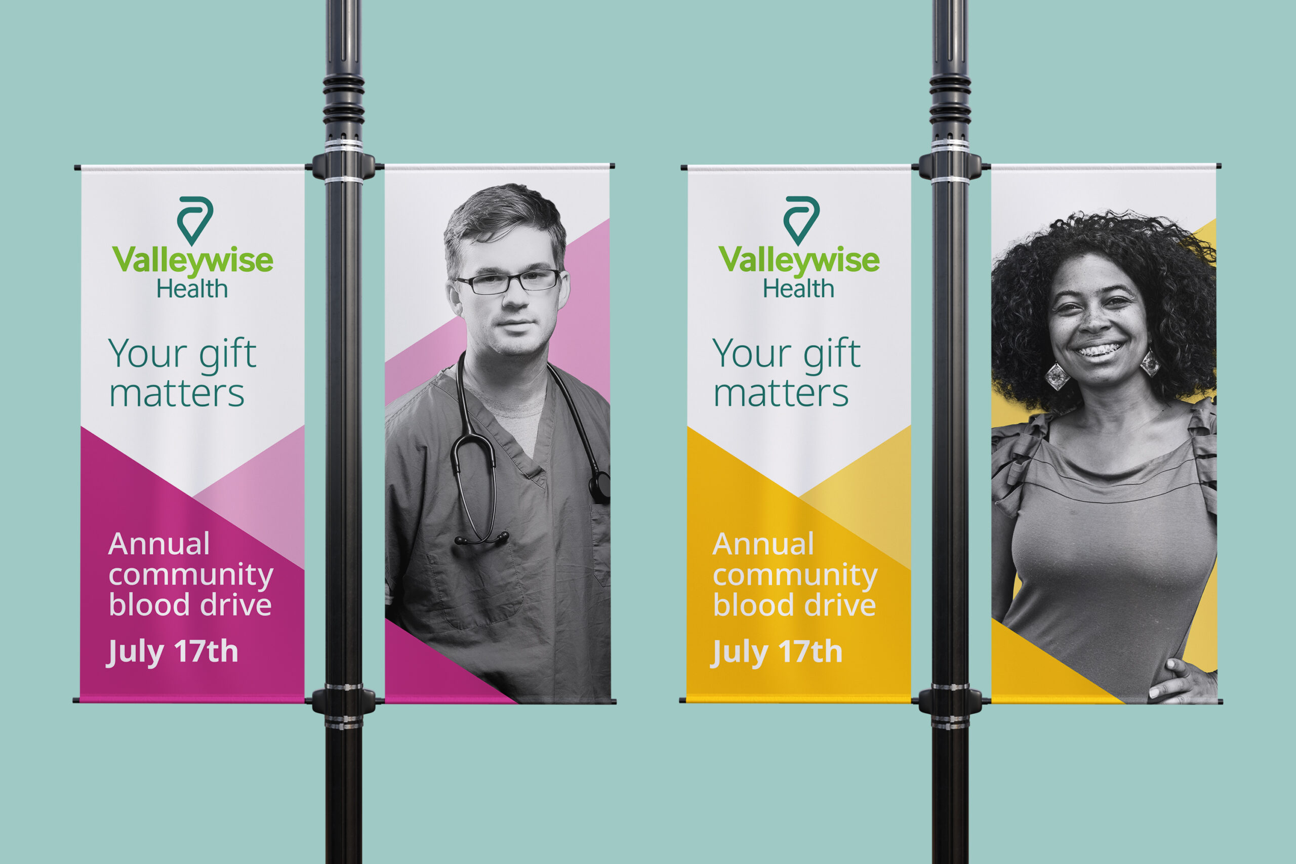
Working with MIHS at such a pivotal time gave us a unique opportunity to approach the brand holistically, influencing every experience the hospital system delivered, from communications to events to patient care. The comprehensive rebrand was built on the promise of “building a healthier future for our community” and includes a new name, visual identity, messaging and experience guidance.
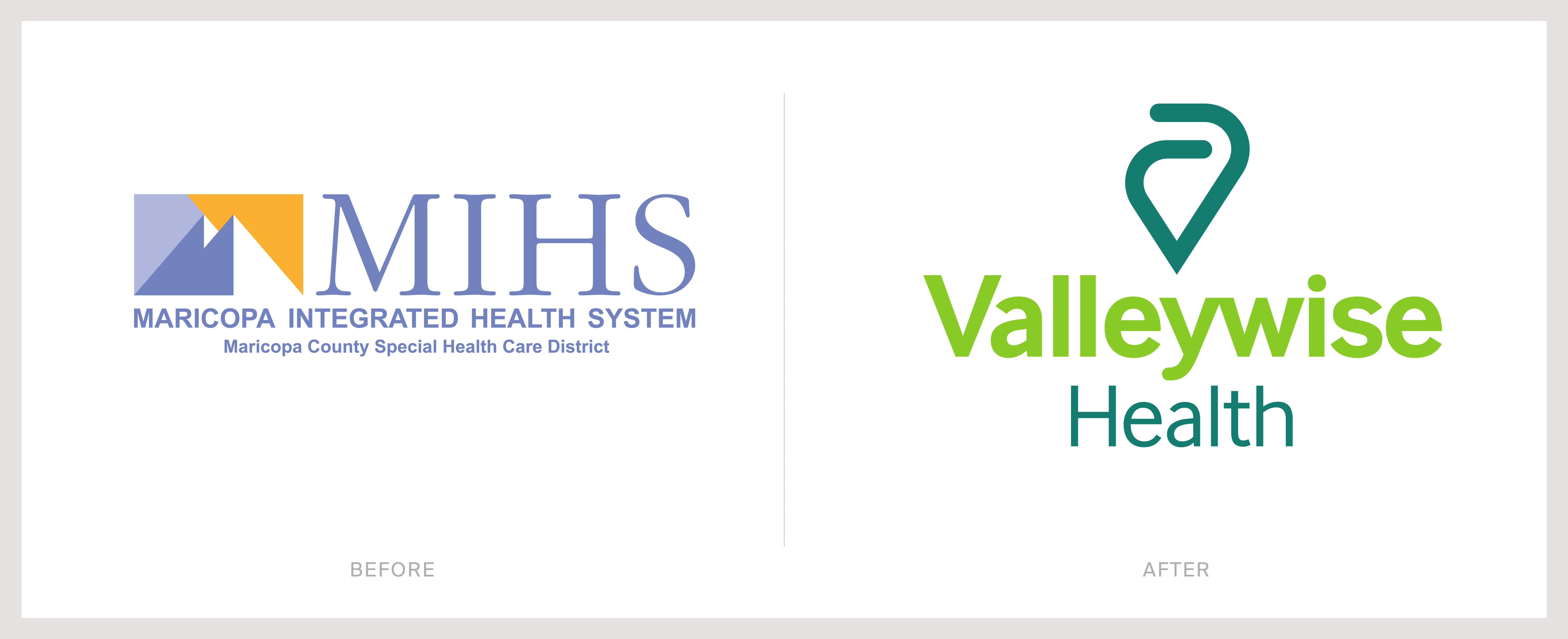
The new name, “Valleywise Health,” highlights the hospital system’s membership in and commitment to communities across the Phoenix area—known as the Valley of the Sun, as well as the teaching nature of the hospital.
Within the new visual identity, the “V” monogram for “Valleywise” is paired with the equals sign, signifying that all are welcome. Embracing “arms” symbolizes the quality care offered. The primary brand colors are a nod to the local nature and landscape of the geographic area that Valleywise serves. The dual greens—Pine and Kelly—represent the desert cacti of Phoenix; the teal is reminiscent of expansive blue skies.