
In SMPL Q+A, we interview Siegel+Gale practitioners on all things relevant to branding, design, and simplicity.
Here, we speak with our practitioners about bringing new life to Maricopa Integrated Health System (MIHS). Located in Phoenix, Arizona, MIHS has a proud tradition of being both the community safety net health care system, with a mission and commitment to serving the underserved and Arizona’s only public teaching hospital.
![]()
Account Management
Why is this investment in brand such an important milestone for Maricopa Integrated Health System?
Lisa Kane: This is a truly historic milestone in the 140-year history of MIHS—now Valleywise Health—a premier public teaching hospital and safety net health care system in the greater Phoenix area. We are grateful to be part of it!
The journey began in September 2016, when Proposition 480—a multi-year bond to upgrade Maricopa County’s health care system and hospital—passed. Our task was to understand the strengths and differentiation of the organization to develop a clear brand story, identity and experience. This revitalized brand is a sign of deeper change and public support for a reimagined health care system that the community deserves.
Not only are we excited to offer a refreshed brand identity that reflects the heart and soul of the organization, but we are also eager to witness the tangible transformation across new system-wide facilities, community engagement and patient experiences at Valleywise Health.
What was unique about this engagement?
LK: We recognized that this initiative was much more than a typical rebrand. During the three-year engagement, our team partnered with various firms to turn this vision into reality. Siegel+Gale was one of five incredible partners, whose responsibilities included demographic planning, operational design, construction management, land acquisition, community involvement, and branding.
Strategy & Experience
Can you explain the new brand strategy?
LK: Working with Valleywise Health at such a pivotal time gave us a unique opportunity to approach the brand holistically. We created a brand positioning, story, voice attributes and experience principles that together express MIHS’ mission—to provide exceptional care, without exception, every patient, every time—and set a strategic foundation for the organization’s development going forward.
The brand promise, “Building a healthier future for our community,” was designed to reflect the expertise of Valleywise, including its teaching system; the inherent hope and optimism of its workforce; and the strength of the greater Phoenix neighborhood that Valleywise calls home. Building on that promise, we drafted a narrative, brand voice, and experience principles that set the tone for Valleywise communications, provide criteria for evaluating patient experiences and provide a lens for decision making across the organization.
With a robust brand strategy behind its operations, Valleywise can ensure that it continues to deliver exceptional care for patients—while gaining credit for the expert and essential service it provides.
Naming
Can you tell us about the naming process, how you selected the name Valleywise Health?
As we set out to rename MIHS, we explored many themes central to their story, including community, connections, exceptional healthcare, caring, support, new beginnings, and the notion of signaling their strength as a teaching hospital. We shared over 100 names that conveyed these themes with the core team. We then took the strongest of these to the Board for their feedback. The final list included everything from real English words to made-up words to Spanish words. We conducted extensive customer research that helped us narrow to three finalists. We shared these three finalists with the Board.
Valleywise Health, a name that signaled both the community—Phoenix is often referred to as The Valley of the Sun—and doing things in a smarter way, was the obvious choice. It was also the perfect, subtle nod to their legacy as a teaching hospital.

Research
What role did research play in this partnership?
To ensure the final name resonated with audiences and didn’t present any red flags, we evaluated eleven options quantitatively and qualitatively—on the ground in MIHS communities, with general market and Latinx consumers, as well as with health care professionals. We learned that the ideal health care brand is respectful, honest, high quality, experienced, expert, and empathetic. Valleywise received the highest total score, based on its performance on these top attributes and standard metrics, such as clarity and appeal. Some of the feedback we received emphasized the community connection or local feel that the name Valleywise projects:
“A company that connects people with services in their areas.”
“Valleywise sounds like an organization that knows and respects its community.”
“Sounds organic, intelligent and community-focused.”
Not only were we given clear direction on the top-choice name, but we also learned—contrary to what we often hear—that these consumers and health care professionals were ready to embrace a new name. Usually, there’s a strong reluctance to change, but not for MIHS. We also discovered that the Latinx community did not favor our Spanish name suggestions.
Design
What was the final concept behind the logo & visual identity? Any inspiration you would like to call out?
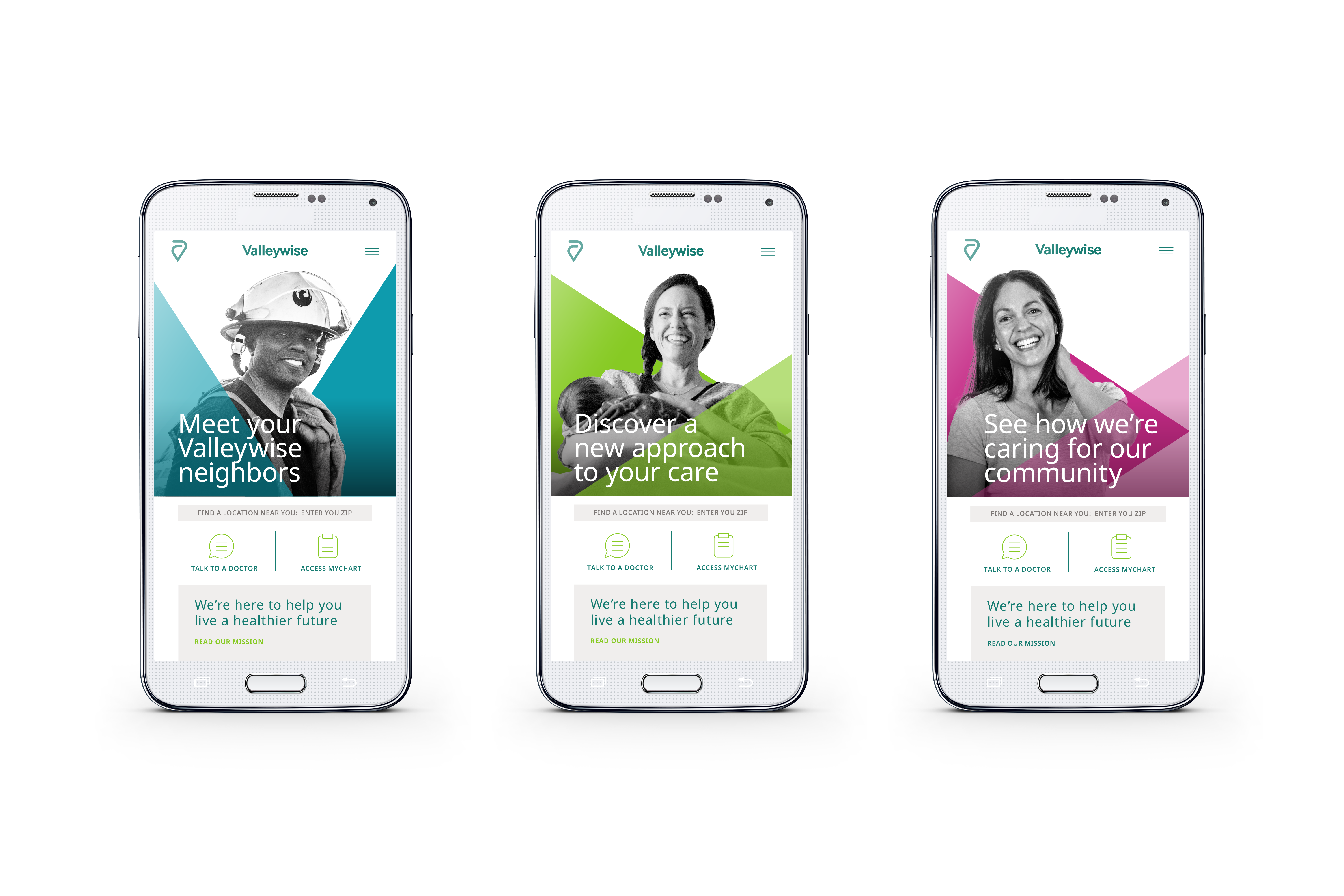
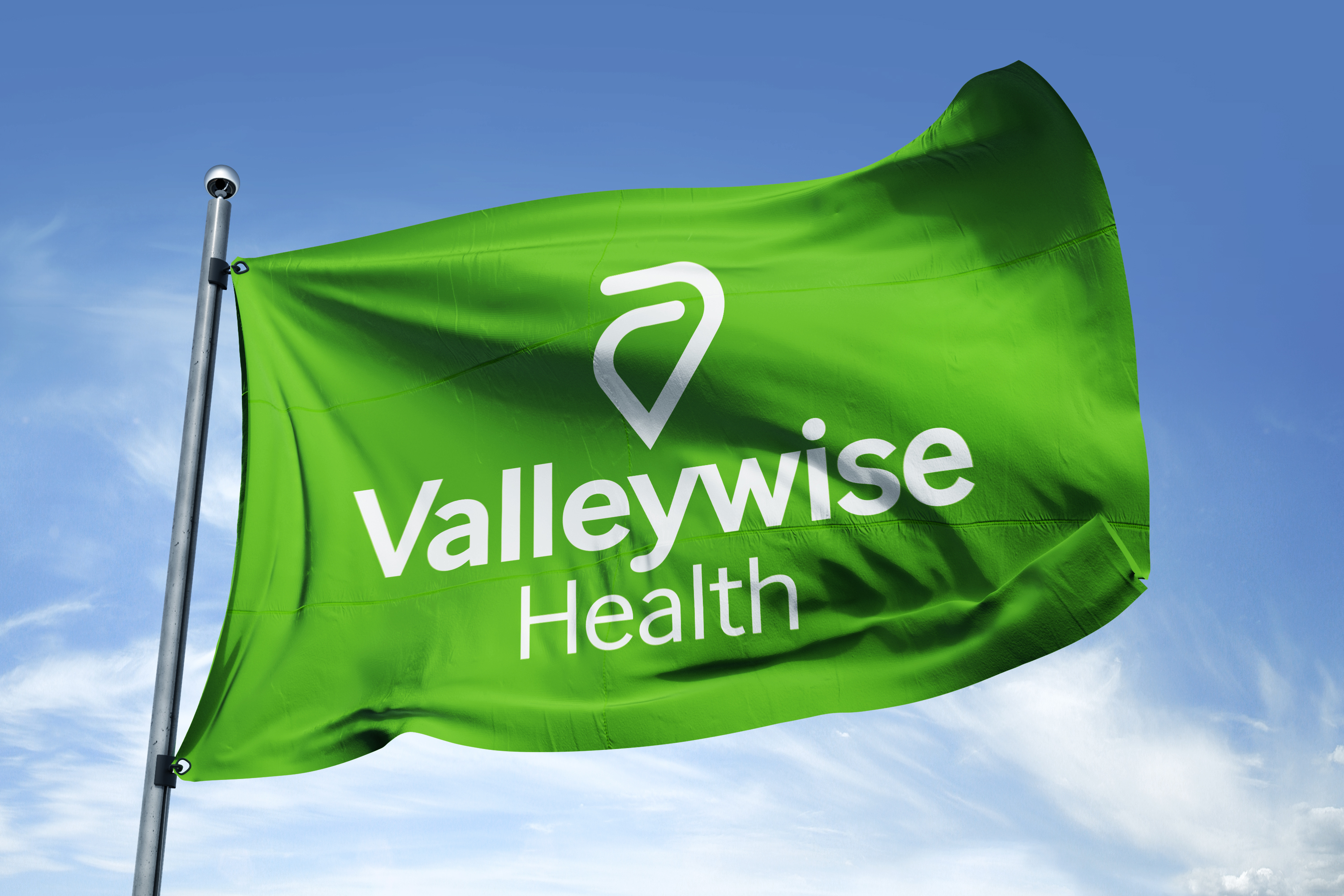
Acceptance and belonging are the driving forces behind a strong community. The new logo and visual identity were designed to communicate that feeling of fellowship and inclusion, communicating that all are welcome at Valleywise Health.
The symbol is derived from a capital “V,” for Valleywise. The rounded arms of the “V” reach upward and fold inward into both an embrace and an equal sign. On its own, it also serves as a heart and location pin, speaking to quality care and locality to Phoenix, respectively. The custom wordmark is clean and sleek sans serif. The rounded terminal of the “y” and the connected ligature to the “w” brings balance and a certain softness to the bold geometric letters.
The local flora inspired the new color palette. Bold graphic shapes that mirror the angles of the “V” logo embrace and highlight our honest black-and-white style photography. The official typeface, Noto Sans, is available in over 800 languages and is accessible to everyone. It was chosen for being truly universal and inclusive. All of these elements come together to create a distinct and flexible visual system that communicates the partnership and commitment to excellence that Valleywise delivers.
What was the process for development?
We originally designed nine distinct potential identities for Valleywise. The Board quickly aligned on a single direction which allowed us to develop the remaining components of the visual identity.
We always knew the logo and visual identity for Valleywise would be modern, clear and simple. Designed with the full integration and context of strategy and messaging over the course of a year, the visual language we created is an extension of the logo and everything it stands for.