
Glanbia
Delivering better nutrition for every step of life’s journey
Challenge
Glanbia is a better nutrition company, home to consumer brands and ingredients that nourish millions around the world. Everything it produces delivers real, nutritional benefits and reflects its respect for others and the Earth. Glanbia partnered with Siegel+Gale to evolve and modernize the brand in line with its redefined direction, focusing on health, wellness and better nutrition for all.
Insight
Through comprehensive auditing, research and interviews to get to the core of the organization, we recognized that Glanbia needed to better reflect consumers’ experiences today.
People want to live full, healthy lives. They want to perform well, recover quickly and stay strong, at any age. Better living requires better nutrition—and Glanbia delivers just that.
Answer
Partnering with Glanbia, Siegel+Gale delivered a holistic approach that expressed the redefined direction of the business. We placed humanity at the center and focused all touchpoints on the brand’s purpose, “Delivering better nutrition.” The comprehensive visual and verbal brand transformation struck a beautiful balance: It retained the existing brand equity while carefully propelling the brand forward.
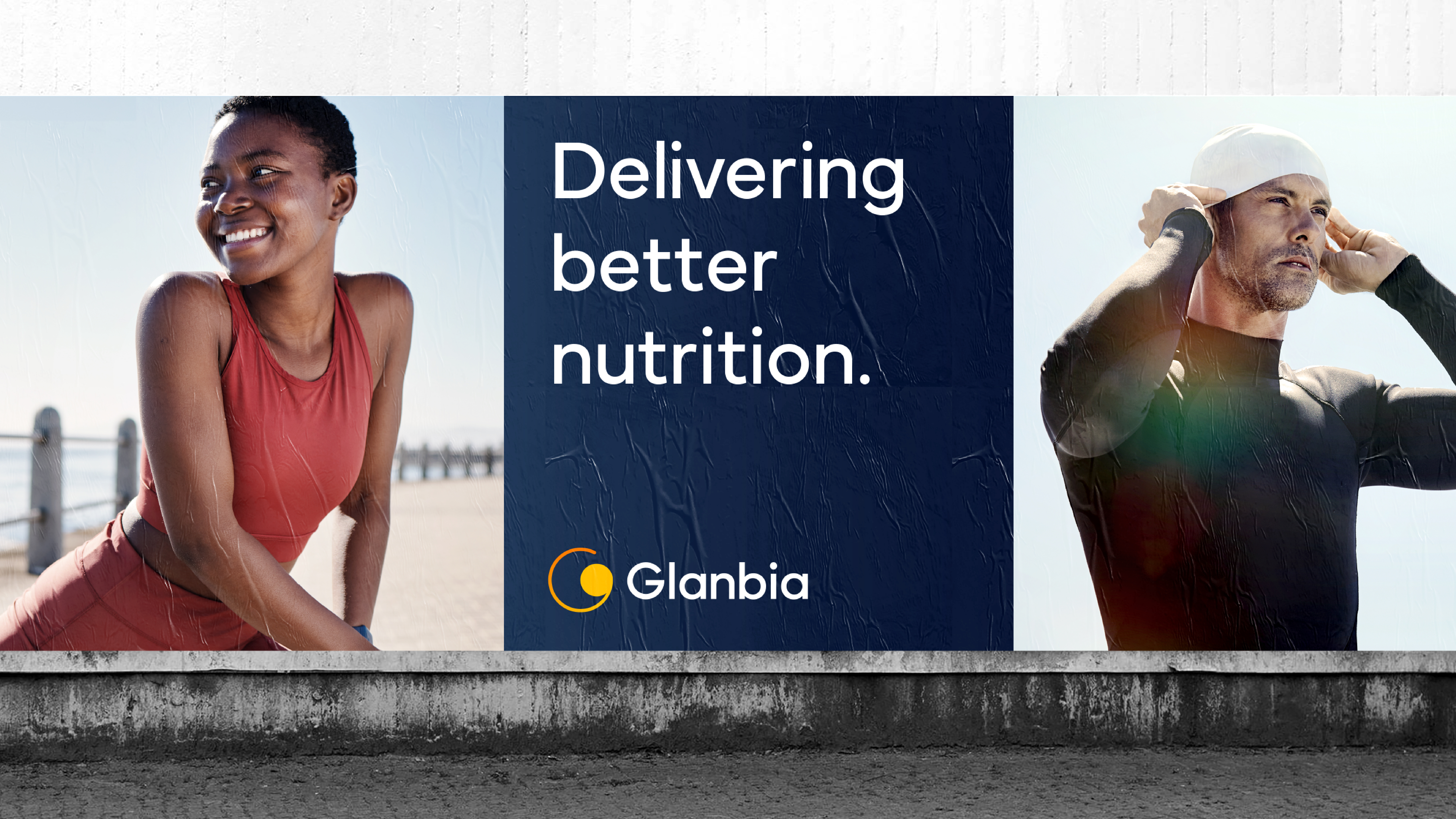
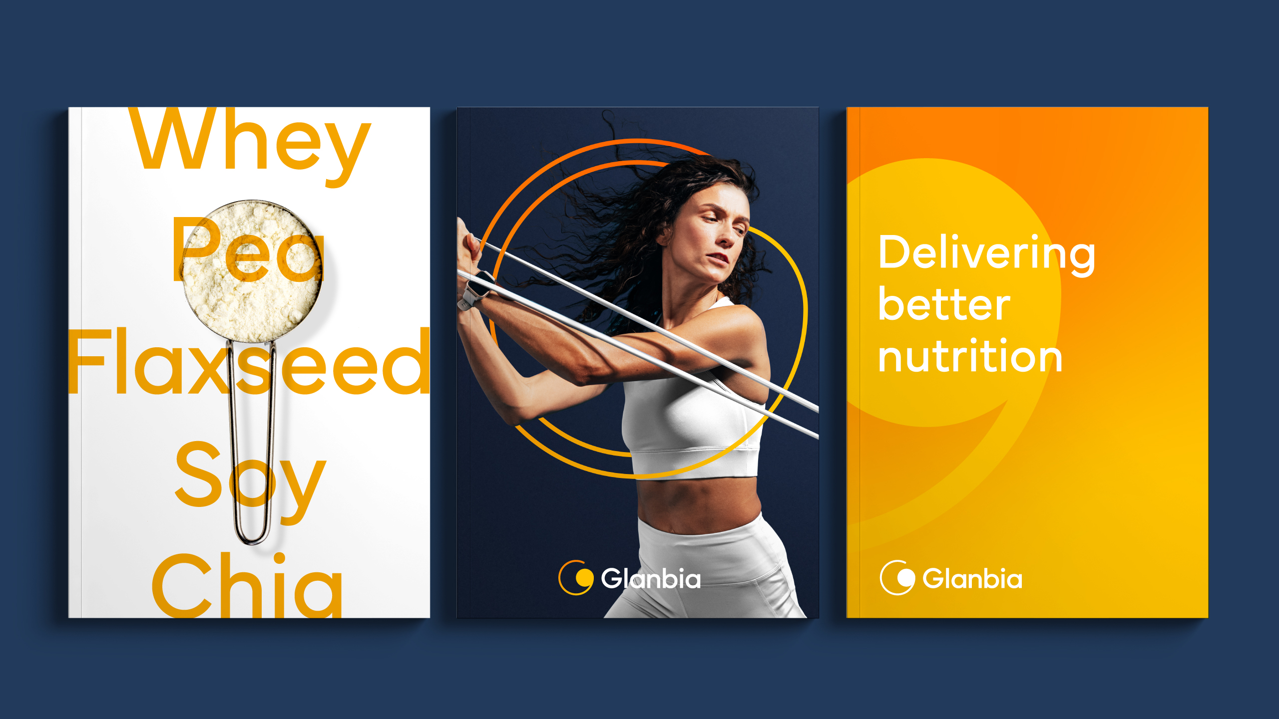
Delivering better nutrition
The brand expression culminates in a unique “G” symbol inspired by the
energy we gain from the sun. Embracing cyclical geometry, the wordmark
carries the shape language throughout the letterforms.
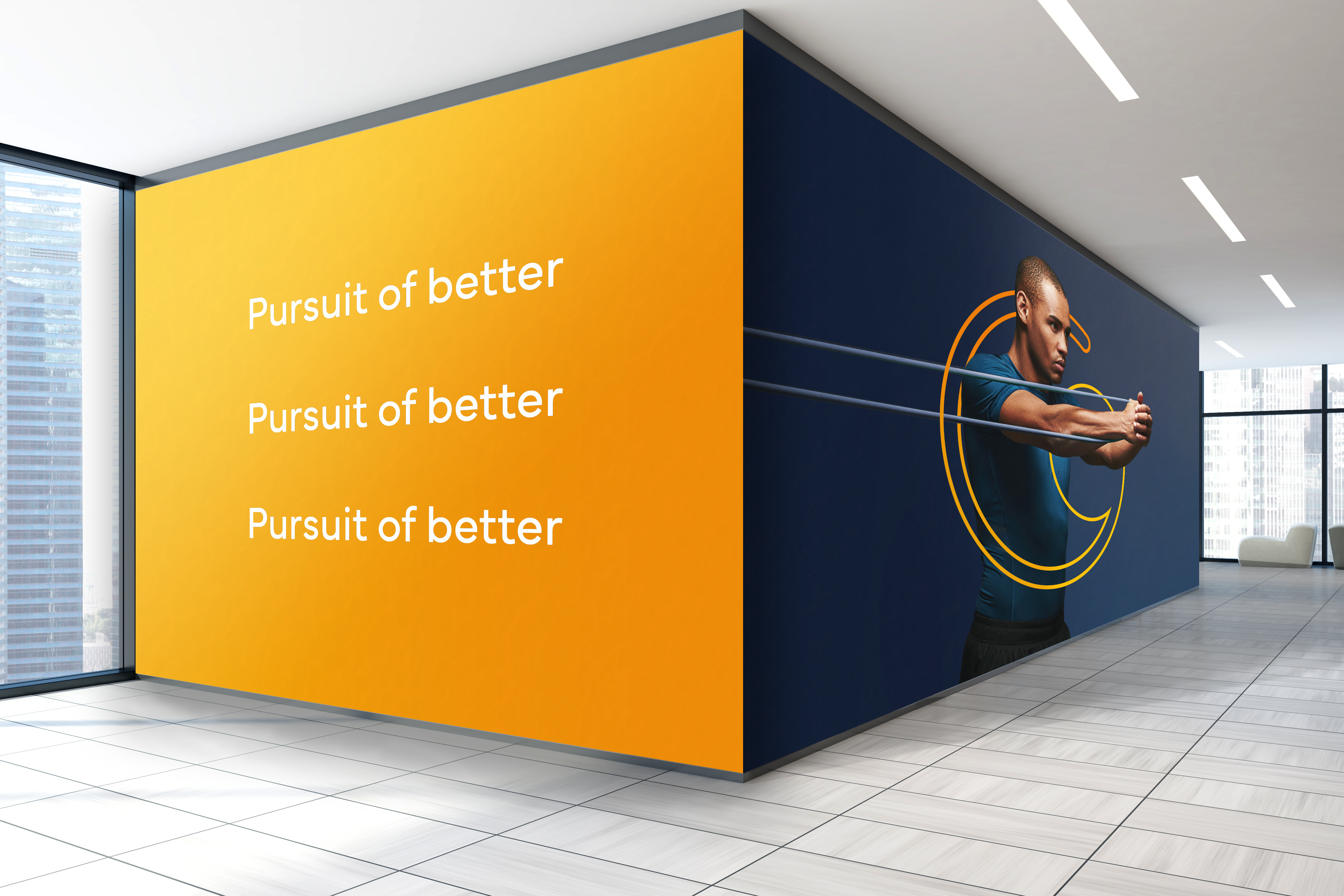
Humanity at the core
The brand system further expresses the power of Glanbia by capturing the
relationship between bodies in movement and our brand symbol. Paired
with a distinctive photography style that focuses on inclusivity and humanity.
We reshaped the color story from generic, corporate color tones to modernized
tones that have a touch of energy and determination.
Cohesive storytelling
To evolve Glanbia’s verbal identity, we reframed the brand narrative
and messaging to more effectively communicate Glanbia’s purpose of
“delivering better nutrition for every step of life’s journey.” And we
pinpointed a brand voice that reflected the culture at Glanbia:
straightforward, humble and optimistic. Glanbia’s new messaging
positions it as a better nutrition company that prioritizes
the well-being of consumers and enables betterment.
Results

Indigo Design Awards—Gold, Branding for Food
Graphic Design USA Health + Wellness Awards—Branding + Identity + Logos
We have loved working with the Siegel+Gale team who are a wonderful combination of insight, clarity and creativity. It has been a breath of fresh air to see ourselves through a new lens.
Martha Kavanagh, Director of Corporate Affairs, Glanbia