Syngenta
Feeding a growing world, sustainably.
Transforming the world’s most local, agricultural and technological innovation partner
Challenge
Since its inception through the merger of the agrichemical businesses of Novartis and AstraZeneca in 2000, Syngenta has evolved into the world’s leading agricultural science and innovation company.
With the formation of Syngenta Group, a project uniting Syngenta, ADAMA and Sinochem’s portfolio of over ten additional brands, it was clear Syngenta needed a new group identity, architecture and positioning to represent itself across more diverse cultural and business landscapes than ever before.
Insight
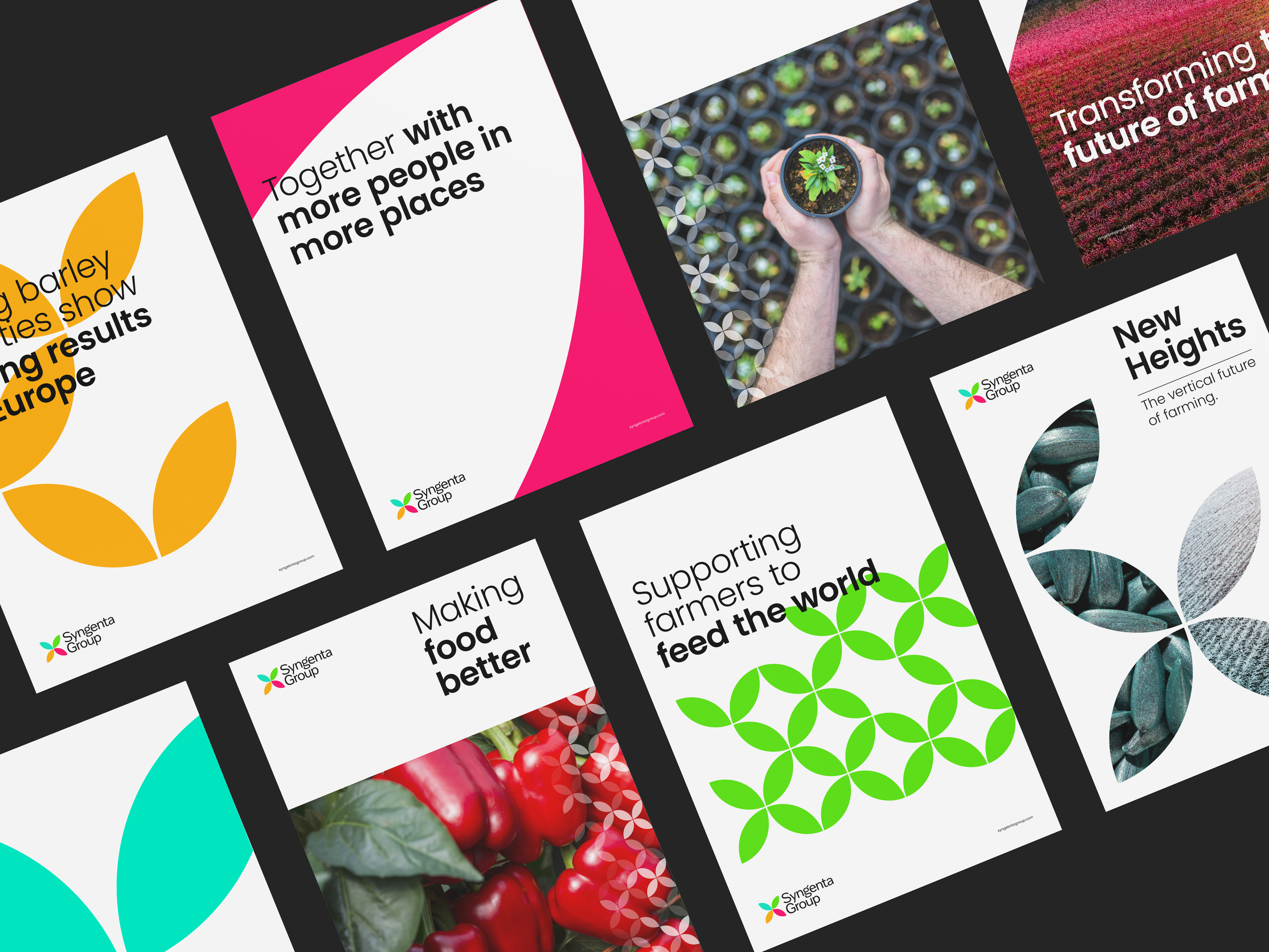
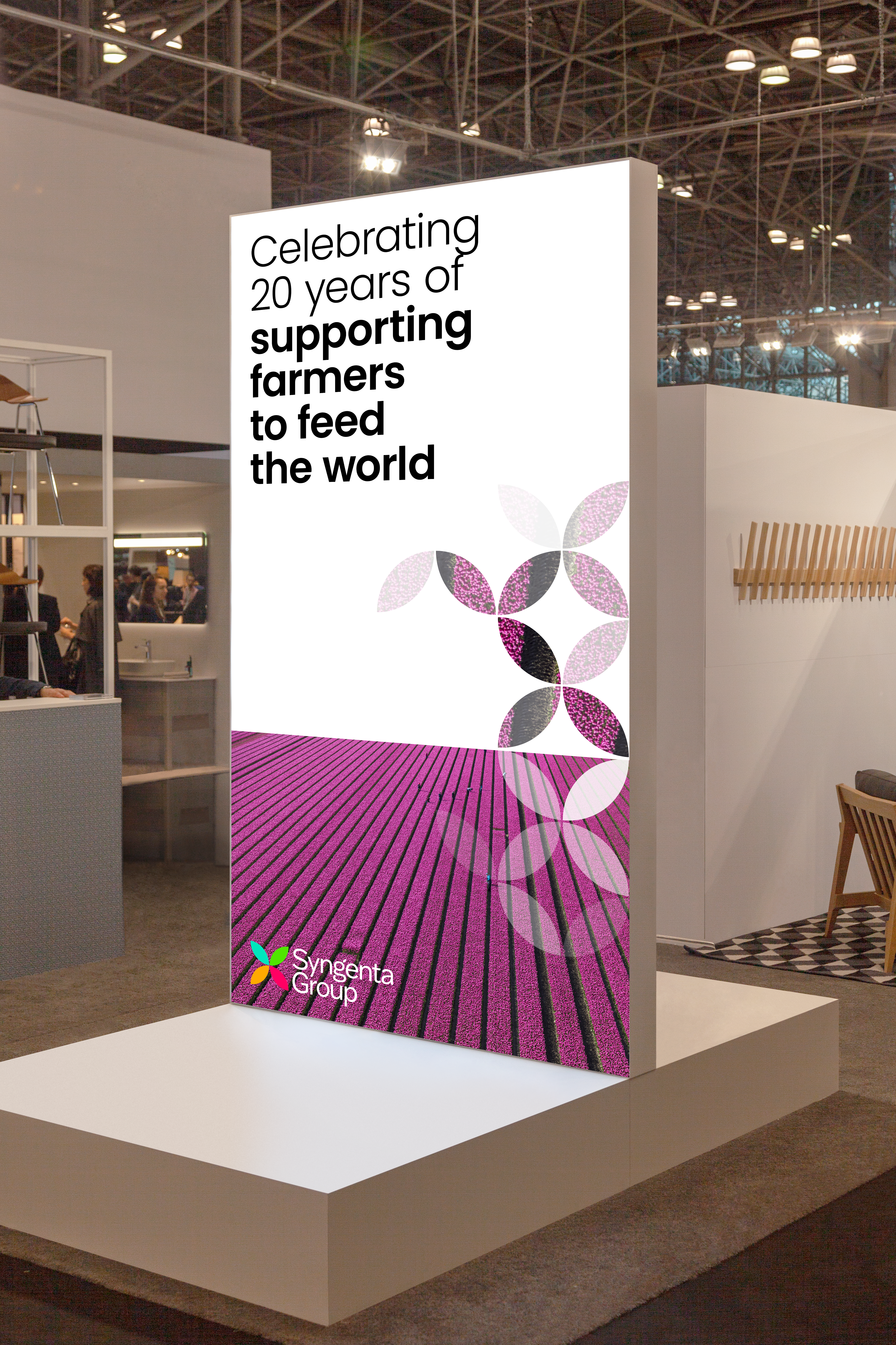
In collaboration with GLOBEONE, we defined the strategic objectives for Syngenta Group. We then created a new positioning reflecting the business’s global work with farmers and agricultural specialists. It demonstrates how the organization applies local solutions to global problems to solve ongoing challenges of sustainably feeding the world through agriculture, science, data and emerging technology.
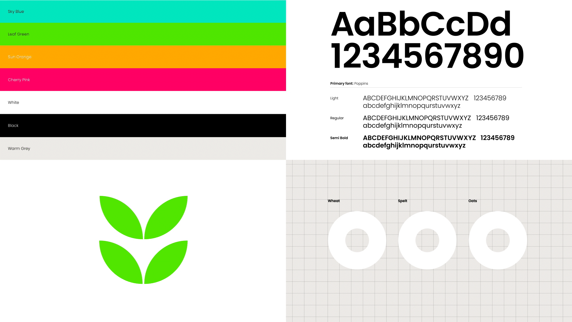
Through six-week sprints, the newly created brand architecture and identity provides clarity and cohesion for the Syngenta Group brand and a portfolio of four divisional brands.
Answer
Leading with the new positioning, “The world’s most local agriculture technology and innovation partner,” a simple brand architecture was created with four business units, including Syngenta Group China, sitting under one group.
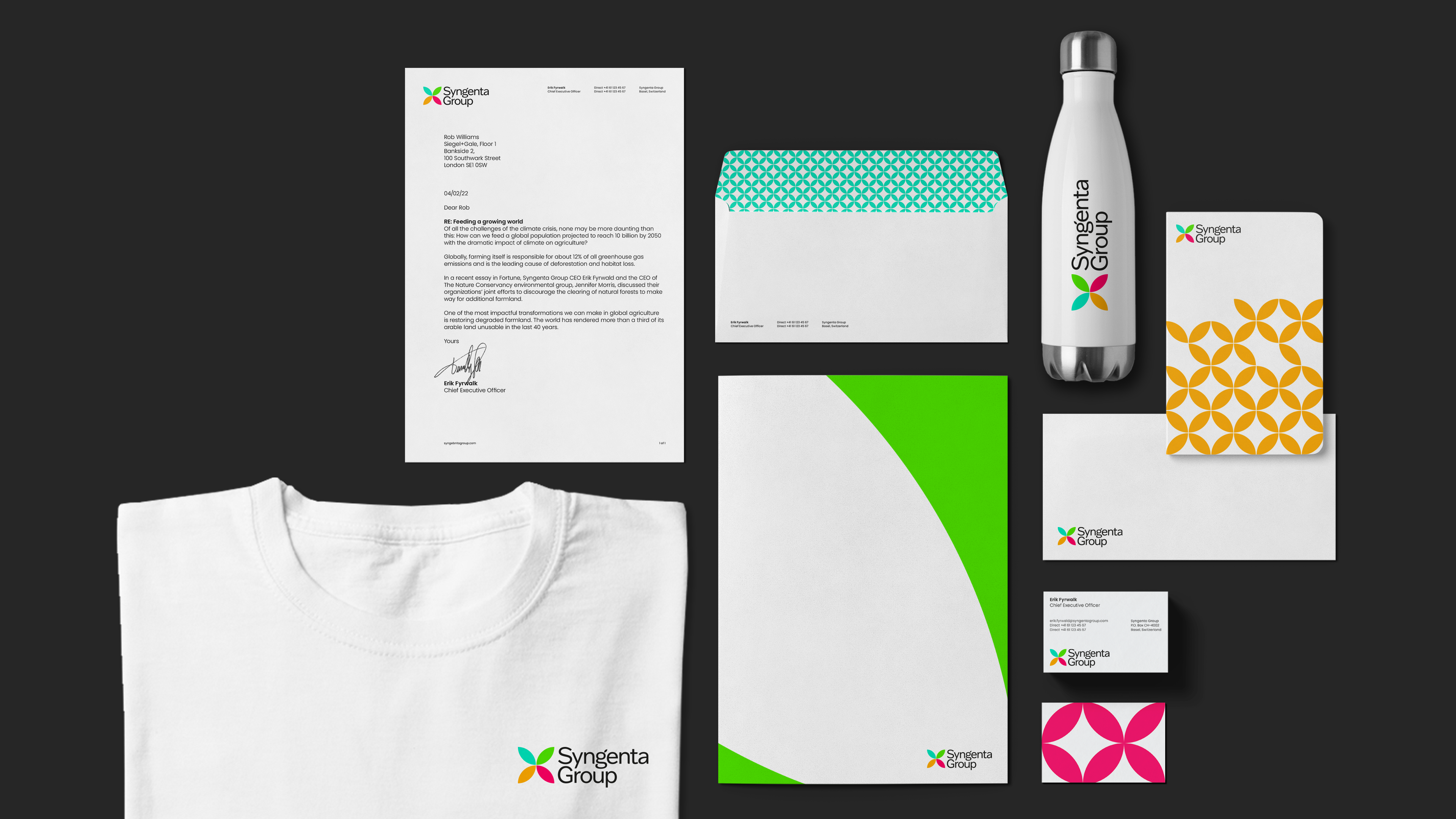
The logo celebrates the robust portfolio of global and local brands, telling the story of how they come together to be more than the sum of their parts. The result is the creation of a modern and fresh brand that also maintains its 250-year heritage.