
LIFT
Navigating infinite changes
Storytelling with groundbreaking visual expression
Challenge
Founded as a service brand by C&D Inc., LIFT is committed to integrating resources and creating added-value through differentiated supply chain operation services. Even though it had expanded globally and pursued sustainable growth, the company needed to reevaluate its brand image to tell its story better.
Insight
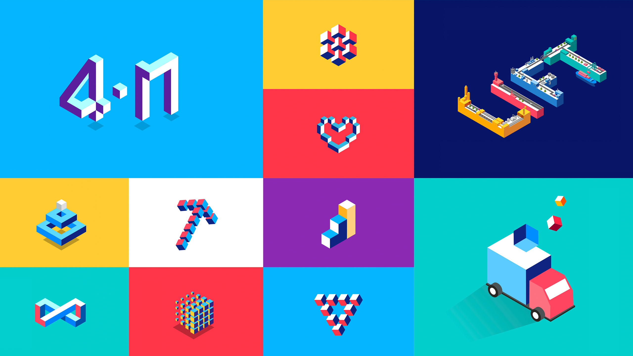
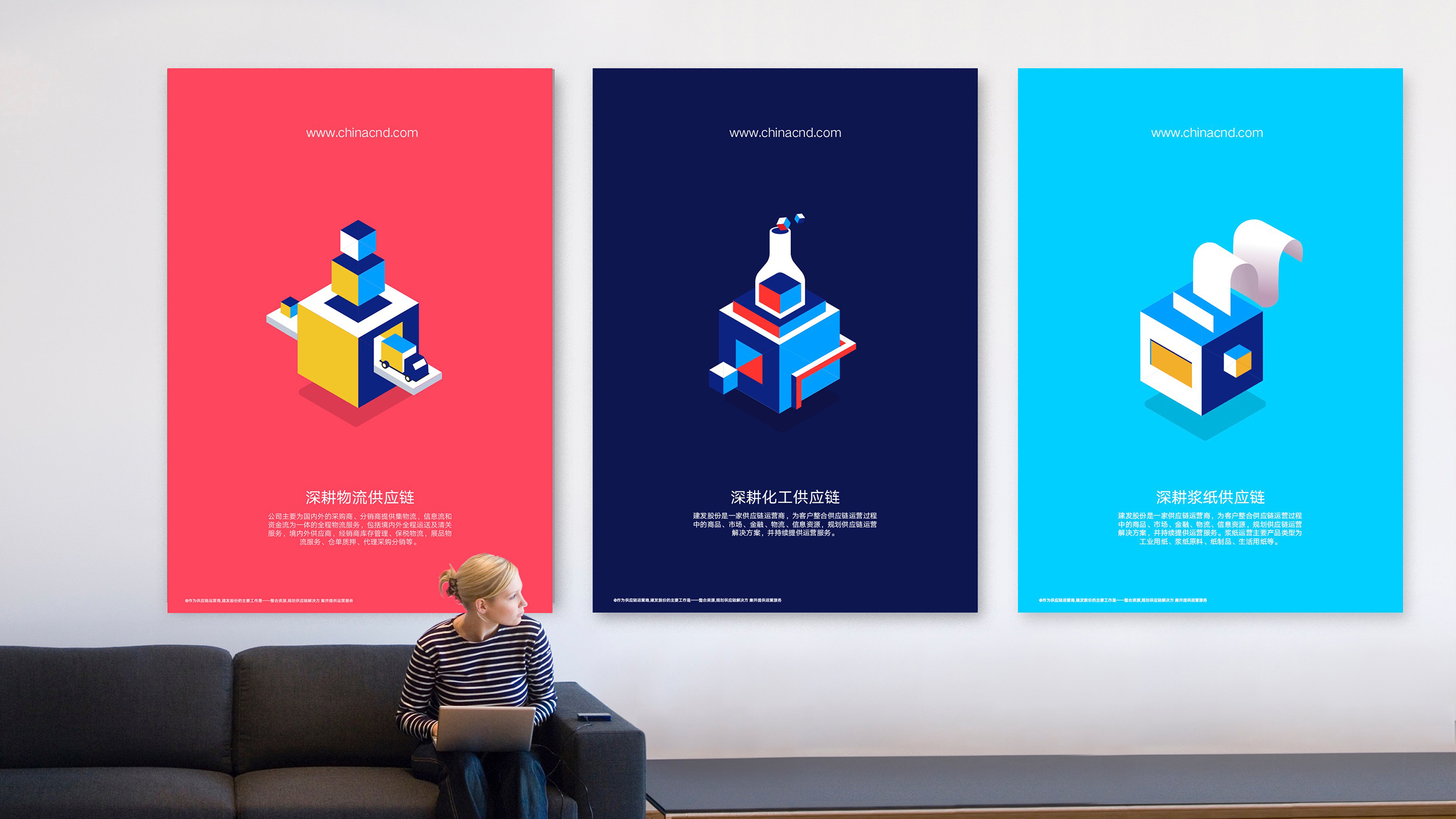
Anchored in four fundamental service elements—logistics, information, finance and trading—LIFT combined multiple capabilities within each element to deliver customized and innovative solutions. With this singular value in mind and considering LIFT will compete in more industries in the future, we realized the visual identity needed to adapt, extend and change both coherently and systematically.
Answer
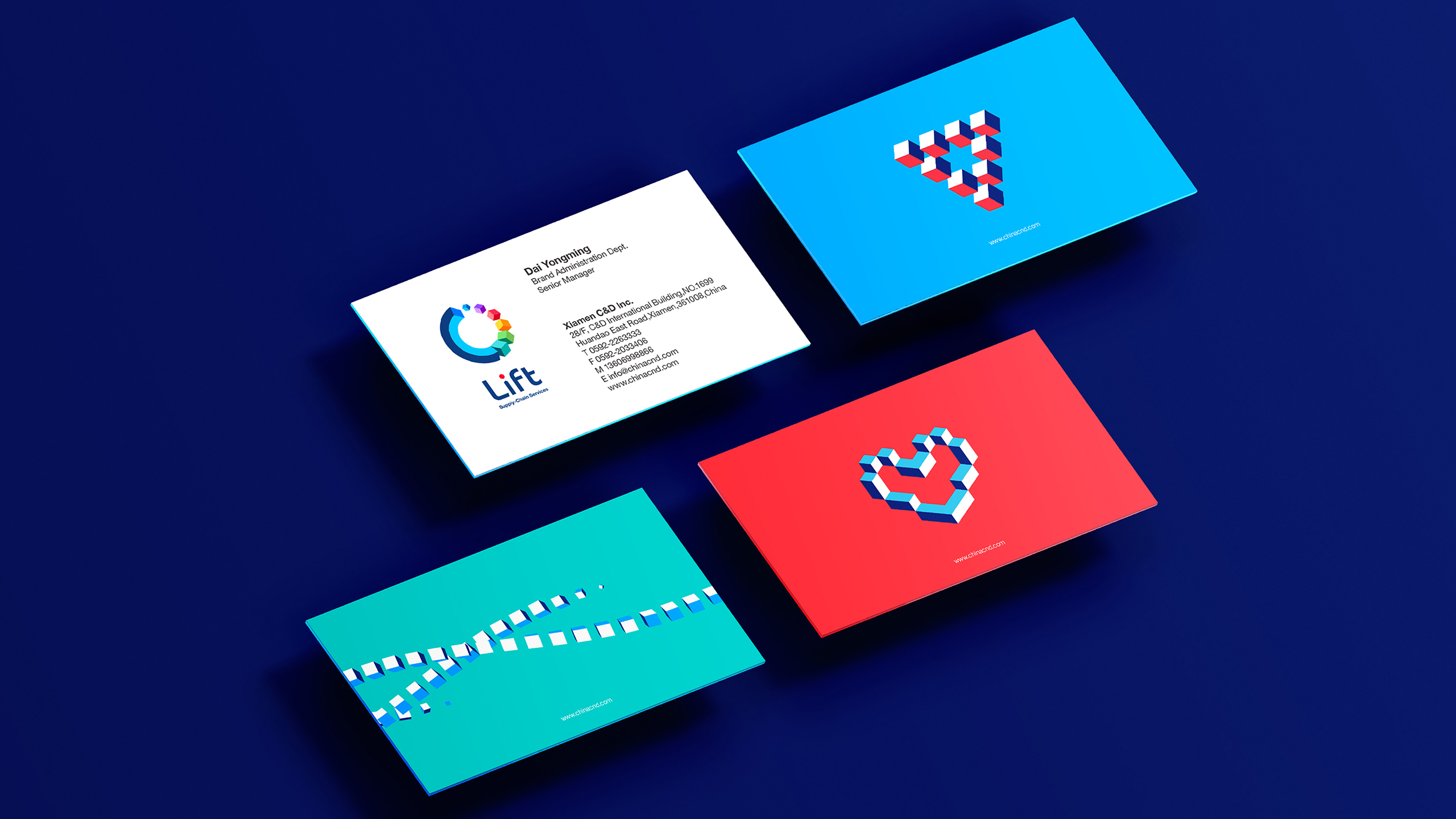
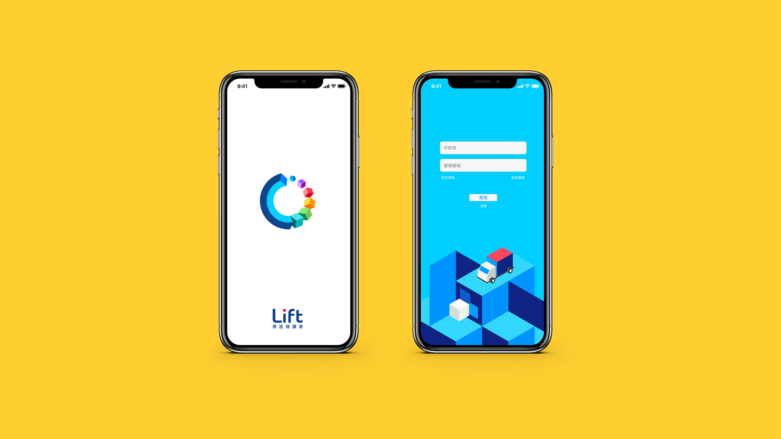
The idea of extending four elements into multiple services expresses the various possibilities that LIFT offers. We leveraged the visual DNA of the Rubik’s Cube and Cube to create a purpose-led compelling identity system. Based on the logo design, we also crafted 12 series of icons to help C&D Inc. expand over 170 countries along with an enterprise video to articulate the core value distinctly.
Results
Transform Awards, APAC
Best visual identity from the professional services sector—Gold
Best development of a new brand within an existing brand portfolio—Bronze