In SMPL Q+A, we interview practitioners on all things relevant to branding, design and simplicity. Here, we speak with our colleagues about our partnership with Tugende.
Tugende is a for-profit social enterprise formally established in 2012 in Uganda. They use asset finance, technology and a customer-centric model to help informal sector entrepreneurs dramatically increase their economic trajectory. Operating in Uganda and Kenya, their 460+ staff have served over 30,000 clients and are rapidly growing and innovating.
Why did Tugende engage Siegel+Gale?
We’re very proud as a firm to have had a relationship with Tugende for many years now. In 2011, our Los Angeles office was first introduced to the company and its founder Michael Wilkerson through our partnership with the Unreasonable Institute (a CSR program supporting social entrepreneurs). Our West Coast team worked collaboratively with Michael and his partners to develop the initial brand for the growing social enterprise, developing everything from a verbal and visual identity to the name ‘Tugende’ itself—a local Swahili term in Uganda meaning “Let’s Go!”
Then, nearly a decade later, our paths crossed again—this time with our team in London. In the years since our first engagement, Tugende had experienced enormous growth and success across Uganda—helping nearly 30,000 local entrepreneurs reach financial independence through asset loans and support, while simultaneously becoming a much-loved and respected brand and employer. With plans to expand into new countries and create new asset opportunities, it was time to refresh the brand strategy and visual identity—helping them to prepare for their next era.
How did we approach this engagement?
It was important from the get-go for us to understand the unique touchpoints the brand and its customers required. To do it, our team traveled across Uganda on two separate occasions for week-long immersions, shadowing employees in communities, working within the branches, conducting workshops with customers and local families—you name it, we did it. We embedded ourselves in Tugende’s world, and by doing so, we came to understand where those moments of value were, the distinctive places we’d need to appear. Learning their internal and external complexities to ensure we could deliver on our promise of simplicity.
Strategy
How did Tugende’s existing purpose and values inform our solution?
One thing that was resoundingly clear to us in all of our interactions was how Tugende had made a real, tangible impact—financially, emotionally and culturally. Everybody we encountered who’d come into contact with the brand had nothing but immensely positive things to say about it. It was evident that the existing purpose and values had resonated, and we wanted to ensure we leveraged as much of that success and sentiment as possible. Our challenge was taking this purpose and rearticulating it in a way that felt true and authentic, but also fresh and indicative of change. We were taking the idea of building a better life through asset ownership—the real core of the brand’s meaningful connection—and amplifying it across new opportunities and growth areas.
Can you explain the new brand strategy?
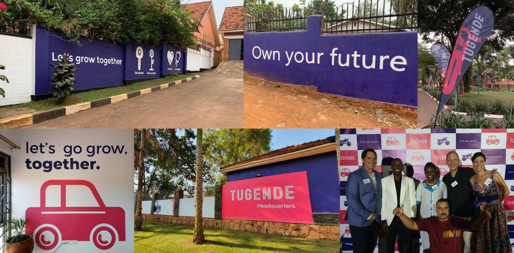
We revised the brand positioning to be more in line with Tugende’s own evolved position within society: presenting the path to financial independence, of course, but also fundamentally embracing and encouraging the spirit of local entrepreneurship in East Africa. We moved from the original positioning of “opportunity through ownership” to a new, more emotionally-charged concept to unite all audiences. The new positioning and tagline “Own Your Future” was designed to inspire customers, partners and employees to each take charge of their destiny through the services and support Tugende offers.
We then let this core idea guide the entire experience. We built the customer journey into our architecture solution, allowing the different stages of personal growth to inform both the model itself and then its nomenclature system. From there, we identified new touchpoints that could help the brand extend its relationships across this life cycle: from a new website highlighting the new asset opportunities and add-ons, to a smartphone app assisting customers to track their journey to complete ownership. At each juncture, local entrepreneurs are empowered to take ownership of their futures.
Design
What was the inspiration behind the visual identity?
Our main idea was to reflect the growth that Tugende has experienced since our initial engagement. The business is a very different entity and offering today than it was upon launch, and our visual solution needed to respond and be empathetic to these developments. This meant analyzing the existing identity and recognizing what was locally admired or appreciated, then refining these core elements and signaling change through new devices, systems and layouts.
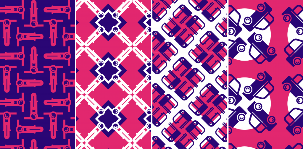
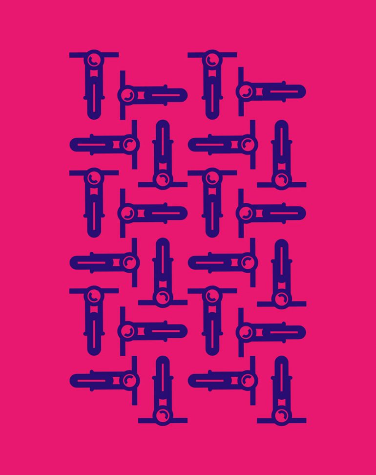
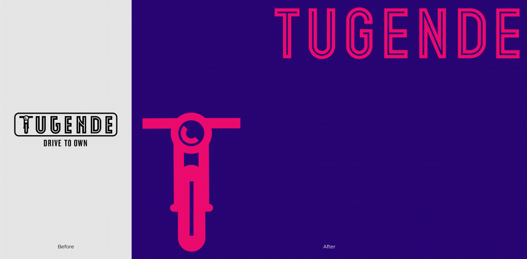
For example, we took the iconic ‘boda boda’—a device built within the T of the original Tugende logotype—and refined and released it from the logo. This allowed it to become a symbol and device imbuing the spirit of entrepreneurship, rather than representative of the sole focus or leased asset of the business. Then, we redrew the wordmark to feel more refined, mature and international—better reflecting Tugende’s role and position for employees and investors. We preserved what was loved from the original identity but enabled the brand to communicate its evolution with confidence and professionalism.
What process was used to define the new identity?
We wanted to create an identity that was inherently usable across the business, regardless of the sometimes-limiting factors of the region. Practicality and appropriateness were front-of-mind for us during this engagement. It meant considering all of the business locations and their specific access to talent and production. In every element, we wanted to reflect and be empathetic to the brand’s surroundings and those who would be using it.
For instance, we adopted the pink color from the high-vis jackets worn by the ‘boda boda’ drivers that were already part of Tugende’s safety requirements. This visual cue had become synonymous with the brand across the region but was missing from the brand’s actual palette. On a similarly practical level, we used an open-source and widely available typeface to ensure all employees could retrieve access easily. Even our system of icons was designed to enable the brand to communicate new assets or opportunities visually to an audience with varying languages or degrees of literacy. The hope, with each step, was to build a system that would be embraced and enjoyed by every audience.