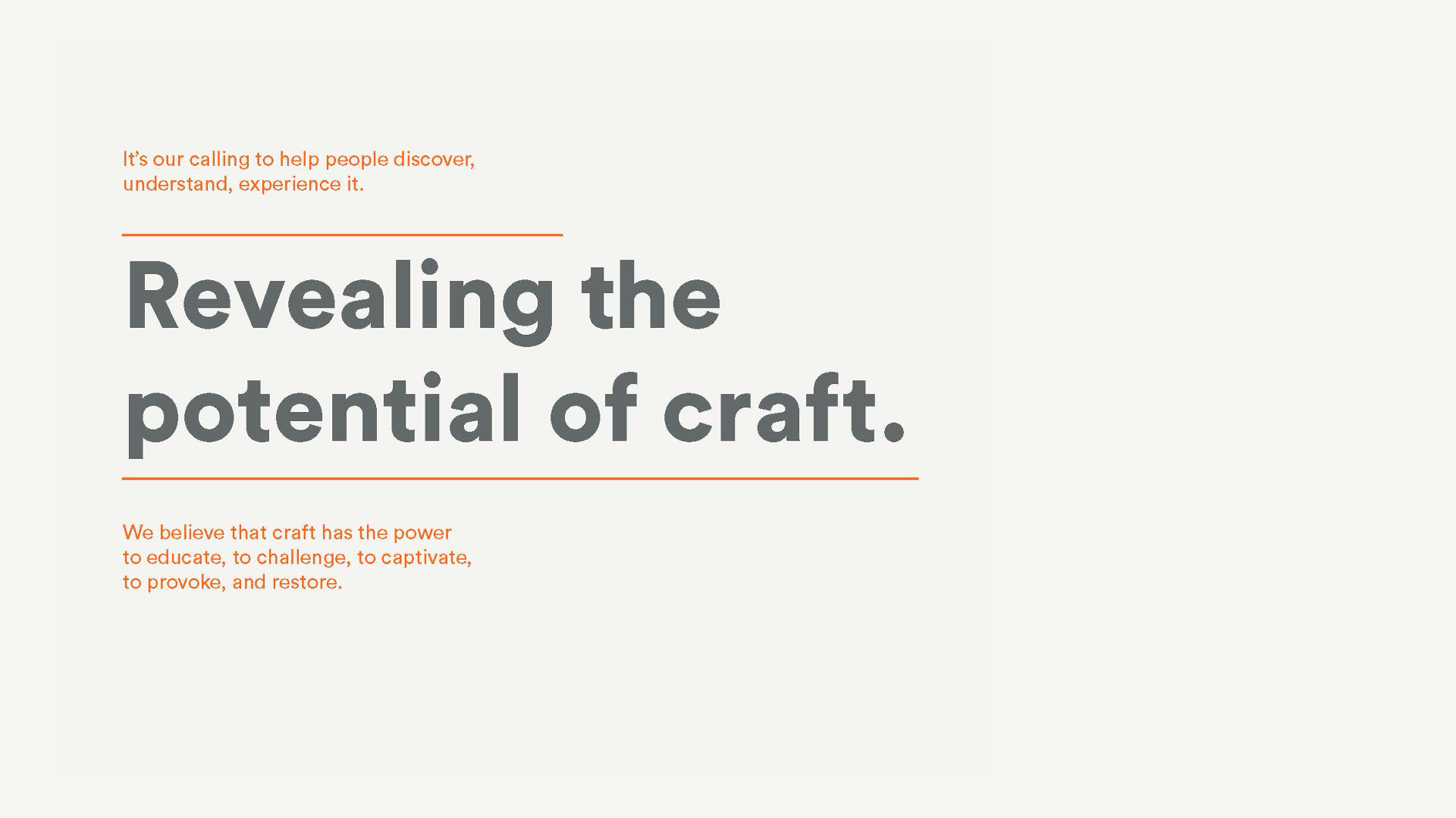
Here, we explore our engagement with Craft Contemporary, formerly known as the Craft & Folk Art Museum. Located on Los Angeles’ historic Miracle Mile since 1965, Craft Contemporary reveals the potential of craft to educate, captivate, provoke and empower. The rebrand is an attempt to better reflect what the museum has been emphasizing: the intersection of contemporary art, craft and design, as opposed to historical exhibitions or dedicated folk art shows.
Why did the Craft & Folk Art Museum need a new name?
The name Craft & Folk Art Museum was setting the wrong expectations. Together, the words “Craft” and “Folk” sounded ordinary and traditional, rather than rich and relevant. The name did little to pique the interest of visitors looking for a more contemporary museum experience. And it failed to highlight what makes the museum so unique: it functions as a platform for a diverse community of makers and as a space to both view and create art. The museum needed a more engaging introduction, one that appealed to a broader audience and worked to elevate craft in the contemporary art dialogue.
Tell us about the naming process.
The challenge was to honor the history and brilliance of craft, but convey its power in a fresh way. We learned craft is all about the “how.” Material and method are more precious than the end art object. The final name needed to dial-up the idea of making and breathe new life into a time-honored practice. Our global naming team developed hundreds of names, everything from very subtle shifts to more inventive solutions with an intriguing edge. We explored a broad range of themes, styles, and tones, ensuring that each name served as an authentic articulation of the museum today and could grow with the museum over time.
How does a new name help activate the rebrand?
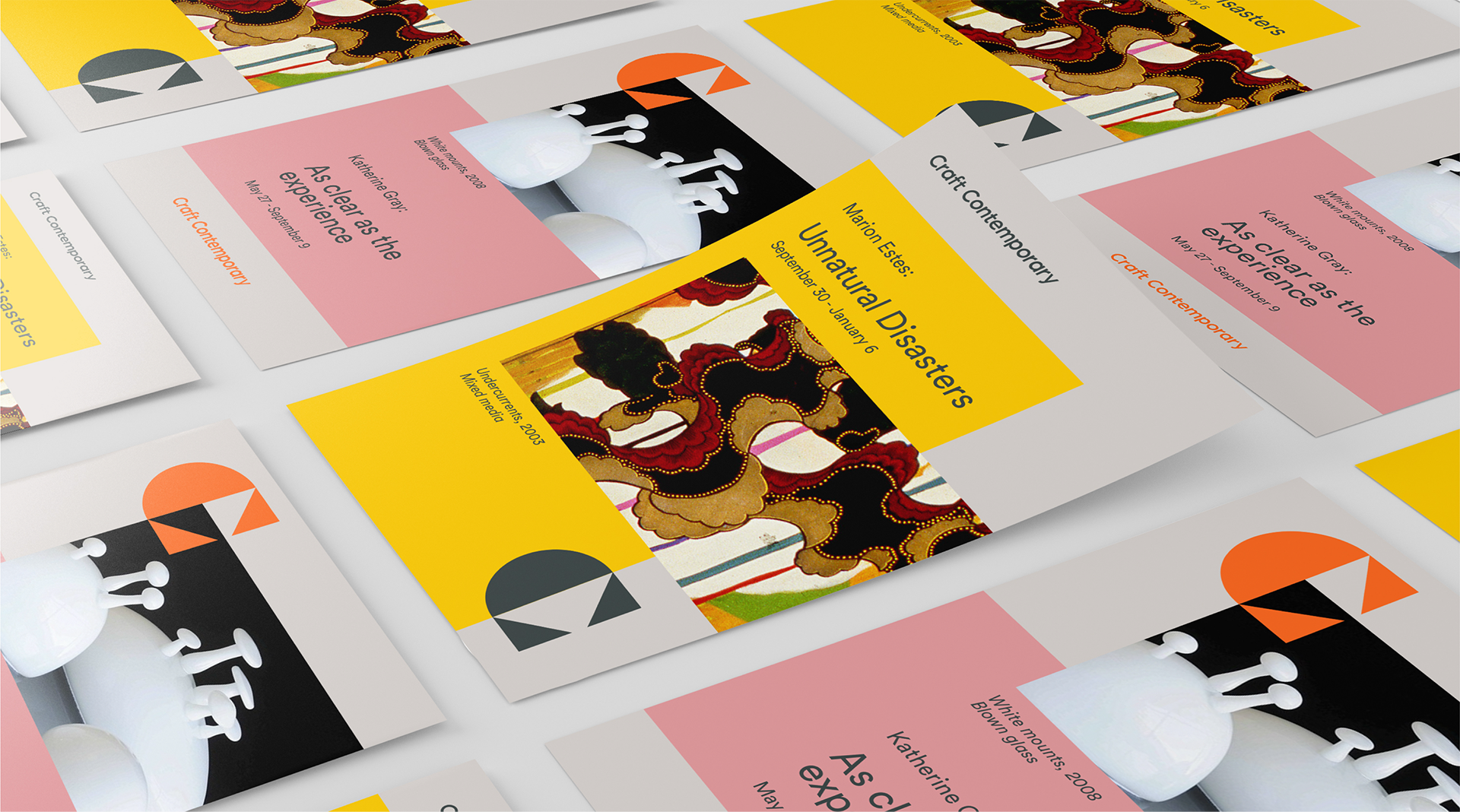
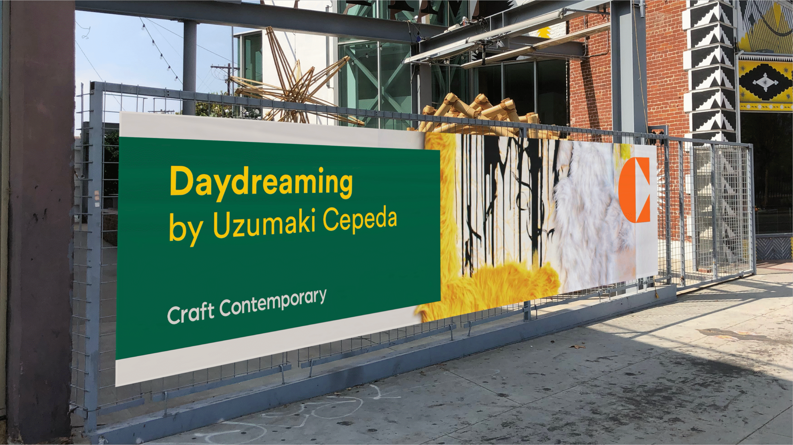
The larger brand refresh focuses on revealing the potential of craft. Craft Contemporary supports this strategic vision by assigning new weight and influence to craft. It turns the word “craft” into a verb, specifically the action of shaping and defining the future. It reads like an open invitation to all audiences—artists, viewers, community members, donors—to collectively engage in the process of making. Craft Contemporary has an alliterative elegance to it; the name feels especially significant and sophisticated in tone, which stylistically lifts and strengthens craft. Omitting “Museum” was intentional. The name belongs to a versatile space that is constantly changing and evolving. It is so much more than just a museum.
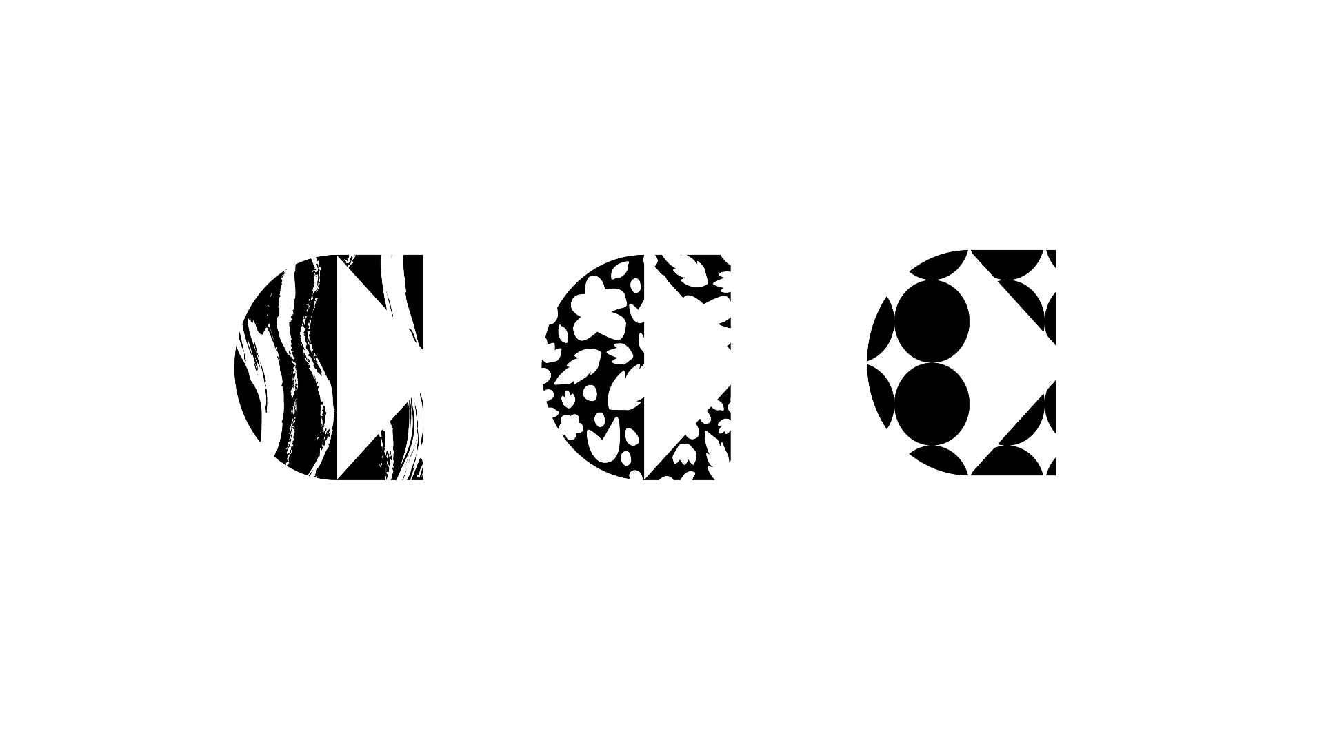
What was the concept behind the visual identity?
From the beginning, this museum was not to shy away from championing new artists or even avant-garde, provocative work. With this in mind, we created a monogram that communicates three things:
1. Bold geometric shapes coming together, to represent community
2. Outward facing triangles, speaking to the dissemination of arts and culture
3. A forward-facing triangle within the negative space, to visualize the pushing of boundaries
What made this assignment unique?
Working with a local museum in my hometown was an exciting endeavor. I feel privileged to have made a mark on the Los Angeles arts community.