In our SMPL Q+A series, we interview practitioners on all things relevant to branding, design, and simplicity. Here, we speak with our practitioners about our rebranding work for global consulting partnership Kearney.
The new brand focuses on the people—clients, colleagues, and alumni—that are at the heart of the firm. Read the official announcement from Kearney here.
Strategy
Why did AT Kearney engage Siegel+Gale?
Kearney first approached us to help clarify its market position and overall story. As one of the world’s leading consulting firms, they did not have the recognition of some of the other more well-known names (e.g., McKinsey, BCG, Bain). When talking with clients, it was clear they enjoyed the firm, the people and the outstanding work, but they could not identify a “signature” of the brand. It was difficult to convey a simple story about who they are and why people should care.
What was unique about this engagement?
What’s most surprising is this engagement didn’t start as a rebrand. It evolved over time as a necessary solution to an initial question—How do we get clients to advocate on our behalf? What started as a clarification of its story turned into a broader initiative that impacts almost every aspect of the firm; from the look and feel, how they attract new recruits and how clients experience working together. It was a radical transformation nobody saw coming.
Can you explain the new brand strategy?
The key insight to the strategy came from within the firm. Working with Kearney is different—their people simplify complex ideas, and they are more relatable than other management consultants. Clients who worked with them already knew this; but the brand needed to communicate this to everyone. That’s why the brand centers squarely on what makes Kearney great, the people. From an identity that highlights individual ideals, to original photography and a more inclusive name to cover the entire family.
“The most exciting aspect of our new brand is that it so accurately captures our voice. Our firm is refreshingly real, relatable, and original. To that end, we are eliminating industry jargon. Kearney people are always themselves. We speak plainly, listen closely, and build great working relationships. We take joy in each other, and in every success achieved side by side with our clients.”
–Alex Liu, Chairman Emeritus, Partner, Kearney
How did you land on the new brand voice?
The voice was born out of the personalities that make Kearney a consistent firm around the world. The people are real, relatable and refreshing—a genuinely original combination in the world of management consulting. It manifests in many ways, including eliminating jargon, telling clearer stories and turning the brand into a more familiar conversation—the brand shares bold ideas but in a way that’s useful, clear and surprising.
“For decades, our brand was centered primarily around our heritage, in which we take extraordinary pride. While showcasing our firm’s family name demonstrates that we remain true to our origins, our updated name, brand voice, and visual identity are more concise and personal, embracing who we are today.”–Abby Klanecky, Partner and Chief Marketing Officer, Kearney
Design
Can you tell us about Kearney’s new initiative to eliminate the internal use of stock photography and introduce crowdsourced images from their employees?
The market has been flooded with dated, unrealistic, cliché photography for a long time. By settling for this approach, companies have missed an opportunity to personally connect with customers and show who they really are.
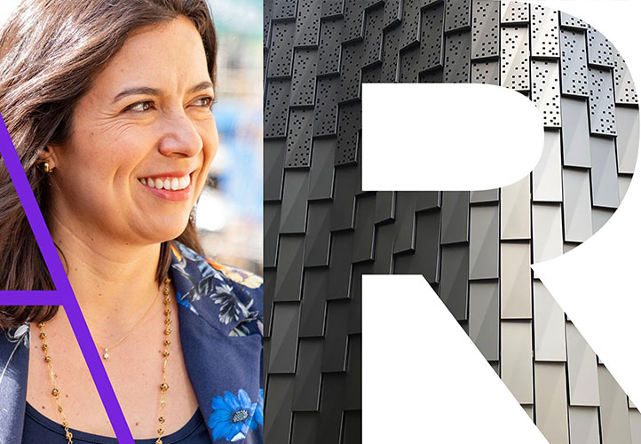
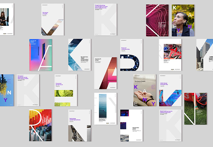
The idea of inviting Kearney’s employees to help shape and build their brand was a no-brainer. Simply put, they understand their people are their brand. The result of eliminating stock photography is images that are innately more real, relatable and refreshing. The initiative gives potential clients a clear picture of what it’s like to work with Kearney, the difference they bring, as well as creating an engaging employee experience. There is nothing more rewarding than seeing something that you have created out in the world. Imagine having that as everyday reality – seeing your photos around the office, on the website, on every piece of collateral.
What was the inspiration behind the visual identity? Any details you would like to call out?
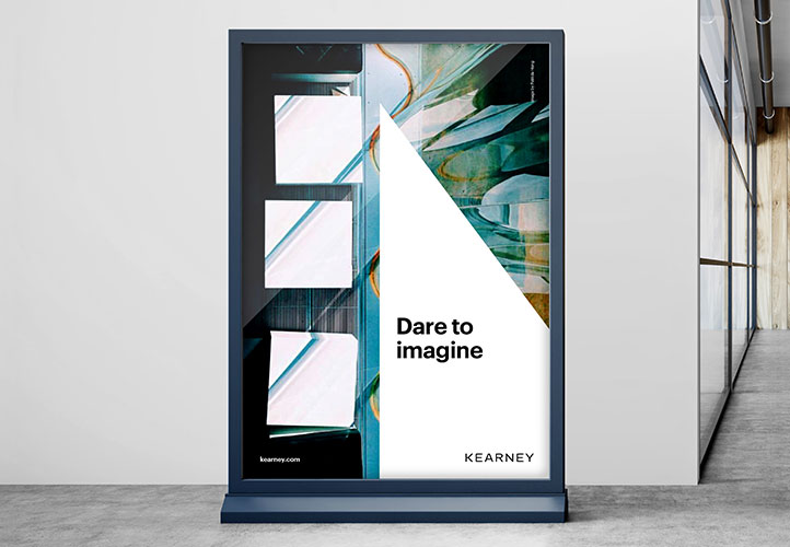
The identity was born out of the firm’s desire to bring their people to the forefront. It’s no longer about one individual but about the different characters that make up Kearney. We created a bespoke wordmark to capture that originality, and then used the characters to frame the crowd-sourced images. The result is a unique, contemporary, and ownable design system that’s full of personality and appeals to the next generation. Once we identified that players in the industry were starting to own specific segments of the color wheel, we realized it was time to move away from the overcrowded segment of predominantly-red brands. We introduced a sophisticated and timeless slate and white system with a new accent color of purple to highlight what’s most important.
Learn more about the new brand here.