In SMPL Q+A, we interview practitioners on all things relevant to branding, design, and simplicity. Here, we speak with our colleagues about our partnership with Jacobs and how we helped them evolve from an engineering firm to a premium solutions provider serving a range of industries globally. The rebrand serves as a signal of Jacobs’ business transformation—to its people, its customers, the industry, and investors.
Strategy
This investment was an opportunity for Jacobs to rally all 50,000 global employees behind an authentic and foundational story, as well as a new look and feel.
Beyond that, it’s the first time the company is moving beyond communicating what they do to celebrating why it matters—the purpose that unites all its people, no matter which company they came from. They made a bold—and key—decision to create a new look and feel that all legacy companies could unite behind.
Brand Communication + Strategy
KC: As technical experts in everything from infrastructure to aerospace, Jacobs is really good at talking about the details of what they do. But what they were less good at was communicating why that mattered. The new brand and messaging framework push the organization to go beyond the what to the ‘so what,’ elevating the unique value they provide to their key audiences that they can’t get anywhere else.
Business Analytics + Insights
What role did research play in this partnership?
From the beginning, Jacobs wanted to do things right, which included a fact-based approach to strategy and input from multiple perspectives. The research helped guide the brand evolution and ensure a strategy that is authentic, relevant and differentiating.
Internally, we began with 40+ one-on-one interviews to understand the current state of the organization and its goals for the future. We then dug deeper by conducting 23 employee focus groups in 22 locations around the world—some of the highest engagement we’ve seen. In those discussions, we began to understand what makes Jacobs who they are, identifying commonalities across demographics, specialties and legacy organizations. We learned that the Jacobs team are doers who enjoy collaborating to solve the most complex challenges and who envision the future Jacobs as a leader—forward-thinking, innovative and visionary. Equipped with a wide range of insights, we concluded the internal research with our EnGage™ study designed to understand alignment between internal and external perception and what drives employee engagement. Overall, we had inputs from over 6,200 employees.
Externally, we gathered client and investment-community input through a series of in-depth interviews. These interviews helped provide context for our larger quantitative study, EyeOpener™. The global study was fielded with over 1,200 decision-makers in 12 categories and provided the data necessary to understand what drives decision making. By understanding what makes a difference to Jacobs’ audiences, we were able to identify inherent strengths and gaps to address in the new brand. Among the attributes most relevant to clients and potential clients were being a thought leader and having the ability to tackle the most complex projects.
The multiple research inputs helped identify the intersection between what is at the core of the Jacobs team, what their clients care about most and what makes them stand out in their global markets.
Design
What was the concept behind the logo and identity system?
The Jacobs logo has been updated and refined to reflect where Jacobs is heading as a company. The shift from an all-capital wordmark to a mixed-case one is indicative of their impact and focus on humanity. While the new logo emphasizes the importance of collaboration and interconnection within Jacobs, it also gives a subtle nod to their heritage.
The capital J in the wordmark is a proprietary mark that serves as a visual shorthand for their new tagline, Challenging today. Reinventing tomorrow. The upward sweeping arc symbolizes agility, a change of course and the willingness to go against convention. This arc leads to the arrow that points up and to the right, signaling the optimism, infinite potential, and the impact Jacobs has on the future. Using the arrow from the J-mark, we amplify its meaning by using it graphically as a point of origin with different elements from the design system, making it a powerful vessel for storytelling.
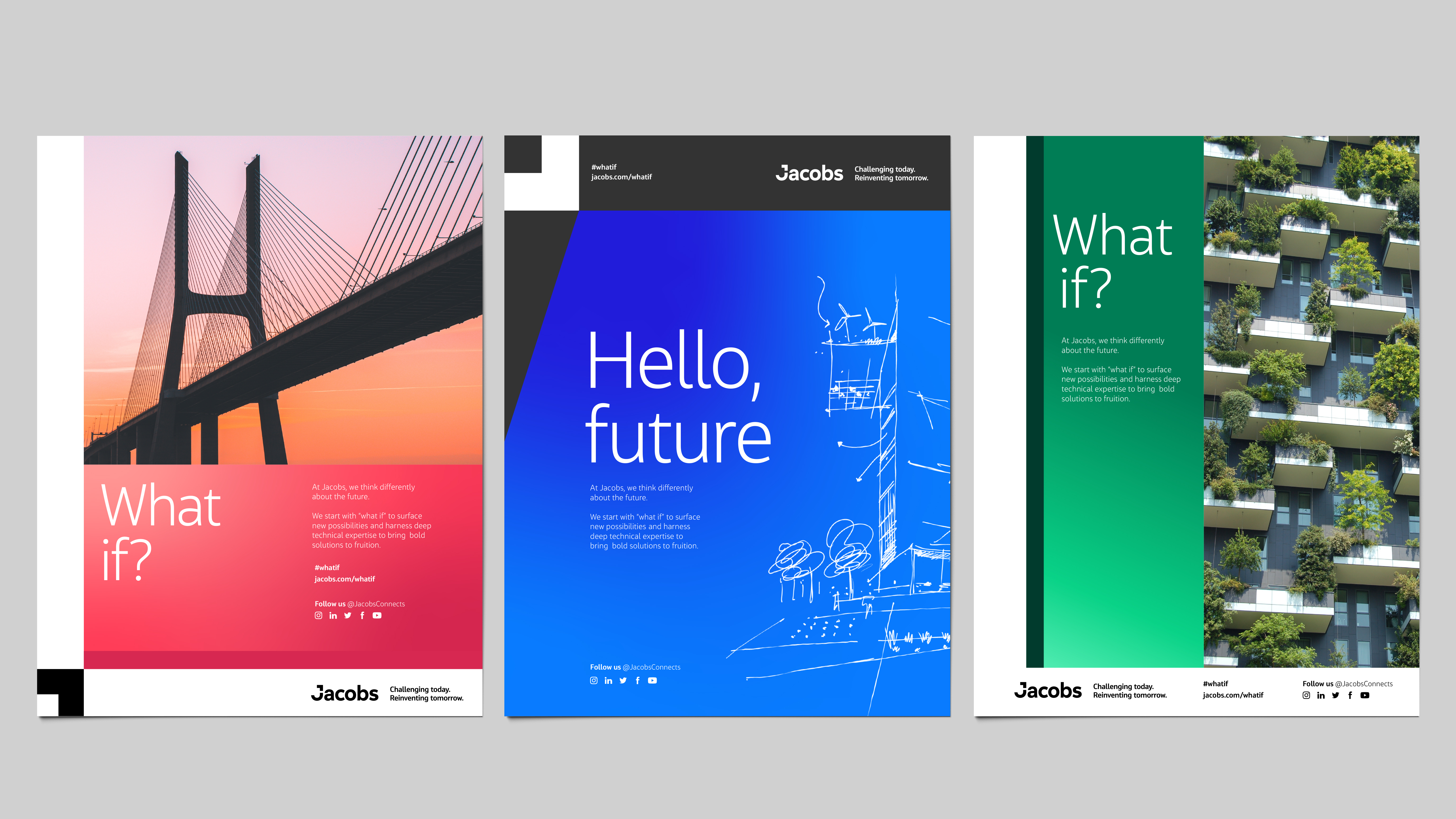
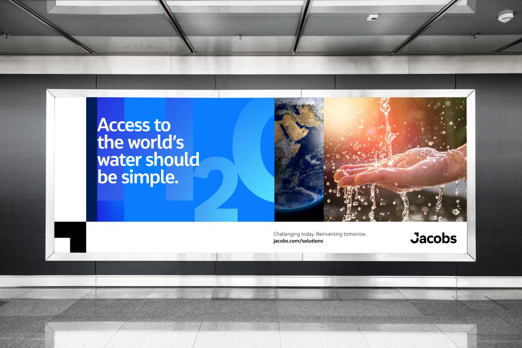
At the center of the visual identity are the sequence frames. Rhythmic frames expand and contract, demonstrating Jacobs process-oriented and collaborative approach to solving the world’s biggest challenges. Paired with a robust color palette that speaks to inclusivity, bright gradients that signal change, illustrations that show creativity along with a wide range of photographic styles, the visual system is incredibly flexible and can adapt to the multitude of communications that Jacobs creates on a daily basis.
![]()
Why did Jacobs choose to create a proprietary typeface?
We’ve recently seen a resurgence of custom typography. The growing trend to create a proprietary typeface proves its relevance and importance has only increased over time. It is the medium that can make or break a communication–every aspect from strategy to messaging to design needs to harmonize to deliver a cohesive, consistent and distinct brand experience.
With this understanding, Jacobs opted to create a new typeface that has design features tailored to their values and needs. An extraordinary amount of attention was placed on accessibility and legibility. With a generous x-height, flat terminals, unambiguous figures, large inner counters, engineering glyphs, multiple language support, consistent character widths, and optimized letter pairings, Jacobs Chronos was developed specifically to be able to communicate to a wide range of audiences across myriad platforms.
Employee Engagement + Activation
Where did Jacobs focus its activation efforts, and why?
KC: People deliver the Jacobs experience. This is why Jacobs focused on ensuring every single one of its 50,000 employees understood and knew how to embody the brand before rolling out externally. The internal launch spanned a 24-hour period in which every Jacobs office celebrated as it came online for the day, showing how the company truly can deliver on its tagline: Challenging today. Reinventing tomorrow.
The company created a significant brand education plan knowing the new brand wasn’t a change in sign but a sign of change—signaling how it had evolved over the years as well as a guide into the future.
KC: Jacobs also did a remarkable job of viewing the process of developing the brand as an opportunity to include and engage people from across the organization. In a way, the brand activation began before there was a brand strategy or identity. It happened in the 24 employee focus groups. In the cross-functional, globally diverse multi-day workshops focused on messaging and implementation. In visual identity sensing sessions with leaders from across the organization. And it continues in the brand education.
Experience
How was the microsite built, and how does the experience help the brand deliver on Jacobs’ promise?
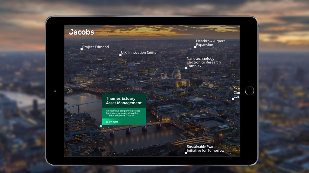
Jenna Isken: The question behind the microsite was, “How do we reach 50,000 employees to educate, excite and engage around the new brand?” The answer was by enlisting the employees themselves. We built a series and activities that were entirely dependent on user participation to succeed. From a real-time photo stream, where 1,000 employees used custom stickers to showcase their brand affinity, to a case study submission opportunity, where 200+ employees submitted projects they were proud of, the majority of the site content is user-generated. This means it always feels fresh and continues to emphasize the most crucial element of the brand—the people.
Strategy + Design
How does Jacobs’ rebrand create differentiation in the short- and long-term?
Jacobs’ new bold and graphic visual identity uses the latest features in design software. Non-conforming to their industry aesthetic, their design system packs a colorful punch that immediately sets them apart. Both the new logo and the graphic language born from its geometry are elevated by its symbolism, which is rooted in their strategy and values, giving their new identity resilience and longevity. This is further exemplified by the shift in their NYSE ticker symbol to the sought-after single letter symbol, in this case, the letter J.
At a high level, their extensive visual toolkit includes a vivid color palette and gradients, arresting photographic styles, creative and technical illustrations, and dynamic sequence frames. Some of these individual elements have a range of expression within the system, resulting in countless combinations that can be augmented or dialed back based on audience, market and context.
KC: The fact that the brand strategy is founded in their unique approach makes it timeless. While the businesses and markets Jacobs competes in may change over time, their unique culture and way of working, thinking and questioning, will continue to set them apart.