UST
Impact unbound
Helping a billion-dollar tech company touch billions of lives
Challenge
Since its founding in 1999, UST Global had evolved from a small start-up to a full-service digital transformation firm with a powerful mission: transforming lives. Despite a strong purpose, the company was having difficulty shaking the perception that it was simply a provider of offshore IT services. Its brand no longer reflected its reality and suffered from a disorganized portfolio, an inconsistent narrative and visual system, and an outdated digital experience. As the company worked toward an ambitious goal of touching 3 billion lives, it was time for UST to let the world know what it was truly all about.
Insight
Through comprehensive research—including the use of our proprietary EyeOpener™ tool—we were able to see how UST measured up when it came to key business drivers like expertise, partnership, leadership and goodwill. We discovered that while those who knew UST tended to think of it highly, others struggled to define what the business actually offered or stood for. Fortunately, our research also showed that UST’s purpose came across as authentic and ownable, allowing us to explore a strategic territory that would help the business stand out: touching or improving lives through technology.
Answer
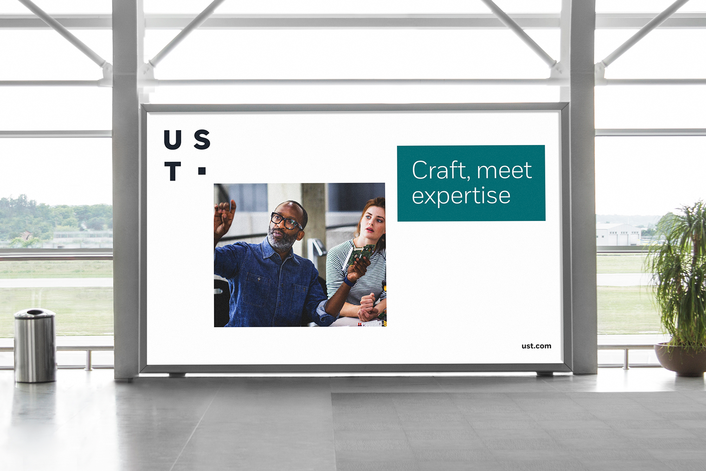
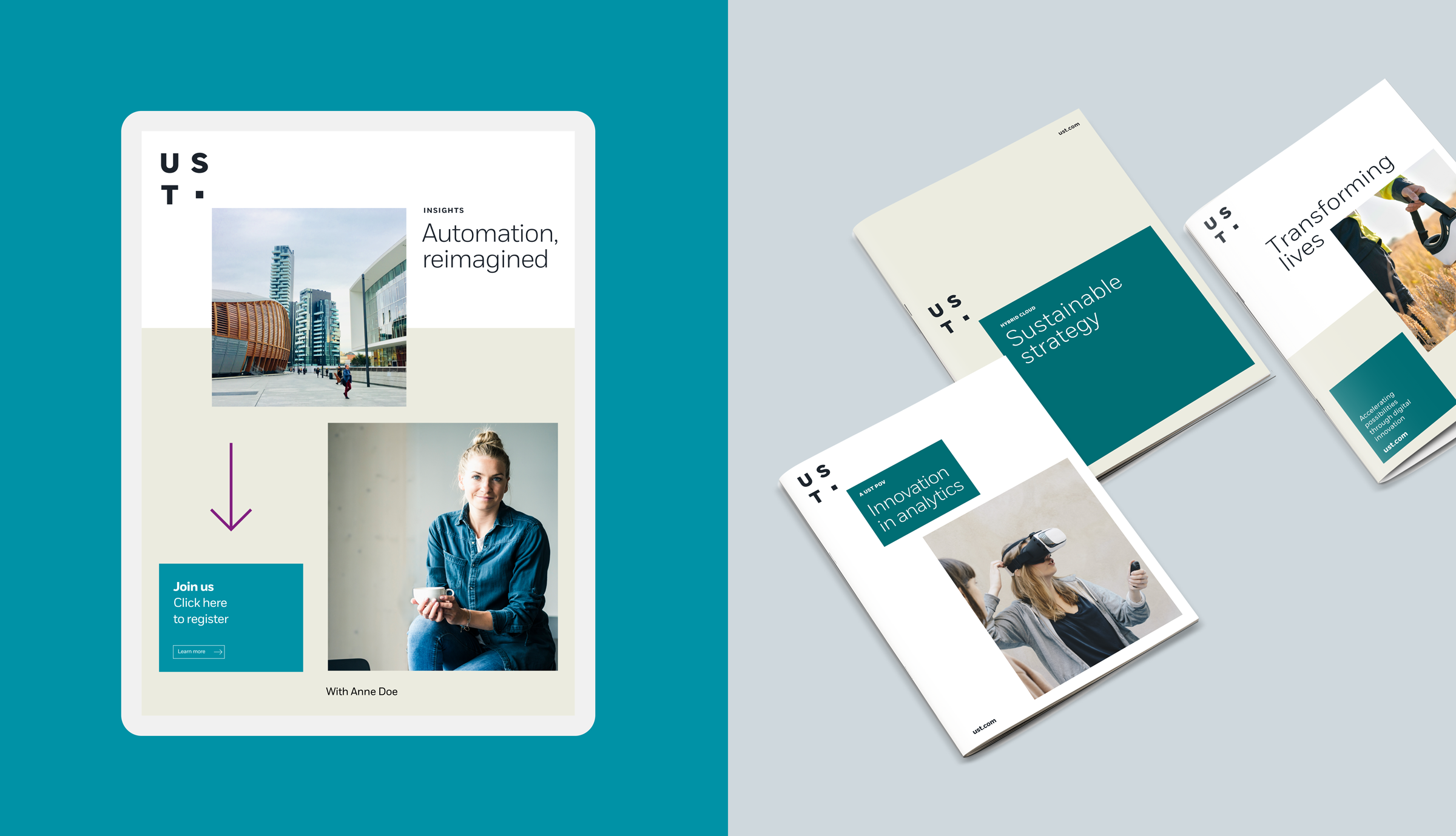
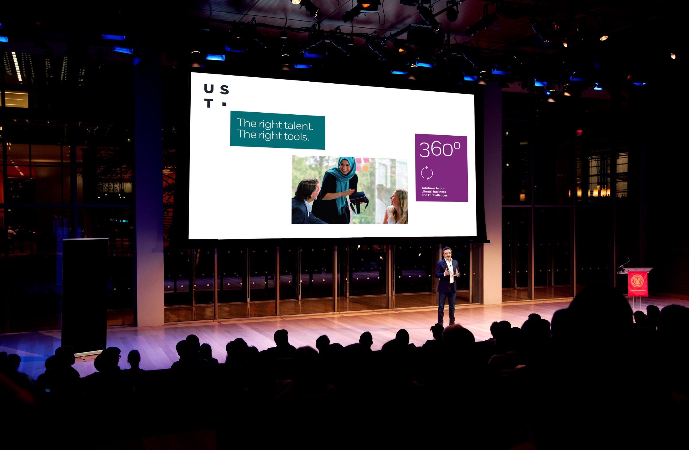
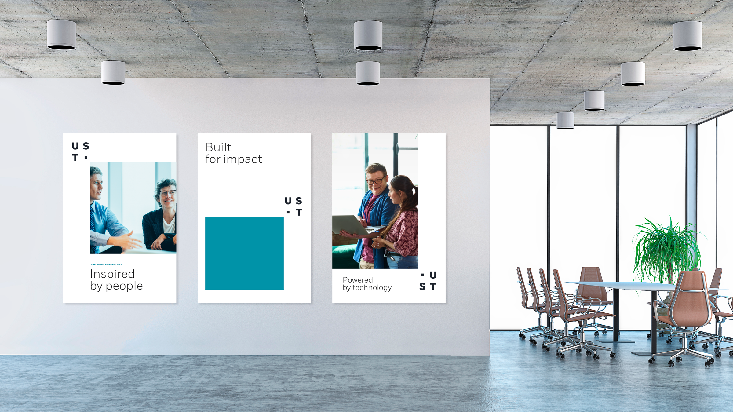
First, we anchored our strategy in a single core idea: Together, we build for boundless impact. From there, we developed a fresh visual and verbal identity that expresses the nimble, confident and tenacious personality of the company—and the humility, humanity and integrity of its culture. Brought to life most notably by a strong narrative and dynamic logo, the new brand inspired our creation of a tighter, more cohesive brand architecture and an electric and engaging website. Launched on the heels of 2020’s global challenges, the brand underscores the importance of companies like UST Global—now officially just “UST”—being able to adapt and evolve in real time.


The whole team at Siegel+Gale were invaluable partners in identifying, articulating and visualizing our authentic UST brand and with incredible results: We've almost doubled in size since our rebrand helped us tell our unique story on how we build boundless impact for our clients every day.
Leslie Schultz, Chief Marketing Officer, UST