
With the release of Jerry West: The Logo, we find ourselves reflecting on one of Siegel+Gale’s most enduring pieces of work, a design so iconic it became synonymous with the sport itself. The documentary’s celebration of West’s legendary career inspired us to revisit the story behind the NBA logo, and how a single photograph of No. 44 dribbling down the court became the face of a billion-dollar league.
It was 1969. The National Basketball Association was locked in a bitter battle against its upstart rival, the American Basketball Association (ABA). At stake: fans, players, media—and millions of dollars.
The ABA had different rules, a flashier style of play. It had the fire and moxie of the underdog. But who was the NBA?
NBA Commissioner J. Walter Kennedy thought he had the answer: the NBA should be the national league of basketball—like the MLB was to baseball. To be like the MLB, they’d need a logo like the MLB. Something instantly iconic, patriotic, easy to market. Something that looked great on shirts, hats, bags…anything and everything.
So they needed the guy who had overseen the development of the MLB logo. The NBA turned to Alan Siegel, founder of Siegel+Gale.
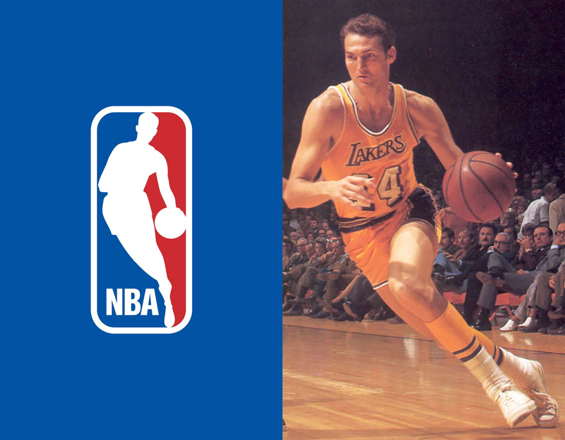
Seeking inspiration, Siegel poured through the photo archives of Sport Magazine. A particular photo of the All-Star Jerry West grabbed his attention: It was dynamic, it was vertical, it captured the essence of the game.
Siegel+Gale’s design team streamlined the image and turned West’s silhouette into a white shape in motion—encased in red and blue halves, mirroring the treatment of the MLB logo. With the letters “NBA” at the bottom, the abbreviation took hold in the public’s consciousness.
More than 50 years later, the NBA logo is one of the world’s most recognized symbols of sports and an unmistakable emblem of American culture. Today, this classic image generates over $3 billion a year in licensing, and the NBA name symbolizes the pinnacle of excellence in professional basketball.