Nielsen
Powering a better media future for all people
A new brand identity and reinvigorated culture
Challenge
Under the leadership of CEO David Kenny, Nielsen honed in on digital-first and globally inclusive media solutions in three areas: measurement, marketing outcomes and content services. The company sold off a shopper marketing business that didn’t align with this focus, transformed the leadership team and invested in technology to take the company into the future from legacy associations with broadcast. With this vision and targeted footprint, the company needed a purpose to reflect its tech-forward leadership in the media industry and inspire associates with a clear path forward.
Insight
Our immersion phase highlighted Nielsen’s authentic strengths in inclusion and innovation through differentiated big data powered by the real people in their global panel. These insights both spoke to product differentiation and their larger corporate goal of being a force for good in the media industry.
As the deliverer of insights that help clients make more confident decisions, Nielsen has the largest footprint globally, is able to be more inclusive and representative in true audience measurement, and can share real data that helps connect audiences and storytellers worldwide.
Answer
Nielsen’s unrivaled leadership in understanding audiences and connections to fuel relevance in the media industry resulted in the idea: Powering a better media future for all people. This purpose has become the company’s rallying cry for the company’s employees and prospective talent as well as how the brand is communicated to clients, partners and the world.
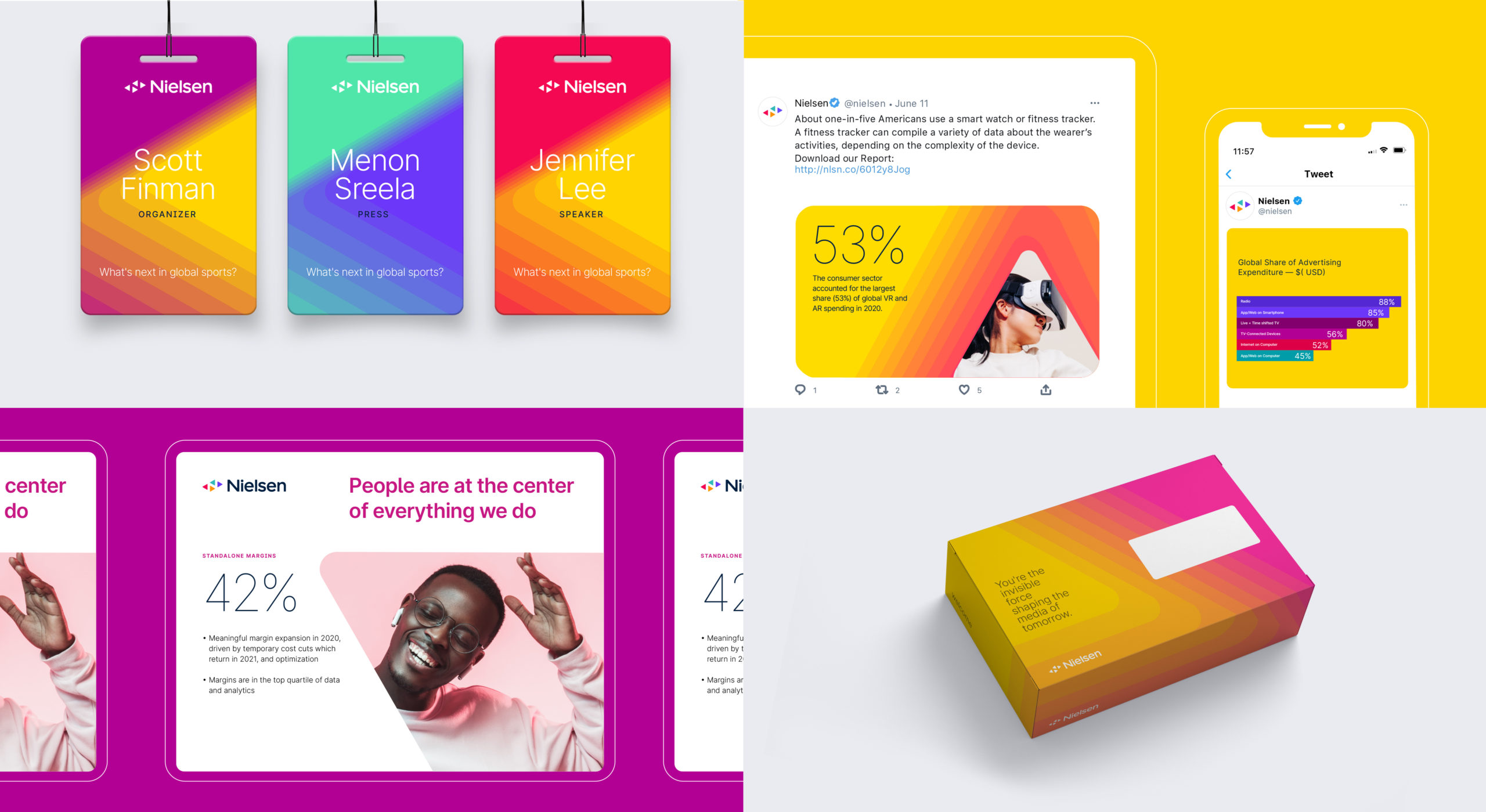
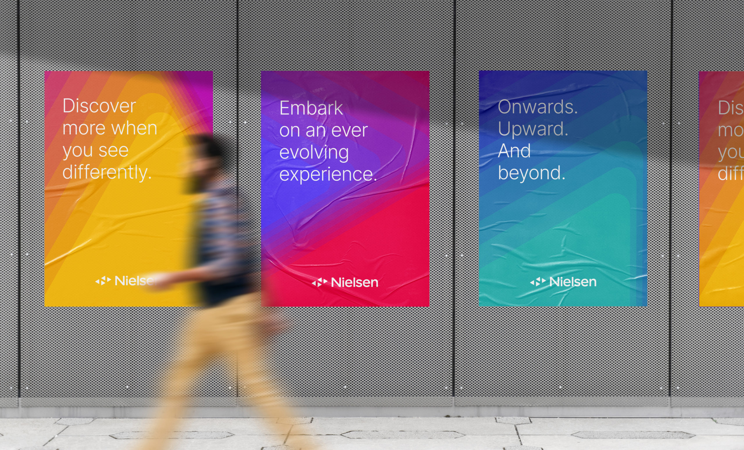
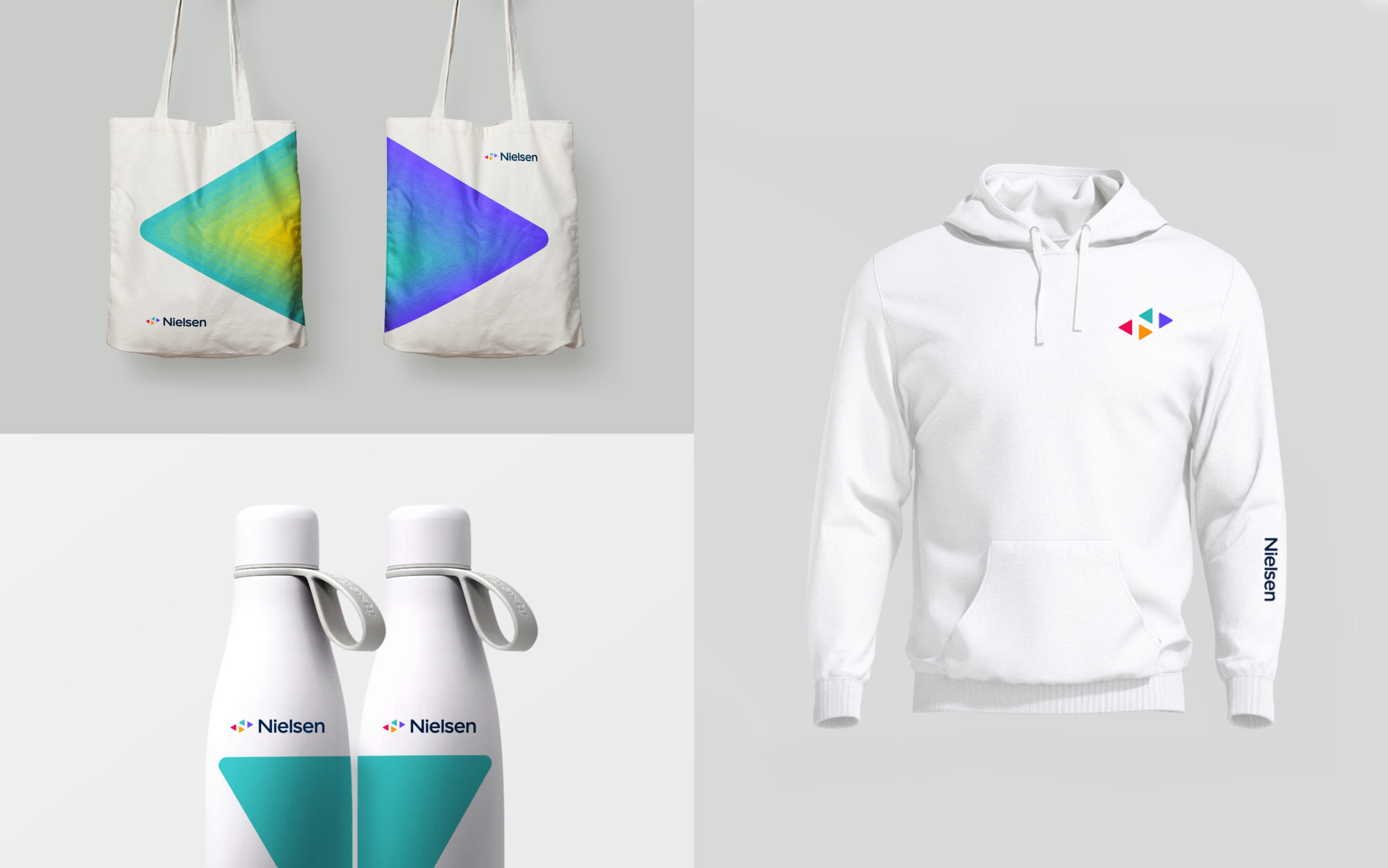
A new visual identity conveys the modern and bold organization that makes sense of a diverse world with an endless number of experiences, channels and interactions.
Now more than ever, “Audience is everything,” and Nielsen is keeping media decision-makers at the forefront. And its purpose and identity showcases all it does today–and how that matters for the future.
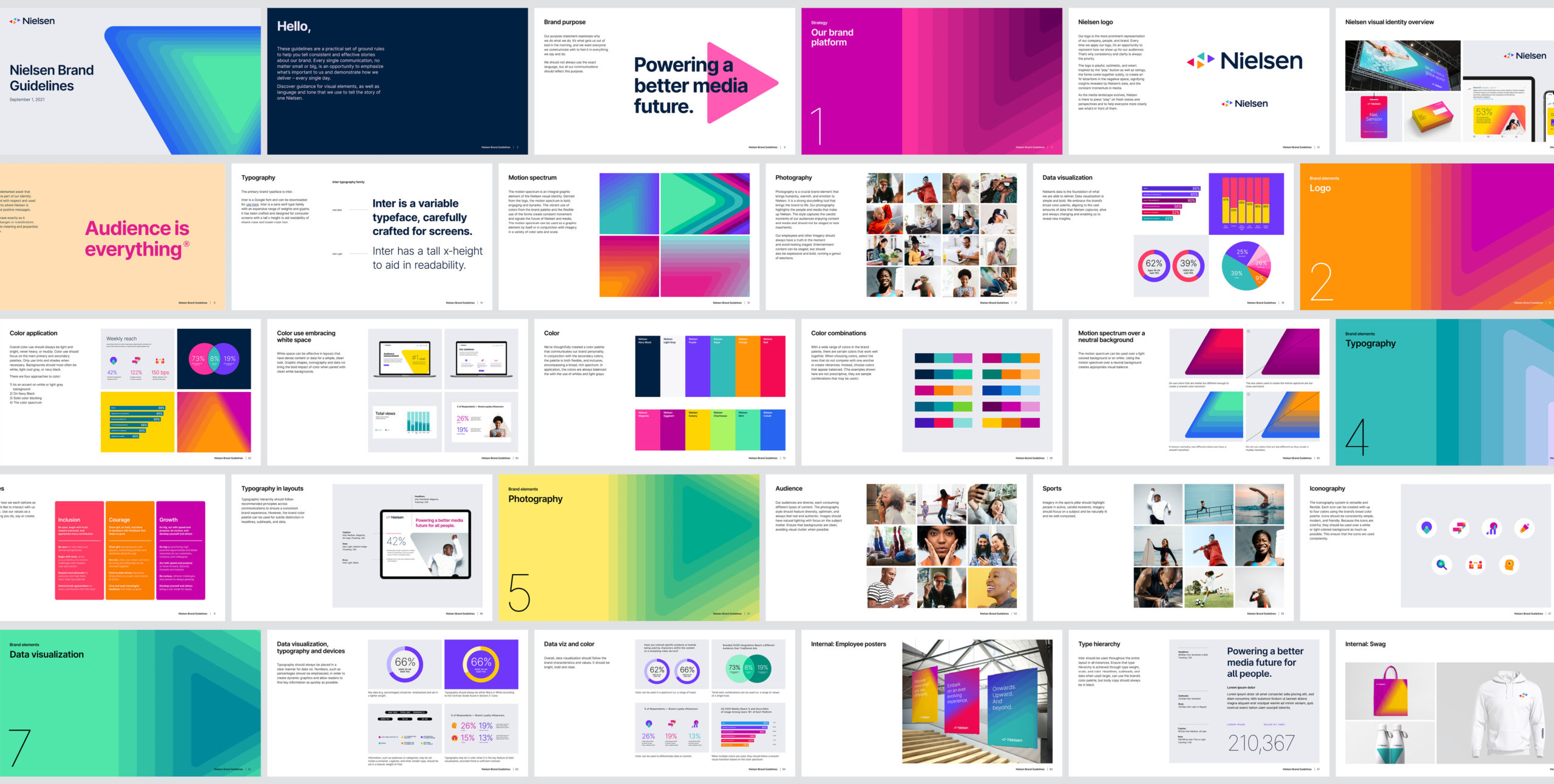
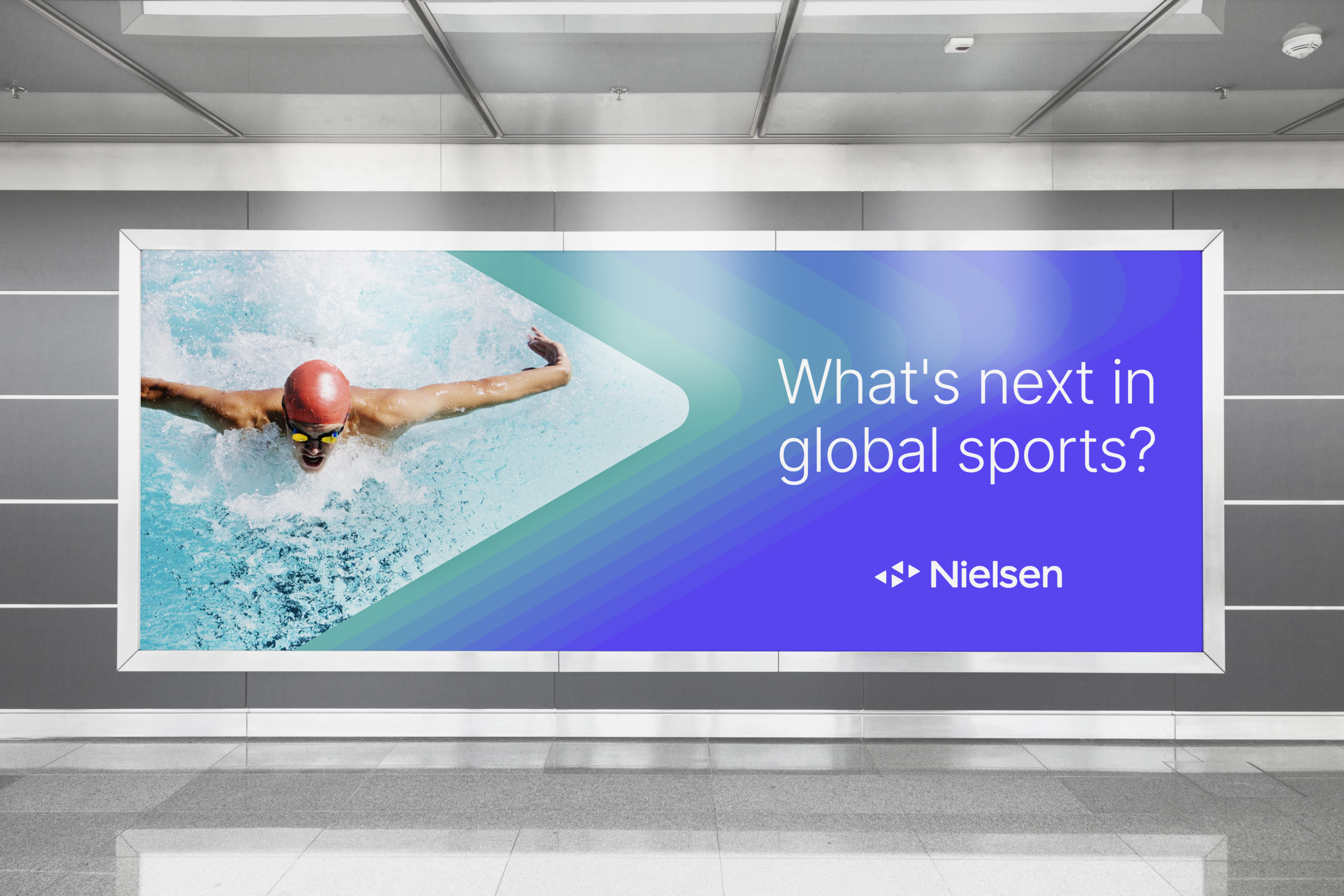
Nielsen's photography is a crucial brand element that conveys humanity, warmth and emotion; it is a robust storytelling tool that brings the brand to life. In the selection of audience moments and entertainment key art, the focus is to bring in authenticity and energy.