Kearney
Expertise with empathy
A brand refresh that highlights the authentic core of consulting—people
Challenge
A.T. Kearney is one of the world’s largest management consulting firms with more than 3,600 people across 40 countries. Its clients include more than three-quarters of the Fortune Global 500 and influential governments and non-profit organizations. But its brand wasn’t getting the recognition it deserved. When speaking to clients, it was clear they appreciated the firm, the people and their outstanding work, but they couldn’t identify a “signature” of the brand. It was challenging to identify a single, simple story about who Kearney is and why clients should care.
Insight
We conducted primary research, including qualitative interviews with clients, employees, firm Partners (also owners) and a quantitative survey of global C-suite executives. Paired with a deep dive into industry trends, market analysis and global business objectives, we uncovered a disconnect between the firm’s ambitions and its brand strategy.
The first step was to define a simple strategic brand platform with a focused positioning and set of principles to establish a unique idea, voice and experience. This led us to center the new branding around employees. Its people are real, relatable and refreshing—a truly original combination in the world of management consulting, which can otherwise be seen as elitist and arrogant.
Answer
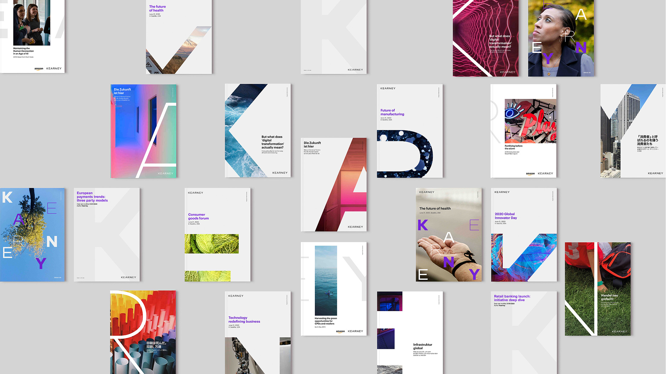
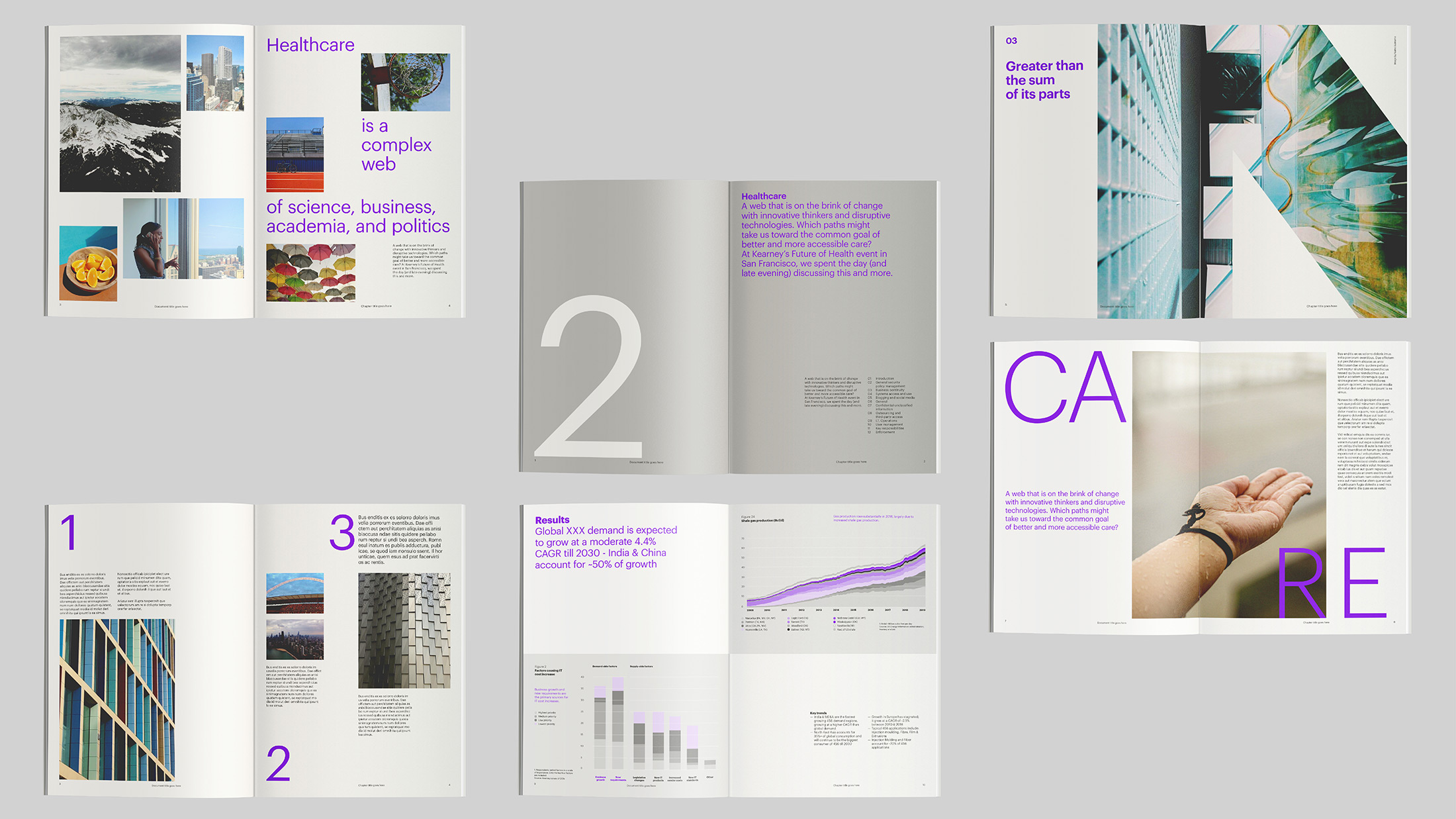
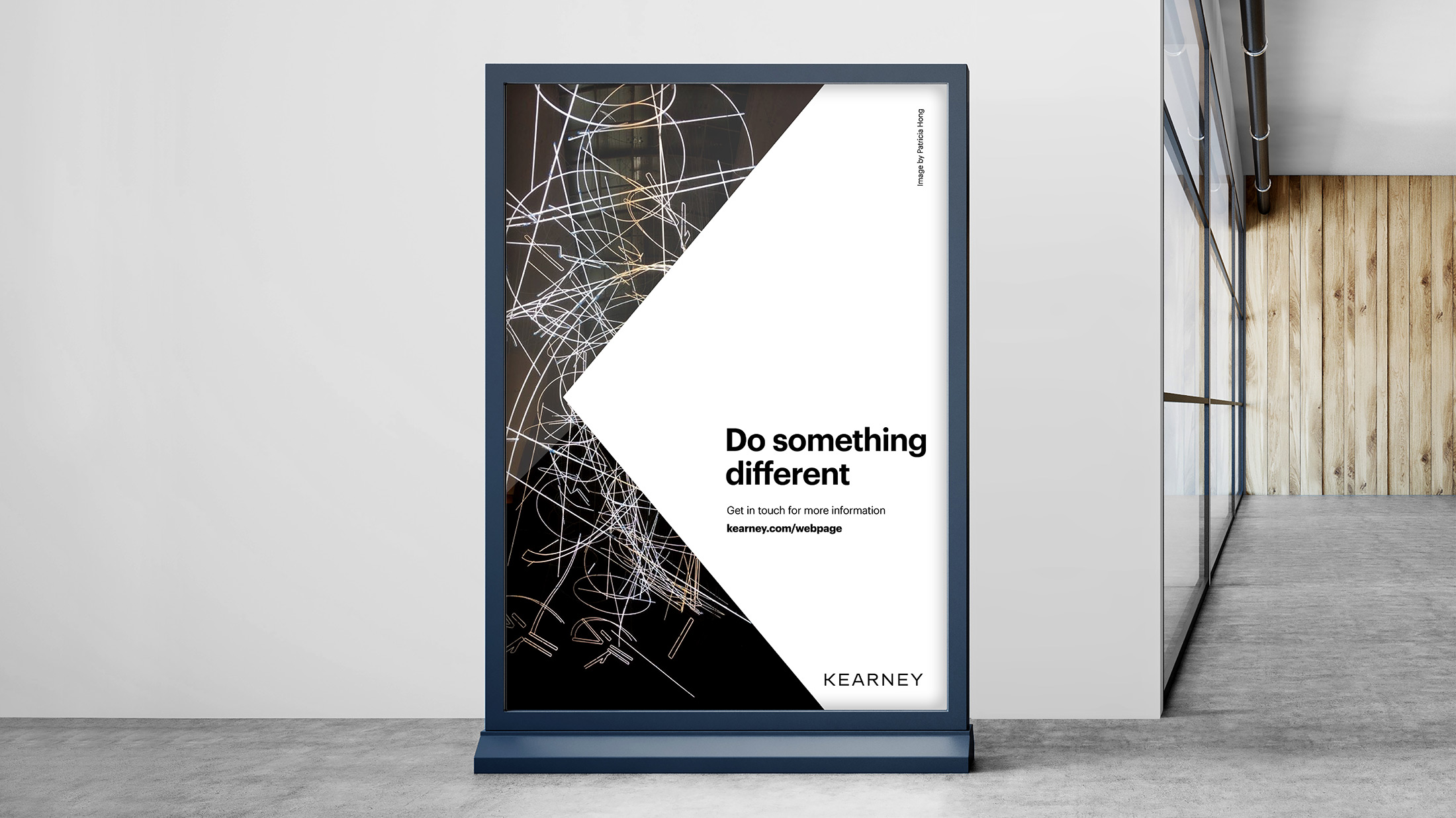
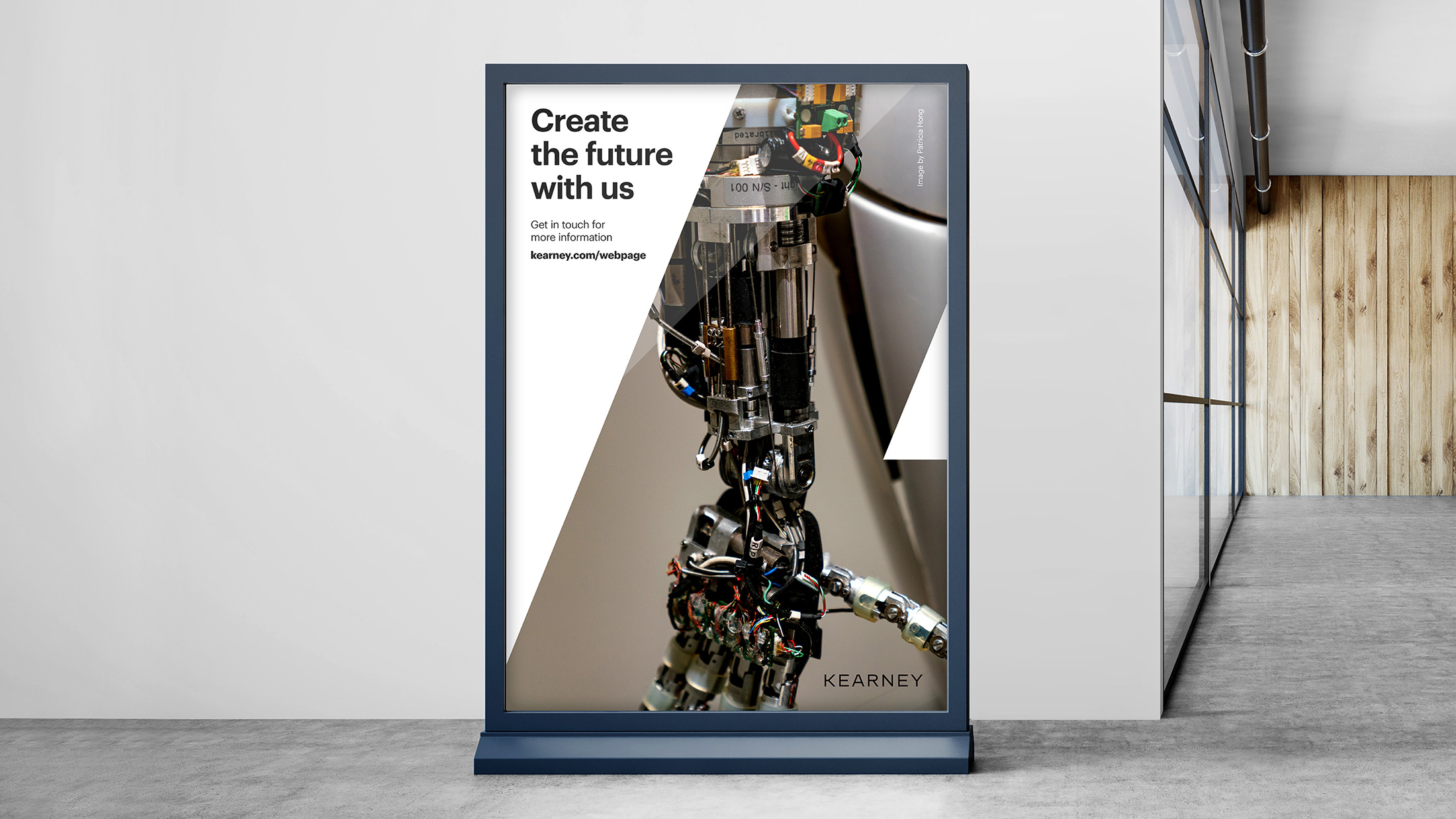
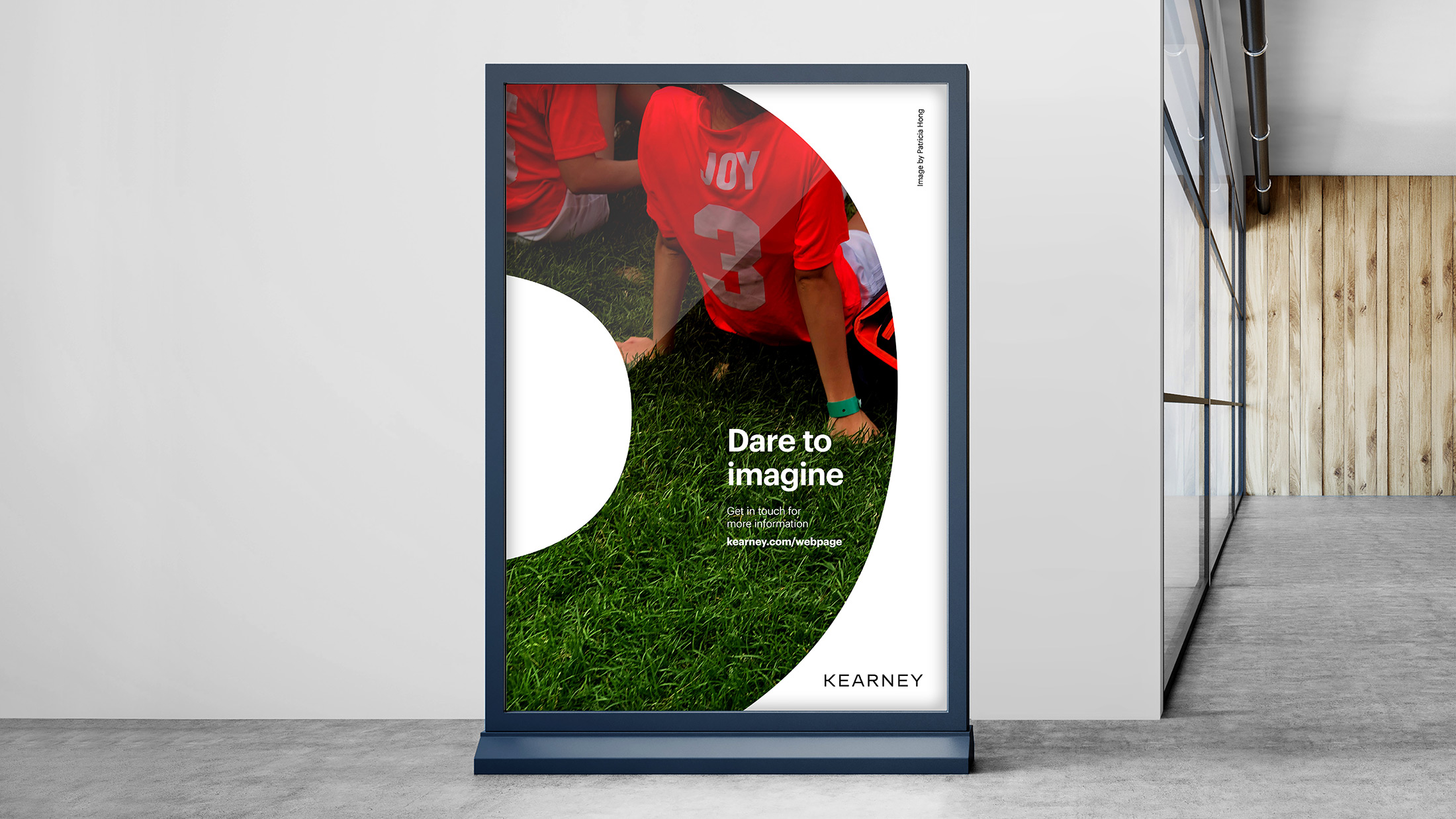
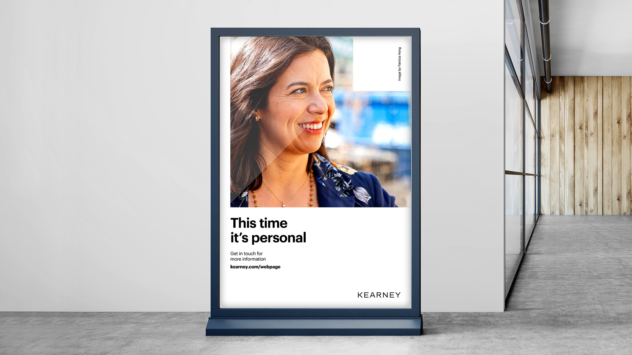
The brand strategy led to an elegantly fresh visual identity update. With an accent of purple, a timeless black and white system serves to highlight a new compelling approach to photography. With our encouragement, the firm chose to eliminate all stock images, replacing them with original photos taken by their people, bringing employees further into the brand spotlight.
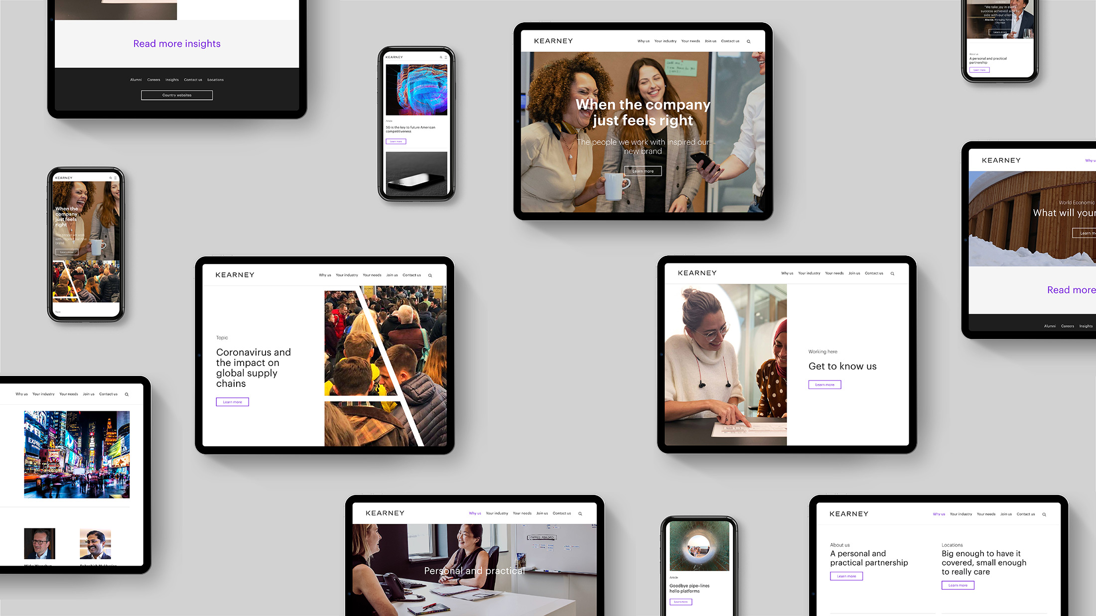
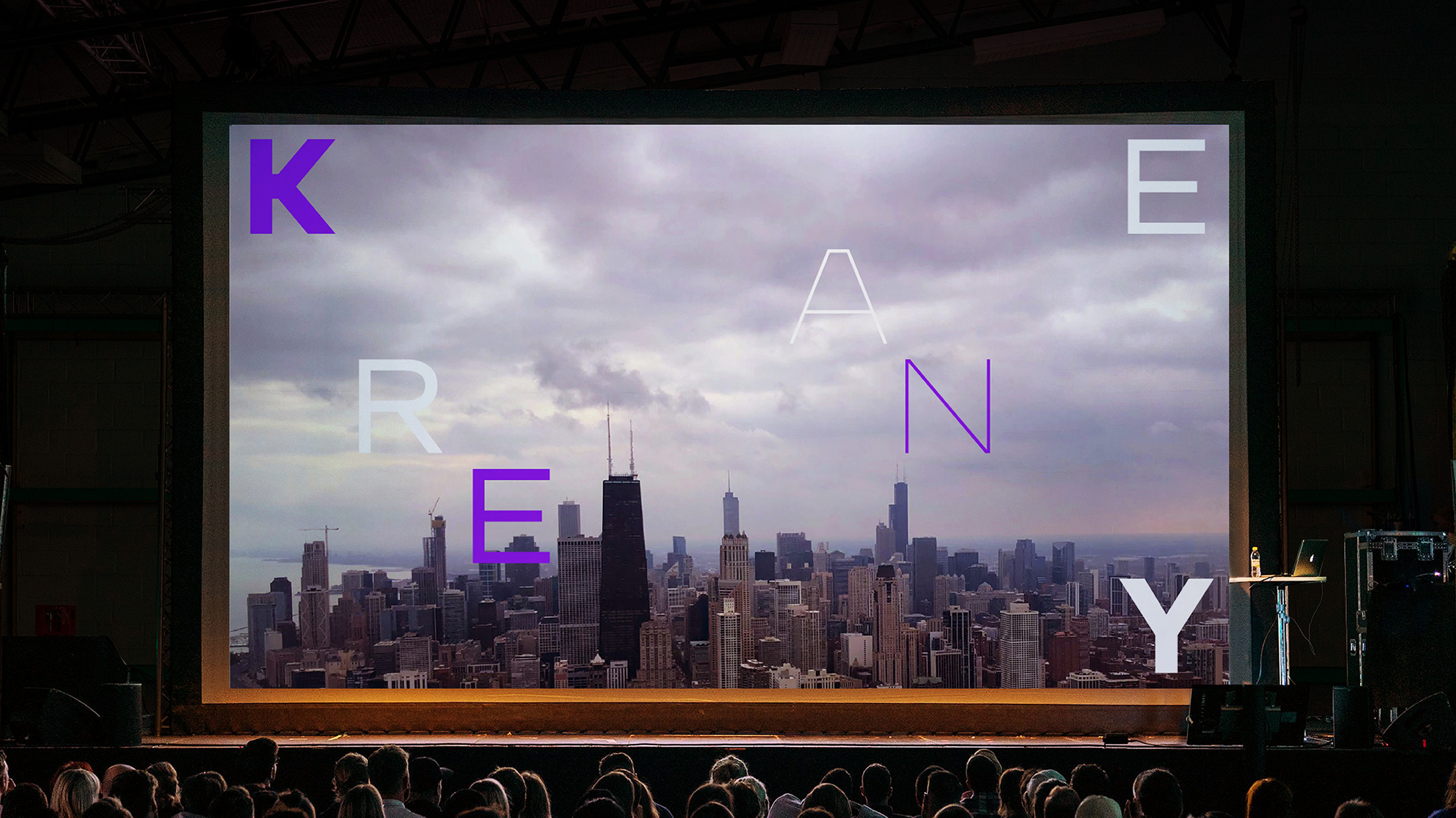
We extended the strategy, voice and design into compelling assets for a global launch in January 2020. A brand launch film featured Kearney employees in scenes that depict the raw, emotional moments we all experience at work. Website, social media presence, office design, events, and internal communications have been refreshed to tell Kearney’s story simply and powerfully.

Results
Our people have always been and will always be our brand, this new look and feel simply focuses on them.
Abby Klanecky, Partner and Chief Marketing Officer
