

Claris
Power to the problem solvers
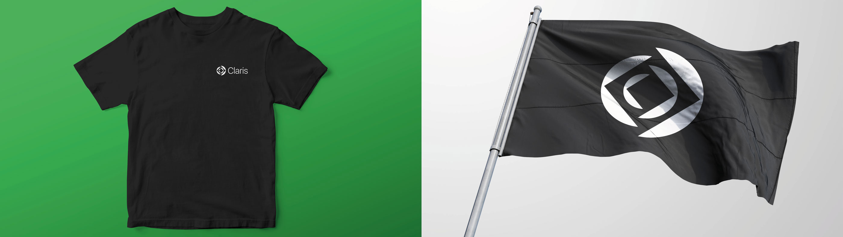
FileMaker is reborn as Claris
Challenge
FileMaker, a subsidiary of Apple, had been known for its rich history—The company created and defined the Workplace Innovation Platform and had grown to over 50,000 customers and more than one million end-users. However, with its component names of “File” and “Maker,” the name was too specific to span the customer experiences that the brand sought to create. With a new CEO and a new acquisition, FileMaker looked to reevaluate its brand positioning and identity. We only had one restriction—have everything ready in 120 days for the annual Developers Conference.
Insight
To expand the brand beyond the FileMaker product, it would need a new name, and we saw a unique opportunity to honor its legacy—in 1986, Claris began as an Apple subsidiary; in 1998, the company was renamed FileMaker, Inc. A return to the original name also underscores a commitment to the company’s mission of bringing “power to the problem solvers.” Claris is a powerful word on many levels, deriving from the Latin word ‘Clarus.’ It means clear, bright and shining, with an origin that gives it instant global relevance to customers around the world.
Answer
At its 24th annual DevCon, FileMaker unveiled a new chapter in the company’s history as Claris. We transformed the original brand into an accurate representation of its business offerings, its customers and its values. We refined and clarified a new category position, “Workplace Innovation Platform.” We then developed a unifying purpose and values that blend seamlessly as a North Star to rally teams worldwide. The new brand story is contemporary while remaining true to its heritage. The Claris rebrand is not only a homage to its roots but represents its technology today and in the future.


Results
The team at Siegel+Gale took on this project with as much enthusiasm and clarity as our team brings to our platform and mission. It was a fantastic partnership and the resulting brand identity is perfectly in line with our vision for the company.
Ann Monroe, VP of Worldwide Marketing & Customer Success, Claris