Novartis
The meaning of life (sciences)
Creating a more cohesive footprint across international divisions
Challenge
In 1996, Novartis was born of what was then the largest corporate merger in history. We not only created the name, identity, logo and positioning of the company but also worked to ensure a smooth integration of people and culture. By 2016, the company aimed to consolidate operations and create a more unified global brand across its three main divisions. Engaging a pharmaceutical workforce of 125,000 employees requires dedication, commitment and expertise, and Novartis once again approached our firm for help.
Insight
On the internal communication side, we conducted a series of interviews with leaders at Novartis who understand Novartis’ internal audiences and their needs. These interviews gave us a deeper understanding of what it looks like to communicate about culture change at Novartis successfully. We learned that to catch the attention of our internal audiences, we should speak in a voice that feels like Novartis while adding a little extra flavor. Insights from our research informed the themes, talking points, tone and audience-specific messages we built out.
Answer
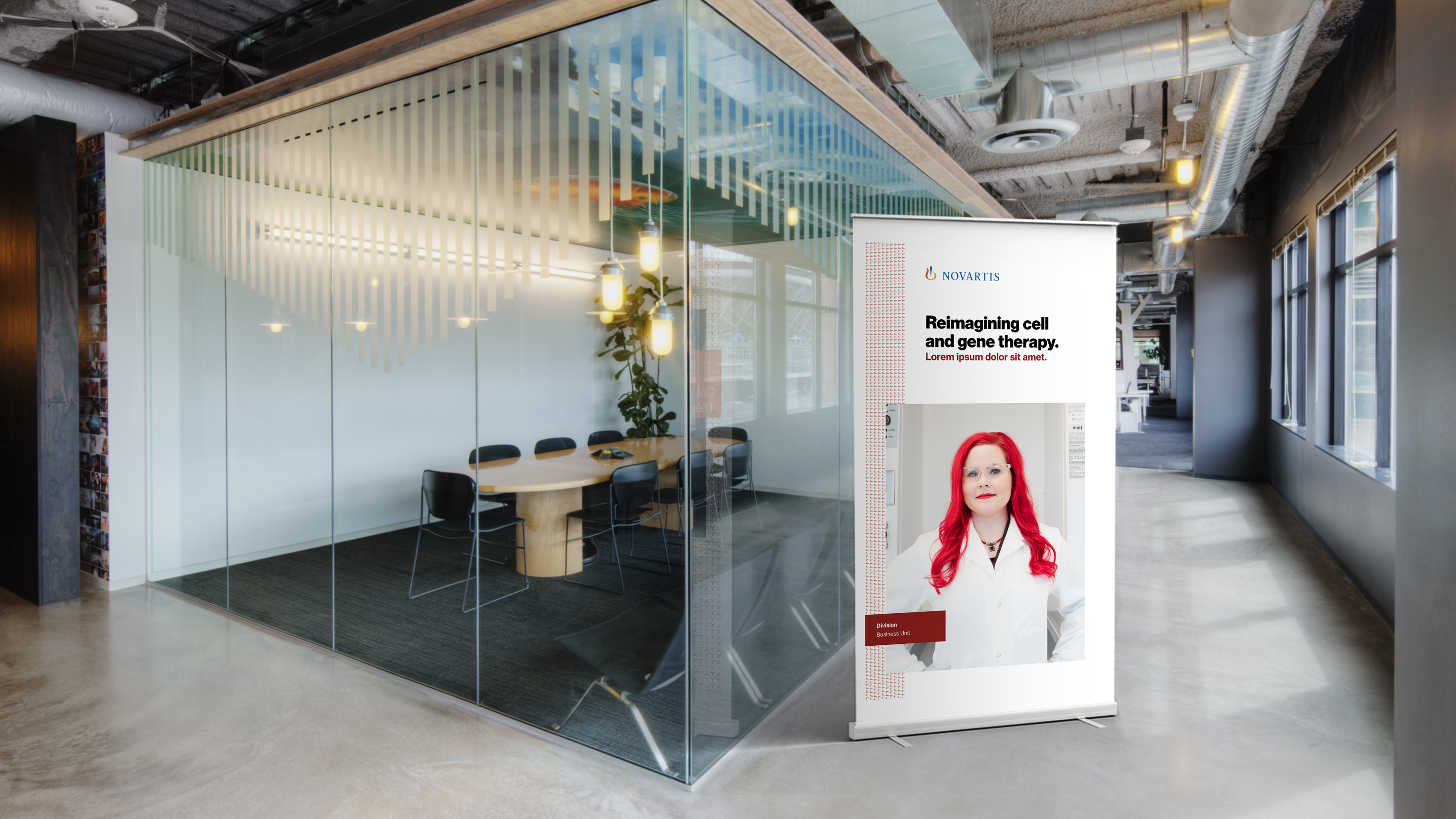
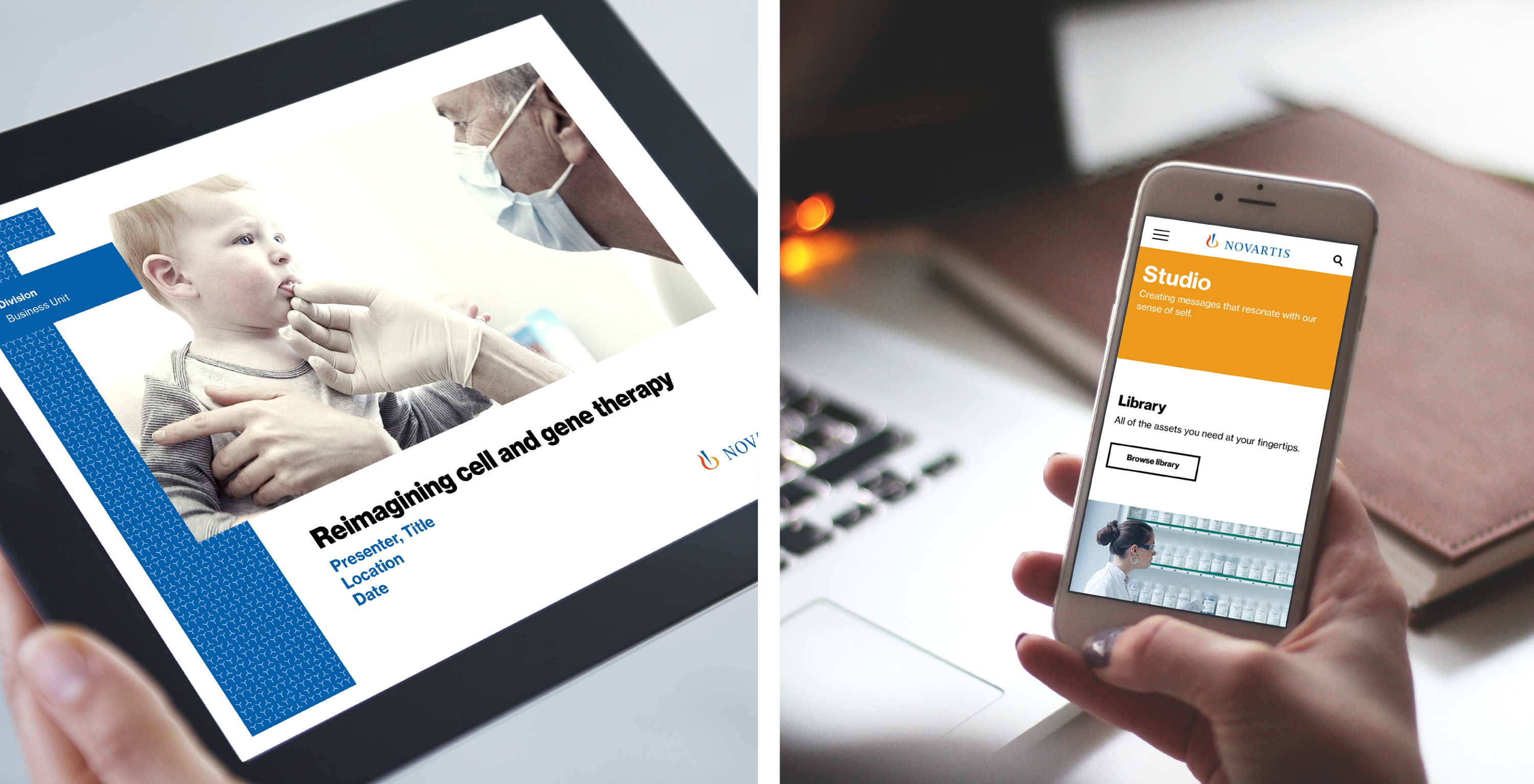
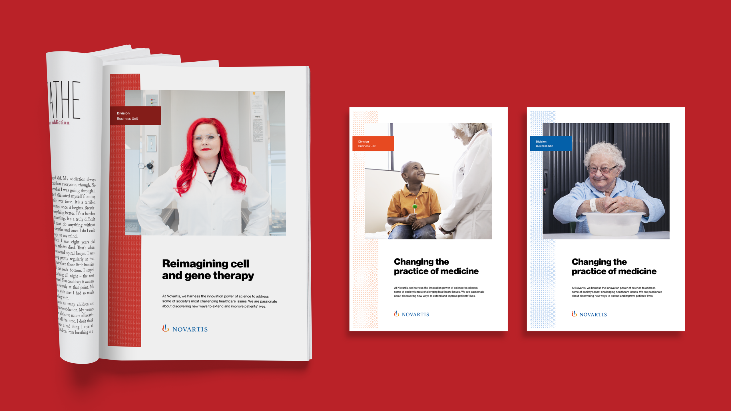
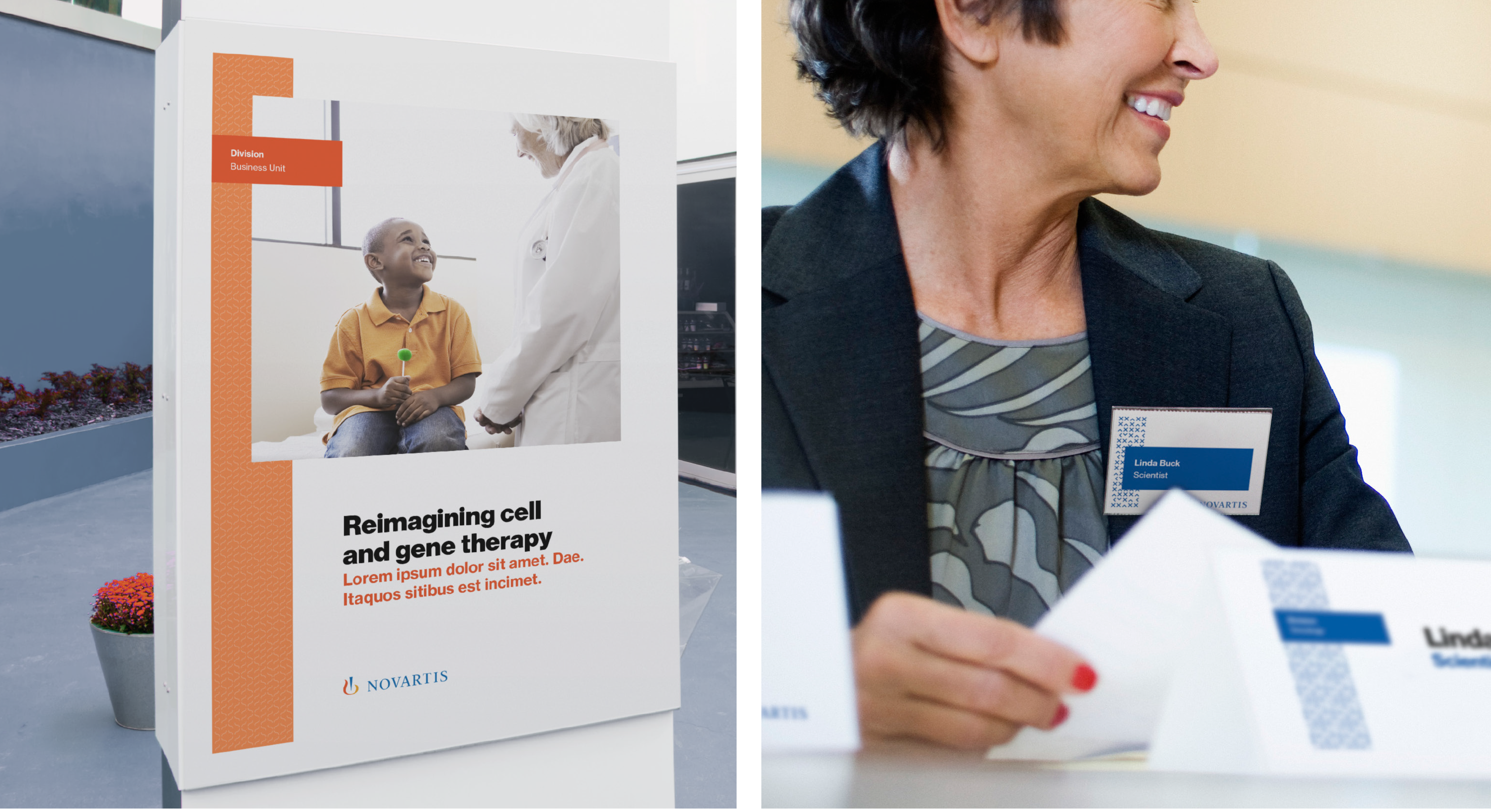
We reviewed and updated the Novartis positioning from simply that of a pharmaceutical company to an R&D-led life sciences company. We updated their corporate brand story, working with their internal communications team to build extensive messaging and employee engagement support tools. We overhauled their identity and visual system, updating our original logo for the digital age and rolling out new versions of key collateral and touchpoints–including a redesign of their global websites and crafting digital and social guidelines to ensure consistency.
As part of the rollout, we built a brand experience center for their global communications and marketing team which supported a philosophical change in how Novartis trained employees and agencies on their brand, to ensure consistency in brand and message around the world—delivering on their goal of global integration.