
IATA
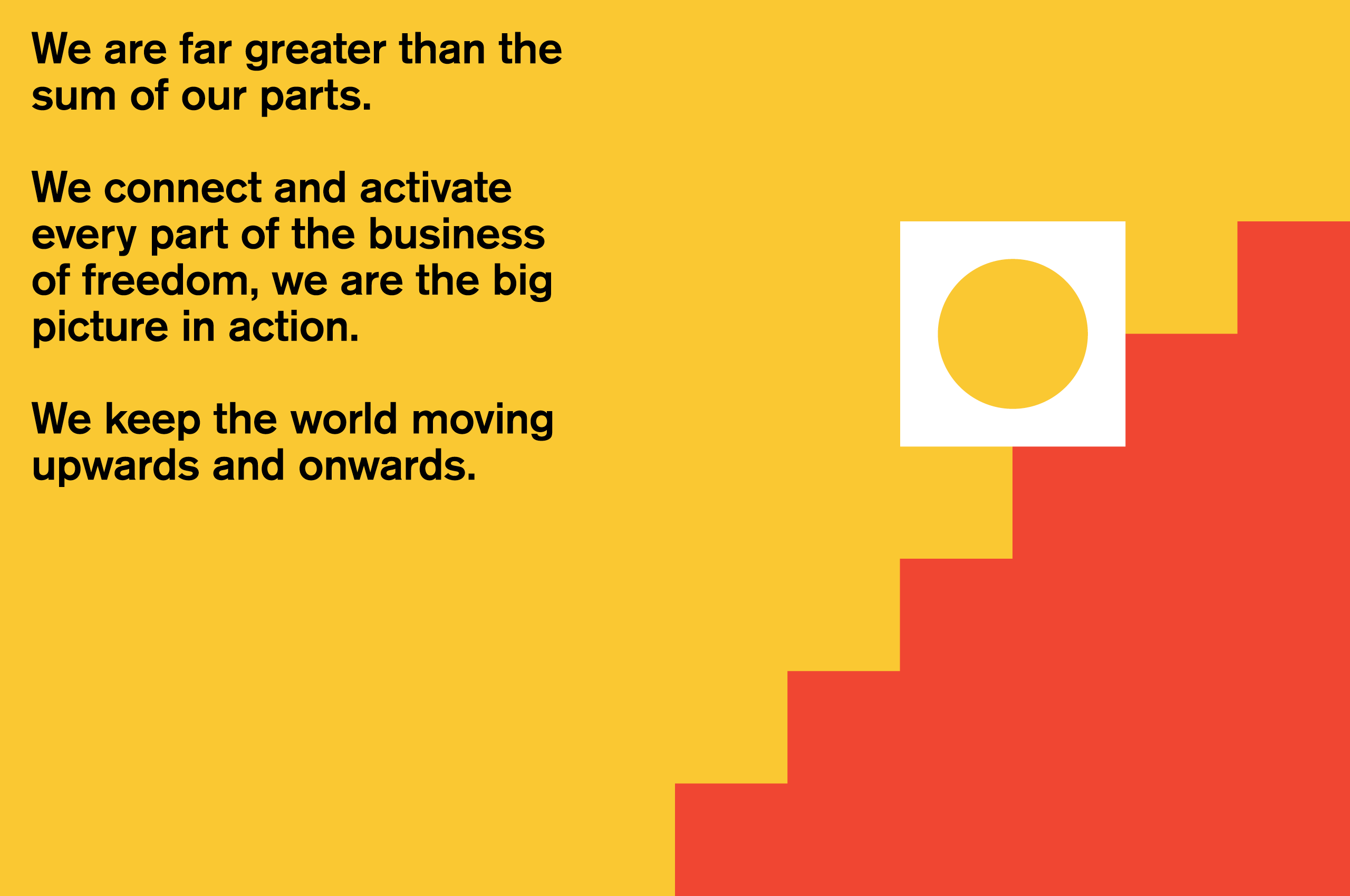
The sum plus the parts
Reflecting IATA’s importance in the world
Challenge
IATA is the trade association for world’s airlines, representing 290 airlines—82% of total air traffic. It is a crucial organization that keeps airlines and airports functioning. While it had a recognizable logo, IATA had operated as more than the sum of its parts, and needed to update its brand and visual identity to reflect its continued and future global importance.
Insight
We conducted a discovery phase that included 30 workshops in 7 countries, from Montreal to Amman, Geneva to Beijing. We spoke to 200 people—around 15% of those that work at IATA—ranging from Vice Presidents and sales people to pilots and product owners.
Coming out of the brand workshops we defined a strategy that was all about the big picture of global travel, and how IATA fits into it. The aim was to create a brand that was clear, simple, modern and efficient.
Answer
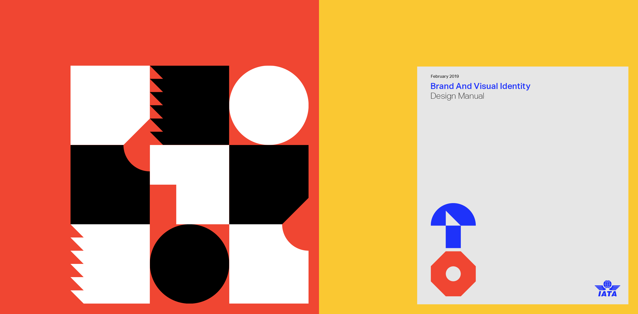
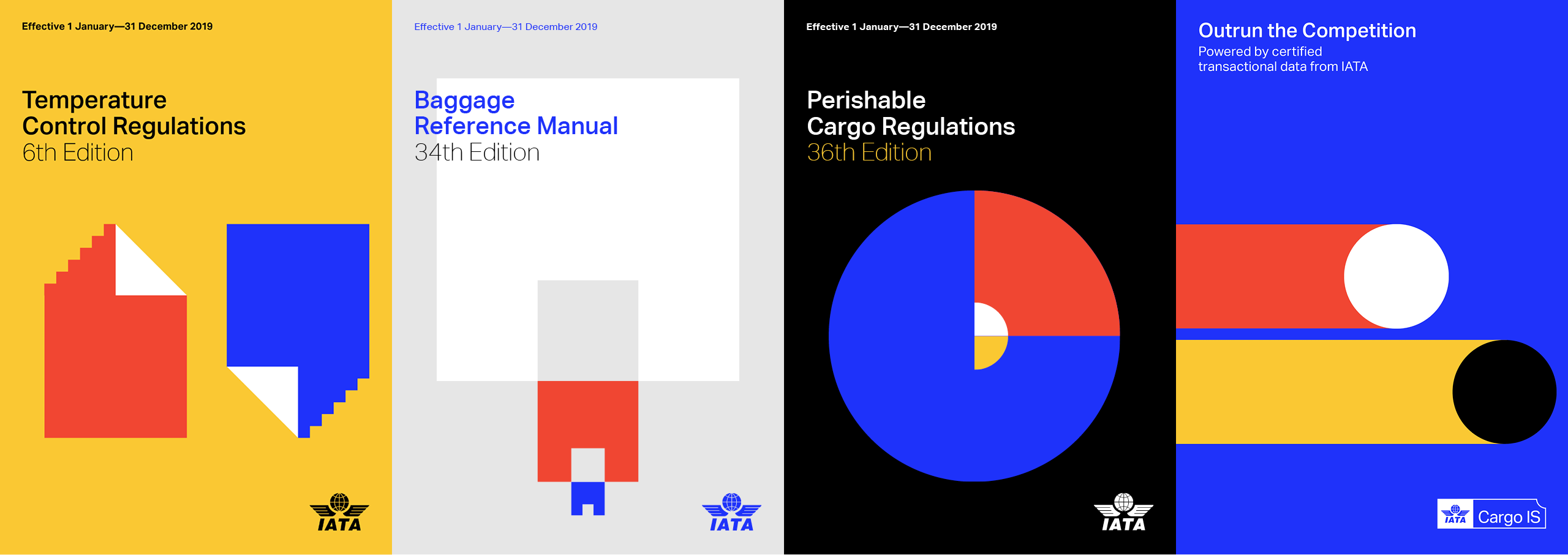
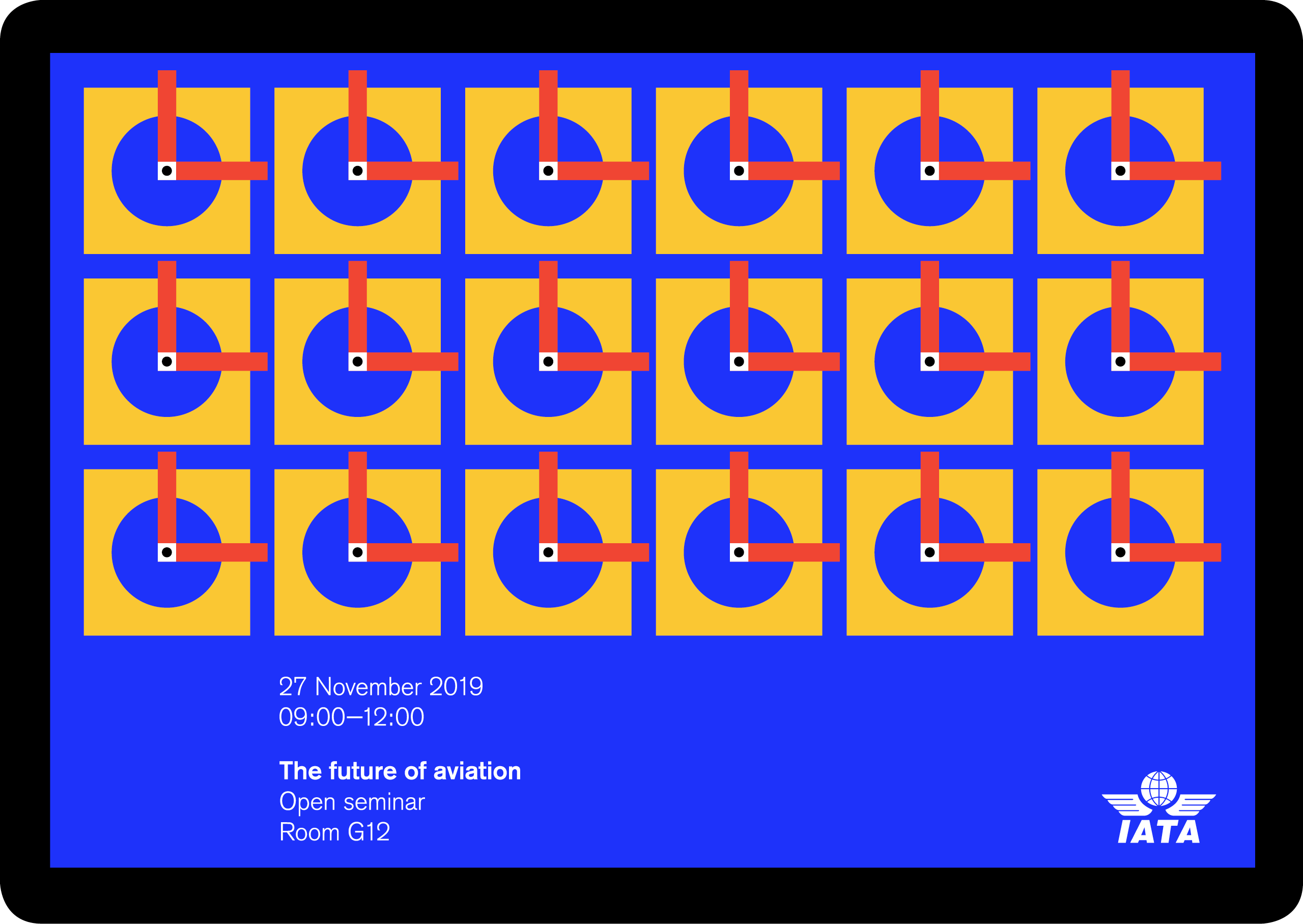
The bigger picture was expressed through interconnectivity, linking and uniting many separate components, reflecting what IATA does.
The new brand is built around twenty-eight component shapes that when combined are unique and ownable, and can be connected in a series of different ways.


Results
Siegel+Gale ran a collaborative project of research and design. What they gave us was a design strategy and assets that shout simplicity and modernity. But more than that, they helped us develop tools and templates that any staff member can fully use in their day-to-day work. Siegel+Gale examined audiences, motivations and goals, and throughout were clear, creative, responsive and purposeful.
Richard McCausland, Head of Brand, IATA