In SMPL Q+A, we interview practitioners on all things relevant to branding, design, and simplicity. Here, we speak with Sean Carney, Senior. Integrated Producer and Ryan Tinsley, Senior Designer about our rebranding work for Rigetti, a full-stack quantum computing company.
Why did Rigetti engage Siegel+Gale?
Sean Carney: Rigetti Computing is a leader in quantum, a fast-emerging sector of the computing industry. Their machines process big data in nanoseconds. Imagine quickly modeling a new vaccine or running the code for artificial intelligence. It sounds like far-future stuff. But this is science, not fiction—Rigetti has machines up and running that users can access via Amazon Web Services (AWS).
Their clients and partners were all missing that point: Rigetti is online with these amazing tools now.
“The Siegel+Gale team fully embraced who we are. They transformed complex ideas into simple yet innovative designs for our website, and brought our brand to life with a bold visual identity that will grow with us for years to come.”
– Lauren Rugani, VP Communications & Marketing
What was unique about this engagement?
SC: Rigetti asked Siegel+Gale to connect the dots—to tell the Rigetti story clearly and compellingly, starting with the digital experience.
That meant creating a partner-first, digital experience that is both notably innovative and remarkably clear, as well as designing a true visual system that stands out as distinctive within the marketplace.
The folks at Rigetti are cutting-edge thinkers and are used to working iteratively and they aren’t scared of unknowns. We took risks together and developed the user experience design collaboratively. Design and digital development—which we oversaw—were super fast.
SC: The particular challenge with this project was that we were asked to develop an MVP microsite with just a few pages to act as a bridge until the full site was complete. The MVP had to have a big visual impact, with bold design and interactive features. In the end, we wireframed, designed and coded the site in under four weeks—at the same time we were designing the full site!
It was a fun puzzle that we all enjoyed figuring out precisely what was essential.
What was the final concept behind the new design system? Any details that you would like to call out?
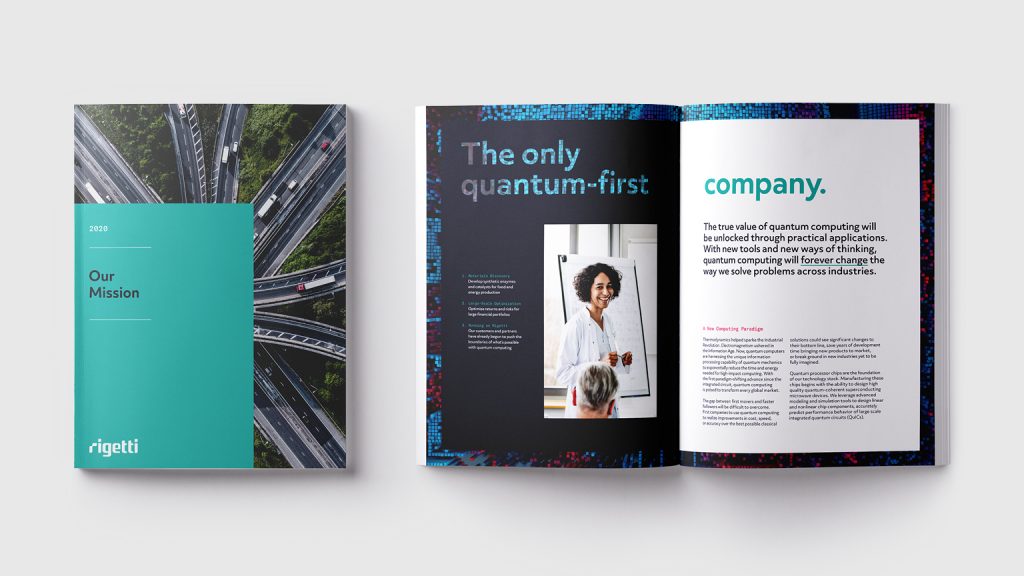
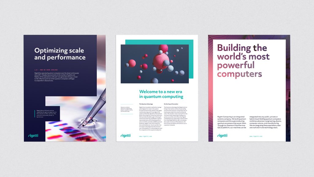
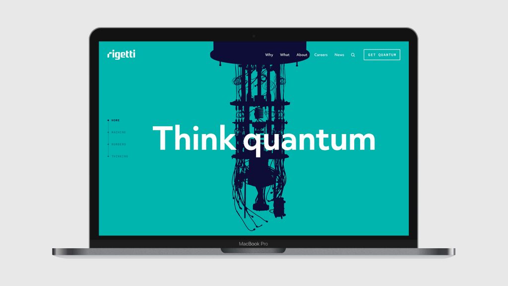
Ryan Tinsley: Building around the established Rigetti logotype, we focused on the evolution of supporting brand elements starting with their signature teal color. In a sea of blue competitors, we aimed at creating a more saturated teal that Rigetti would be able to own, as well as a bold secondary palette. We then constructed a modular grid system that would allow for flexible layouts with a focus on core colors, updated typography and textural use of imagery. This treatment of imagery helps further introduce the various focus areas in new, unexpected ways. We finished by providing a robust guideline system that provided further artistic direction on how to photograph employees, the physical space and hardware to create a cohesive modern brand.
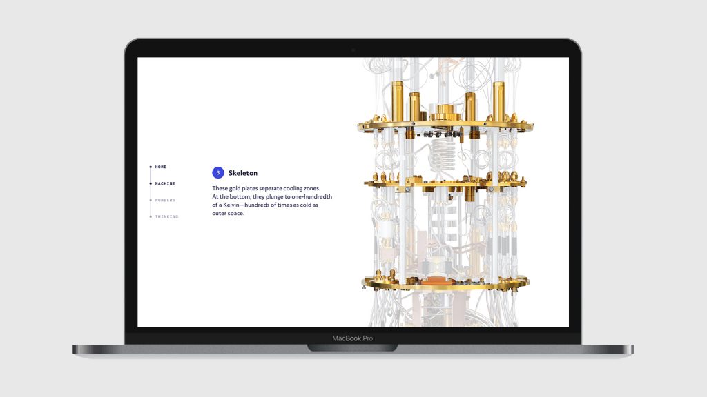
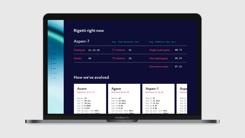
RT: To the average person, quantum technology may seem like an invention of science fiction, yet it is very real and advancing as we speak. Rigetti creates beautifully complex machines that are works of art in their own right, and we wanted to showcase these machines front and center on the homepage. To debunk the sci-fi narrative, visitors are first introduced to an illustrated silhouette (fiction) that turns into the real machine (science) and are then taken on a journey through a scrollable animation that explains the inner workings. This element is the foundation of the site’s design. It continues to introduce live statistics of active machines, versions of older builds, and various case studies on consecutive pages regarding Rigetti’s hardware and software.
Where did Rigetti focus their launch efforts, and why?
SC: Everyone knows everyone else in quantum computing, or so it seems. In February of this year, Rigetti invited quantum insiders to Rigetti Advantage 2020 —an all-day, quantum computing industry conference. They unveiled the new strategy, design system and MVP site that we created, along with an array of new products and capabilities. It was a compelling presentation. Rigetti’s partners carried the message from there—it was quite effective and organic in that way.

