In SMPL Q+A, we interview our practitioners on all things relevant to branding, design and simplicity. Here, we speak with our experts about our work with Quicken, maker of America’s best-selling personal finance software. For 40 years, more than 20 million customers have relied on Quicken to help them take control of their finances and lead healthier financial lives. (Learn more about the evolution here.)

Account Management
Why did Quicken engage Siegel+Gale?
Kaitlin Smith: Quicken approached Siegel+Gale to revitalize its brand. With over 20 million customers over the past 40 years, the Quicken brand was highly recognizable, with a strong following of committed customers who depend on Quicken products to manage their financial lives. The Quicken team wanted the visual identity to reflect the current state of the brand and signal future growth, with cloud-based products leading the way. Siegel+Gale had done previous brand refreshes for Quicken over the years, but this new challenge required a more comprehensive reimagining of their brand — an exciting opportunity we were thrilled to be a part of.
Strategy
Can you explain the new brand strategy?
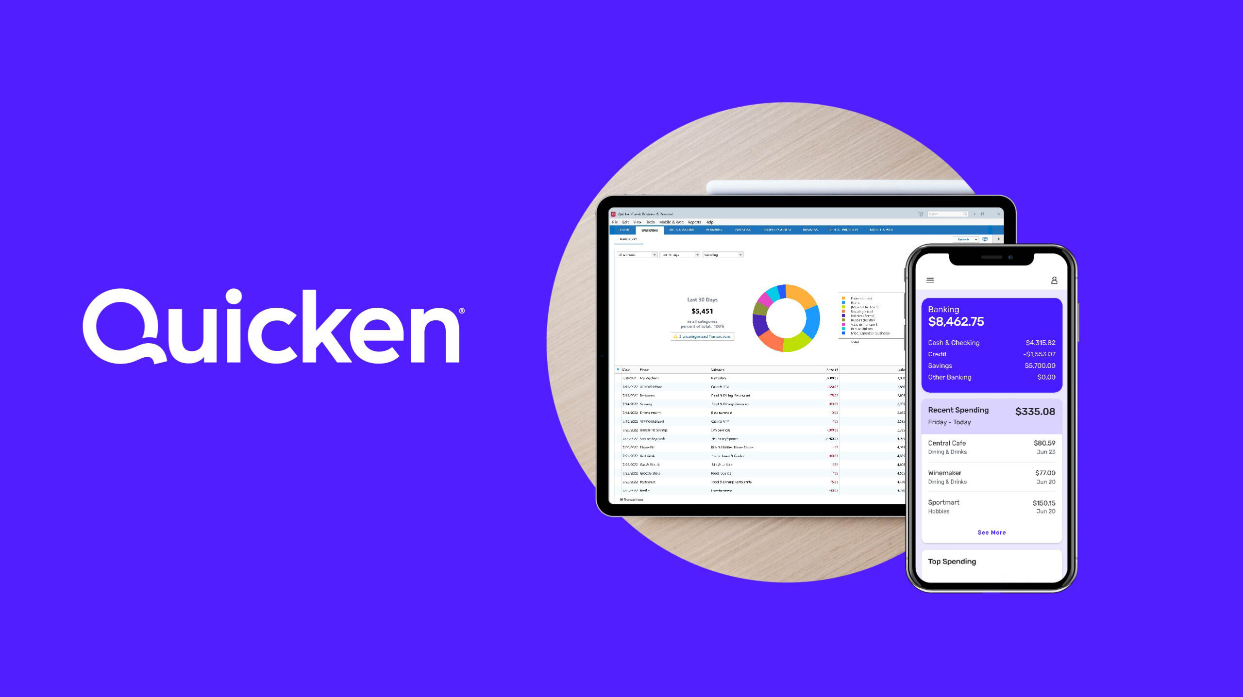
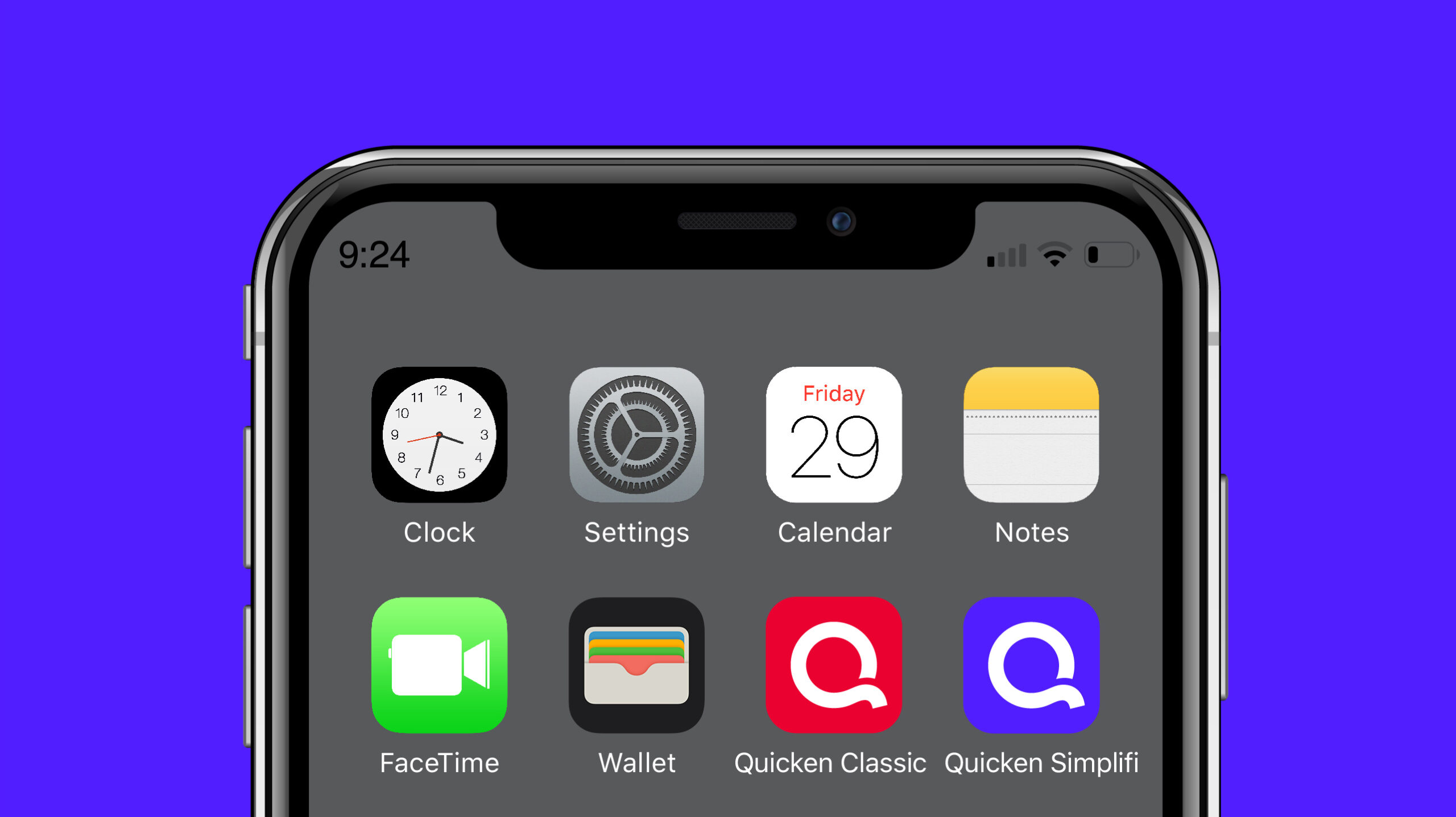
K.S.: To achieve their business goals and modernize the brand’s visual identity, the Quicken team first needed a streamlined brand architecture. To create an intuitive, future-facing solution, we leaned into the trust earned over time from the time-tested Quicken brand and the recent equity garnered by their cloud-based Simplifi product brand. The Quicken brand was elevated to be both the company name and lead name across all product offerings.
The fresh blue color from Quicken Simplifi was leveraged to be the primary color for the company-level brand and all future products. For continuity and clarity, an updated version of the legacy red color associated with the original brand was retained for all desktop software products. By combining a nod to the past with a lean into the future, Siegel+Gale provided the desired stability and recognizability for existing customers alongside a fresh new look to pave the future path for the company.
Insights
What role did research play in this partnership?
Kristen Berry-Owen: By engaging potential customers from the younger generation as well as loyal customers familiar with Quicken, we were able to pressure-test our design options and understand which delivers the inherent equity to support the future vision of Quicken. Research respondents evaluated design concepts on metrics, such as bold, fresh, modern, simple, smart and fit for the brand and product offerings. Through research, we were able to build consensus around a design choice that delivers the desired brand characteristics to the target audiences.
Design
What was the concept behind the new visual identity? Any inspiration you would like to call out?
Mei Wing Chan: Our brief was to take a digital-first approach to the identity and build on the success of the Quicken Simplifi product, while retaining the trust earned over four decades. As a result, our creative design execution leans into a modern, geometric language for the identity and visual system which translates well on digital platforms. Front of mind was also ensuring that simplicity and ease-of-use for customers was at the heart of the brand experience.
How was the new logo developed?
M.W.C.: For the identity, the ‘Q’ from Quicken takes on a circular shape representing a complete and all-compassing form, while the tail of the letter signals motion and forward progress. In addition, the ‘Q’ becomes a graphic element in the visual system, where it places customers at the center to suggest care and trust. This circular shape is echoed elsewhere in the identity system, which can be seen in buttons, radius corners and containers. The color was selected to be unique in the competitive landscape, where its violet tone is a combination of the original Quicken red and the blue from Simplifi.
Activation
How is Quicken activating the new brand, and how does it help to signal their future?
K.S.: We admire Quicken’s commitment to bringing existing, loyal customers along this brand refresh journey. From day one, through activation, keeping current customers at the center of the work has helped ensure both clarity and appreciation for their loyalty. Existing customers were introduced to the new brand before it was fully rolled out across marketing, website and product experiences–an excellent demonstration of how much Quicken cares about their customers and thinks of them as a vital part of their community.
With existing customers as the foundation, the refreshed brand now serves as a warm welcome to new customers who can better see themselves in the modern reflection of the company, with the reassurance and stability that only Quicken can credibly own in the ever-changing marketplace of personal finance software.
Updating the visual identity for a 40-year-old brand was an opportunity we had to get right. We wanted to honor Quicken’s past while signaling our exciting future, with web & mobile products leading the way. We also needed a brand architecture that was built with our future growth in mind. Siegel+Gale helped us accomplish both with a very thoughtful approach.”
—Tina Lin, Director, Product Marketing, Brand & Channels, Quicken