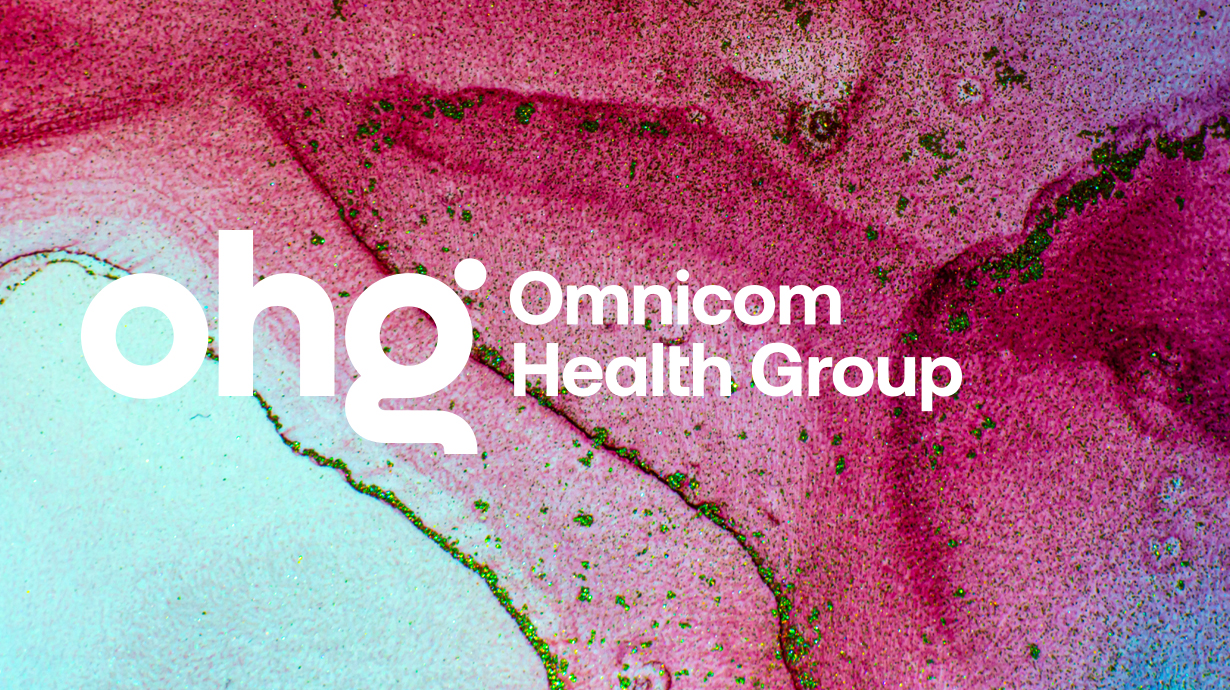
In SMPL Q+A, we interview our practitioners on all things relevant to branding, design and simplicity. Here, we speak with our experts about our work with Omnicom Health Group (OHG). OHG is a global collective of diverse healthcare marketing and communications companies. In July 2023, OHG unveiled its rebranding efforts, debuting a new logo and design elements as well as prioritizing a brand narrative that clarifies the complexity of the network’s portfolio for clients and employees alike.
Strategy
Why did Omnicom Health Group (OHG) engage Siegel+Gale?
Katie Conway, General Manager, West Coast: In the past, OHG operated as a traditional holding company and hadn’t invested in defining and communicating its brand. But when Matt McNally joined as CEO twelve months ago, he brought a bold ambition to be the most networked global health network. To achieve that vision, they needed a brand that would clearly articulate what OHG does and the unique value it provides.
How does the new brand narrative elevate the positioning of OHG?
Katie Conway, General Manager, West Coast: To inform the narrative development, we did listening sessions with employees from across the 30,000+ person network. In those conversations, we heard some concern that OHG, as the holding company, was coming in to take over. But that wasn’t the case at all. In fact, Matt and the leadership team believed it was the differences within OHG that drove its impact—and this is what the narrative captures. It celebrates the unique agencies and individuals within the network, positioning OHG not as the center and administrator but as the foundation and connector that creates unexpected connections across agencies, individuals and clients to create innovative and impactful solutions.
Design
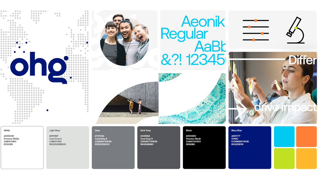
What was the concept behind the logo & visual identity? Any inspiration you would like to call out?
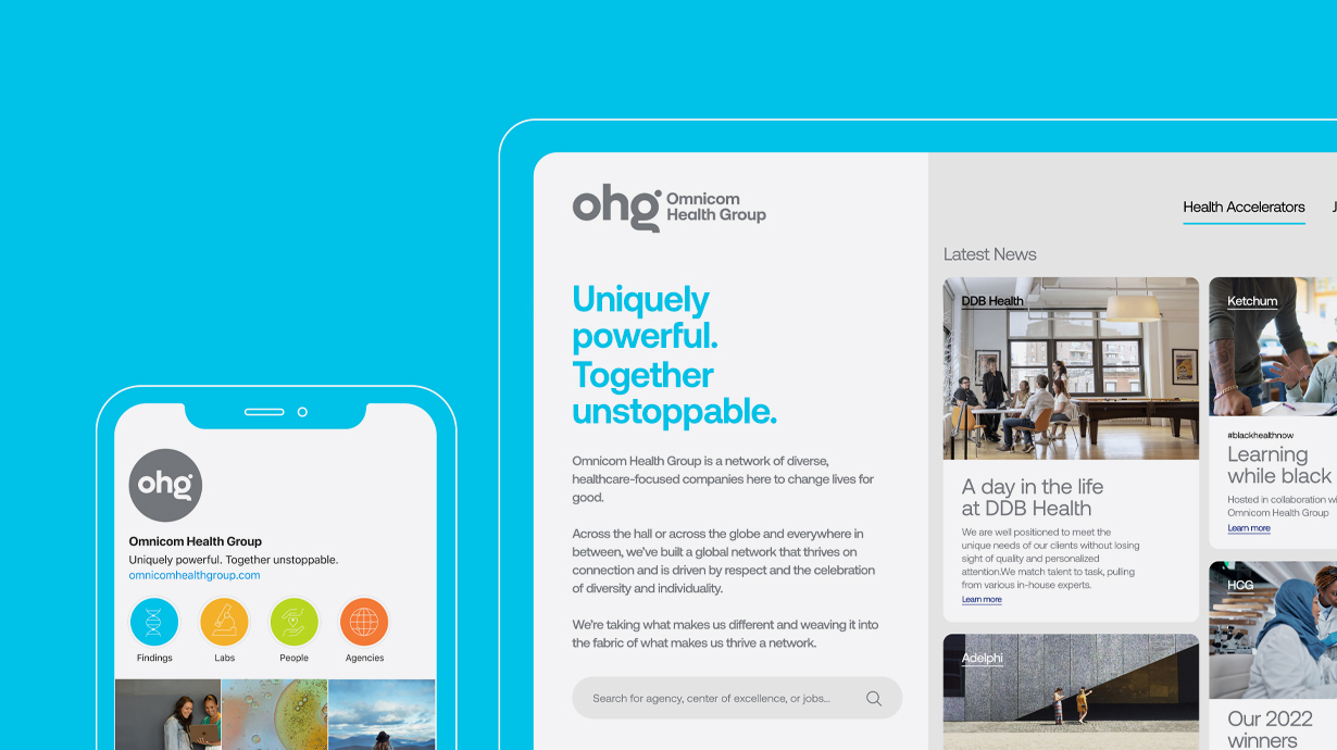
Simrit Brar, Creative Director: We were very inspired by the positioning: “Uniquely powerful. Together unstoppable”. It captures that each agency and individual at OHG brings their best self and uniqueness, but together, they think bigger and create something exceptional.
This, when translated to the design approach, led to “connected rhythms”: By bouncing ideas off one another, we progress further and grow faster. Each of our rhythms has its own beat, but together, they connect and iterate to form new, more innovative patterns and tempos. These rhythms start with each of us and move outwards to combine and create new beats every day and everywhere.
We wanted the visual system to balance humanity with science in a way that felt like it had moments of boldness and the right amount of restraint since it had to flex well for audiences that were both employees at various agencies but also a range of health clients. This was important as OHG is a network with many agencies with unique identities. It was important that OHG not compete with them.

How does the new brand identity reflect OHG’s commitment to being the best healthcare agency network in the world?
Simrit Brar: OHG’s new brand identity reflects its ambition and commitment to its integrated, diverse teams and new partnerships. From the repetitive circular element in the logo to the bold, rhythmic visual system, the design language for OHG became approachable and energetic, capturing both humanity and the power of the collective.
To learn more about our partnership with OHG, tune into our Siegel+Gale Says podcast for a conversation that explores how to utilize brand to implement a CEO’s new ambition.