
Taurus
Building advantage
Refining a brand for growth: From a Swiss start-up to an international leader
Challenge
Founded in April 2018, Taurus was born from a vision to simplify and accelerate access to blockchain-based markets. With one unified platform, its clients can manage any digital asset: cryptocurrencies, tokenized securities, and digital currencies. Experiencing rapid growth, from start-up to more than 50% market share within three years in its native Switzerland, the brand was in a unique position. However, with plans to develop into a global leader, Taurus needed a solid brand foundation.
Insight
This project was a true collaboration. With founding partners and CMO heavily aligned on their purpose and values and involved in every aspect of the business, they could provide an in-depth snapshot of the climate and a deep understanding of not just Taurus but its customers.
This knowledge allowed us to uncover that conveying trust was vital, as was demonstrating the organization’s level of expertise in both Finance, Technology and Regulation. We focused on the information that revealed the true value to Taurus’ customers–the speed and ease of offering digital asset advantage.
Answer
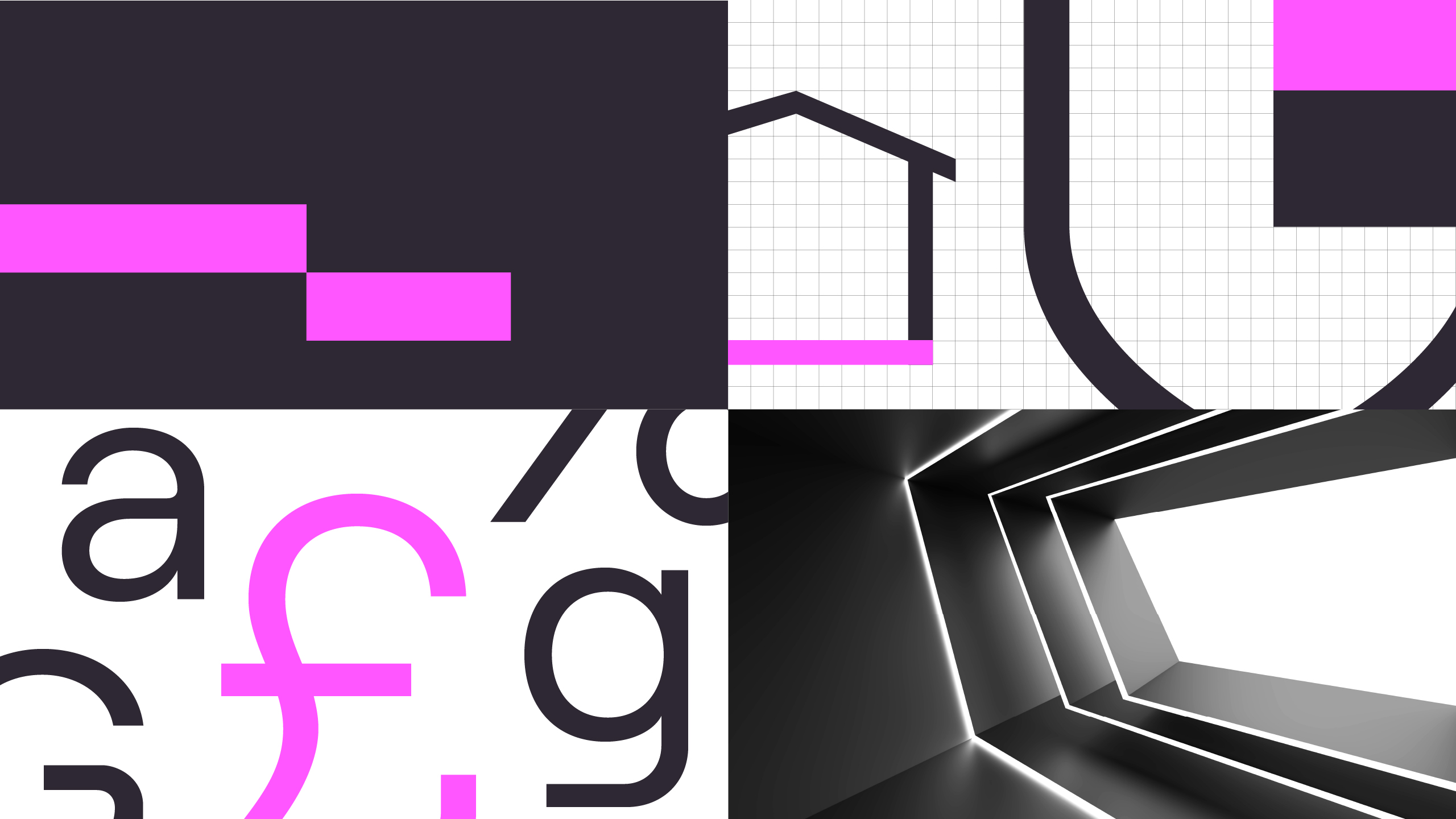
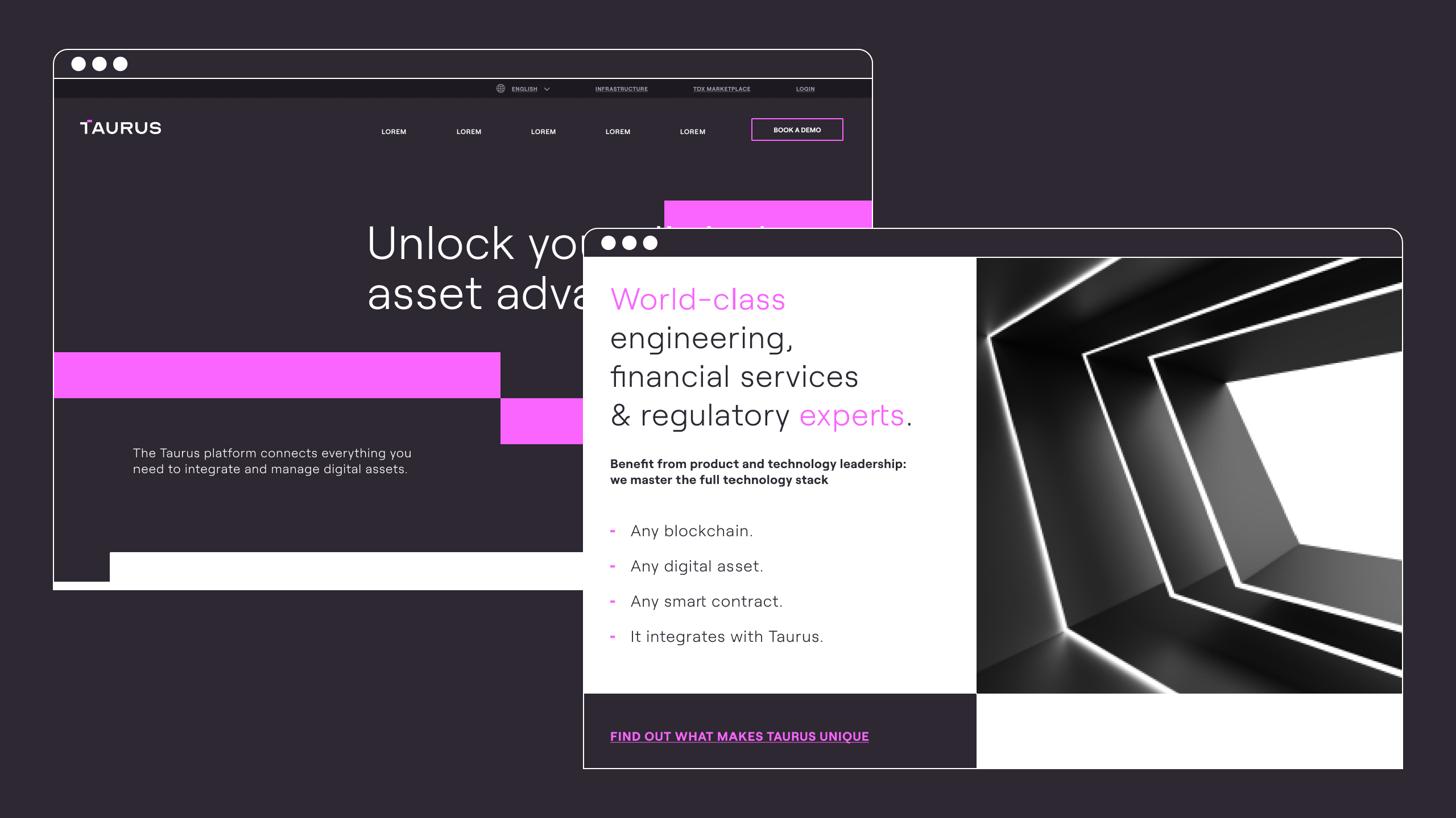
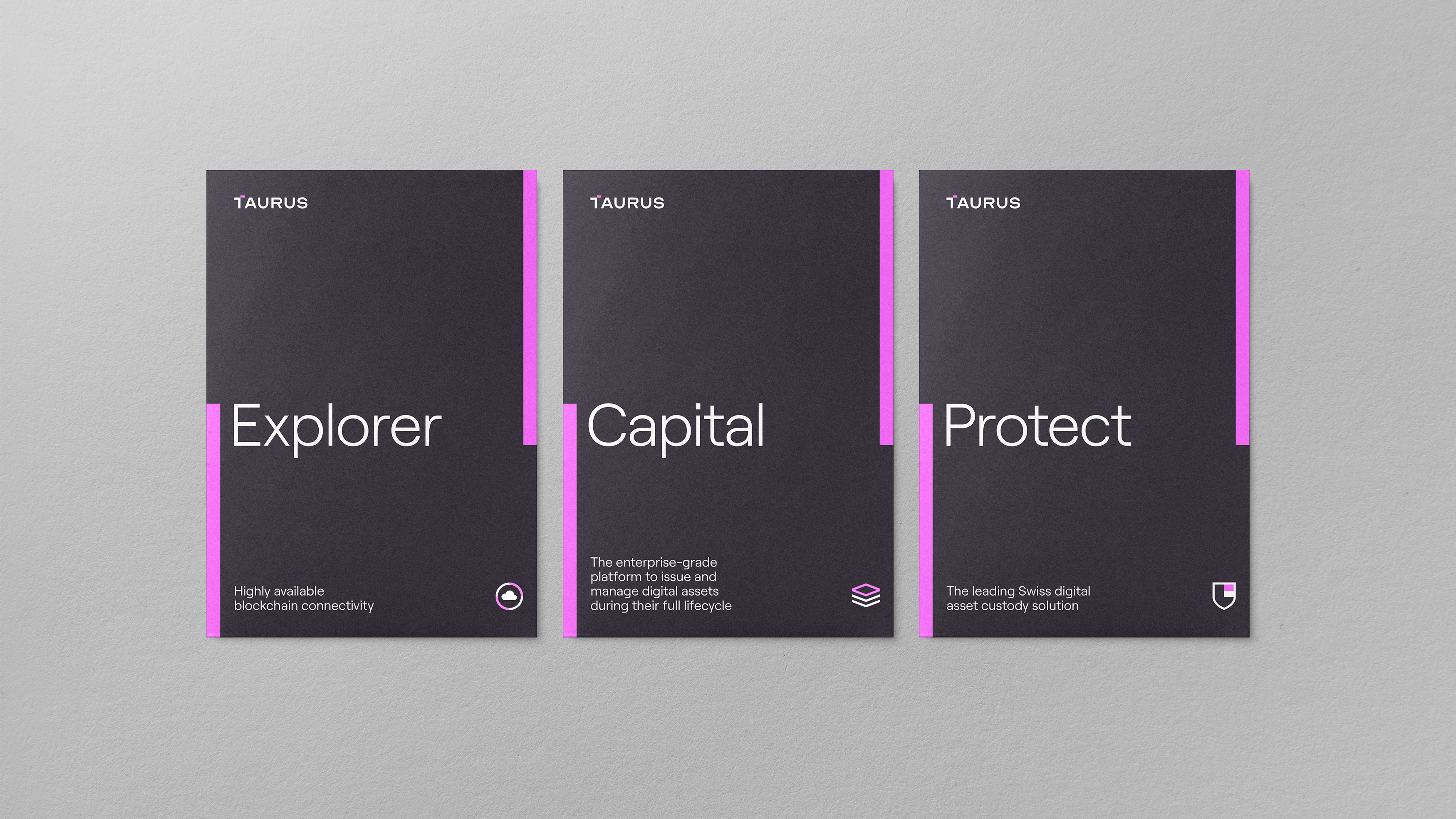
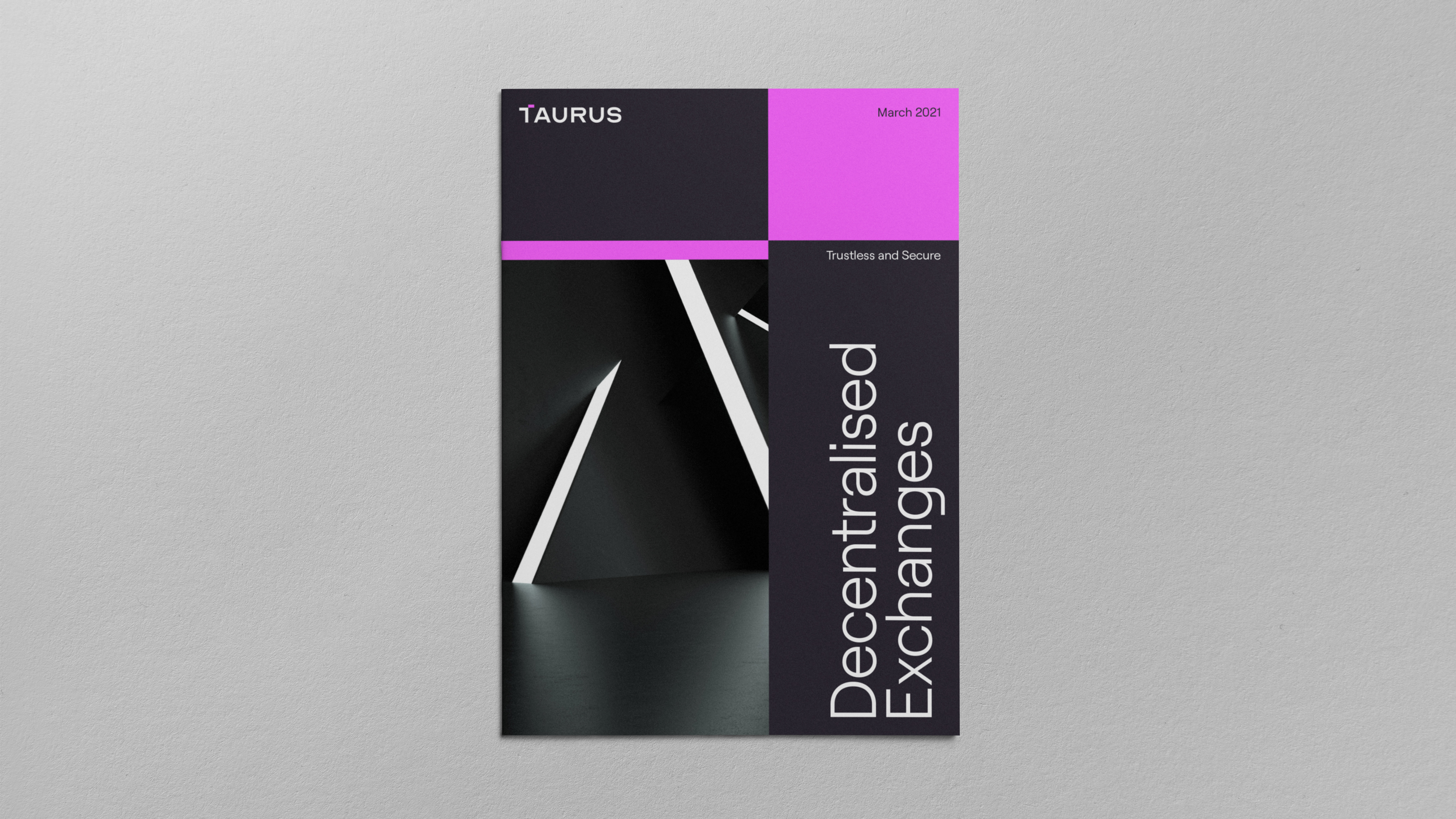
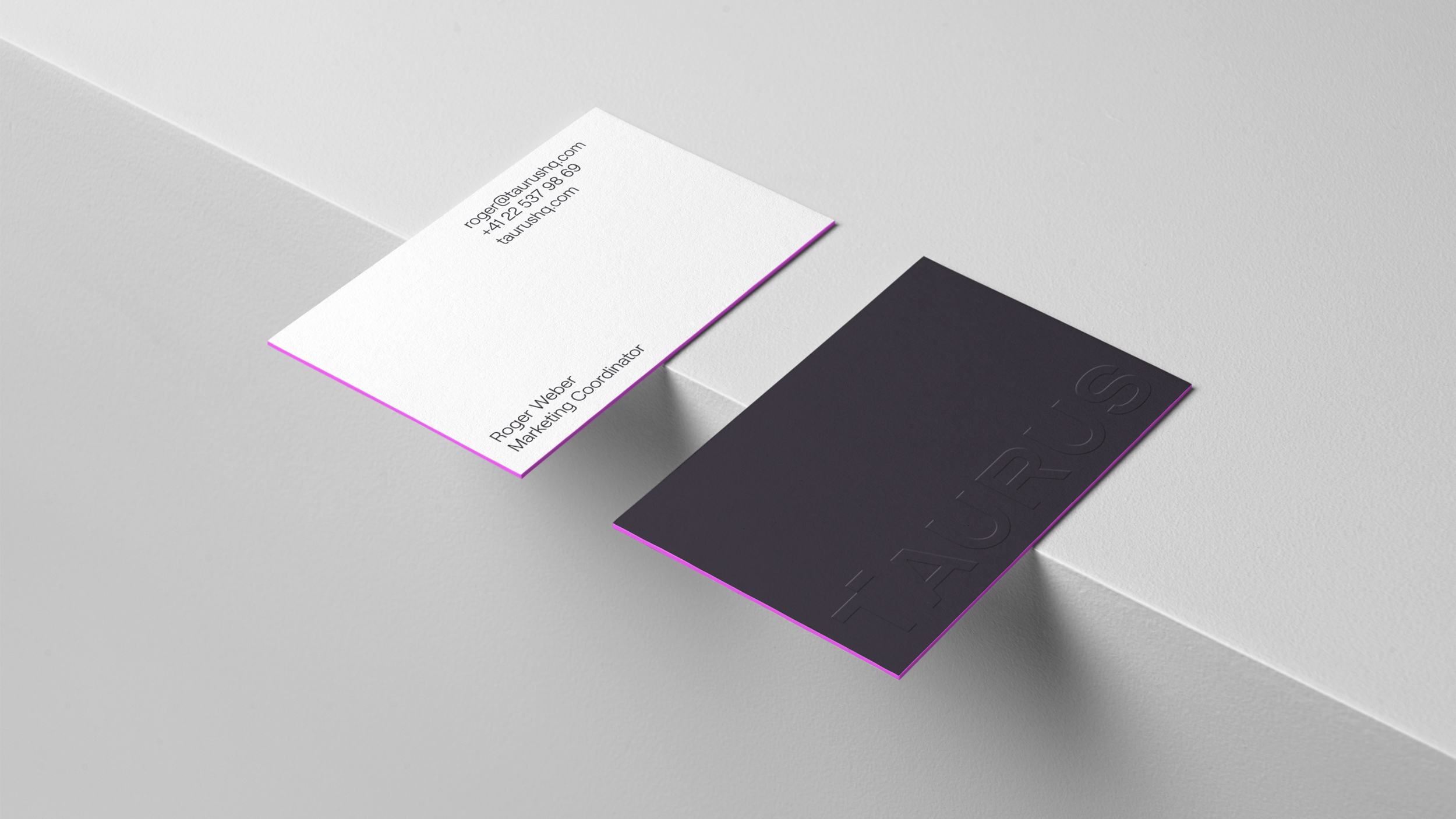
We helped Taurus to define a brand platform that leads with ‘Build your digital asset advantage.’ The brand platform was reflected in a visual identity that balances trusted Swiss structure and function with a modern and eye-catching color and typeface, reflecting the innovative nature of the business.
Siegel+Gale was more than a design agency; they were an extended part of the Taurus team. They helped us synthesize the value and impact we bring to our clients daily: a digital asset platform that gives them a sustainable competitive advantage. The visual language of the evolved brand reveals a Taurus always more customer-centric, cutting-edge, and innovative.
Victor Busson, CMO & Head of Strategic Partnerships, Taurus