
Tabreed
Essential impact
Refreshing a brand as a catalyst for change
Challenge
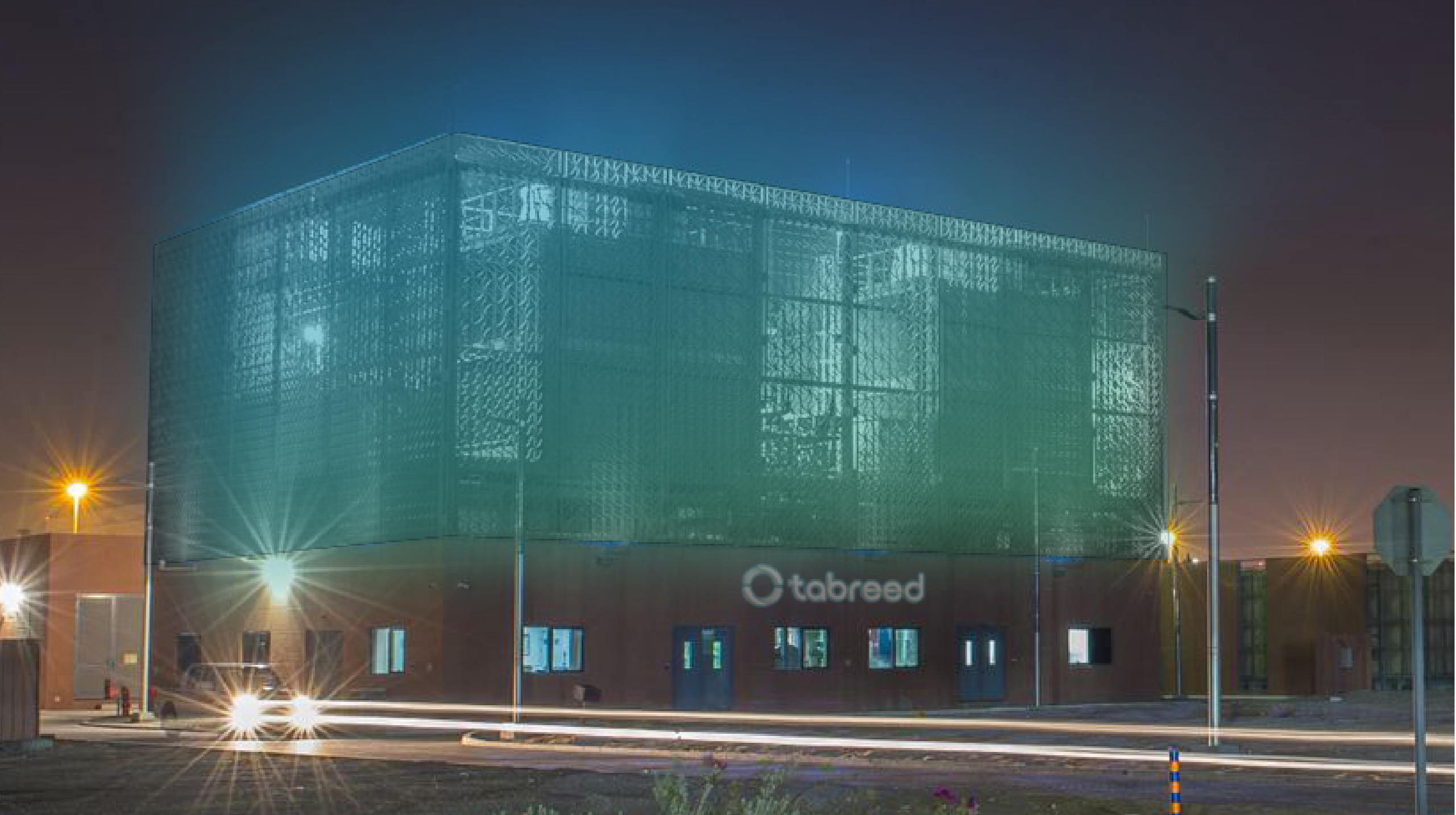
For over two decades, Abu Dhabi-based Tabreed quietly built one of the world’s most experienced district cooling companies. Working in some of the harshest climates on Earth, the company delivers centralized cooling plants in districts across the Emirates, Bahrain, Oman and Saudi Arabia. To achieve ambitious growth plans regionally and globally, the brand needed a meaningful, authentic purpose and universal expression.
Insight
Our research uncovered three fundamental truths: Tabreed delivers a vital, indispensable service. It offers people a tangible way to reduce their carbon footprints with more sustainable energy use. Finally, its energy efficiency, operational excellence and infrastructure development skills help shape planning decisions in the communities and countries where Tabreed operates.
Answer
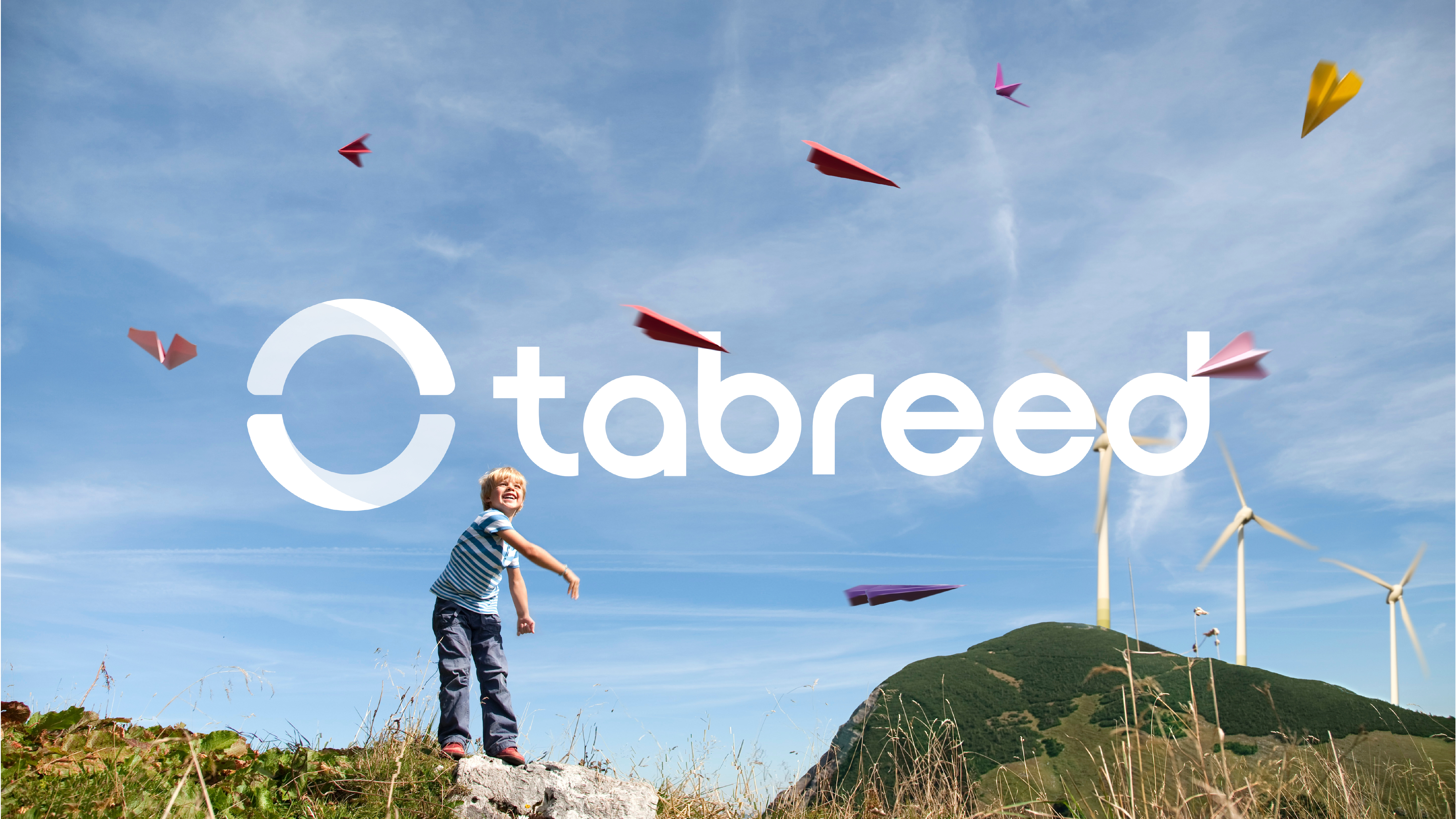
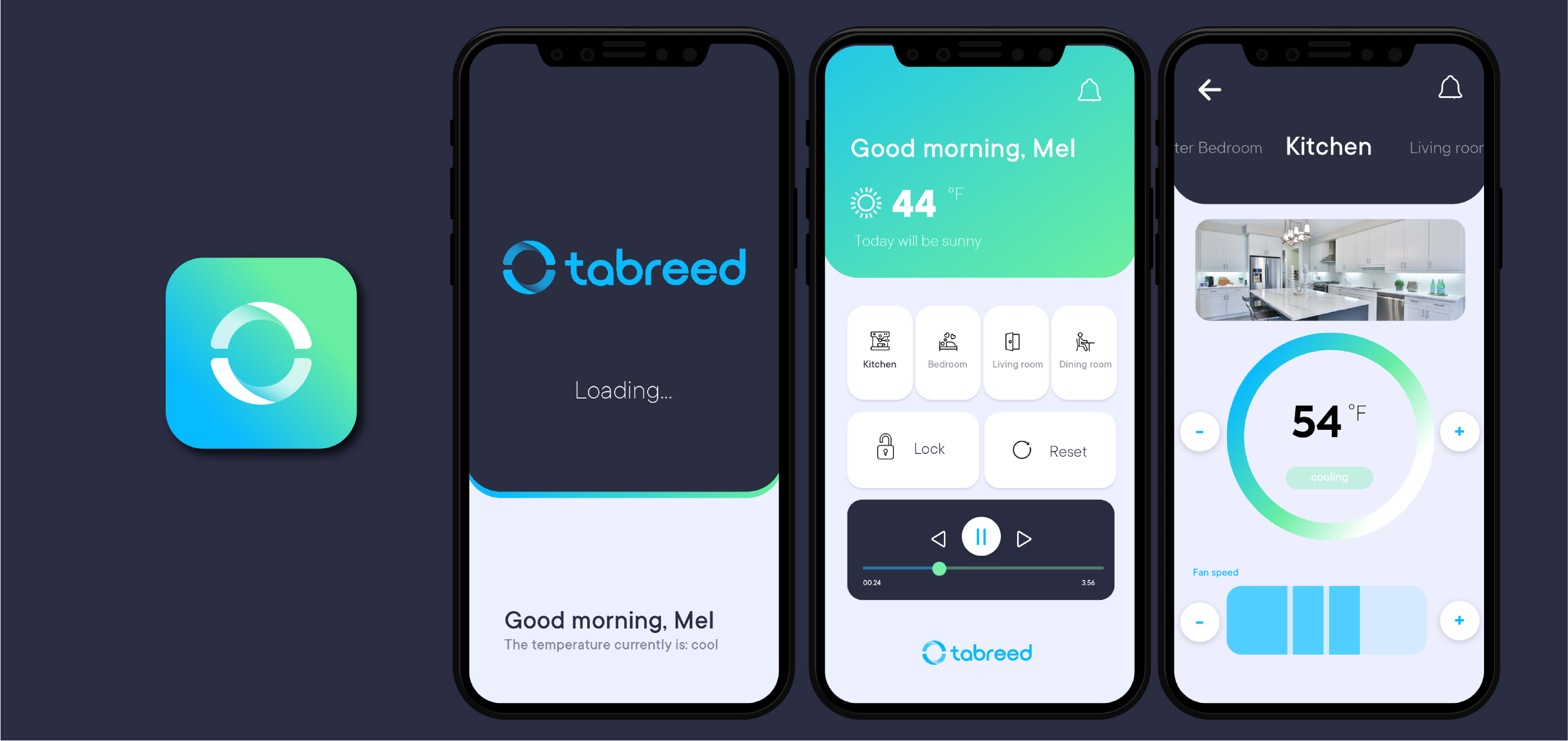
The duality of being “Essential” was the key to the new brand; essential infrastructure and essential to advancing toward sustainable living. The new mark focuses on the symbiotic relationship Tabreed has with the communities it serves. A refreshed architecture consolidated a fragmented identity into a single brand to travel wherever the business goes. Building upon the company’s expertise, Tabreed is now positioned as a broad-based energy efficiency and infrastructure development partner.

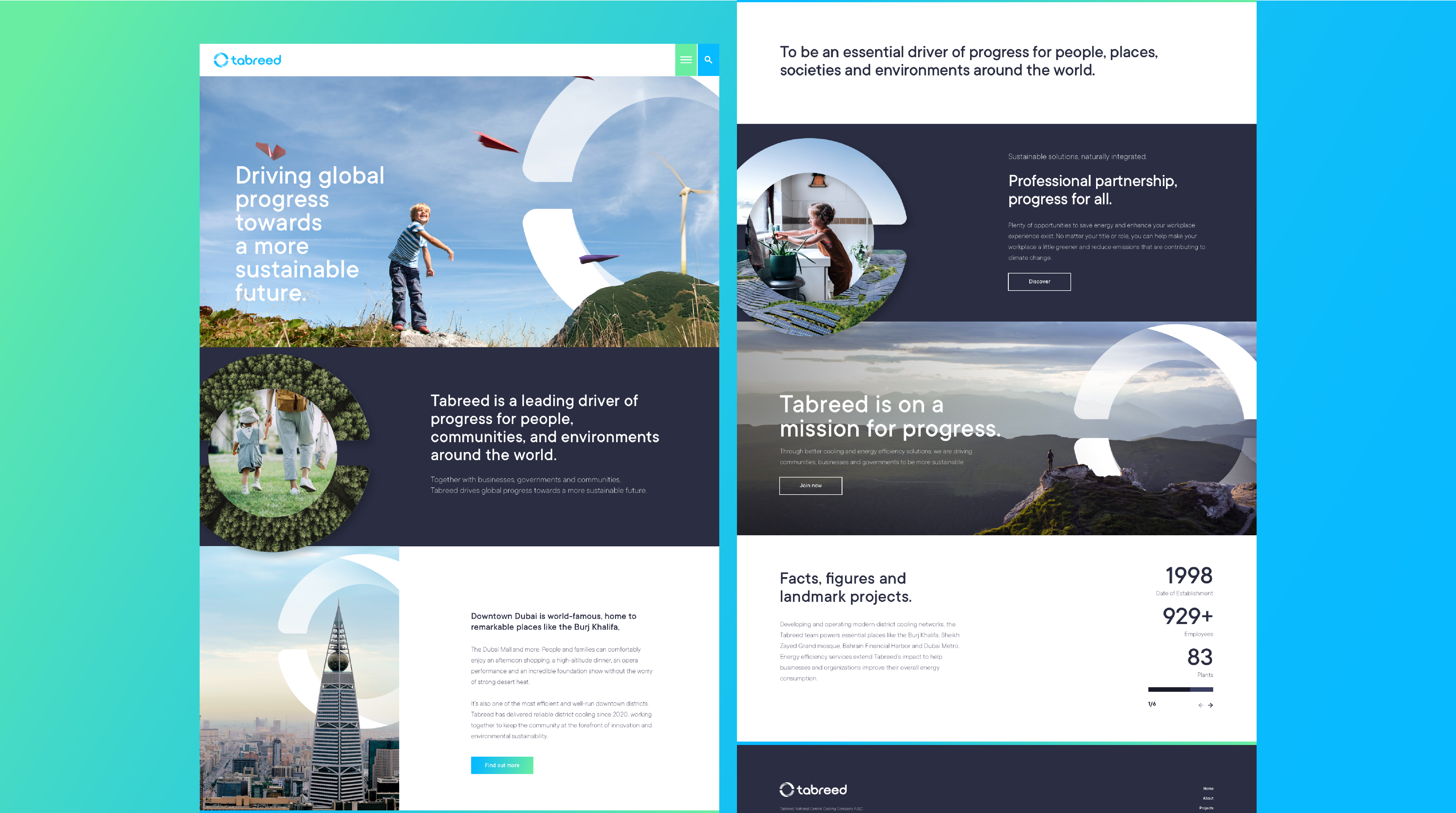

Demonstrating Tabreed as an essential brand and a catalyst for change was vital. This is based on the foundation of being an essential driver of progress, places, societies and environments around the world.
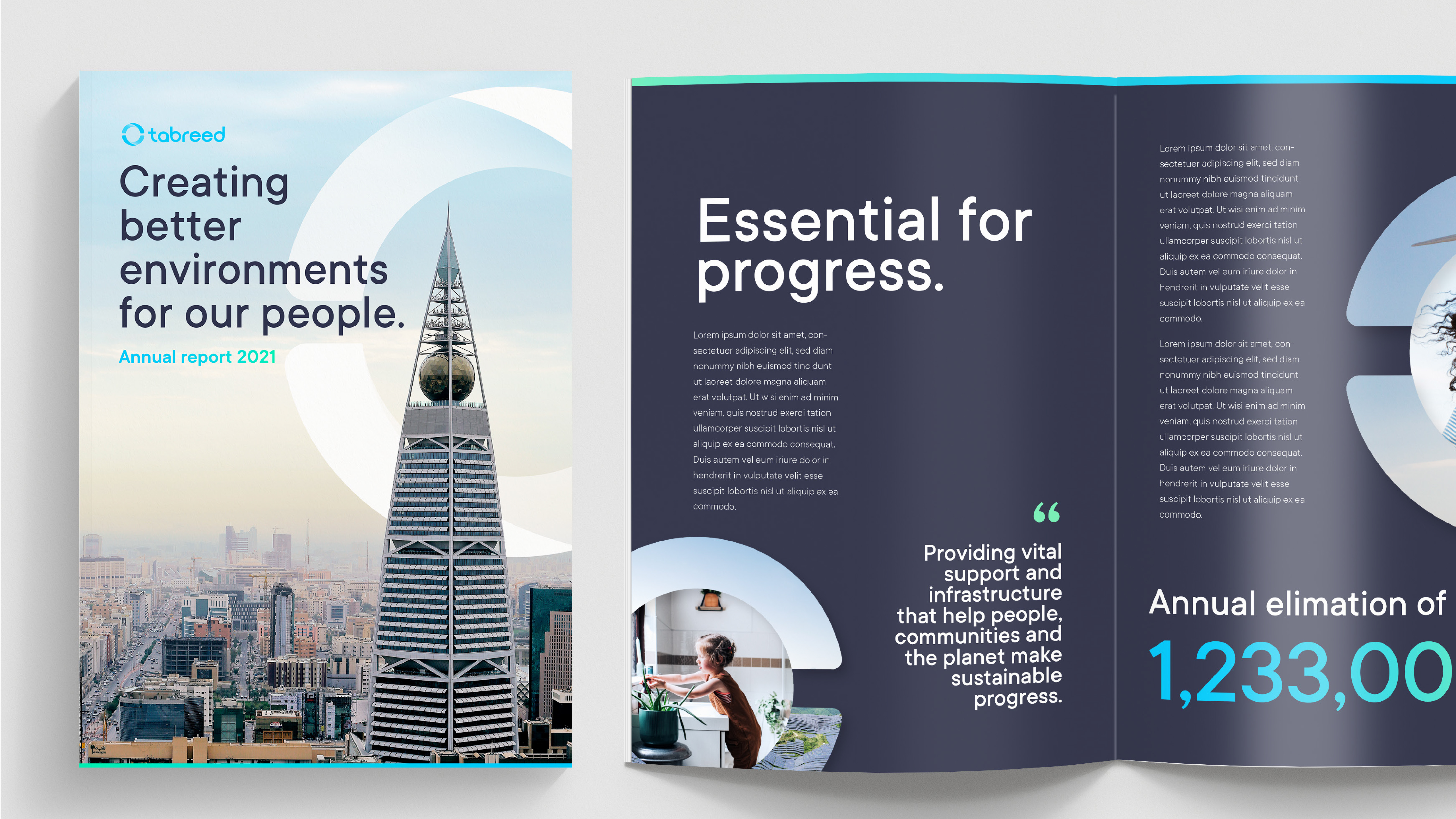

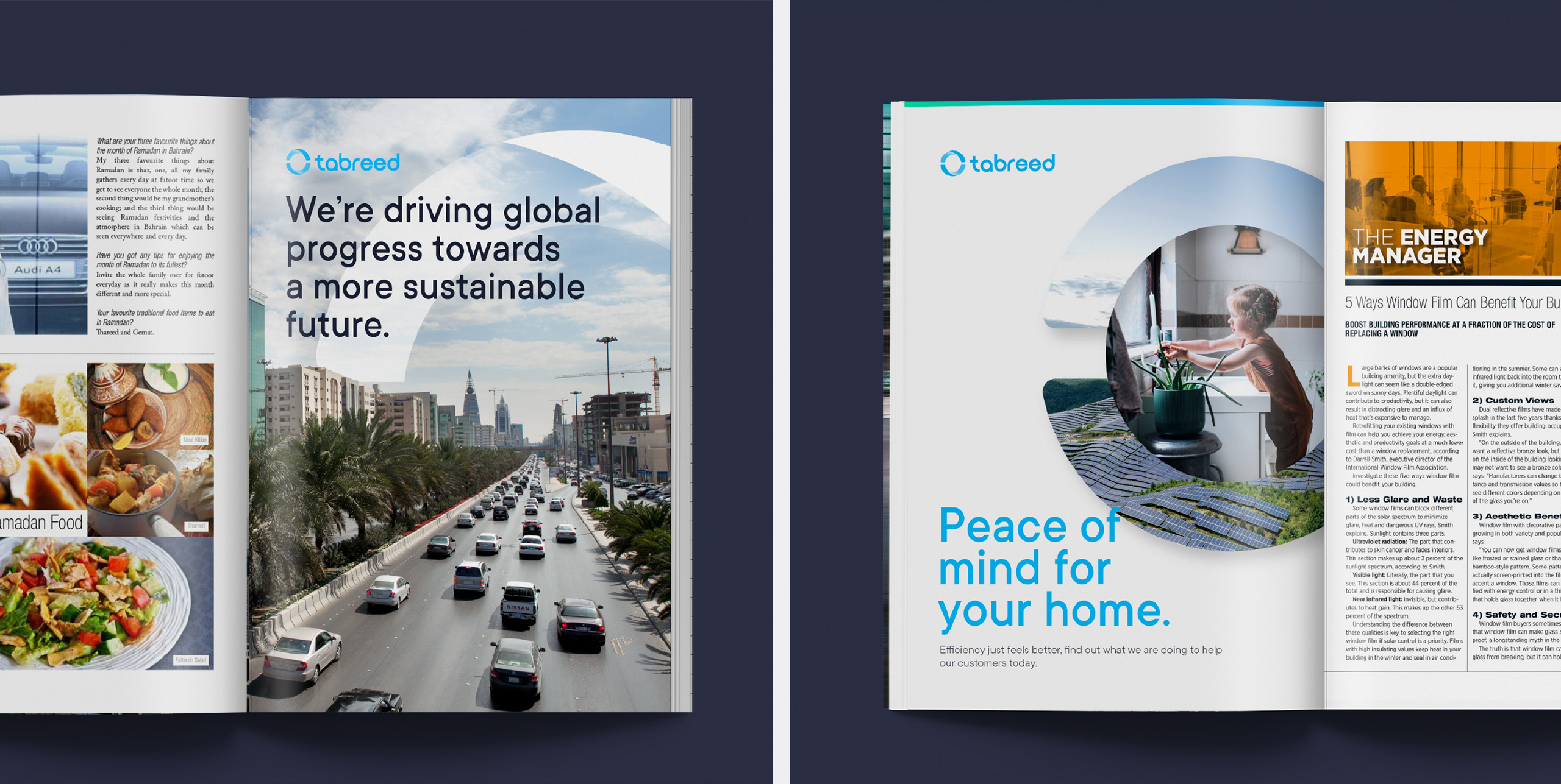
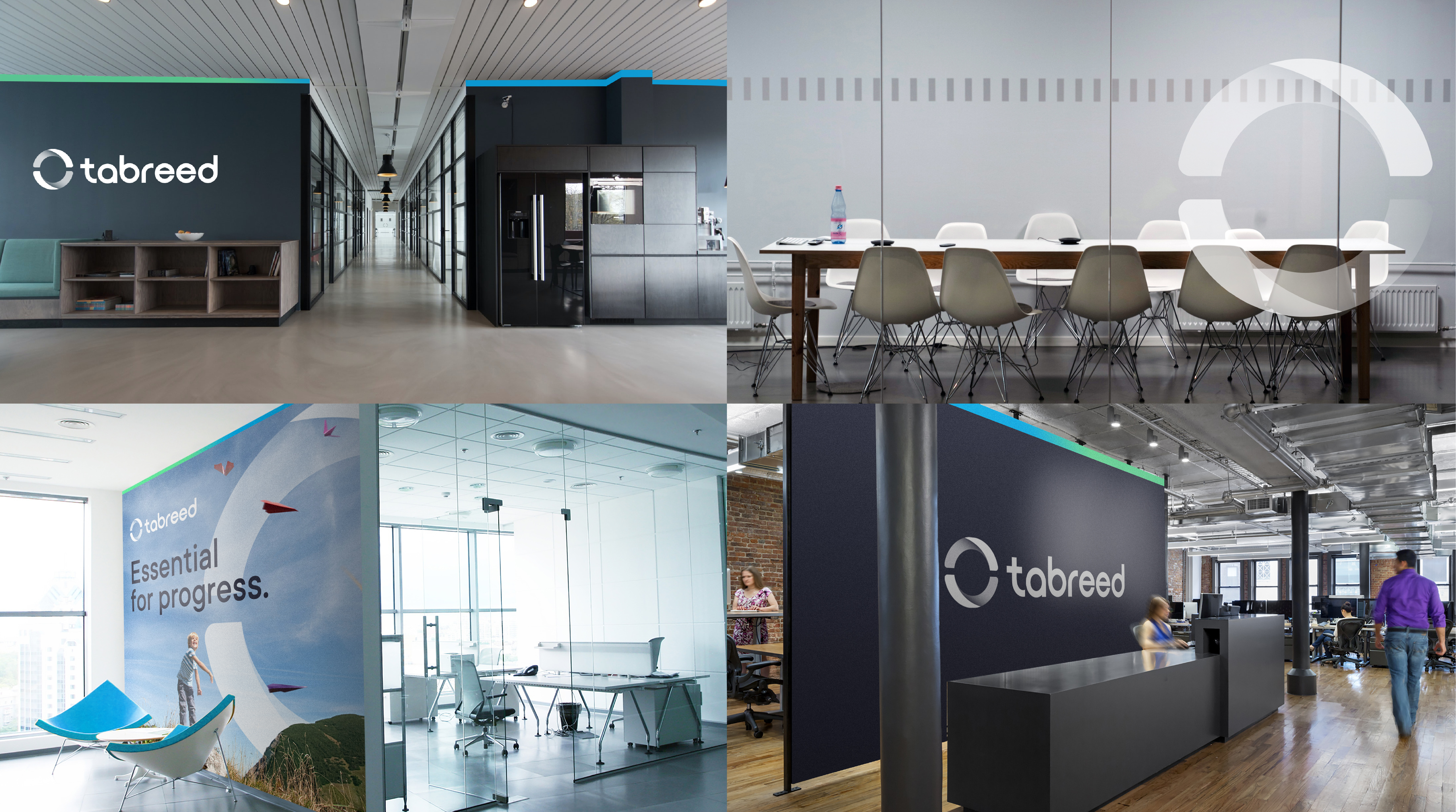

The tidy and simple visual identity allows the brand to live across all channels. The color palette speaks to the sustainable living aspirations of the brand.