

Shenergy
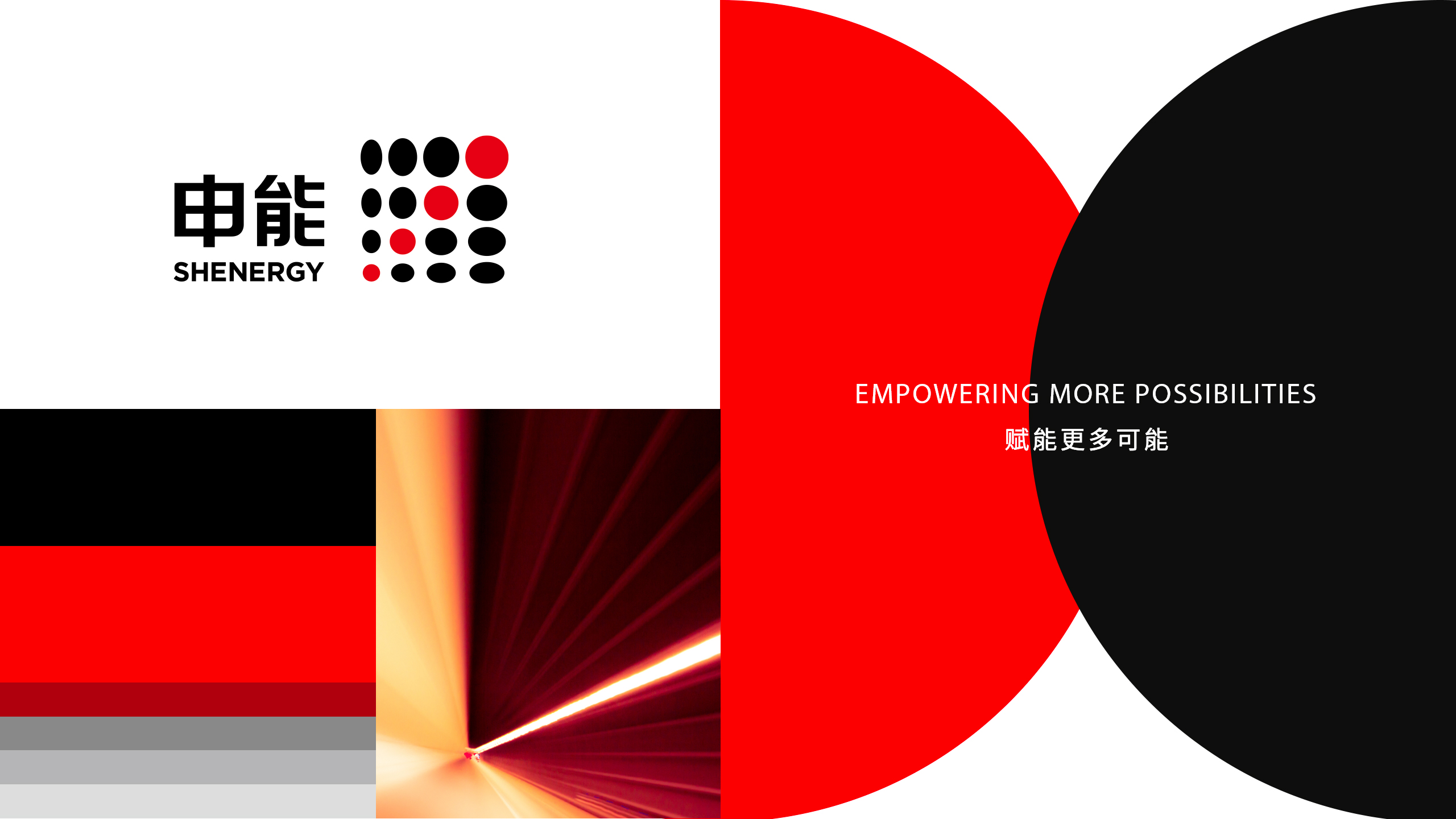
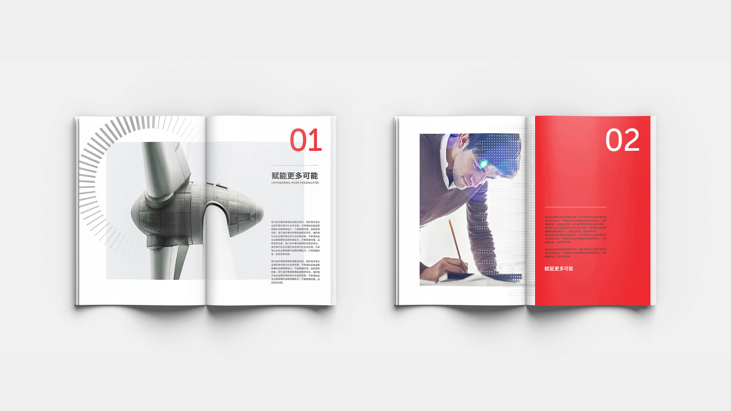
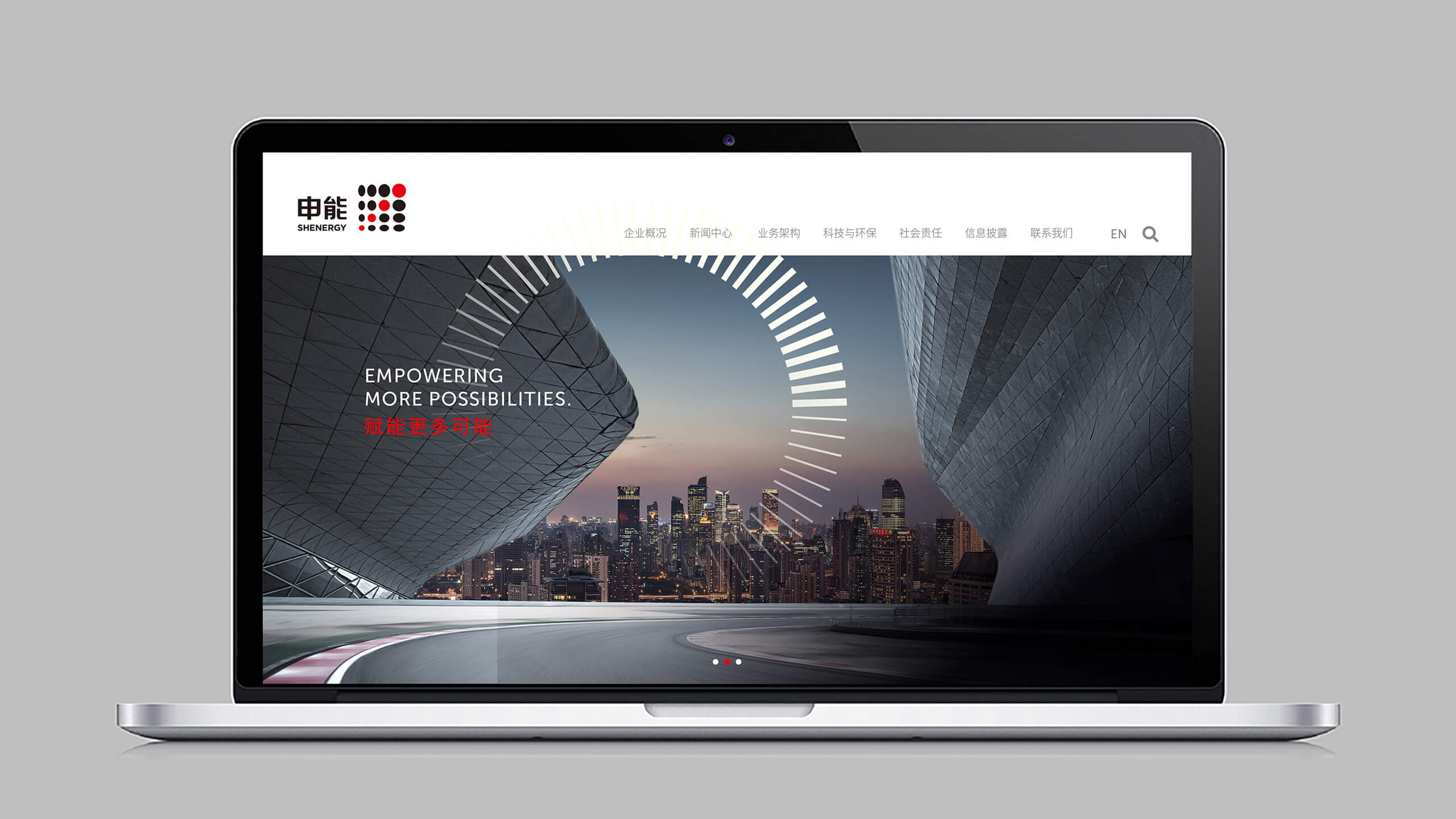
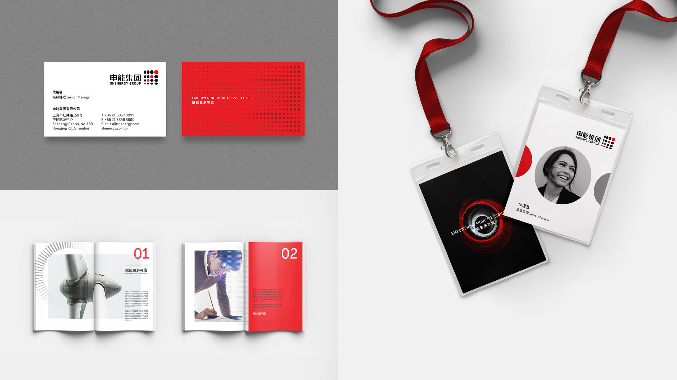
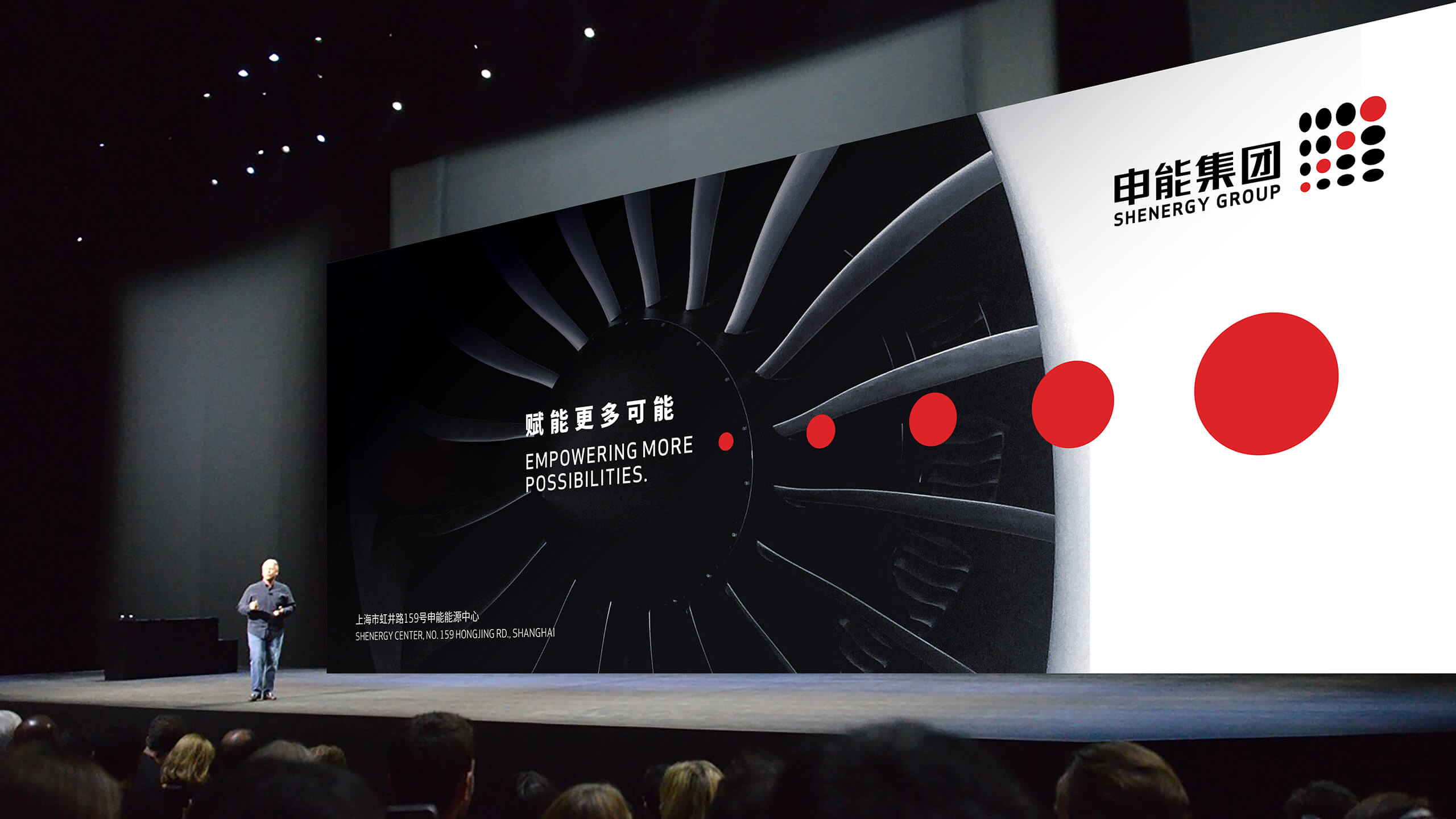
Empowering more possibilities
Revitalizing for diversity
Challenge
Shenergy is a state-owned company founded in 1987 by the Shanghai Municipal SASAC. In recent years, it became a conglomerate that covers a diverse set of industries, with multiple layers of sub-enterprises. Though Shenergy has established itself as a comprehensive energy enterprise group that thrives on expanding into multiple industries, the company lacked a clear brand position to highlight its diversity and inclusion. Shenergy also needed to revitalize its brand image to complement its updated brand position across various touchpoints consistently.
Insight
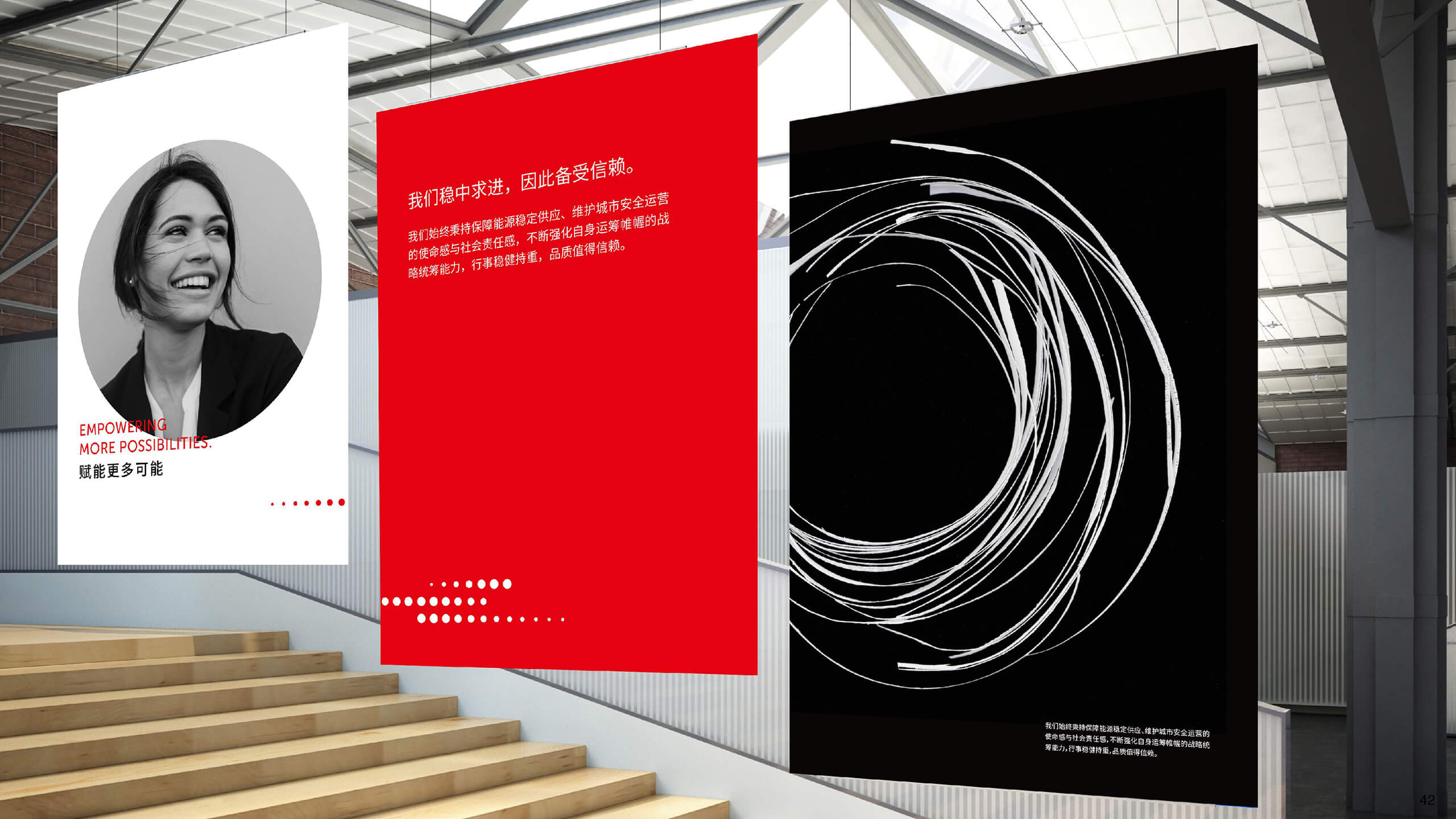
By conducting extensive interviews and in-depth analyses, we could fully observe and understand the vast array of rich stories Shenergy has among various industries. These stories helped us identify Shenergy’s mission to improve quality of life with energy security and supply. This mission gave us the foundation for a strategic and creative brand refresh.
Answer
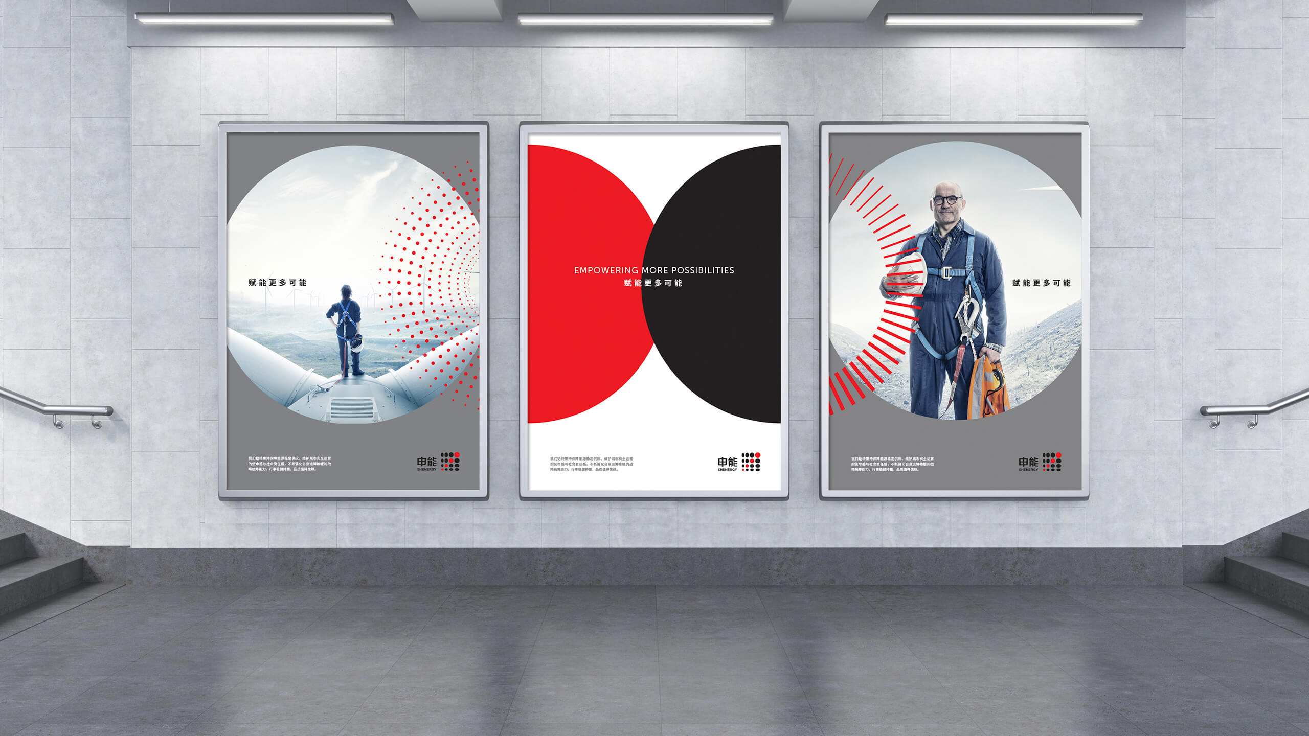
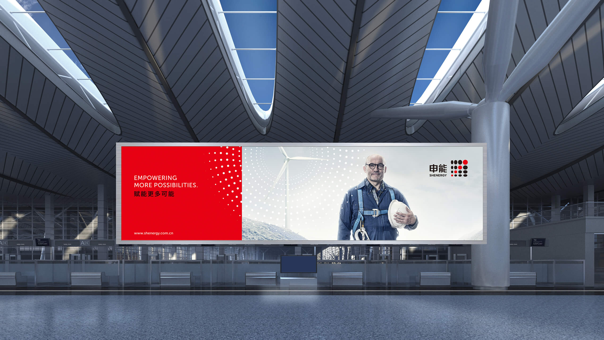
Guided by the new brand positioning of ‘Empowering more possibilities,’ we identified a comprehensive hybrid brand architecture. This architecture mapped out Shenergy’s expansion into various business areas and positioned each sub-enterprise distinctly. Rooted in Shenergy’s brand strategy, we created a consistent and vivid visual identity system to highlight Shenergy as an accountable, inclusive, modern and forward-looking brand.
Results

2021 Transform Awards, APAC
Best visual identity from energy and utilities—Gold