
Livian
Love how you live
Creating a simplified experience for real estate agents and their clients
Challenge
Founded in 1983, Keller Williams Realty is a global real estate and technology company. With a complex brand architecture spanning multiple audiences and distinct brands, Keller Williams recognized that its brand was being created from the bottom up. Known as a leader in real estate, they were facing challenges as they sought to evolve the brand consistently toward the future. They were also keenly aware of tech’s increasing presence in the industry and potential revenue streams. Hoping to build stronger post-transaction relationships with customers, they set out to create a platform that could unite agents and homeowners under one digital umbrella—fostering relationships that last a lifetime.
Insight
Concerned that their agents were becoming more attached to third-party real estate tech platforms, they accelerated building their own platform. Providing a distinct identity would allow this new brand to communicate a sense of warmth that’s difficult for a corporate parent brand like Keller Williams to communicate. By focusing this identity on the “human element” of real estate, they could subtly convey their interest in long-term client relationships—not just the buy/sell relationship. In an already crowded field of real estate tech platforms, differentiation was key.
Answer
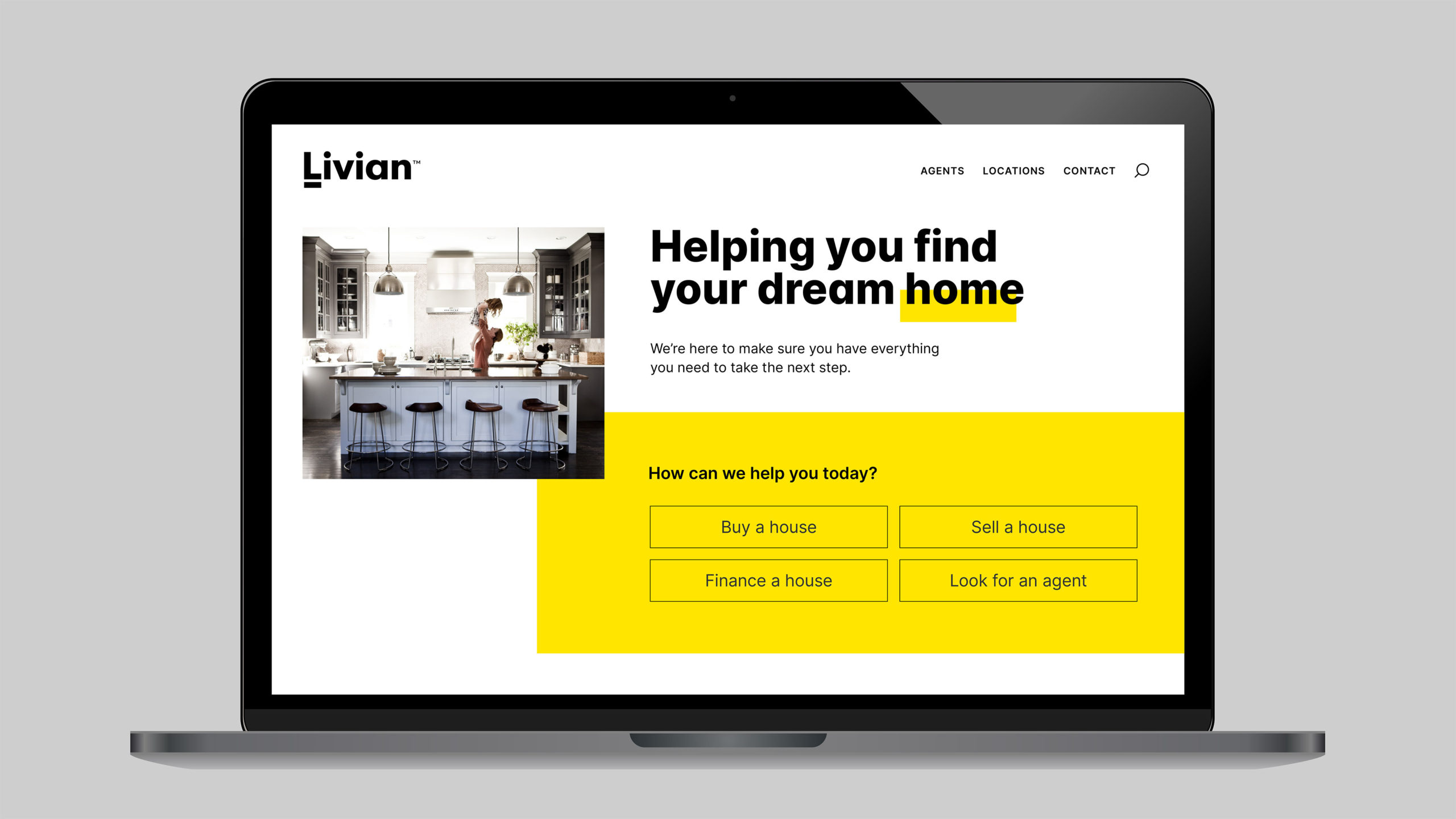
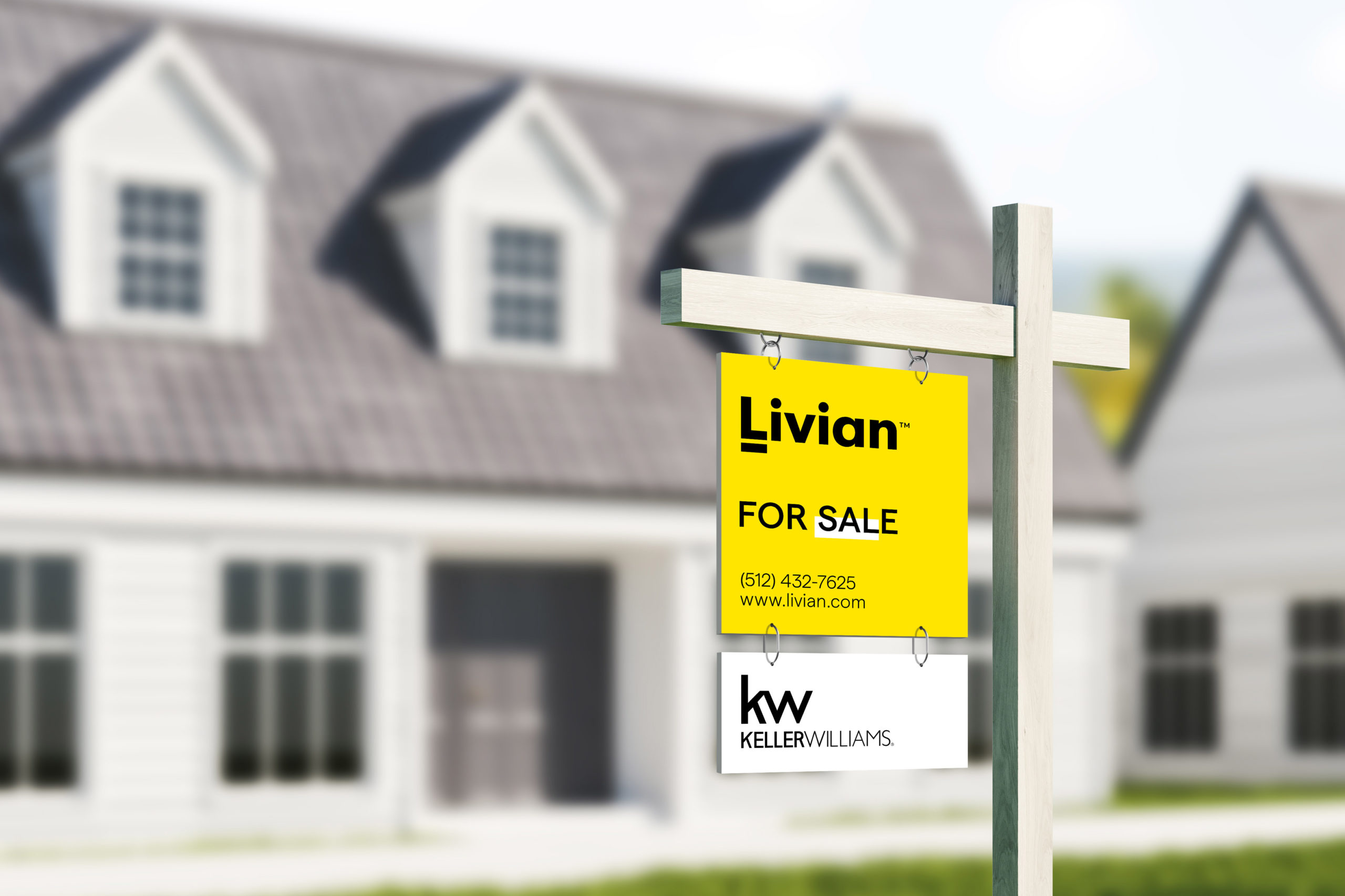
An audit of major competitors and colors on yard signs revealed a color that no one else was using: yellow. It was ideal for standing out in front yards and was the perfect choice for a bold brand with a sunny disposition. Typography was selected with approachability in mind—a major element of the new brand personality, not only for its ability to attract users but also to help home ownership appear less daunting. The chosen name, Livian (intentionally sounding like “living in”), alludes to this sense of home ownership—a relationship that lasts far longer than the typical real estate transaction. The treatment of the logo and shorthand with an underscore under the “L” emphasizes the role Livian plays in supporting both agents and consumers while signaling ease of use and an unpretentious, approachable personality.
Keller Williams is a place where entrepreneurs thrive. Livian embraces and expands upon this vision by helping real estate professionals accelerate their freedom, finances and fulfillment. Creating a new brand with a tailored identity provides an opportunity to communicate a new sense of warmth and energy to better align with the goals and needs of real estate agents and their clients.

Results

Indigo Design Awards—Gold, Branding for Real Estate
The Communicator Awards—Silver, Corporate Identity