
Blue Apron
The perfect pairing
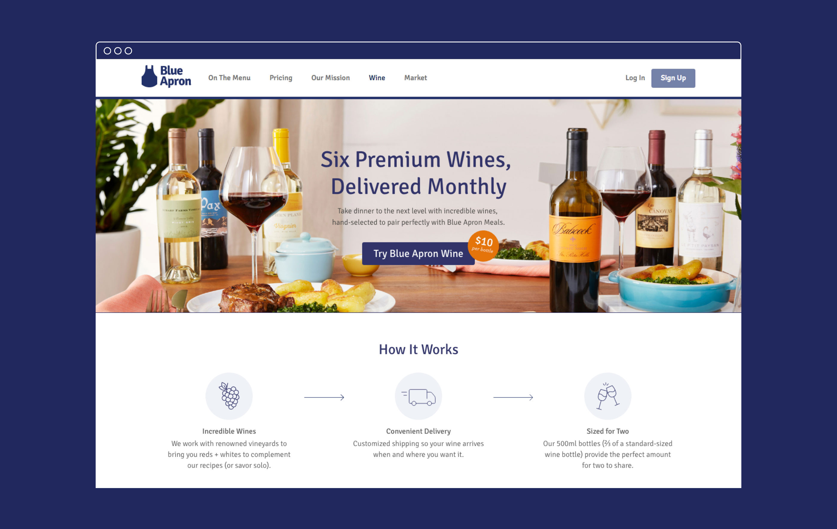
Bringing accessibility and sophistication to a winning wine list
Challenge
Once considered a startup darling, Blue Apron was losing its shine amid a sea of imitators. To regain its edge, the meal kit service added wine to its offerings, but struggled to make it as accessible to consumers as its sophisticated cuisine.
Insight
By rooting our design strategy in Blue Apron’s business imperative—making choices simple and attractive—we could help make their wine experience inspiring, rather than intimidating, while creating a consistent look and feel that could expand with the brand’s portfolio.
Answer
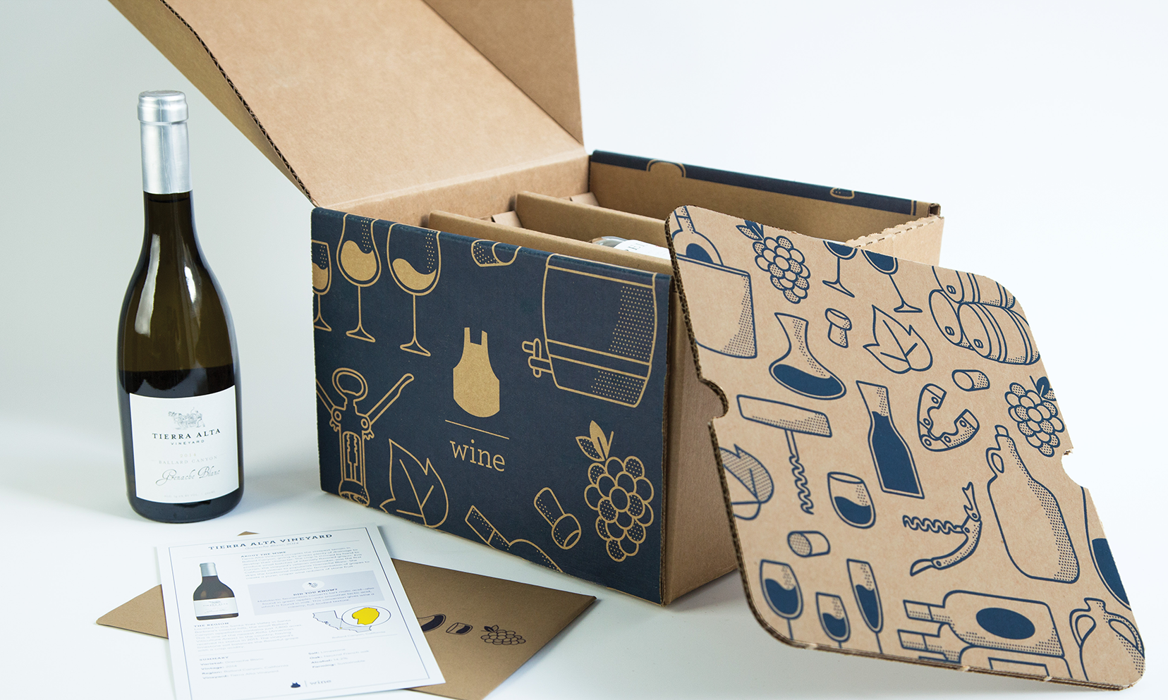
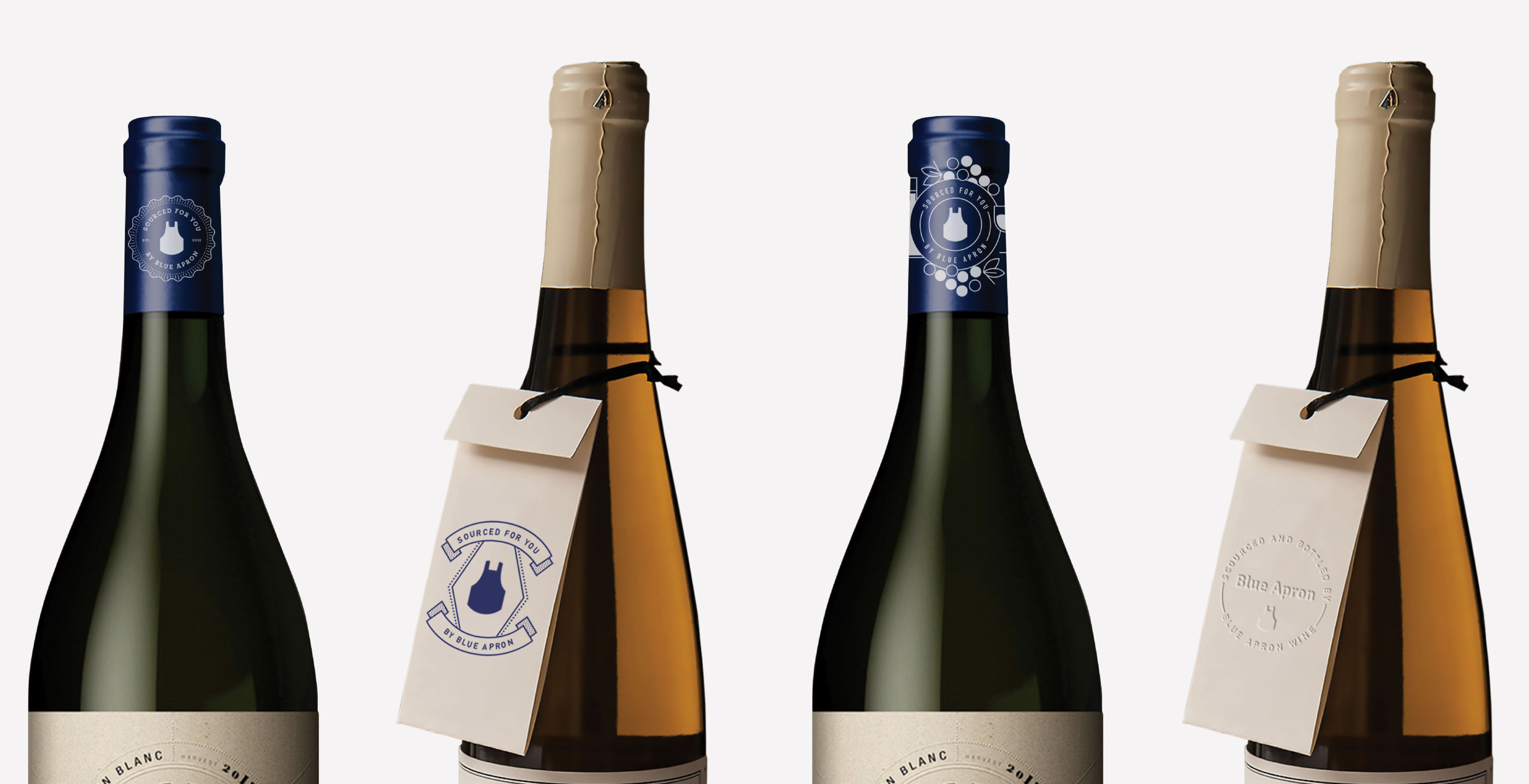
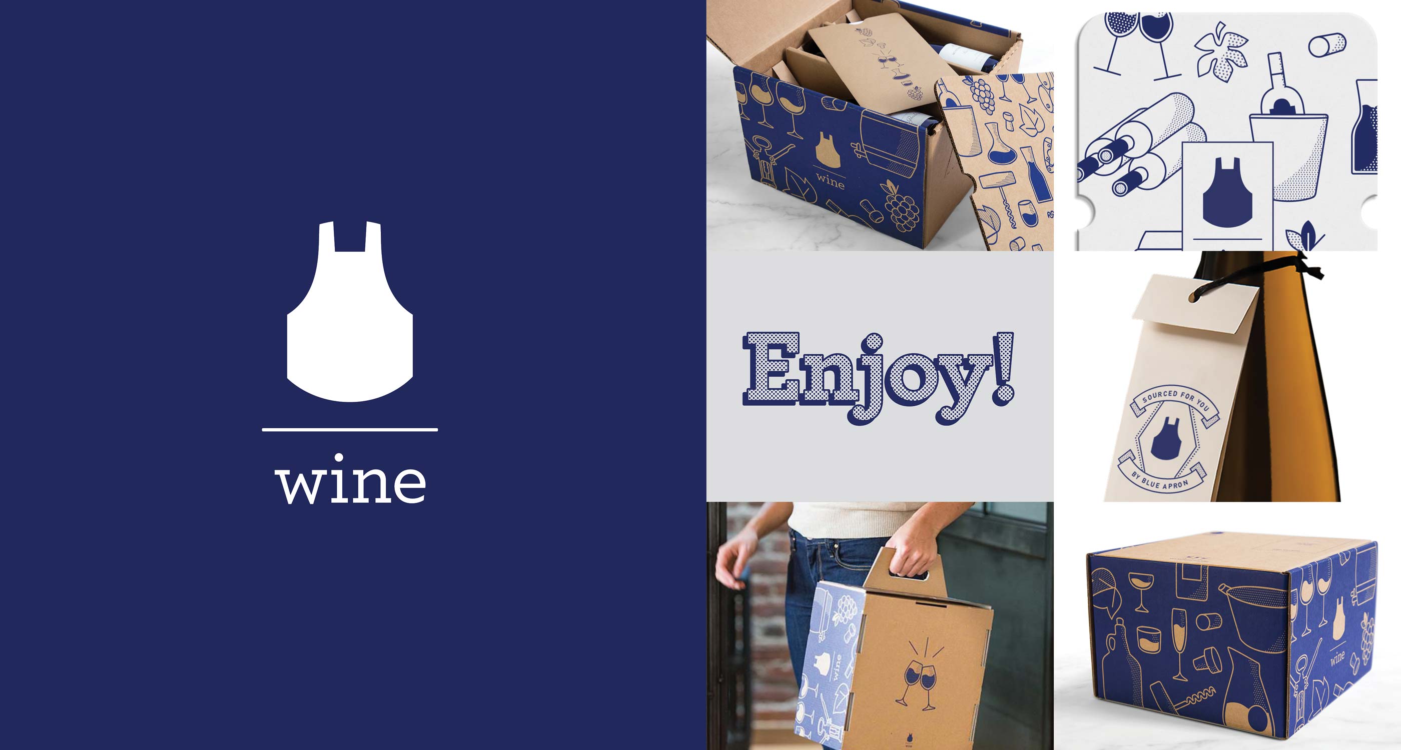
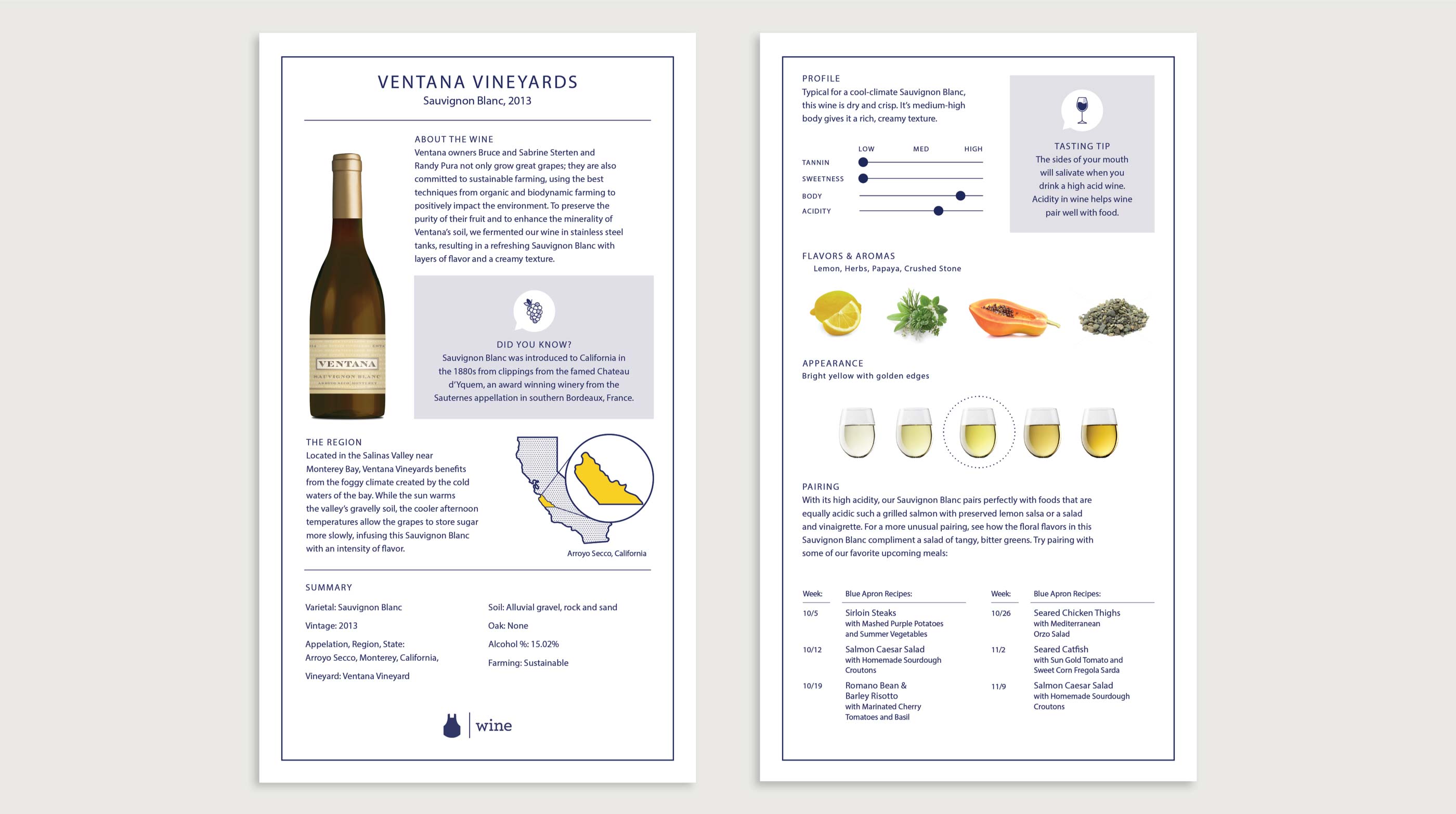
We refreshed Blue Apron’s wine packaging and iconography to be clear, yet whimsical—making information more digestible while introducing elements of surprise and joy. By successfully adapting the brand’s friendly, yet elevated, aesthetic for its wine business, we helped Blue Apron begin to diversify its offerings while setting the stage for future growth.
Results

Creativity International Awards—Silver, Packaging
Transform Awards North America—Bronze, Best Use of Packaging
By simplifying…it allows us to unleash far more discovery and out-of-the-box solutions, which leads to better results for the company and our consumers.”
Jared Cluff, CMO, Blue Apron