American Woodmark
From inspiration to installation
Crafting a customer-first brand for a global cabinetmaker of choice
Challenge
As a community-minded, purpose-driven company with an appetite for innovation, American Woodmark needed an identity to communicate who they’ve become and where they’re heading. Since its beginning in 1951, the company rapidly transitioned from a small manufacturer to a global cabinetmaker of choice. With that strong heritage, unique values and an authentic culture to build on, American Woodmark required a fit-for-purpose brand to that could set the stage for a varied portfolio to become a customer-first ecosystem.
Insight
Our EyeOpener™ research revealed what matters to people when it comes to home improvement: confidence, style, inspiration and relevance. Homeowners, designers and business professionals all wanted premium quality and the reassurance of expert attention as well as creative inspiration and aesthetics to match wide-ranging personal taste. We uncovered that American Woodmark matches these needs with a strong ethos and expert leadership, as well as a family of over 15 brands that offer cabinets for authentic, personalized spaces beyond just the kitchen.
Answer
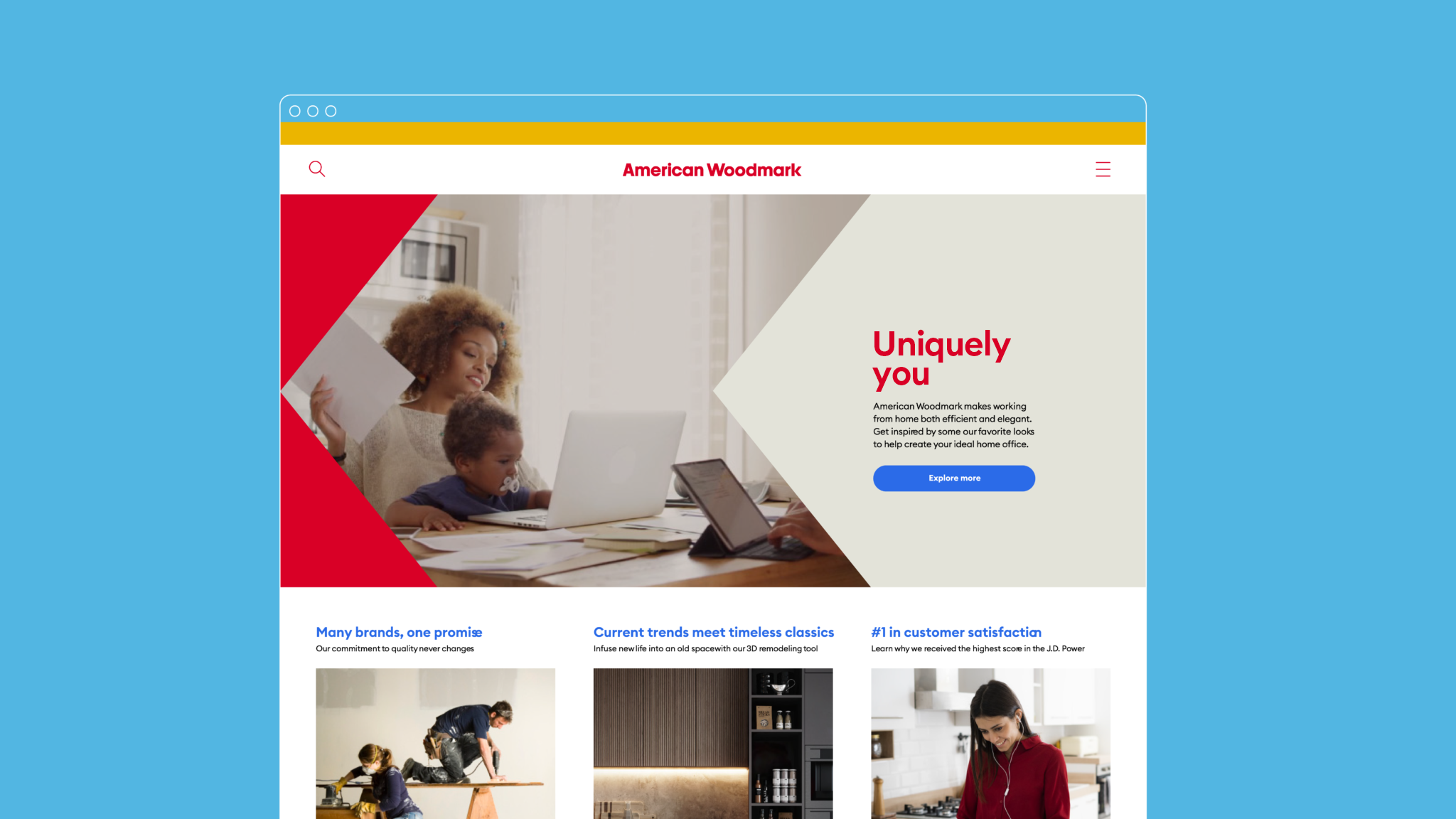
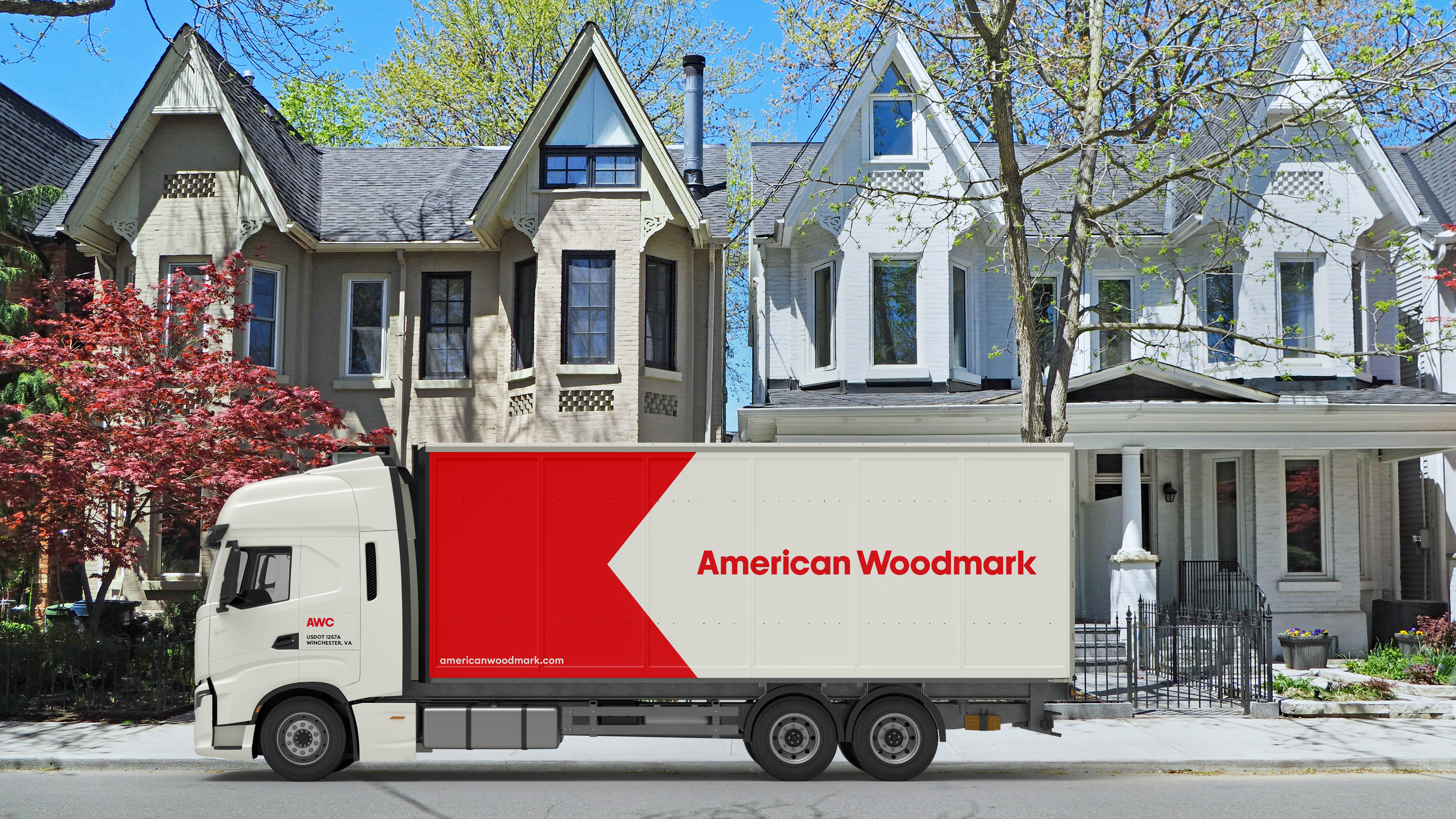
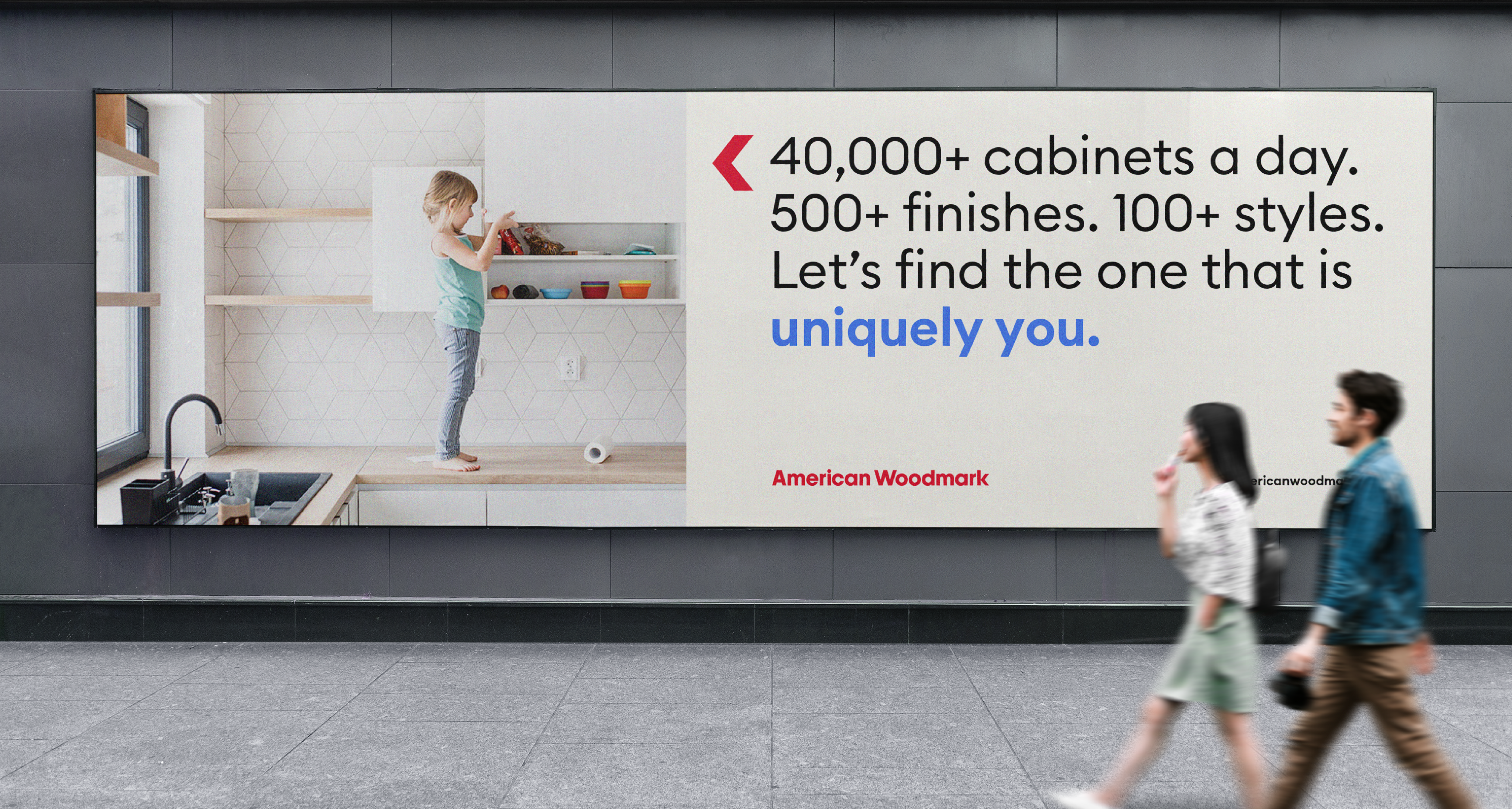
We developed a brand essence that built on strengths while pushing into new territory. With the core idea “Uniquely You,” American Woodmark invites audiences to ignite their imaginations with choices that inspire spaces all their own. An empowering, original and bright new voice, a strong new brand narrative, audience-specific messaging and bold new visual identity captures the brand’s focus on personal style, inspiration, expertise and customer support and reassurance.
The digital-friendly red is light, bright and functional, yet modern. The warmth of the tone makes the brand approachable, an authentic reflection of its customer-centricity.
The blues (cobalt and sky) represent the trust and confidence born out of our customer's positive interactions with the American Woodmark brand. Sand, a very light cream, is used with red in backgrounds, complementing and slightly softening the intensity of the red. Black and white are the functional bookends of our palette, holding the colors together. They are both used for type, and white is sometimes used for backgrounds.
The icons are also designed to be motion graphics; the join is activated as the animation piece, maneuvering through the icon until it rests on the final red and black version.