In SMPL Q+A, we interview our practitioners on all things relevant to branding, design and simplicity. Here, we speak with our Design Director, James Snook, about our work with Tether.
Tell us a little bit about Tether.
James Snook: Launched in 2014, Tether is a blockchain-enabled platform revolutionizing the digital use of fiat currencies. The company introduced the Tether ‘stablecoin token,’ a cryptocurrency pegged at a 1:1 ratio to the US dollar and fully backed by the company’s reserves.
Since its launch, Tether has surged forward and expanded its reach into sectors including sustainable energy, communications and education, ventures that align closely with its core principles, centered on advocating for user self-sovereignty, freedom of speech and data privacy.
What challenges was Tether facing?
JS: Tether boldly redefines conventions and overturns expectations, and this bold spirit needed to be captured in its new identity. A key challenge was communicating the concept of ‘subverting the expected’ in a clear, straightforward and distinctive way unique to Tether.
Recognizing the evolution of its brand, Tether enlisted Siegel+Gale to assist in transitioning from a stablecoin business to a digital infrastructure enterprise. This new brand would encompass the verticals and services developed since the renowned stablecoin’s launch.
Was there an “aha” moment?
JS: We brought Tether’s distinctive brand personality to life using what we termed an ‘un-ness’ approach: celebrating the unusual, unexpected and unconventional.
‘Un’ serves as a dynamic foundation for the brand, empowering Tether’s tone of voice to embrace the unusual, echoing the brand’s fearless, free and fair principles.
Tell us about the new visual identity.
JS: Tether’s identity is bold, confident, and direct, free from unnecessary decoration and fuss. As a business that speaks in a straightforward and honest way, we wanted the identity to amplify that clarity, clearly communicating that with Tether, there is a different, better way forward.
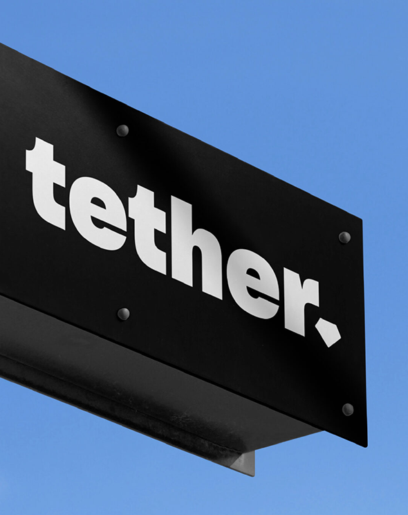
The logo is an excellent representation of the identity. Unadorned in style, it celebrates Tether’s unconventional approach, with the characterful full stop adding to the brand’s purposeful and definitive nature.
What is your biggest takeaway from the project?
JS: Building a brand free of decoration and fuss might seem like a relatively straightforward idea. However, striking the right balance was crucial. Our goal was to achieve a streamlined approach without compromising depth.
While we fully embraced the power of simplicity, each element needed to carry weight, leaving no room for a sense of incompleteness. This unconventional approach allowed us to create a brand identity that truly resonates and feels distinctly Tether.
What did you enjoy most about working on this project?
JS: AI-generated imagery played a key role in creating a distinct image library for Tether. Given the brand’s fearless spirit and commitment to daringly reimagining conventional norms for the greater collective good, integrating AI into their creative process felt natural. A consistent and
considered content prompting approach was developed to empower the Tether team to generate diverse, eclectic content, spanning from everyday to extraordinary, capturing the essence of the business offering in an unexpected and unforgettable way. As AI technology advances, this approach ensures the brand maintains its unique identity over time.


