
In SMPL Q+A, we interview our practitioners on all things relevant to branding, design and simplicity. Here, we speak with our Senior Designer James Snook about our work with the world’s leading agricultural science and innovation company Syngenta.
Why did Syngenta approach Siegel+Gale?
James Snook: When Novartis and AstraZeneca merged their agrichemical businesses in 2000, the newly formed brand, Syngenta, quickly became a world leader in agricultural science. This merger resulted in the formation of the Syngenta Group brand, which comprised Syngenta, ADAMA and Sinochem’s portfolio, a combination of over ten different brands falling under the Syngenta Group brand.
However, this new combination created complexity; the group needed to simplify through a new identity, architecture and positioning and ensure it was represented across the vast business and diverse cultural landscapes. It was our job to help them simplify.
Strategy
Can you explain the new positioning?
The new positioning was developed to reflect the organization’s global work with agricultural specialists and farmers. By applying local solutions to global problems, the brand can solve ongoing challenges such as sustainably feeding the world through emerging technology, science, data and agriculture. The positioning needed to reflect this clearly.
What was the result of the brand architecture?
Now armed with a new positioning, “The world’s most local agricultural technology and innovation partner,” we needed to create a simple brand architecture solution. Developed with four business units under one group, we created a simple but effective endorsement strategy to showcase the connection to the Syngenta Group Family.
By bringing these brands under the one group, Syngenta’s entities retained the original Syngenta identity and were captured under both Crop Protection and Seeds. Syngenta Group China now houses the China brand portfolio.
Design
What can you tell us about the development of the visual identity?
We developed the visual identity against the brand’s new positioning. The challenge was to ensure the brand retains its heritage while creating an identity that feels fresh and new.
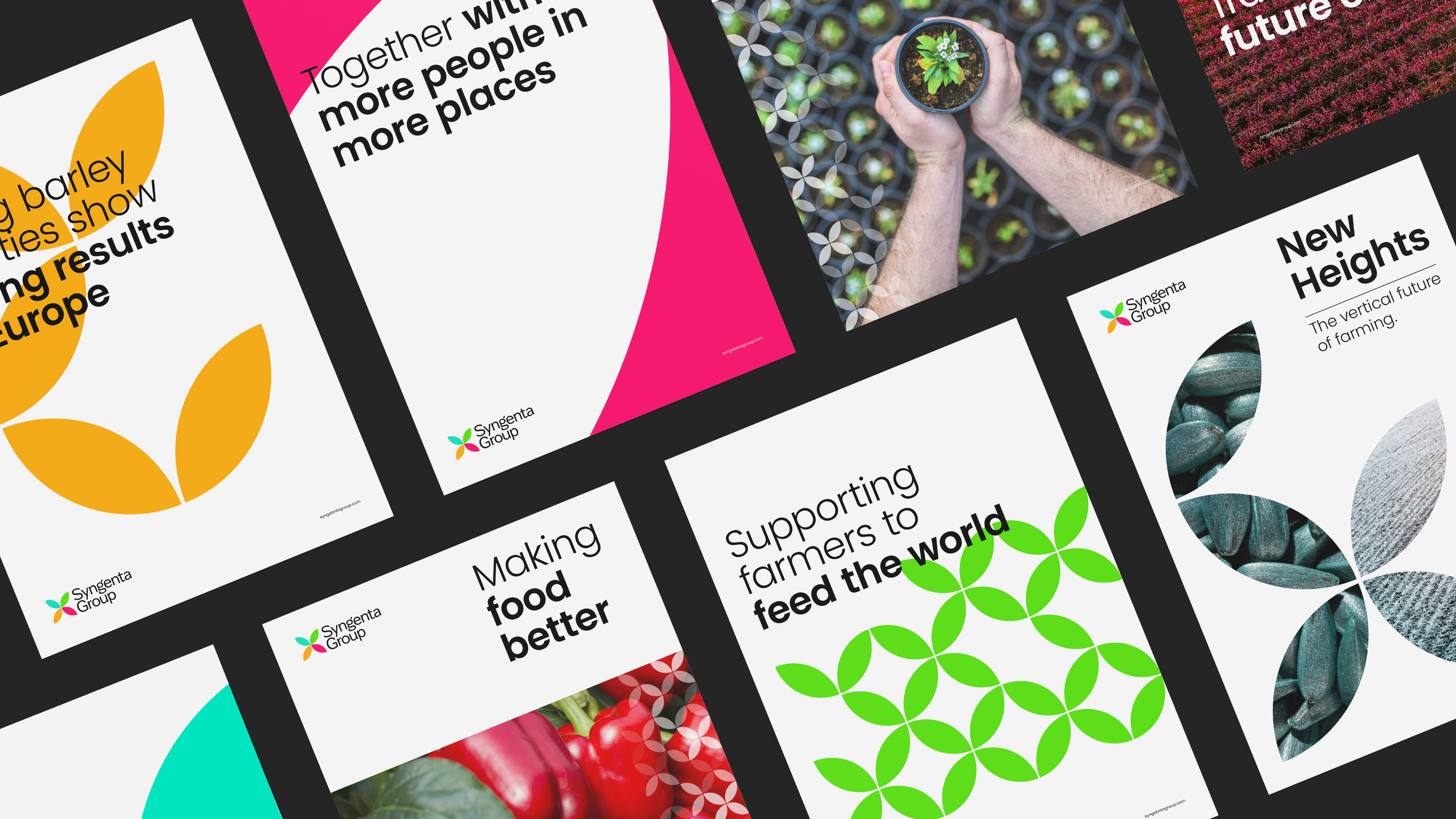
Building upon Syngenta’s most recognizable asset, ‘the leaf,’ we built an identity that told the story of the four seasons, speaking to Syngenta’s local footprint across the globe as well as to the groups’ interconnected nature.
Each brand color (blue, green, yellow and red) represents one of the four seasons and, together with the leaf symbol, help create the Syngenta Group logo. We developed a graphic pattern from the logo symbol to further communicate the brand’s story and aid brand recognition.
Imagery also plays a strong role in the identity, reflecting the diverse and ever-changing landscapes across the world. Using macro and microphotography, we could further communicate Syngenta’s global/local story.