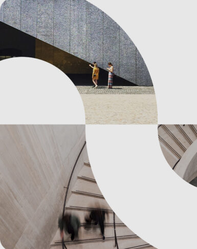
In SMPL Q+A, we interview our practitioners on all things relevant to branding, design and simplicity. Here, we speak with our experts about our work with Solventum, the new independent health care company 3M plans to spin-off. Learn more about the new brand here.
Account Management
What made this engagement so unique?
Samantha Starr-Shields: Working with 3M on this project has been very exciting! 3Mers are very passionate and loyal to the brand, so it was important from the start to create a brand that celebrates that passion. We’ve had the opportunity to roll up our sleeves and partner closely with the 3M Health Care marketing team to develop every aspect of this international spin-off brand. From research and brand strategy development to creating the new name and visual identity, so much work has gone into creating this thoughtful brand. This is just the beginning; we can’t wait for the world to see how we’ve collaborated with the 3M team to help bring the Solventum brand to life.

Strategy
How would you define the new Solventum brand?
The Solventum brand is about listening and responding: Listening with empathy to the needs of medical providers and responding with unexpected solutions to address their needs and solve big healthcare challenges.
What is the new mission and promise?
Solventum is driven by a profound mission: Enabling better, smarter, safer healthcare to improve lives. We found that this mission resonates powerfully with Solventum employees worldwide, and we wanted to make sure it is reflected across the brand experience, especially in employee-focused activations.
Solventum’s promise—we never stop solving for you—speaks to the company’s intense focus on customer needs, and its people’s drive to create game-changing solutions at the intersection of health, material and data science. This promise sits at the heart of Solventum’s external expression and inspired the Solventum name and identity.
What were some of the challenges in creating the new brand?
This type of undertaking begins with seemingly thousands of questions: What unique value will the spinoff bring to customers? How can the company distinguish itself in a highly competitive marketplace? How should it be different from legacy 3M?
At the outset, the biggest challenge was to define a plan that balanced the need for rigor and fact-based decision-making with the equally important need to move fast. We succeeded with a strategy that blended quantitative insight, creative intuition and close collaboration with the Solventum team.
Naming
Tell us about the meaning of the new name.
The name is about solving healthcare challenges and gaining momentum through that process. “Solving” captures the dedication to finding breakthrough solutions. “Momentum” symbolizes swifter, nimbler innovation. It’s a future-focused, dynamic name that captures the spirit of the mission.
Design
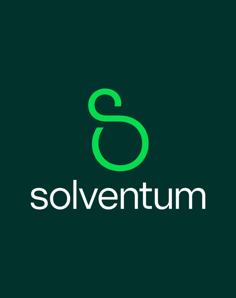
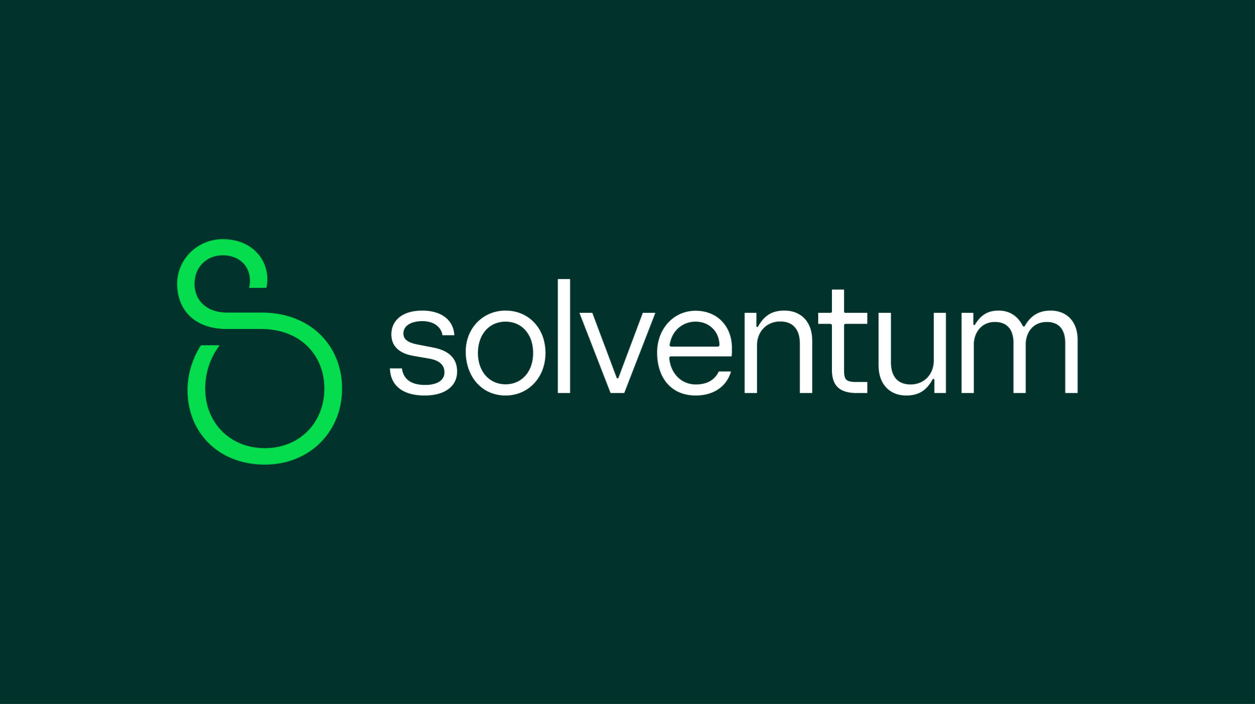
What is the meaning behind the new logo?
Sam Houle: The new logo is inspired by Solventum’s drive to never stop solving. The brand symbol, the “S” monogram, is an expression of being boundless and limitless. The movement and curvature of this symbol reflect Solventum’s responsive, caring, and imaginative nature.
The custom wordmark has been crafted to mimic the geometries of the brand symbol to create a strong visual connection between the two elements. Striking the right balance of credibility and humanity was paramount when crafting this wordmark. This balance was brought into the wordmark through the beautiful contrast of humanistic curves and structured angles.
What inspired the brand color palette?
S.H.: Solventum’s distinctive brand color is green–the color of life, growth and safety. The color palette utilizes a vibrant bright green to capture the imaginative energy when solving complex challenges as well as a richer, deep green to show the brand’s caring, people-first nature. The expanded color palette brings in the colors of healthcare through a beautiful array of teals, clinical white and cool grey tones.