Over the last year, Siegel+Gale has had the distinct pleasure of working with Flywheel Sports as their strategic branding partner. Now, with the new brand identity solidified and in-market, we spoke to some of the key stakeholders who worked on the project about the strategy behind the Flywheel Sports rebrand, the new look and feel, and what’s next for the brand.
How is the digital presence reflective of Flywheel’s ‘personalized’ and ‘inclusive’ ethos?
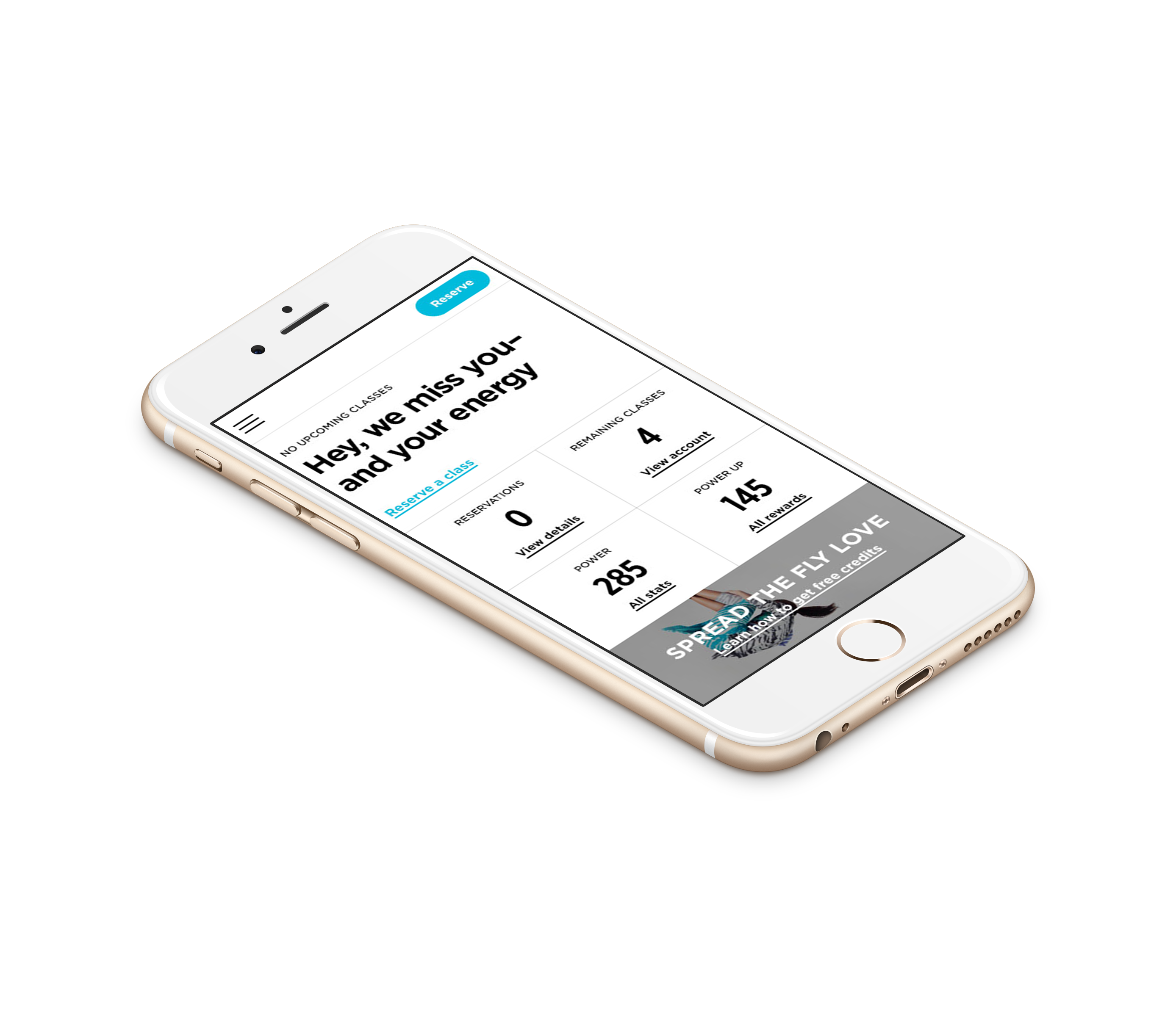
Leesa Wytock, director, digital experience, From a UX, content and experience perspective we always kept the first time and occasional rider in mind. How can we make the experience less intimidating and more accessible? From a progressive profile to sign up, to preparation tips for your first ride—we pushed hard to create features and interaction that could expand the Flywheel audience beyond power users—without alienating their core.
Robert Hegeman, digital creative director: A big part of the new site and app experience is getting more in-tune with individual rider trends and making smart recommendations on classes relevant to each user. This brings Flywheel one step closer to it’s riders and builds momentum in making reservations easier and getting it’s audience to explore different classes.
Another initiative for the project was building more personality (the rebel, the entertainer, the visionary, etc) around it’s instructors and features lifestyle cues for each (hometown, guilty pleasure, top artists). So from that perspective, the instructors feel more approachable and real. It’s easier for users to identify and feel connected to the instructors.
Can Siegel+Gale further discuss the reasoning behind this design work?
Kevin Grady, global executive creative director: “Our collective desire with this work was to maintain certain elements of the original identity while evolving it into something more contemporary and dynamic.
Is Flywheel trying to reach a new audience?
KG: There is a continued desire to make men feel welcome at Flywheel. The new identity works for both women and men.
What were the major challenges?
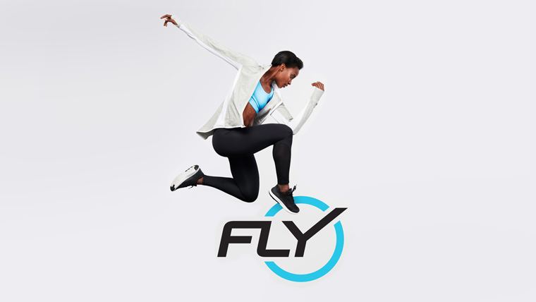
KG: It was challenging to create a new mark that evoked cycling without being too literal. The words “fly” and “wheel” evoke some fairly obvious potential logo solutions, and we wanted to avoid them. At the same time, we wanted the mark to be somewhat descriptive. In the end, we used the “Y” in “FLY” to suggest spokes connected to a wheel, a solution that has the right sensibility without being too “on the nose.”
How does the new look differ from its previous brand identity?
KG: We created a new version of the “Fly Bug”—the logo version with the word “fly” within a blue circle. We created custom typography that recalls the rounded aspects of the original typography, but that has more movement and energy. We also a selected a new family of colors, including a more vibrant blue to replace the original one. So there’s some degree of continuity, but also built-in flexibility.
Congratulations to our client Flywheel Sports on a successful rebrand!
Kevin Grady is global executive creative director. Leesa Wytock is director of digital experience. Robert Hegeman is digital creative director.