Business at our San Francisco office has been growing briskly over the last year, and our design team has been welcoming new members to keep pace with the work. They’ve been doing a stellar job, both exceeding client goals and exemplifying Siegel+Gale’s core values as a progressive, smart, deeply-caring, and closely-knit organization.
Inspired by this influx of new talent, Creative Director Blake Bäkken and team had an idea to maintain creative momentum for the long-term: a quarterly internal design project as a channel for purposeful creative expression. Topics are relevant, providing stimulating ideas for individual reflection and group discussion. Projects are socially responsible, so everyone can feel good about participating. The result is a regular opportunity to engage with fresh subjects as a team while featuring the design capabilities of SGSF as framed posters in the studio.
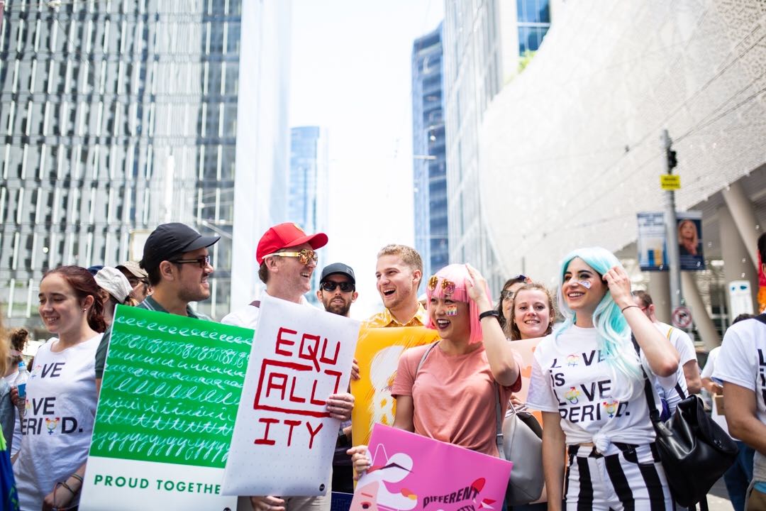
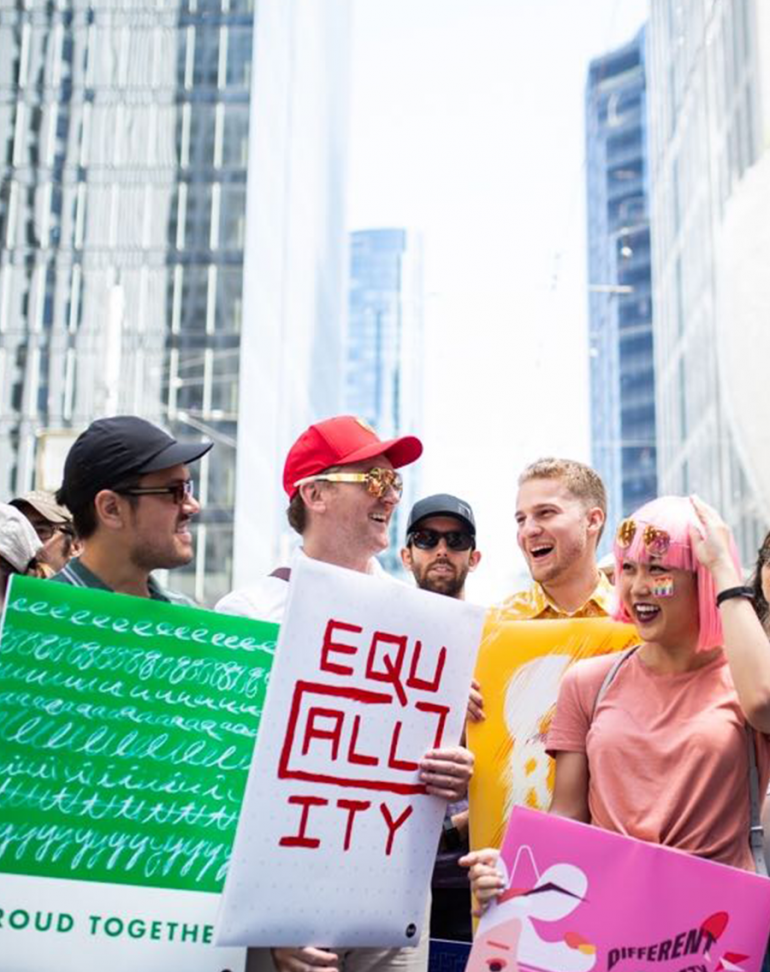
For the first project, our team created posters on the theme of equality. By chance, this coincided with San Francisco’s annual Pride Parade. This was a creative bonus, providing a unifying color palette for the designers, who each chose one color of the rainbow flag for their work. Omnicom’s participation in the parade brought the project out of the office and into the sunshine. It was a celebratory and meaningful exhibition when the design team all showed up to march together, proudly carrying the finished posters.
By exploring an idea together, our SF team brought to life an array of expressive design solutions. Just as important, though, is the thought process behind the creation. The designers, in their own words:
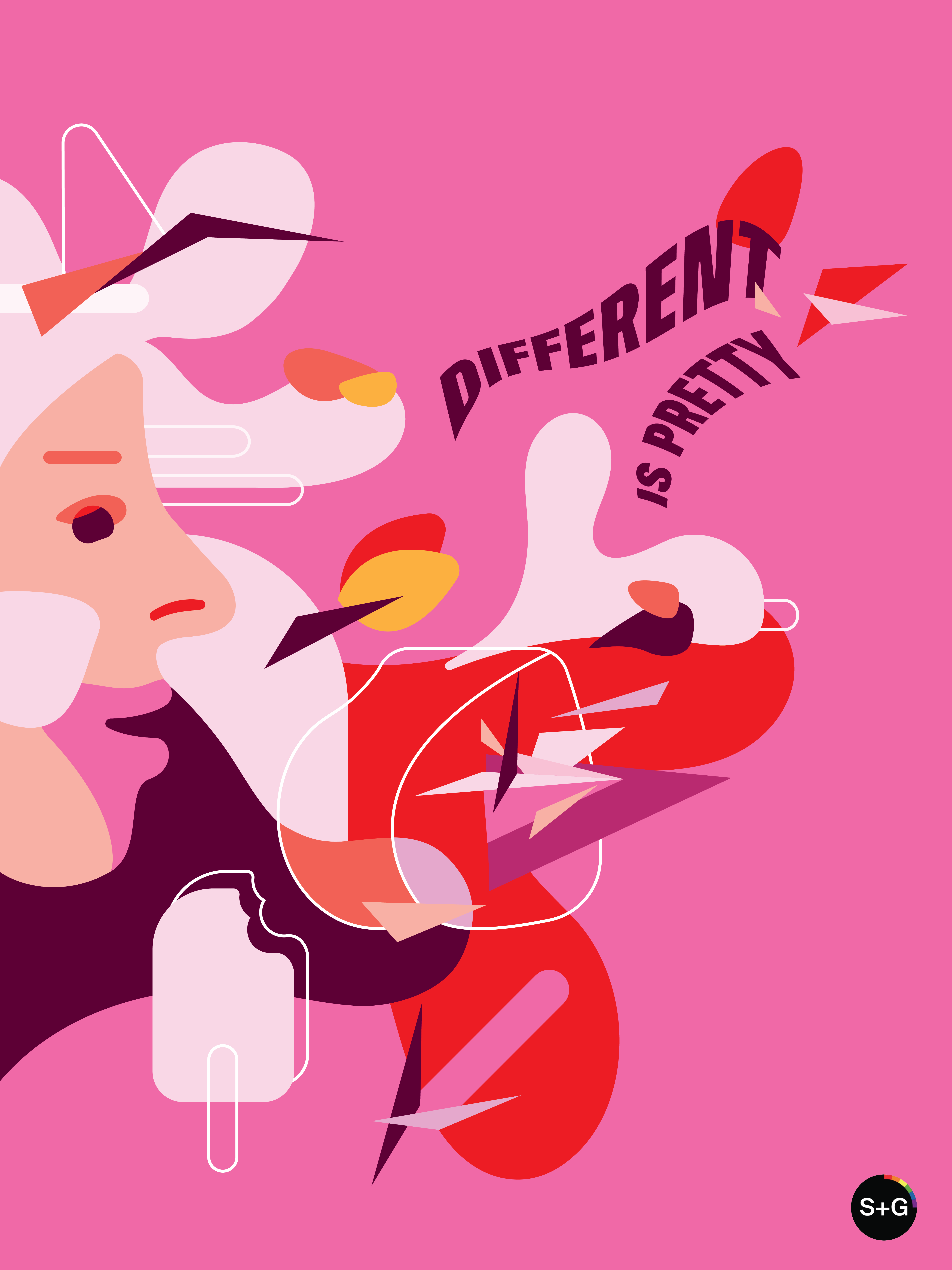
Different is pretty
“In honor of Pride Week, this poster is a simple reminder that love and beauty have no boundaries. With its free-flowing forms, abstract shapes and fun colors, we embrace an individual’s love in its truest forms.” —Sojin Kim, Senior Designer
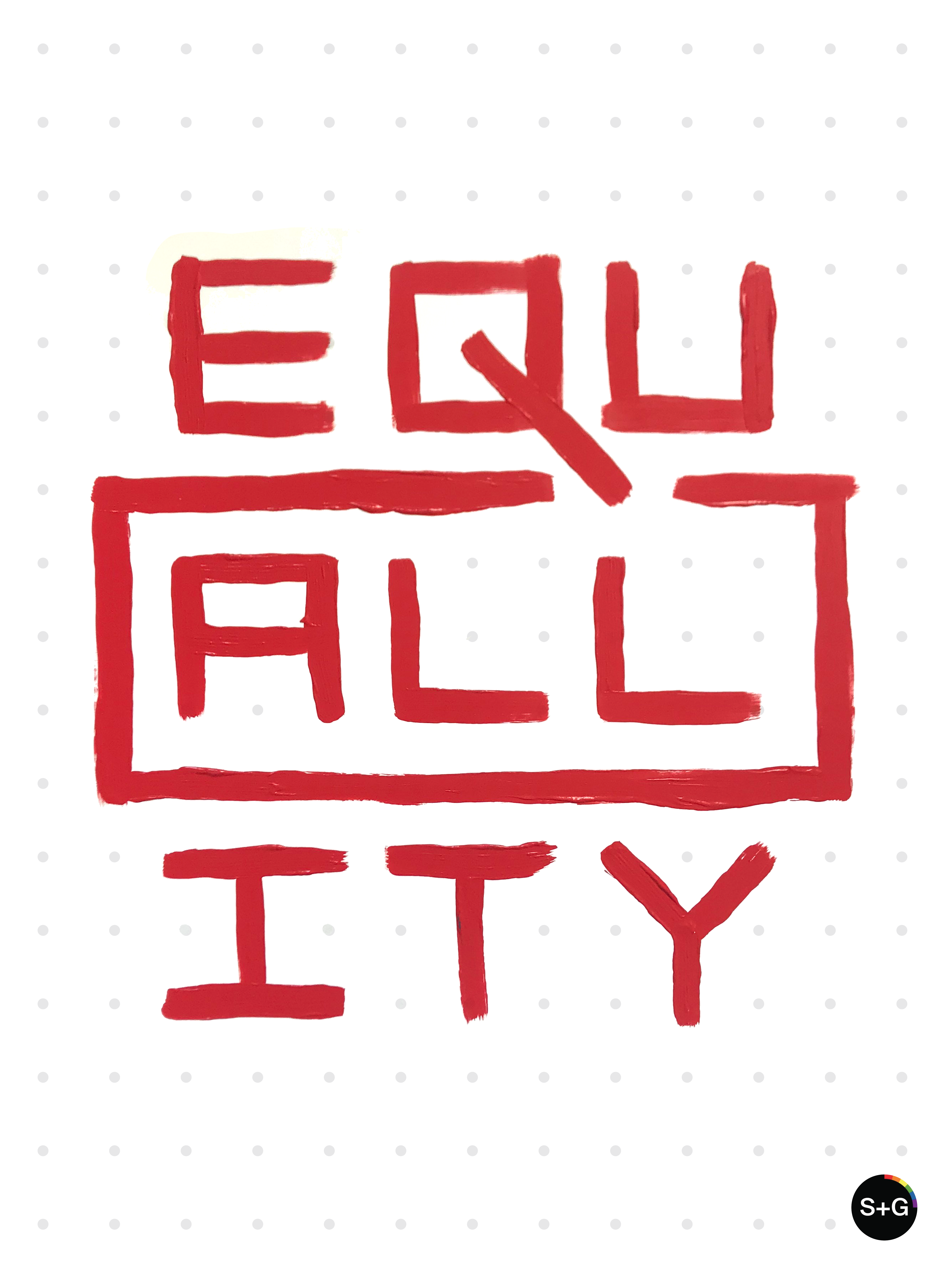
Equality
“We are all the same, sorta. But, we are definitely all in this together. Whether you’re simple or complex. Big or small. Warm or cold. Connected or disconnected. Let’s embrace these simple truths about ourselves and work toward our true potential. We are limitless! And hopefully, we’re striving to be our very best selves. I chose to represent our potential with universal dots and lines. A gesturally painted series of lines in shiny bright red paint reveals just how interconnected and aligned we can be.” —Blake Bäkken, Creative Director
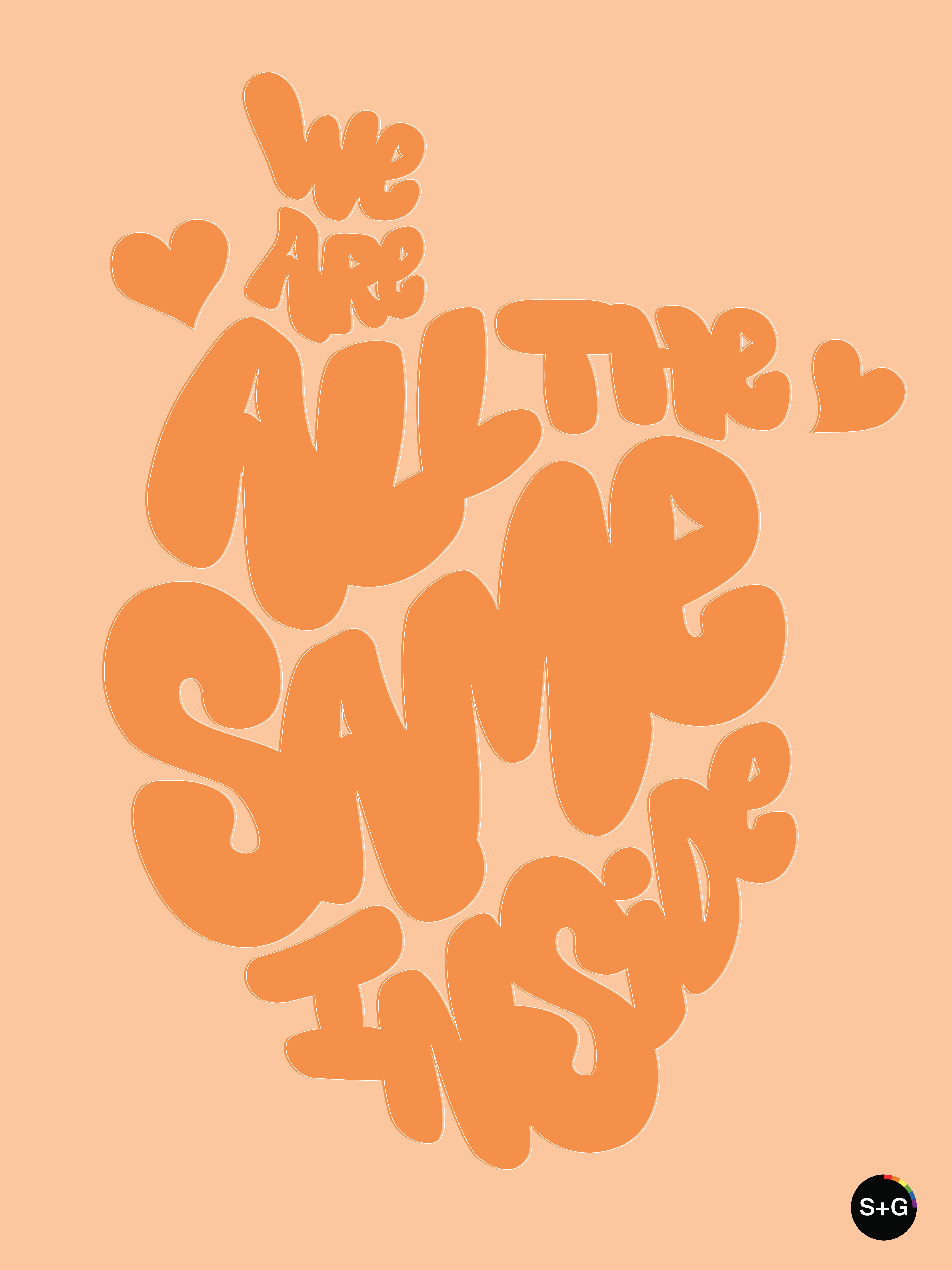
We are all the same inside
“In creating my poster, I decided to shape the words of ‘We are all the same inside,’ into the form of the human heart. This concept embodies the idea that as humans, we may differ in our backgrounds, the languages we speak, and the interests we have, but we all belong to a single human race, despite our beautiful differences.” —Hannah Rizza, Design Intern
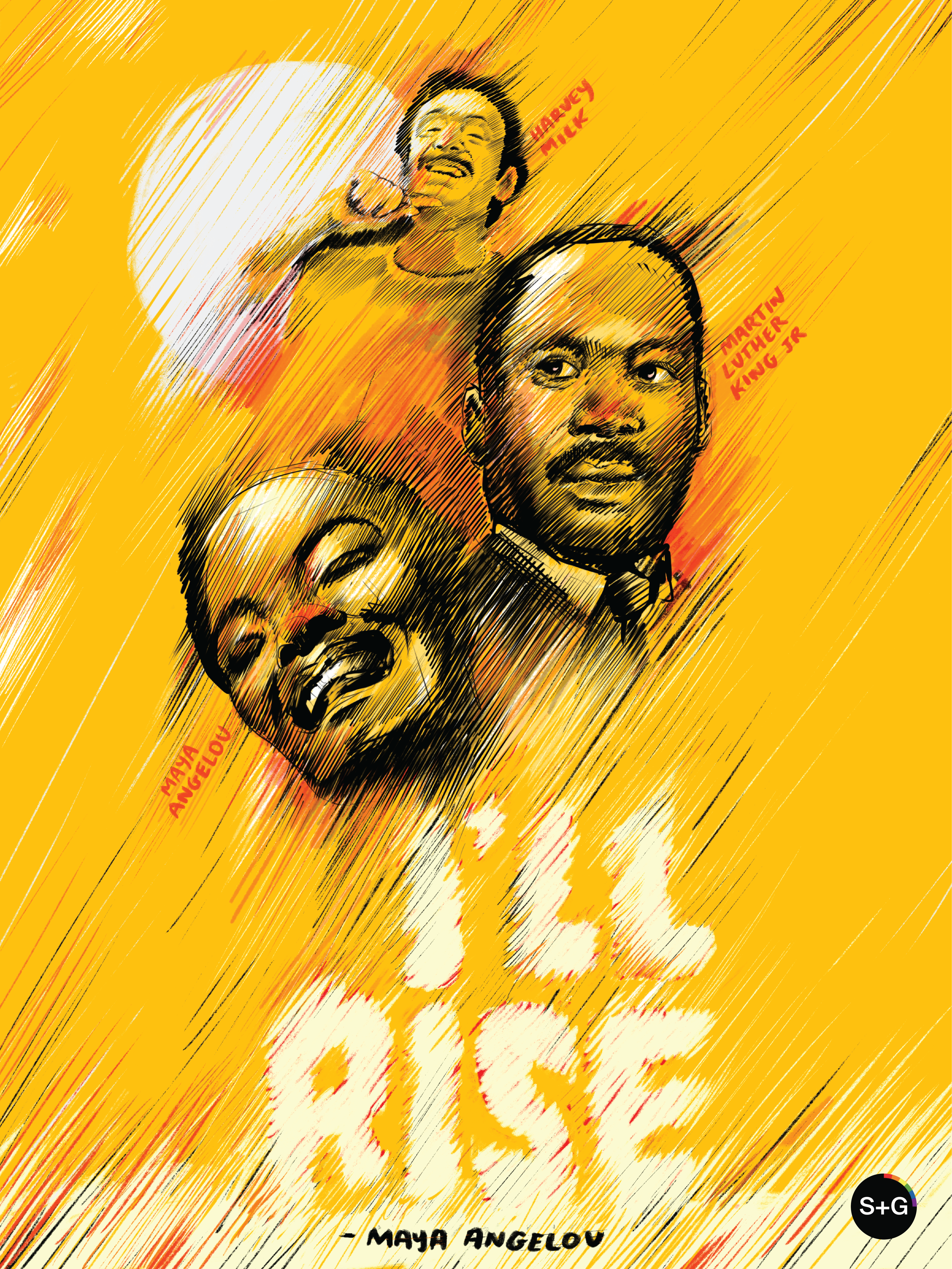
I’ll rise
“Maya Angelou rose above hate armed with her pen and paper. MLK rose above hate equipped with a powerful voice and a philosophy of peace. And Harvey Milk rose above hate by standing for what he believed in — even when others didn’t stand beside him. My poster remembers those who have fought for humanity, and reminds us that we must all rise above hate in whatever ways we can.” —Matt Hansen, Designer
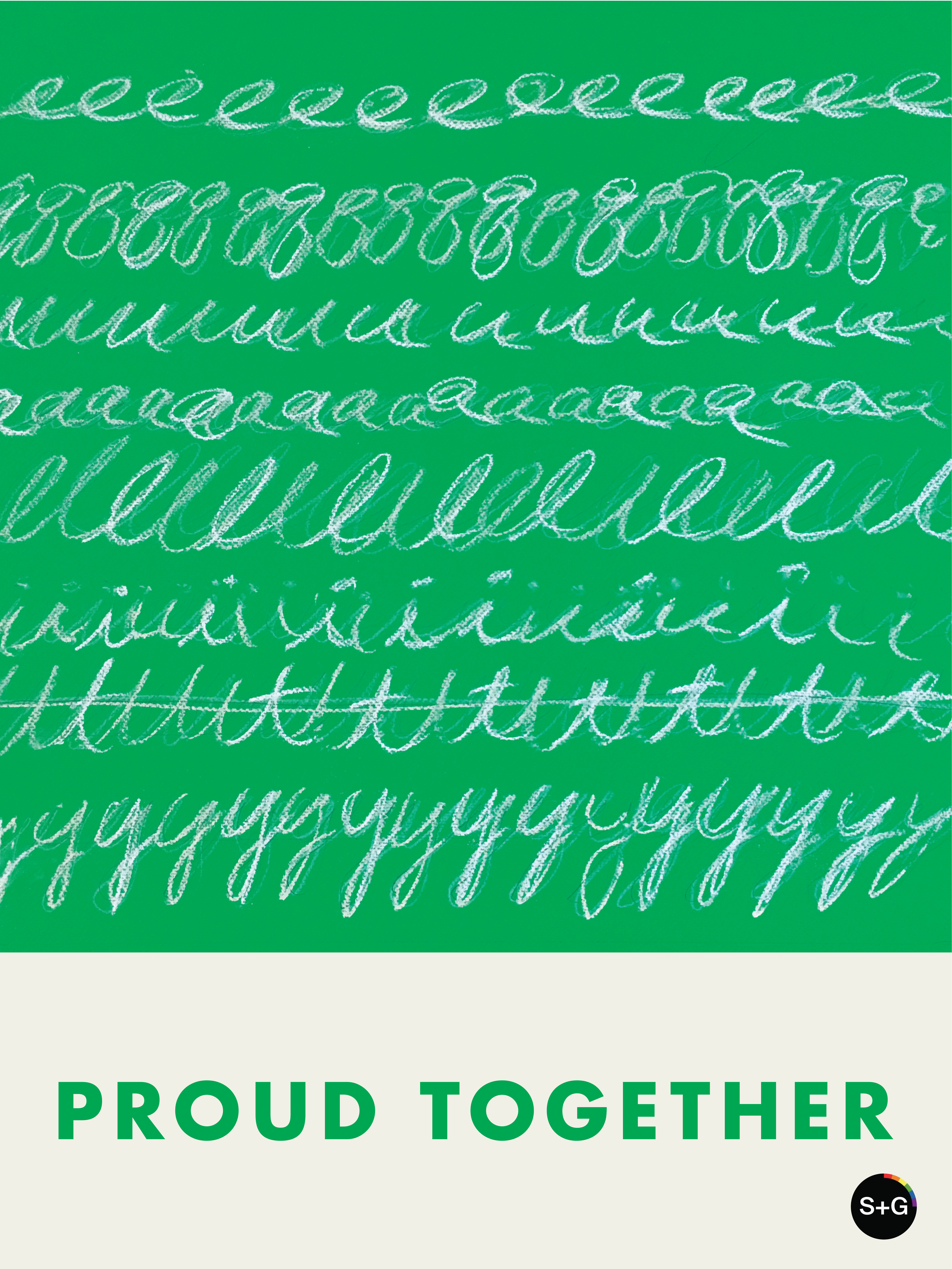
Proud together
“Practical equality, really living it in spirit and action, requires respect and empathy so we can find common ground when we have differences to work out together. I took formal inspiration from Cy Twombly’s art, using connected cursive letterforms to express sequences of distinct but equal units. I also got to work with green, like a chalkboard, with an easy reference to learning. So here are art and education together, two of the best things that can bring people together in our world.” —David Daugherty, Freelance Strategist/Writer/Designer
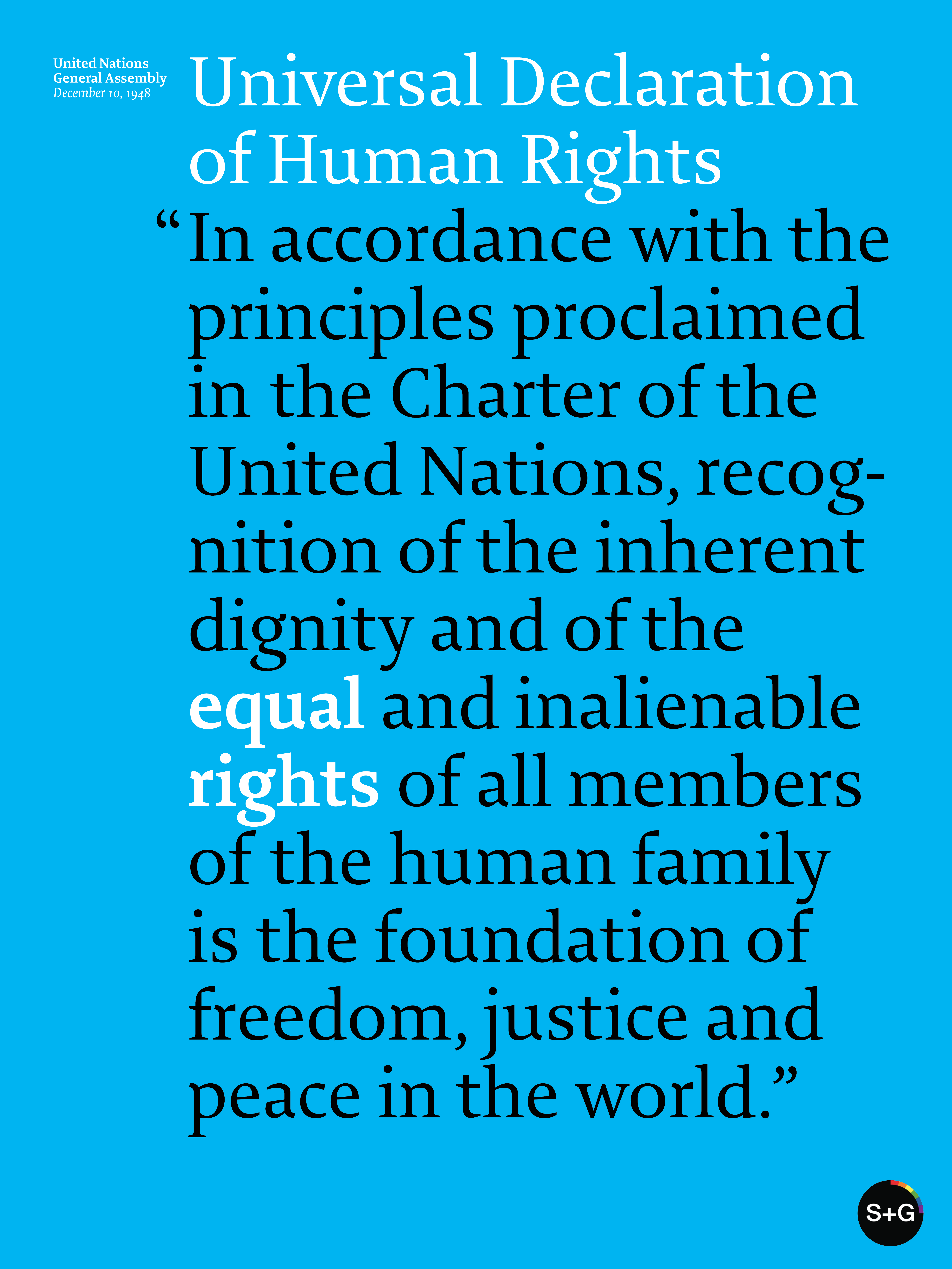
Equal rights
“I see equality as a human rights issue and was inspired to take a deeper look into the Universal Declaration of Human Rights. For the poster, ‘equal’ and ‘rights’ are treated as a single statement from the preamble to the Declaration.” —Mei Wing Chan, Design Director
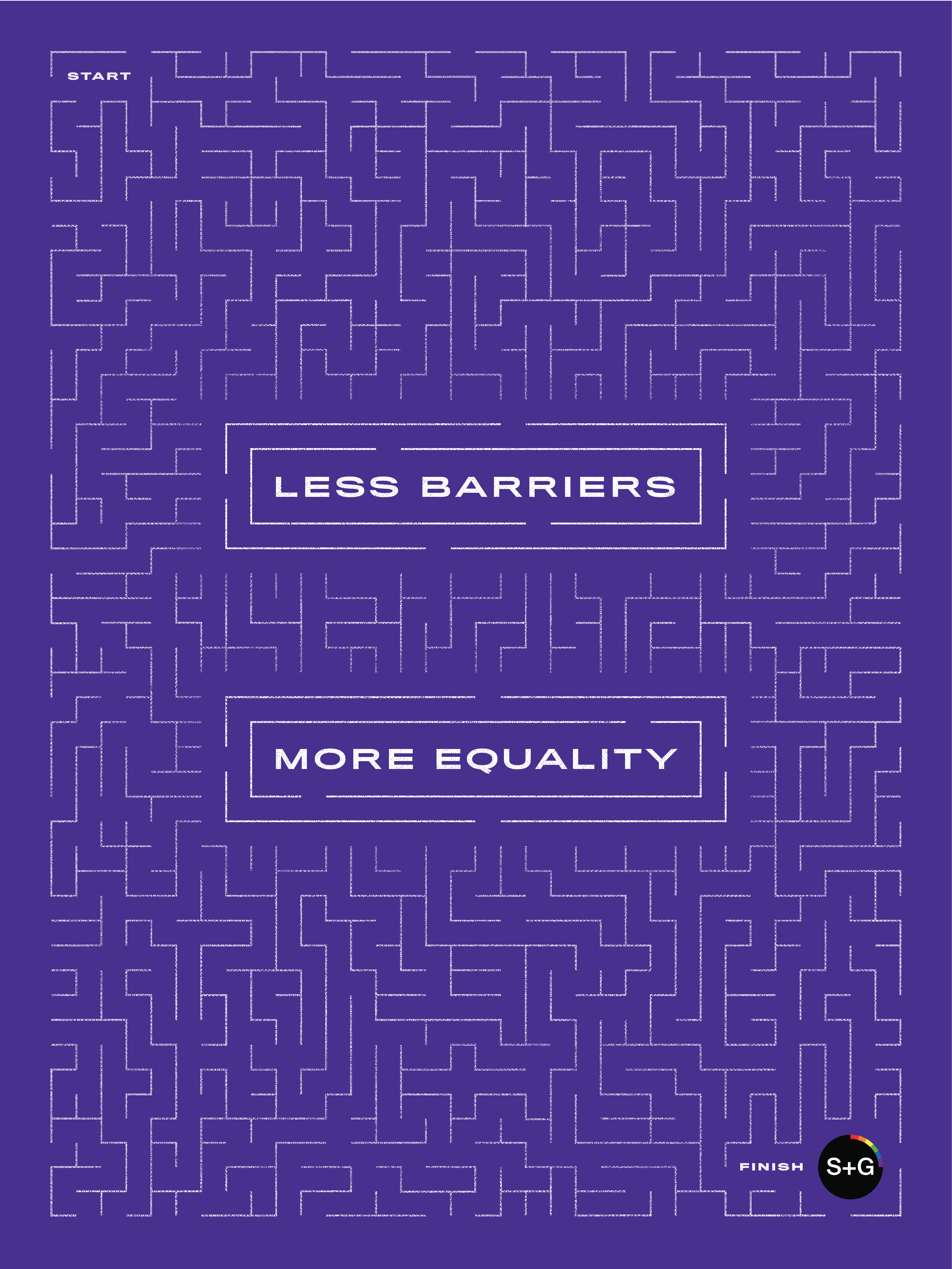
Less barriers, more equality
“This poster represents the constant barriers that are being placed to hinder equal rights progression. The central equals sign represents tearing down these types of barriers from the inside out.” —Ryan Tinsley, Senior Designer