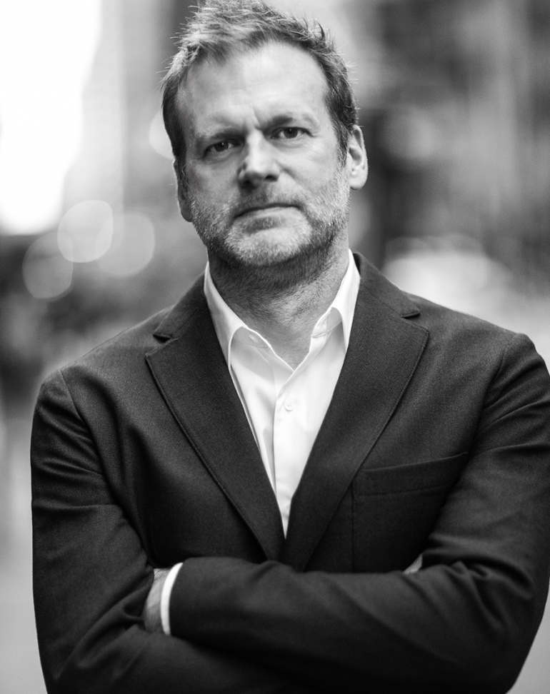
SMPL Q&A is a blog feature in which we interview experts on all things relevant to branding, design and simplicity. In this Q&A we speak with Douglas Sellers, Executive Creative Director, about the duality of design and simplicity.
We know you’ve had a fantastic career. If you had to sum up your experience in two sentences, how would you describe your career?
I feel very fortunate to have worked with so many talented and smart people, and on some of the most visible brands in the world. The industry is so exciting now and looking toward the future, the possibilities are endless.
What does simplicity mean to you?
Simplicity should be effortless, like second nature. It means not getting in the way; not trying so hard. Simplicity in branding is also about getting to the essence of something—the purity of an idea.
I apply the ethos of simplicity not only at work but also in my day-to-day life. I don’t like clutter, tricks or superfluous information.
Nothing drives that sentiment home quite like the welcome gift I received from our Co-CEO and Chief Creative Officer, Howard Belk. He said, “Hey Doug, here’s your chainsaw. Because you always cut through the bullsh*t.” I loved that and thought it was a brilliant metaphor for simplicity.
How do design and simplicity fit together?
That’s an interesting question, and I might even rephrase it as, “How do simplicity and design come together as a strategic tool to create simple futures that are bold, visionary and dynamic experiences?”
At one end of the spectrum, simplicity and design are about creating with clarity and purpose—creating something useful, beautiful and relevant.
On the other end, it’s about being bold, visionary, and unexpected in the way we address the duality of design and simplicity. Our job is to dream big and help our clients see the world differently to create change, ultimately helping them succeed.
We heard you are interested in typography. What spurred this interest, and do you have a favorite typeface?
Since I was a child, I have loved type. We used to take family vacations, and I would stare out the car window and admire all the logos and fonts on the sides of trucks and road signs. Ultimately, I went to design school in Switzerland because of its rich heritage in typographic design.
For my inner-brutalist, I’ll go with the original sans-serif, Berthold Akzidenz-Grotesk, as my favorite typeface. However, I also like the more modern, human Ubuntu for its simplicity. Designed initially for online usage, Ubuntu is an accessible typeface and democratic in nature.
There are so many beautiful, amazing typefaces now. I love to draw or choose a typeface that fits a brand’s character. Often times, people forget that type has personality and is a powerful tool that can make a brand feel proprietary.
Who are your design idols?
All the mentors that helped me throughout my schooling and career.
What three words would you use to describe your design (or creative style)?
Bold, bright and badass.
What’s one thing that isn’t on your resume that people should know about your work style?
That my favorite tools are a white piece of paper and a Caran d’Ache Mechanical pencil with 3B lead.
What do you see as the biggest opportunities for the world of design? Anything you would like to see more (or less) of?
The beauty of design is that some elements remain constant, such as people continuing to trust brands rooted in simplicity.
I’m looking forward to seeing how design as a craft and sustainability intersect. There’s great potential there. Certain brands such as FREITAG have embraced this notion for years, but now as climate change and its subsequent economic impact are daily news, how will brands incorporate a progressive mindset into their storytelling, and back it up with action?
When you can customize almost every detail of a product or experience you purchase, whether it be a sneaker or a playlist, it will be interesting to see how hyper-personalization evolves.
Douglas Sellers is an Executive Creative Director at Siegel+Gale.