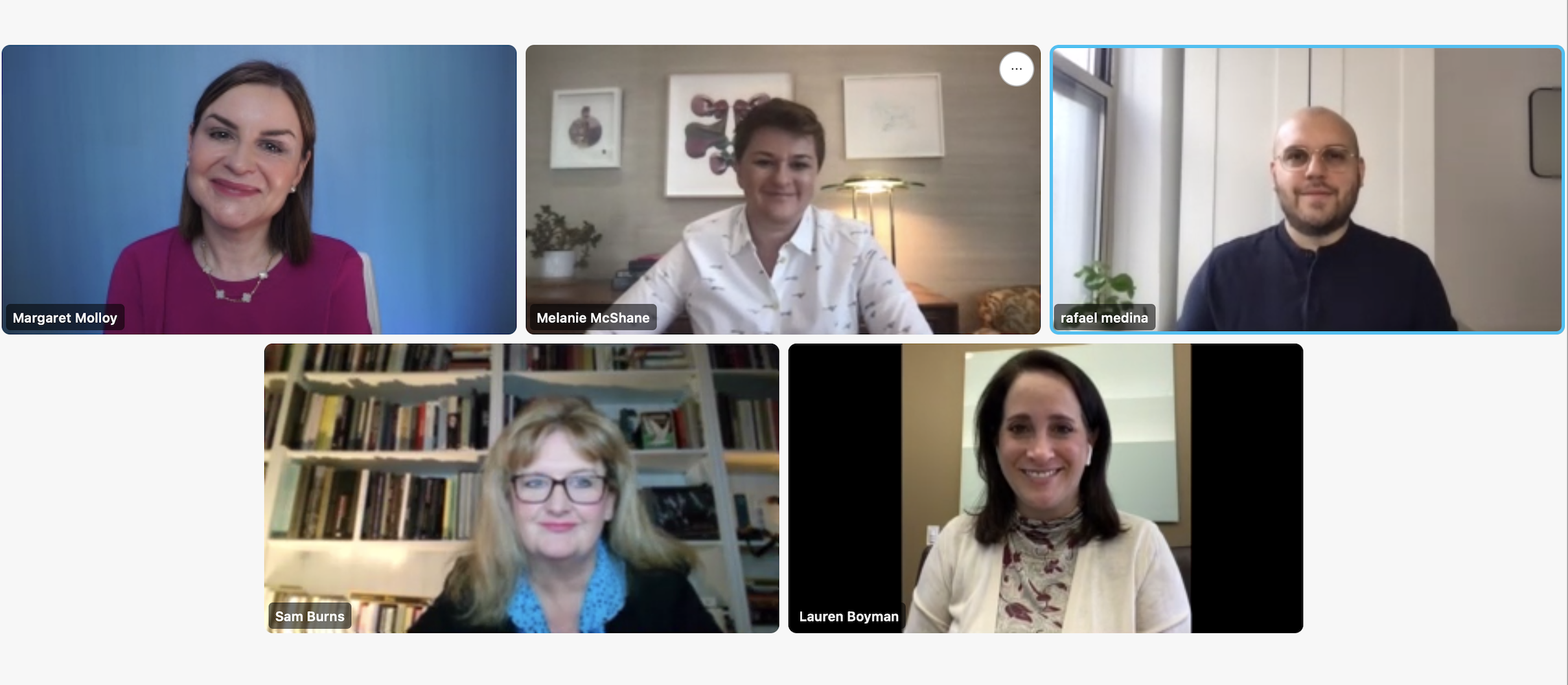
In our Unlocking Brand series, a CMO and Siegel+Gale’s branding experts go behind-the-scenes for a look at an exceptional brand-building case. In our latest installment, “Evolving an iconic brand for growth,” our Global CMO, Margaret Molloy, moderated a conversation between Sam Burns, Global CMO of KPMG, Lauren Boyman, U.S. CMO of KPMG, and our Executive Director of Strategy, Melanie McShane and Creative Director, Rafael Medina.
Together they explored how to transform an iconic brand, including how to use data to achieve alignment, how to bring brand-led experiences to life and how to use design to express business strategy. For the complete conversation, head over to the Siegel+Gale Says podcast on Apple Podcasts or Spotify.
Margaret Molloy: How did you know it was time for a brand refresh?
Sam Burns: We knew we had a really good story to tell, complete with fantastic client successes, deep technical capabilities, and some great accolades from analysts. But that story wasn’t hitting the market in our brand where our positioning wasn’t as clear, and the look and feel was a little bit old-fashioned for the digital era. We knew we needed to be more modern. We knew we wanted to be the destination for top talent. And we were also keen to address our employer brand simultaneously. From an ESG lens, we also wanted to enhance our role as a societal brand.
Plus, in a business like ours where you’re dealing with 144 member firms around the world and 236,000 people all operating under one brand, they still have a degree of autonomy in their countries or territories. You start to see fragmentation creep in—people start creating new campaign positionings and generally pushing the boundaries of the brand guidelines, especially for those innovative, more entrepreneurial parts of our business who always mistakenly think that they can depart from the primary brand to stand out. I call this “brand meanders.” And that’s always a good indicator that it’s time for a change.
M.M.: How did we, at Siegel+Gale, settle on the positioning? Talk us through your process.
Melanie McShane: With so many different member firms, you are balancing a lot of different interests and needs. And one of the things we realized early on is that KPMG is a very data-driven, rigorous organization. So, part of the process was thinking about how we were going to get as many different insights as possible, so that we could have a rigorous fact base. And this obviously connects very much with how Siegel+Gale approaches these projects: gathering what’s on people’s minds and where the world is headed.
The second piece of this was to think about how we do it in an inclusive way. Many of the senior business leaders and partners at KPMG were keen to point out that the future of the business didn’t necessarily lie with them, so they wanted to, for example, get the perspective of younger folks in the organization. This ensured that the process was inclusive and equitable.
And then the last piece I’d add is that there was a desire to be ambitious and forward-looking. We are proud of the core that KPMG has in order, but also how the positioning could sustain the growth in newer areas that we talked about and really step up to not just drive the business across all the different lines of service, but to really play more of a societal role as well.
What we landed on is that KPMG has an incredibly powerful engine to get to insights. And it’s not limited to getting the insights—it has the capabilities to help businesses, organizations, and individuals see new opportunities and then actually take advantage of them.
M.M.: Lauren, can you speak for a moment as to how this brand refresh is impacting the various stakeholder experiences?
Lauren Boyman: A brand should be a constant reminder of what our people should aim to represent. So, it shapes our client experience because, number one, our people are thinking every day about how they can leverage data and how they can push themselves to get that insight in whatever it is that they’re doing for the client or for the firm.
We did a series of brand road shows around the country and, in order to physically bring our brand positioning to life, we had an actual insights window. It was an insights-window prop for people to pose with, to hold, to see themselves with. That was an inspirational aspect, because it is what we learned from our clients that people want—they’re looking for an organization that’s going to bring insights and it’s our people who do that. There’s a lot of data out there, but how that actually comes to fruition in a client conversation or in a client engagement within insights is to solve the issue at hand. That’s what makes a firm stand out.
M.M.: How did you think about the brief, as it were, to have design express the new strategy?
Rafael Medina: We needed to take a bird’s-eye view of the brand—a holistic view in which we asked ourselves, “What are the implications around the positioning, and how are we expressing that and bringing that to life?”
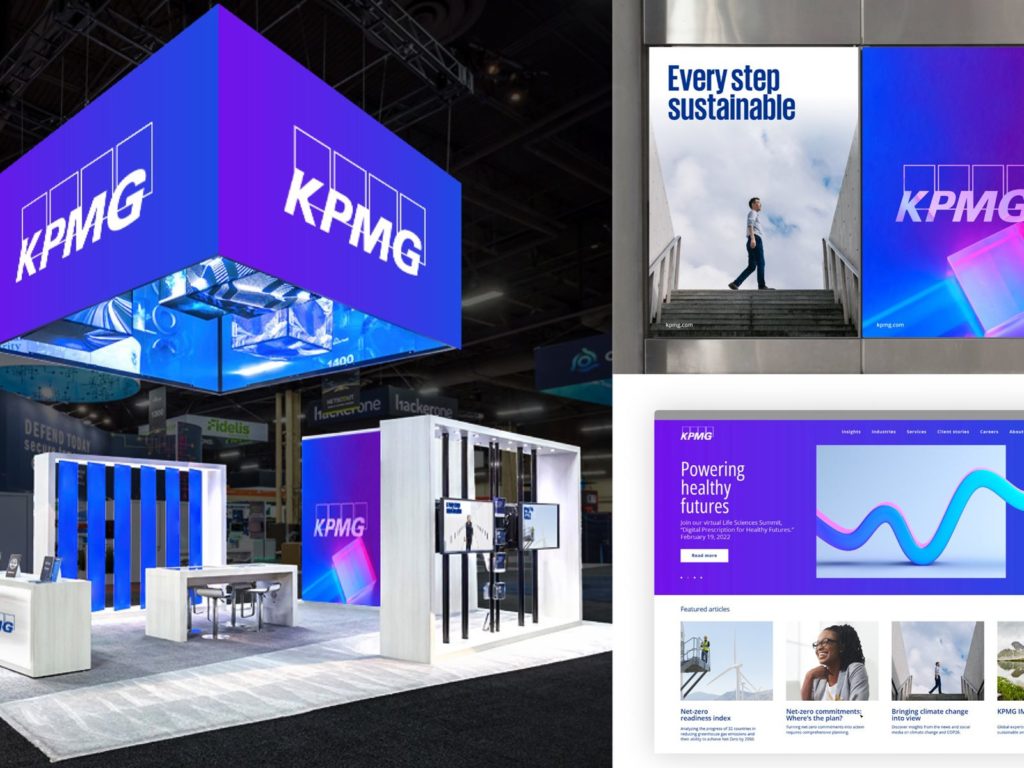
To do this, we took these legacy elements, primarily the logo—this world of blue that was so deeply embedded into the DNA of the identity. We utilized it as a jumping-off point in this exercise of bringing insights-focused positioning into the visual language.
We were transitioning from a primarily print-driven brand experience to a digital-first brand experience. So, we looked at how we could take the core assets and optimize them to deliver insights and reveal these opportunities around the brand experience. We retained the logo, but we moved it to this center stage moment where it’s capable of broadening how it’s expressing and delivering that notion of insights as a hero element. We also looked at ways that we can broaden and enrich our signature colors to really deepen and emphasize and create more of a vibrant nod to the technology-driven digital experiences and the world in which clients are living. We were solving some of the user pain points around legibility, so we evolved the font, making it much bolder and more impactful.
The insights window was derived from the logo, and the logo was comprised of these four rectangular forms. These forms were the foundation—the building blocks for the brand. Throughout the system, that simple graphic element highlighted moments within an image containing information in a way that was bold, impactful, and effective across different medias.
The design expresses the brand’s strategy, because we found a universal language that’s capable of evoking and speaking to a multitude of audiences in a way that’s actionable in real time and, above all, true to the brand.