
The rise of technology has resulted in an influx of start-ups, with every new venture a potential disruptor. For major players, losing market share is like a sinking ship; the process is often slow but inevitable. A fate Blockbuster suffered from the rise of Netflix. While start-ups have mastered the art of gaining market share, the real challenge for them still lies ahead.
Evolving to a medium-sized business has already proven difficult for many fintechs, for example, looking to disrupt the major banks. Despite Monzo and Revolut disrupting the sector and Starling recently becoming the first neo-bank to break even, fintech growth has slowed of late.
While start-ups can often consider agility to be an advantage, incumbents are frequently better placed when it comes to branding. Heritage, often synonymous with purpose, is something grown, not created, and it’s something incumbent financial institutions tend to have in abundance. However, a brand doesn’t need heritage to be authentic—it merely requires a foundation or a purpose rooted in truth.
We believe that a brand’s authentic truth can be the key to unlock scale.
The beginning
Founded in 2015, Digital Risks was a brand that crossed the divide between online platform and specialist insurance broker. Its founders realized that the insurance model of the time did not meet the needs of today’s businesses. With a plan to enter a new phase of growth, Digital Risks required a brand that could support that growth through a powerful identity.
Sea of sameness
The fintech industry has a dominant set of brand codes. Many operators seem to share the same color palette, while logos follow an unwritten rule of building from the brand’s initials.
It was clear that for Digital Risks to bridge the gap between start-up and scaling business, differentiation would be key.
Value in values
Demonstrating the desire to set a higher standard in business insurance and embracing the inherent risks founders face when they start a business, Digital Risks needed to cement these principles into the foundation of their identity. The name Superscript was adopted to replace Digital Risks, taking as its inspiration the typesetting terminology of a raised character, linking back to those higher standards.
Four distinct pillars—Unafraid, Unassuming, Unexpected and Unstoppable—were developed as the basis for the identity.
Breaking the visual tropes
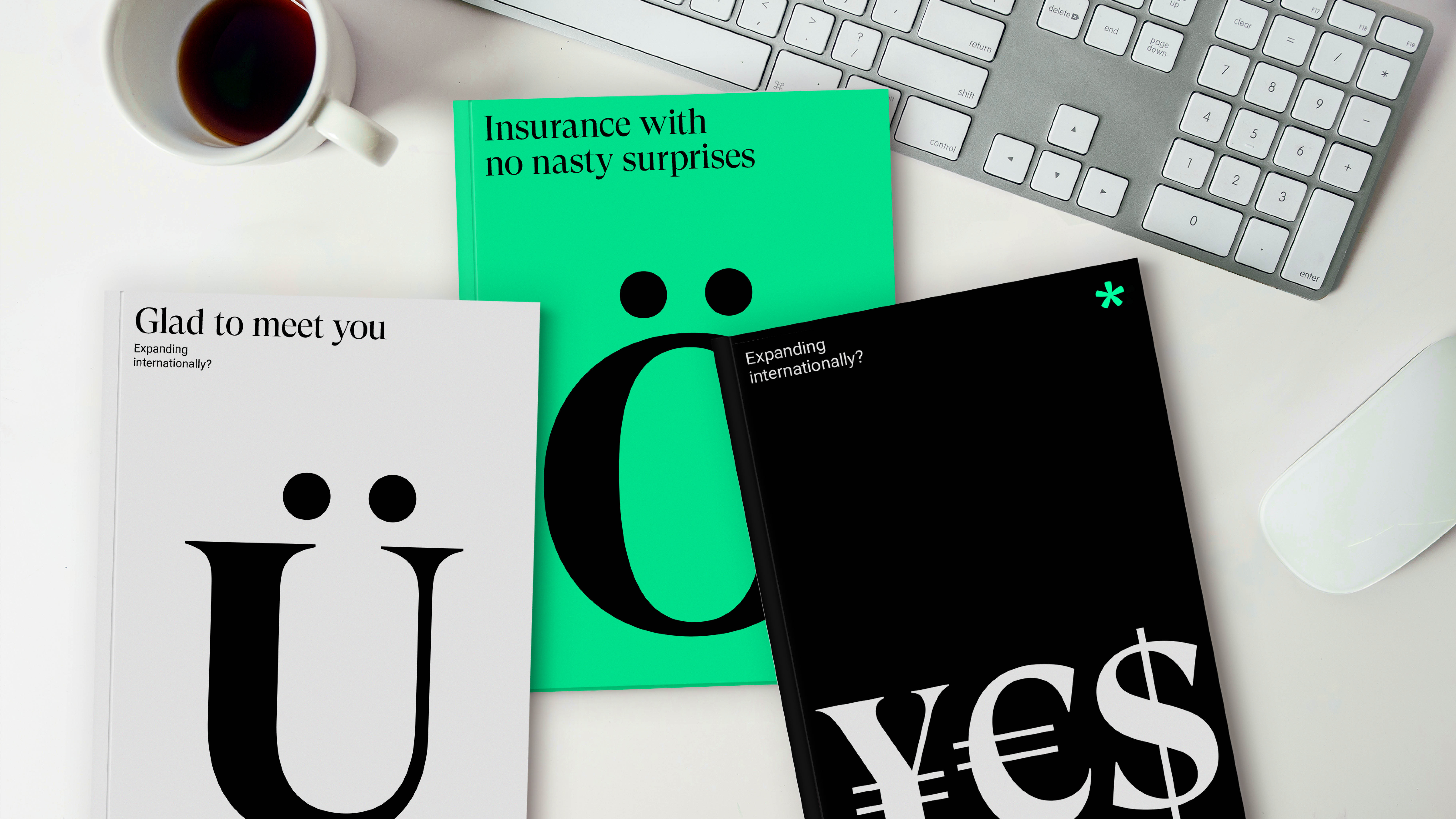
When thinking about how we could encapsulate these four pillars in a simple and pure form, we landed on the asterisk, a symbol customarily associated with the insurance industry’s negative elements, such as the small print. To us, it is the perfect icon in representing how Superscript subverted industry norms.
From this element, we developed a visual identity that captured the unique way Superscript is going beyond the industry conventions. This more ‘grown-up’ editorial approach started as an asterisk but developed into informing the logo, typography and photographic style.
Our visual audit of the category revealed that the clear communication of products and services was a problem in the insurance industry. Therefore, we decided to open up a wider range of glyphs, enabling Superscript to do this uniquely and distinctively.
Armed with an identity anchored in truth, Superscript now has the foundation to develop a heritage not usually associated with start-ups. The brand flips the perception of business insurance from stuffy and corporate to empowering and inspirational. Superscript’s embrace of the risks inherent in the world of business and the bravery and commitment required to embrace that risk is the thread that connects the brand to its audience.
James Snook is Senior Designer on our London team