This article originally appeared in Transform magazine.
How important is typography in branding? What role does it play in creating cohesive brand identities?
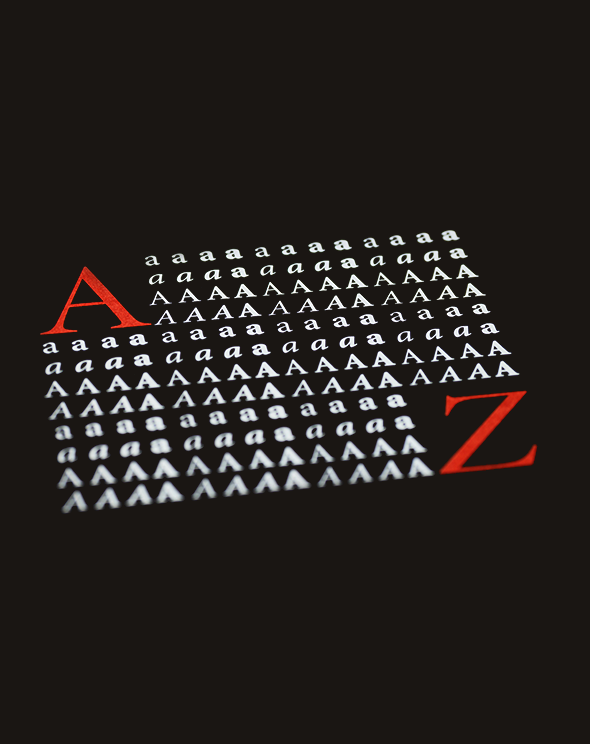
Amanda Bowers Wong: Typography is an extremely important component that not only incorporates a variety of creative aspects but glues all those elements together. A visual identity, including a logo, colour palette, and photography, expresses the spirit of a brand. But it is typography—with its thoughtful and purposeful design—that makes those pieces legible. That means you can understand a visual identity and, chiefly, the brand’s spirit.
A great example of typography helping to create a cohesive program comes from a source that is not often associated with branding: Medieval manuscripts. As an art history major at Stanford, I wrote my honours thesis on the Lorsch Gospels, a set of seven biblical manuscripts created for Charlemagne’s court. I find the use of coded language in Medieval art so intriguing—every detail included is meant to be read in such a specific way. In the Lorsch Gospels, for instance, the incipit pages paint Charlemagne as the natural heir to the Holy Roman Empire. This propaganda pervades the gospels, using both illustration and text to link Jesus and Charlemagne. No detail is negligible and so the reader takes in the material in a highly curated way. The same is true in branding: the details work together to tell a unified story that informs and engages consumers.
Why is typography often overlooked compared to other aspects of brand design and why should it be given greater emphasis?
ABW: Typography becomes a supporting cast member that doesn’t get top billing but subtly holds up the show. That’s because, when typography works well, you absorb only the information that you read—the typography essentially becomes invisible. You’re not trying to distinguish between an “i” and a “j” or wondering why a cupcake shop chose a typeface reminiscent of Russian Constructivism. Considered typography eliminates distraction and confusion.
Because typography educates and engages, it has the power to contribute significantly and strategically to a visual identity. As designers, we have the great honour—and responsibility—of ensuring that typography is not overlooked. We must be thoughtful and aware of larger historical contexts. We must develop criteria when sifting through font options. And we must consciously choose what to lean into and what to stay away from.
What is typography’s main purpose within visual identities?
ABW: The main purpose of typography is to spell out a word or words and to then visually support the communication of those words. Designers can harness the beauty and strategy of typography to either enhance or contrast with other brand elements. Take the visual identity of a bank: the name of a stately bank is not likely to be expressed in, say, a typeface made of cat silhouettes. Instead, a traditional serif typeface that evokes ideas of heritage and stability is a safer choice. Serif forms originate from carving stone, so it suggests that the bank is well established and successful, qualities that target consumer trust. Conversely, a new, digitally forward bank might choose a more modern sans serif to play up ideas of technology and innovation.
Siegel+Gale’s work with Bristol Myers Squibb is another good example of typography reflecting brand identity. The company strives to balance the rigour of science with the humanity of a patient-centric approach. The typeface for the logo is very precise. It’s upright, freestanding, and strong. But the subtle curves give it softness, so it doesn’t feel cold or aggressive. The wordmark of the logo mirrors Bristol Myers Squibb’s ethos.
What brand(s)/product(s) have the strongest use of typography and why?
ABW: The new mark for the Brooklyn restaurant Gage & Tollner stands out. The wordmark speaks so clearly to the strategy of the visual identity. The letterforms are derived from a historic mark and are so evocative of a time and style—they signal the nearly-150-year history of Gage & Tollner. The ornate letterforms set expectations for the experience. This isn’t a dive bar, this is a high-end, white-tablecloth meal with martinis and flattering lighting.
Another favourite of mine is an earlier version of the logo for Hiny Hiders, a bathroom-partition vendor. I noticed this mark a few years ago and I just think it is so weirdly fabulous. It reminds me of my work with manuscript marginalia, where bored scribes took to the edges of the page, adding intriguing—and oftentimes cheeky—illustrations.
Amanda Bowers Wong is Associate Creative Director