This post originally appeared on the Creativity International Awards.
Siegel+Gale’s wine packaging design for Blue Apron wins accolades in the Creativity International Awards.
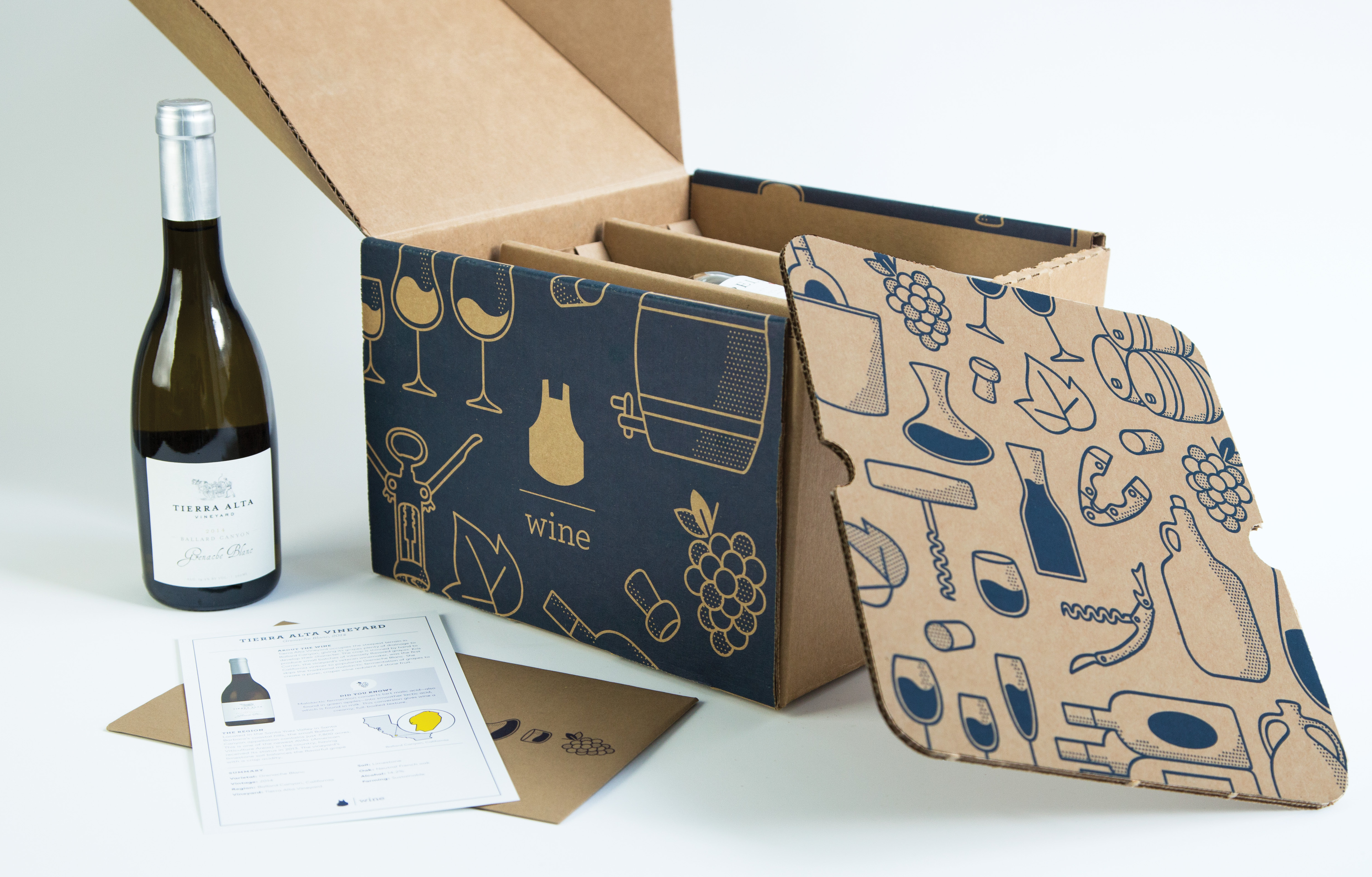
Blue Apron, one of the most sought-after billion dollar unicorns in the e-commerce world, suddenly found itself one amongst a growing population of recipe and delivery services available to the market. In order to expand their business, they made the decision to enhance and diversify their offerings. In the same way they had made sophisticated cuisine accessible and cooking it easy, Blue Apron made wine, which is often considered prohibitively intimidating, just as simple.
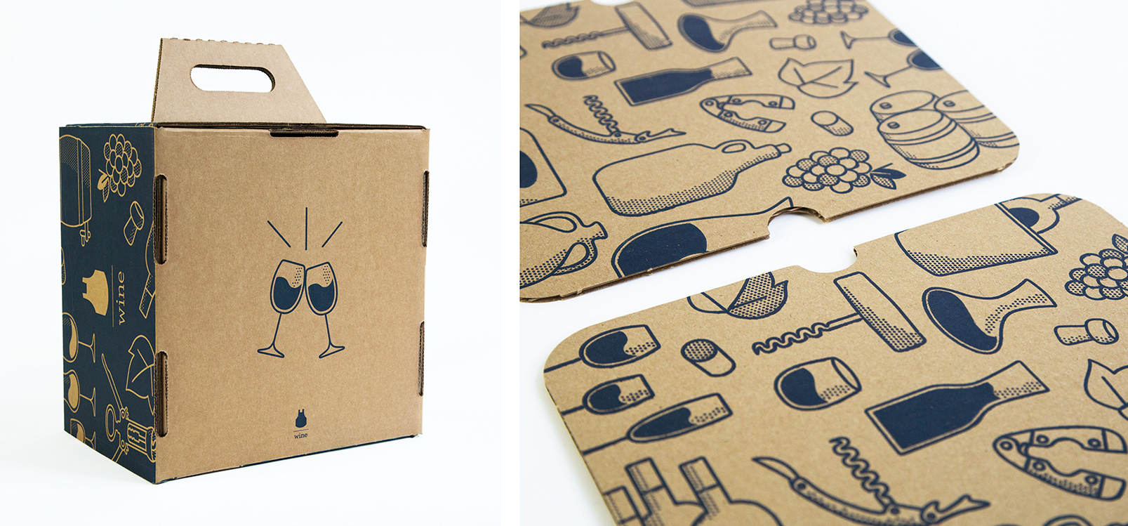
The packaging and icon design is firmly rooted in this business imperative—making choices simple and attractive. Siegel+Gale took Blue Apron’s current icons and drew a custom set of iconography, resulting in a more coherent and distinctive icon style to continue the growth of the brand’s portfolio. The icons have a human quality to them, putting a sense of whimsy, surprise and joy at the fore of learning about wine and food.
To move the brand forward we:
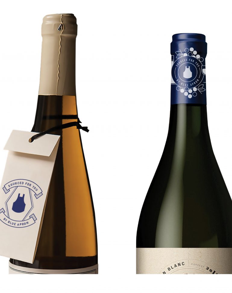
– Created a logo signature system allowing for growth and flexibility as new line extensions emerge and simplified the mark by removing the words “Blue Apron”
– Crafted a proprietary style of icons that are friendly yet elevated to balance the brand’s accessible nature and the high quality of its offerings
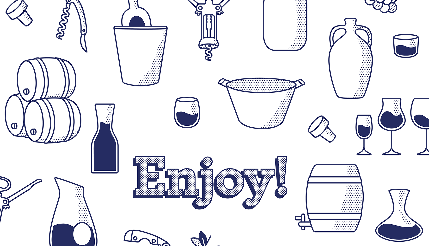
– Designed the packaging to allow for moments of surprise and delight: a hidden message for the mailman beneath the shipping label, and illustrated vignettes that celebrate the shared experience of uncorking a bottle of wine
– Simplified the tasting cards that accompany each box of wine and made the information more digestible to deliver a joyful learning experience on a topic that is often considered intimidating