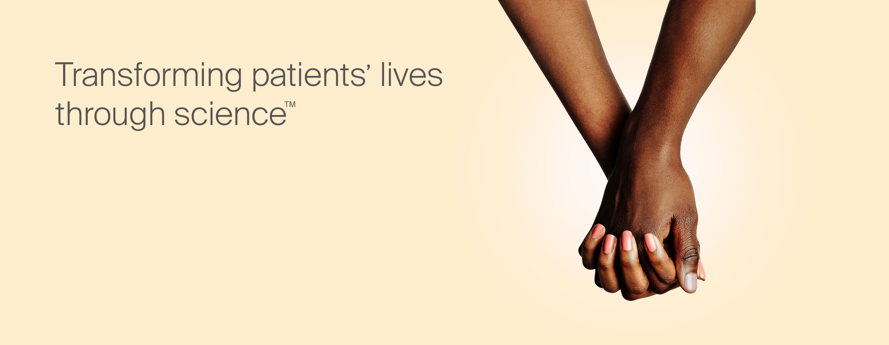
Bristol Myers Squibb
Compassionate science
Building a leading biopharma company
Challenge
Bristol Myers Squibb was on the verge of a momentous deal—the acquisition of Celgene, a leading biotech company. Company leadership believed that the integration of Celgene would create a new and better entity, so they decided to explore a new visual identity and brand voice. The new brand needed to signal a giant leap forward and symbolize a new era for Bristol Myers Squibb as a diversified specialty biopharma leader.
Insight
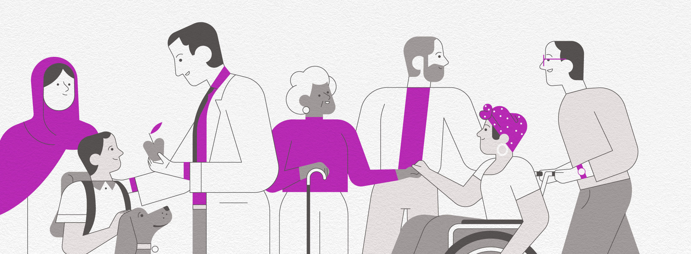
While most people have heard of Bristol Myers Squibb, the company has evolved a great deal since its last corporate rebrand in 1989. The brand needed to make three significant shifts—refocus its story so that it was clear the patient is at the heart of everything it does; elevate the experience of engaging with Bristol Myers Squibb as a whole; and redefine the brand’s voice, making it feel more personal.
Answer
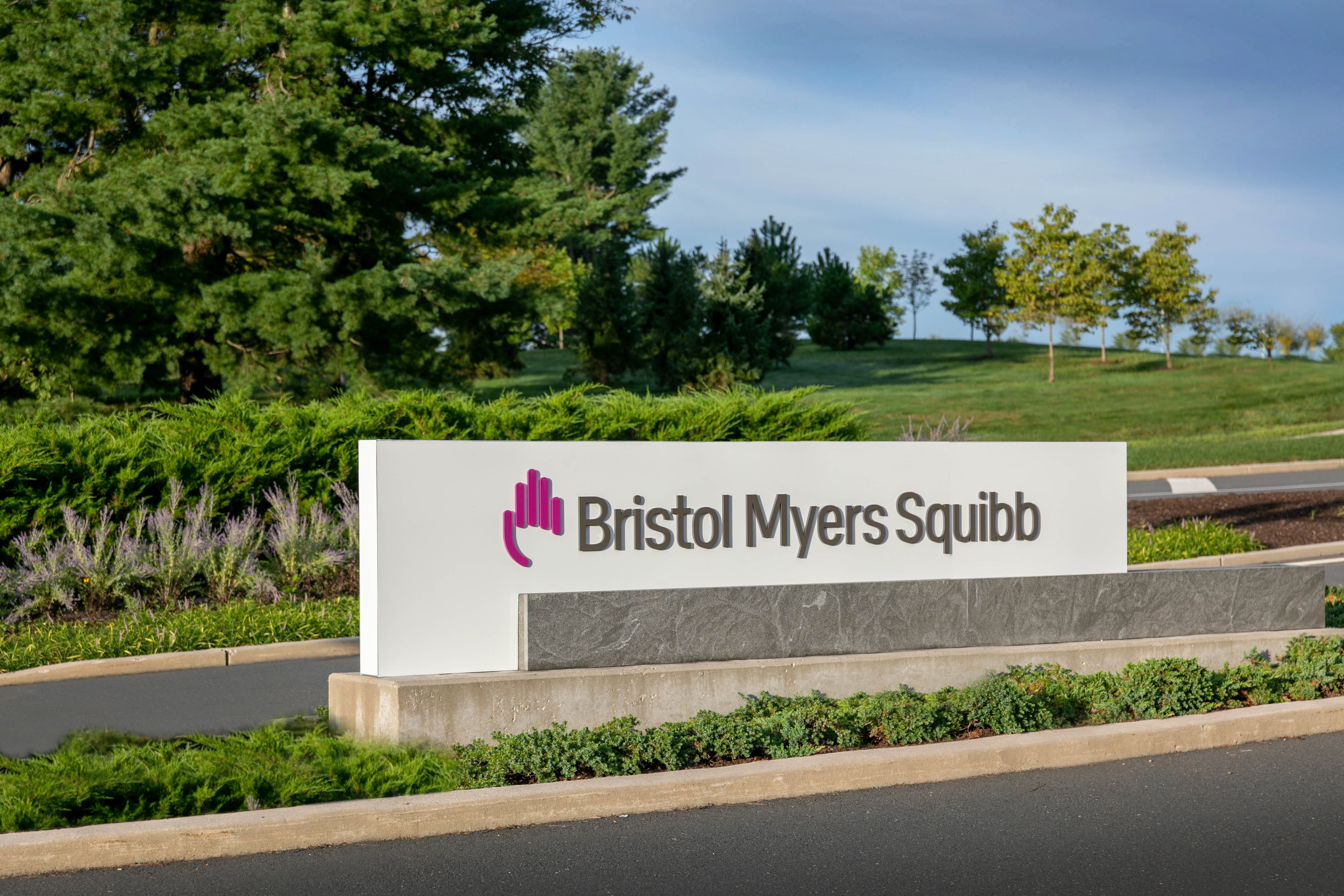
In March 2020, Bristol Myers Squibb launched its new corporate brand. The new branding includes several changes—a color change to purple, a stylized hand in the logo, a new font, and the removal of the hyphen in “Bristol-Myers.” These elements combined reflect the new Bristol Myers Squibb, representing its commitment to compassionate science and putting patients first.
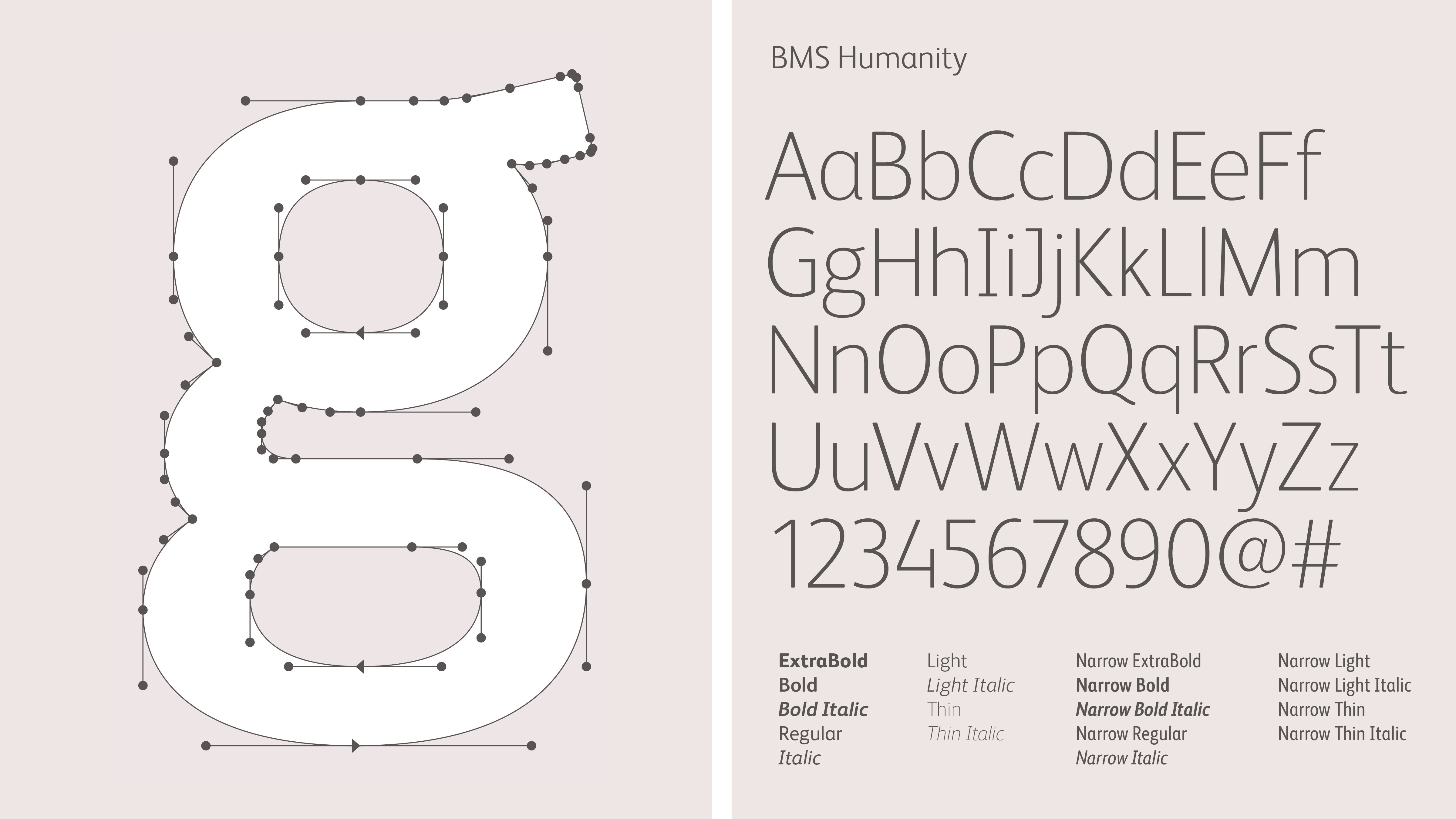
The elegant gray wordmark was drawn and exclusively customized for Bristol Myers Squibb. The condensed letterforms are rigorous and precise. Tall, strong and proud, the logo establishes Bristol Myers Squibb as a leader with real gravitas.

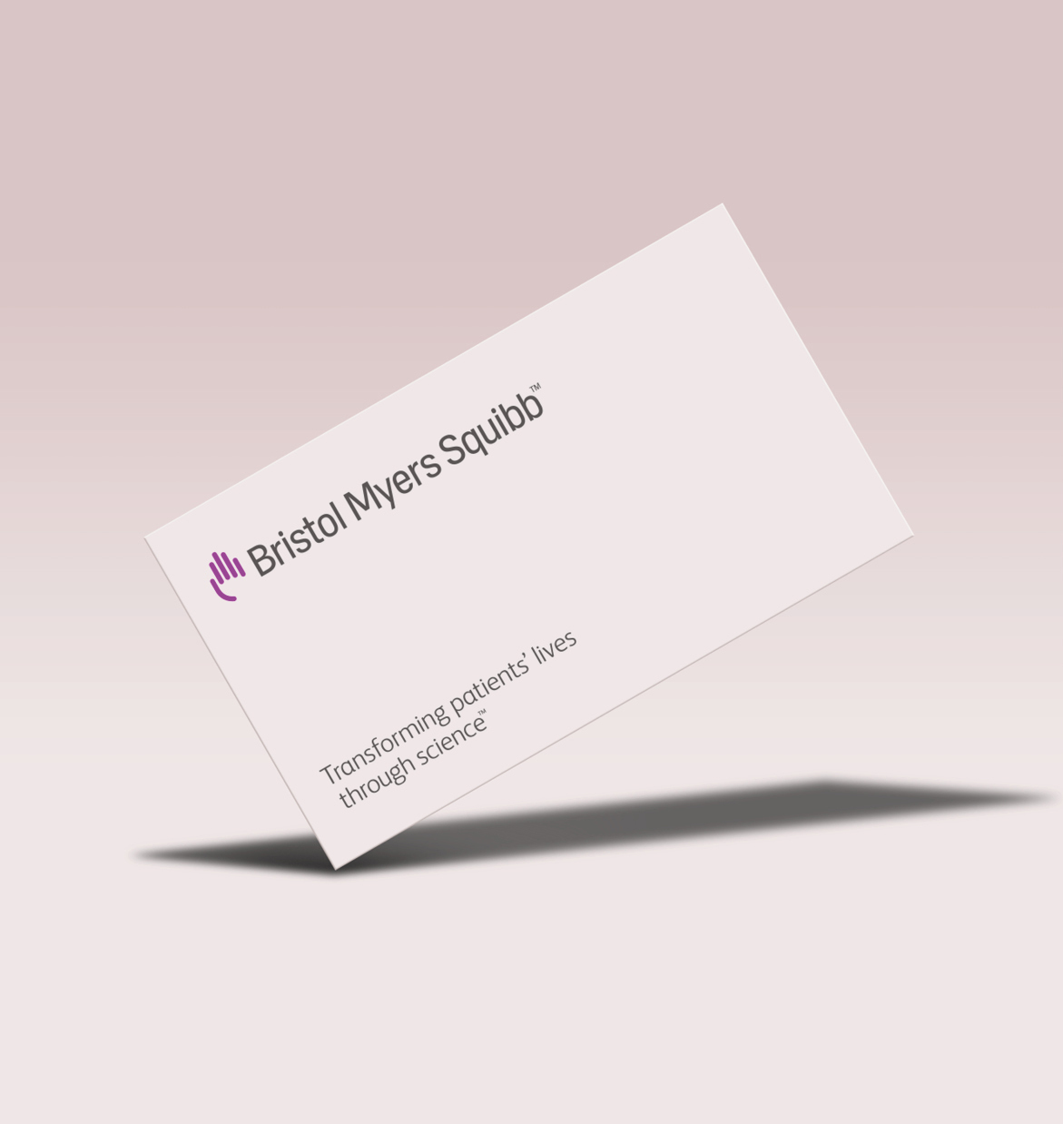
The brand’s new core colors are purple, gray and white—a deliberate departure from the blues commonly used by many in the pharma sector.
Purple acts as a purposeful accent to highlight a benefit from Bristol Myers Squibb, or to create a close connection between patients, people and science. It calls attention to key data and provides direction in digital applications through elements such as buttons and website navigation.

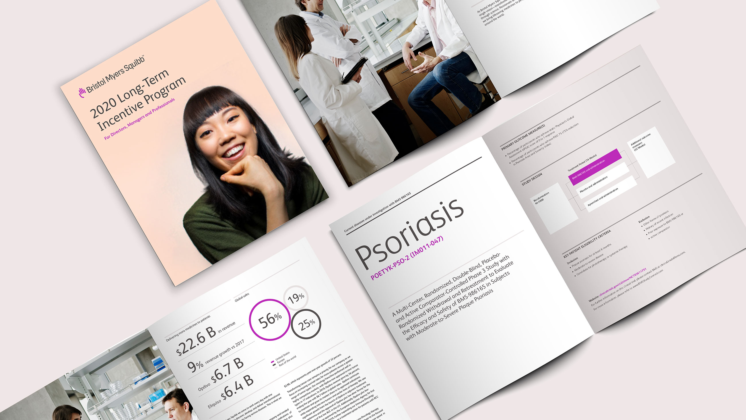
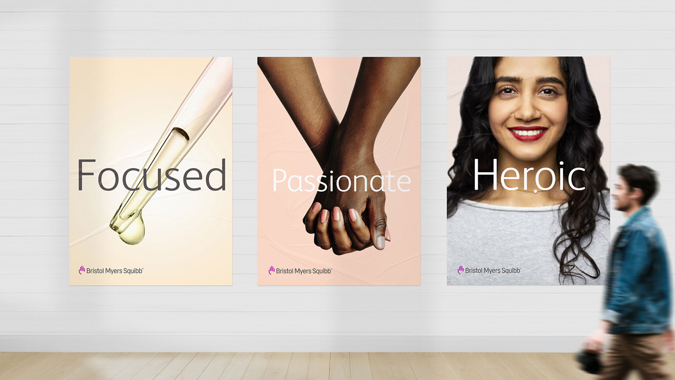
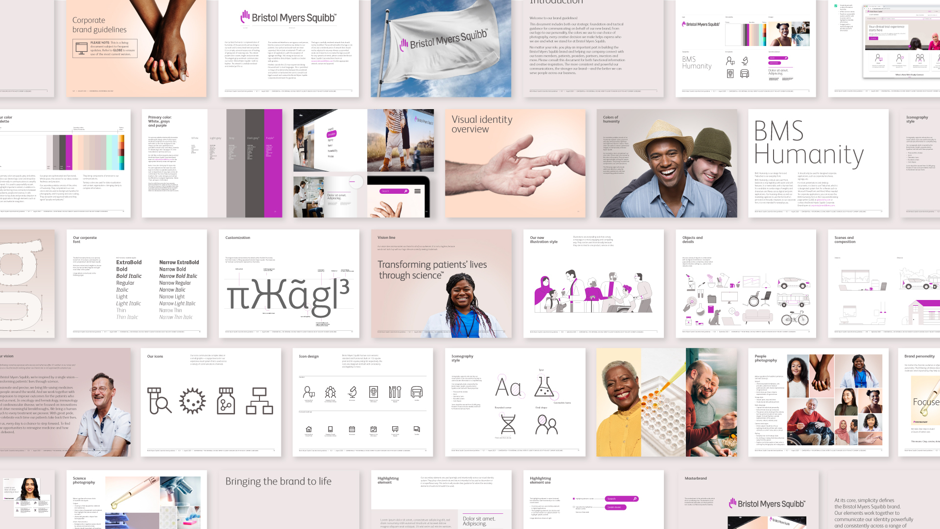
Simple but powerful attributes define the new brand voice, such as passionate and focused. This is by design: we wanted the company’s communicators to be able to grasp—and use—the voice easily. Tonally, these attributes help strike a balance between science and humanity—a balance that’s uniquely Bristol Myers Squibb.
Results

Transform Awards North America—Silver, Best visual identity from the healthcare and pharmaceuticals sector
Transform Awards North America—Bronze, Best corporate rebrand following a merger or acquisition
We needed something that was fresh, more representative of who we are and who we will be in the future. So, we started from scratch. We didn’t try to put new wheels on to fix something that wasn’t working, we started from ground up.
Former Executive Vice President, Bristol Myers Squibb