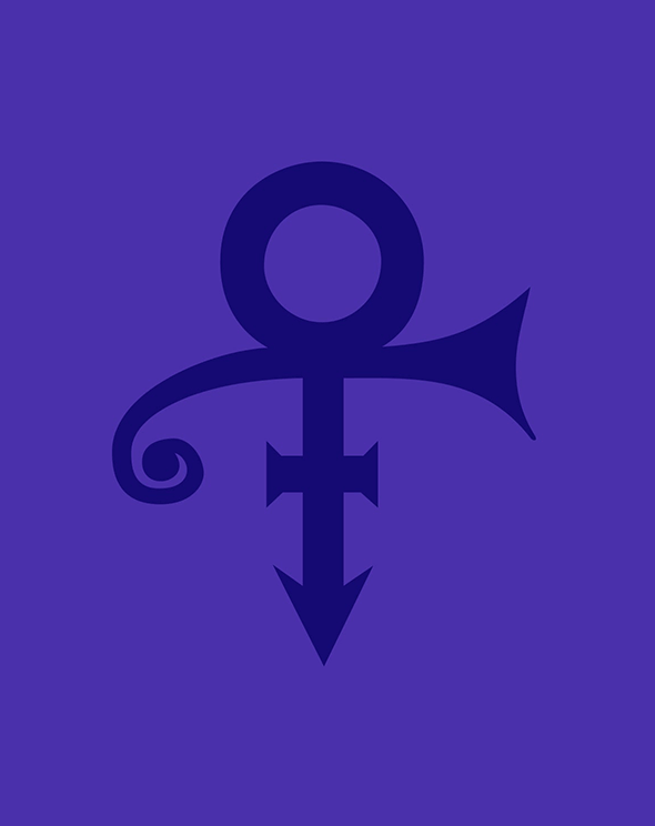
In 1993, Prince, an artist recognized for his music (and his affinity with the color purple), announced that he would no longer be known by his name, but by a symbol; a logo. A logo is a powerful thing. It’s the most immediately recognizable element of a brand. Little wonder then that many a brief we receive asks us to evolve a brand without changing the logo.
As a designer, your first instinct in refreshing a brand image is to modernize the logo. However, many brands are rightfully reluctant to alter a key element their hard-won, long-standing customer base will instantly recognize.
The request not to change a logo speaks to another truth—not only is a logo powerful, but it is also no longer enough. In a world of disruption, changing customer expectations, and digitization, brands must now navigate all channels effectively—internal and external, physical and digital.
While the logo is the tip of the spear, it is also the tip of the iceberg. Many other elements such as color, graphics, custom typefaces, illustrations, and animations also now play a critical role in driving standout in a sea of sameness.
How can a brand refresh its image and ensure that it stands out in the modern digital world while maintaining the heritage built in an analog world? And how can a logo be evolved for the digital world without sacrificing recognition? Here are three examples of brands successfully navigating this challenge.
Lufthansa
For the 100th anniversary of the renowned Crane, German aviation giant, Lufthansa, decided to refresh all assets for a digital age. Untouched since 1962, the modernized Crane has been adapted to perform better under digital duress without losing minute detail. The changes are minimal yet vital in ensuring the logo stands up when applied to technology such as digital boarding passes, websites, social media and video.
To complement the now robust logo, a custom typeface was also designed to perform better in the digital sphere. A new icon set and a refresh of the famous yellow and blue allows Lufthansa to present a modern brand without eroding its heritage.
Ericsson
Ericsson demonstrated how small changes can lead to big improvements with its revised brand identity. The project focused on how they tell their story by creating a new visual language that feels at home in every context, either physical or digital. Structured, yet optimized into a digital-first identity, the graphic language was created from and for their products.
Econ, the Ericsson logo, is now smooth and natural and aligns with a pixel grid ensuring it renders in higher resolution in animations and digital applications. This was only the start a much larger rebranding project which tackled typeface, colors, iconography and tone of voice.
American Express
The recent American Express rebrand both preserves and enhances the iconic Blue Box logo, an instantly recognizable element of the brand. This allowed the designers to alter the letterforms and finesse the detail to render in a bold and clear way that functions in both large- and small-scale environments. It is paralleled by the introduction of an alternate logo for Amex, the well-known shorthand for American Express.
Simplicity from complexity
Refreshing a brand is a complicated procedure. But by simplifying that process and ensuring a balance is struck between vintage and contemporary aesthetics, a brand can be modernized. By guaranteeing a logo is optimized for a digital world, augmented with an iconic suite of fixed and flexible assets, the brand’s heritage is maintained and its reputation enhanced. An important consideration for any brand looking to avoid being lost at sea.
Matteo Di Iorio is a Senior Designer on our London team.


