This article originally appeared on The Drum.
Whether you consider your brand building exercise a refresh, evolution or revolution, the logo is likely to command a healthy portion of the conversation. Crafting a new brand identity requires vision, restraint and execution—a combination only the most capable brand stewards achieve. Some of the process comes down to an indefinable magic—a meeting of designer and strategist; a striking of creative oil. But there are key qualities of memorable logos for which a team should strive for during the creative process, and by keeping them in mind, can ensure an impactful outcome. These qualities are shared by some of the world’s most successful brands—the ones that have risen to the level of ubiquity; and remained at the forefront of culture despite substantive societal change. We define these three qualities of flexible logo design as authenticity, intrigue and flexibility.
1) Authenticity
Your logo should reflect the greatness in your brand story, and the imperfections, too. Your audiences are ready and eager to appreciate both.
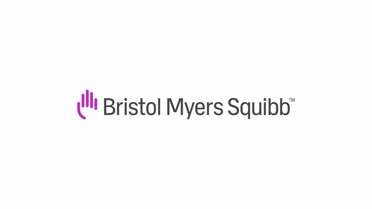
The first part of authenticity is knowing exactly who you are, and communicating that. By reimagining their logo and visual identity system, global pharmaceutical company Bristol Myers Squibb (BMS) began telling a new, more human story—one that represents their commitment to patients. Scientific excellence is integral to the BMS brand—and that comes across in the new logo’s precision. The motion of the hand wave is a nod to the people behind the brand—and a leap forward for humanity in the pharmaceutical space.
Paired with the other visual elements, the logo signals Bristol Myers Squibb’s commitment to its patients, and positions them as a forward-looking organization. It roots the brand in its people—a group of professionals who care deeply about helping people—bringing out that caring spirit in a space where it is often sparse. Tall, strong and proud, the new logo establishes Bristol Myers Squibb as a leader with real gravitas—a coming of age for the brand.
The objective: Stay true to form.
How to: Acknowledge who the brand is, including heritage visual cues and details, while pushing its meaning forward.
2) Intrigue
The best logos are iconic, and carry an invaluable brand equity. Part of their magic is their ability to inspire and provoke imagination with just a glimpse—and through decades and generations of cultural change. No matter when or how they show up, they create a distinct feeling which their brand can own.
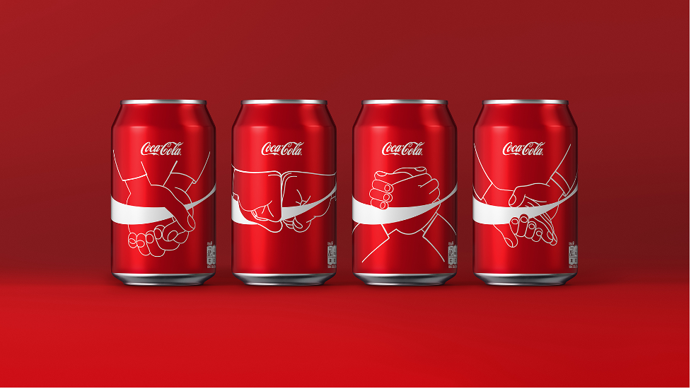
For Coca Cola, that feeling might be joy. The equity of the brand’s logo is incalculable. Originally drawn in 1887 by the same man who nailed the drink’s formula, the logo has changed minimally since. But it’s ability to inspire, connect with, and conquer consumers across the globe never ceases. The elaborate Spencerian script flourishes even with the most minimal executions. All of the visual elements are both rooted in—and have fostered—the DNA of the brand.
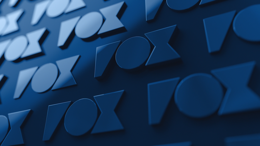
Formed in 2019 after Fox’s television studio, 20th Century Fox Television was acquired by Disney, Fox Entertainment’s brand shares an omnipresent quality. The feeling the visual brand creates is of magnitude and motion. It stands behind and bolsters them as a major entertainment brand. Fox Entertainment’s logo is not just a logo—it anchors a forward-moving visual system. It draws upon the heritage of the logo in a way that feels fresh and new and can be reinvented over time.
The objective: Create a distinct and ownable feeling
How to: Define the brand DNA and find new ways to express it through simplified execution or abstraction.
3) Flexibility
The right logo has the ability to appeal to diverse stakeholders and beyond. It is the emotional cornerstone of your brand, and the gateway to your experience.
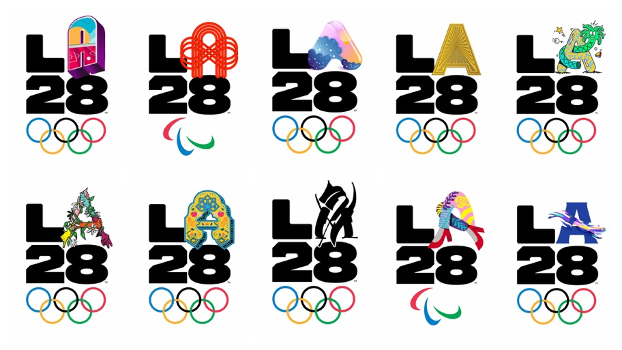
Leading brands are interested in gender-fluid, racially integrated visual representations that speak to a wide base of people. The LA2028 logo, which debuted four years ago as part of the 2024 bid, is a strong example of using an ambiguously gendered figure to amplify, rather than lose, impact, strength, and audience connection. The vibrant gradient of color is proud and beautiful.
LA2028 isn’t yesterday’s Games—it’s an audacious new vision for the future. The brand is unapologetically and distinctly Los Angeles—but flexible for the world to see themselves in it.
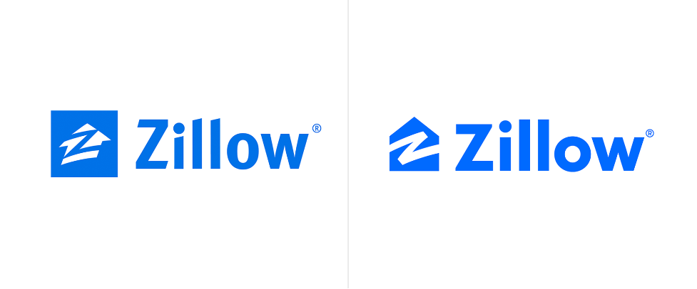
Zillow’s visual identity reflects their mission to simplify the journey toward home. That inherently meant a simplification of their logo—which since 2019 has been more clear, more welcoming, and more flexible.
The logo neutralizes Zillow as a real estate marketplace for everyone—high-end buyers; young families; savvy investors—it’s about the user. The logo flexes to what the user needs it to be, and it underpins each user’s very personal real estate journey.
The objective: Universality and longevity.
How to: Design a visual device, or framework, that affords the identity the ability to take on as much personality as possible—to be everchanging and dynamic.
The world changes. The best logos are built to continue to make sense for a long time. By incorporating authenticity, intrigue and flexibility into their logos’ designs, companies can achieve a memorable brand identity.
Nijel Taylor is Design Director at Siegel+Gale